
CSS文字超過兩行用省略號代替(相容所有瀏覽器)
方法一:常規寫法(只相容Chrome核心瀏覽器)
完整程式碼供參考:
<!DOCTYPE html>
<html lang="en" dir="ltr">
<head>
<meta charset="utf-8">
<title>Titile</title>
<style type="text/css">
.test1{
overflow: hidden;
text-overflow: ellipsis;
display: -webkit-box; (1)只顯示一行,超出部分用省略號
white-space: nowrap; (2)只顯示兩行(或多行),超出部分用省略號
    overflow: hidden;
    text-overflow: ellipsis;
    display: -webkit-box;
    -webkit-line-clamp: 2;  // 控制多行的行數
    -webkit-box-orient: vertical;
這個處理方式的目前只相容webkit核心的瀏覽器:
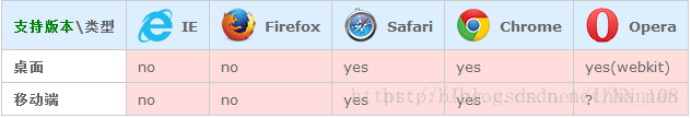
方法二:可以相容所有瀏覽器的方式( js + CSS實現 )
思想:首先新建一個隱藏的DOM節點,把要顯示的內容插入到該DOM節點中,然後計算該DOM的寬度,如果超過了原來文字寬度的兩倍,則顯示省略號。
以下為Vue.js的實現程式碼(僅供參考):
<template>
  <div :class="{content: true, ellipsis: ellipsis}">
    {{content}}
  </div>
</template>

<script>
export default {
  data () {
    return {
      content: '這裡是測試的文字,abc,123,這裡是測試的文字,abc,123,這裡是測試的文字,abc,123',
      ellipsis: false // 判斷是否要加上...的樣式
    }
  },
  create () {
    if (this.content && this.content.trim()) {
      const contentWidth = 800 // 假設原來文字的寬度的800,這裡根據具體的情況而定
      this.ellipsis = this.isEllipsis(this.content.trim(), contentWidth)
    }
  },
  method: {
    isEllipsis (content, contentWidth) {
      let el = document.createElement('div')  // 建立一個臨時div
      el.innerHTML = content
      el.style.whiteSpace = 'nowrap' // 不換行
      el.style.position = 'absolute'
      el.style.opacity = 0 // 完全透明
      document.body.appendChild(el)
      const elWidth = el.clientWidth  // 獲取這個含有content內容的臨時div的寬度
      document.body.removeChild(el)
      return elWidth >= contentWidth * 2   // 判斷這個臨時div的寬度是否大於原節點寬度的兩倍
    }
  }
}
</script>

<style lang="scss">
  .content {
    max-height: 45px;  // 兩行文字的最大高度
    line-height: 22px;
    overflow: hidden;
    position: relative;
    &.ellipsis {
      &:after {       // 如果超過2行的寬度,則用...放在第二行的結尾
        content: '...';
        font-weight: bold;
        position: absolute; // 調整...的位置
        top: 22px;
        right: 0;
        padding: 0 20px 1px 45px;
        background: url('../images/ellipsis_bg.png') repeat-y;   // 預先準備好的覆蓋的尾部圖片
      }
    }
  }
</style>
方法三:可以相容所有瀏覽器的方式( 純CSS實現 )
通過float特性實現多行文字截斷效果,基本原理:
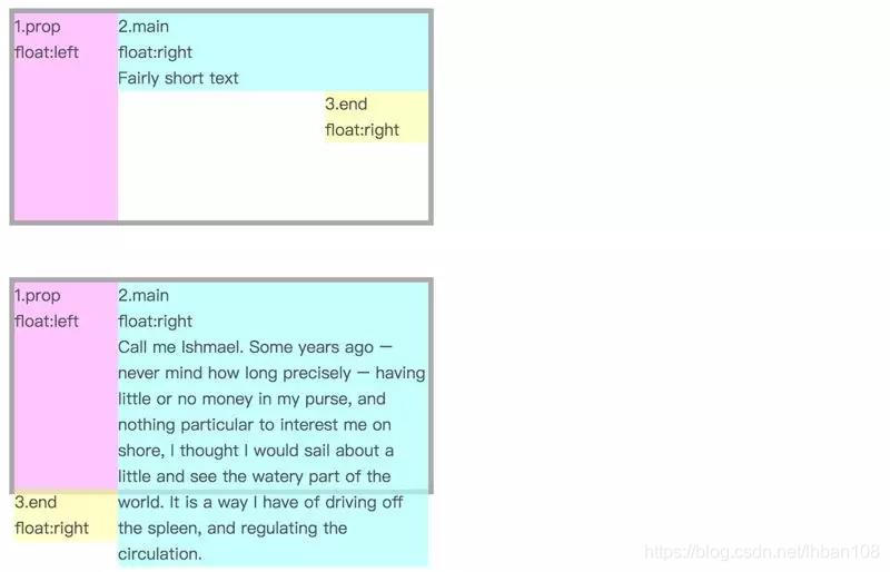
有個三個盒子 div,粉色盒子左浮動,淺藍色盒子和黃色盒子右浮動:
1、當淺藍色盒子的高度低於粉色盒子,黃色盒子仍會處於淺藍色盒子右下方。
2、如果淺藍色盒子文字過多,高度超過了粉色盒子,則黃色盒子不會停留在右下方,而是掉到了粉色盒子下。
好了,這樣兩種狀態的兩種展示形式已經區分開了,那麼我們可以將黃色盒子進行相對定位,將內容溢位的黃色盒子移動到文字內容右下角,而未溢位的則會被移到外太空去了,只要我們使用 overflow:hidden就可以隱藏掉。
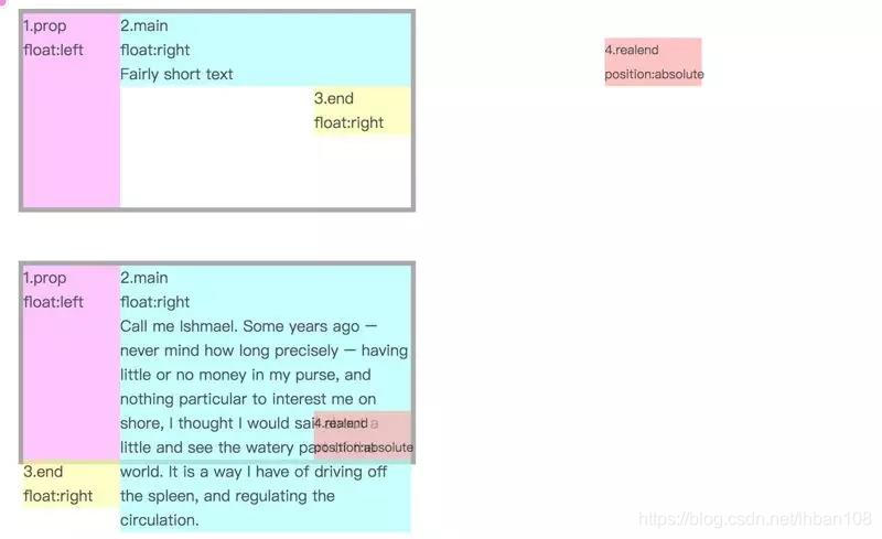
基本原理就是這樣,我們可以將淺藍色區域想象成標題,黃色區域想象為省略號效果。那麼你可能會覺得粉色盒子佔了空間,那豈不是標題會整體延後了嗎,這裡可以通過 margin 的負值來出來,設定淺藍色盒子的 margin-left 的負值與粉色盒子的寬度相同,標題也能正常顯示。
具體程式碼如下:
<!DOCTYPE html>
<html>

<head>
    <meta charset="utf-8" />
    <meta http-equiv="X-UA-Compatible" content="IE=edge">
    <title>Page Title</title>
    <meta name="viewport" content="width=device-width, initial-scale=1">
    <style>
        .wrap {
            height: 40px;
            line-height: 20px;
            overflow: hidden;
        }

        .wrap .text {
            float: right;
            margin-left: -5px;
            width: 100%;
            word-break: break-all;
        }

        .wrap::before {
            float: left;
            width: 5px;
            content: '';
            height: 40px;
        }

        .wrap::after {
            float: right;
            content: "...";
            height: 20px;
            line-height: 20px;
            /* 為三個省略號的寬度 */
            width: 3em;
            /* 使盒子不佔位置 */
            margin-left: -3em;
            /* 移動省略號位置 */
            position: relative;
            left: 100%;
            top: -20px;
            padding-right: 5px;
            background-color: #FFF;
        }
    </style>
</head>
<body>
    <div class="wrap">
        <div class="text">
            That's the basic idea. You can imagine the light blue region as the title, and the yellow region as the ellipsis. Then you may think that the pink box takes up space, but will the title be delayed as a whole? Here you can come out by the negative value of margin. Set the negative value of the pale blue box to be the same width as the pink box, and the title can also be displayed normally.
        </div>
    </div>
</body>
</html>
這裡我目前看到最巧妙的方式了。只需要支援 CSS 2.1 的特性就可以了,它的優點有:
相容性好,對各大主流瀏覽器有好的支援。
響應式截斷,根據不同寬度做出調整。
文字超出範圍才顯示省略號,否則不顯示省略號。
至於缺點,因為我們是模擬省略號,所以顯示位置有時候沒辦法剛剛好,所以可以考慮:
加一個漸變效果,貼合文字,就像上述 demo 效果一樣。
新增 word-break:break-all; 使一個單詞能夠在換行時進行拆分,這樣文字和省略號貼合效果更佳。
這個方法應該是我看到最好的用純 CSS 處理的方式了,如果你有更好的方法,歡迎留言交流!