
Android學習之shape屬性與用法
經常在專案中使用shape在XML中繪製各種形狀,簡單整理了一下shape的屬性與用法。
shape的圖形選項有四種:
- rectangle(長方形)預設的形狀,可以畫出直角矩形、圓角矩形、弧形等
- oval(橢圓) 用得比較多的是畫正圓
- line(線條) 可以畫實線和虛線
- ring(圓環)可以畫環形進度條
注意:定義ring圓環的時候需要用到shape的幾個屬性
android:innerRadius 尺寸,內環的半徑。
android:thickness 尺寸,環的厚度
android:useLevel boolean值,官方建議設定false.
其中innerRadius和innerRadiusRatio同時出現時以innerRadius為準,thickness和thicknessRatio同時出現以thickness 為準
除了以上四種圖形外,shape還包含了6個子標籤
1、corners 圓角
android:radius 整型 半徑
android:topLeftRadius 整型 左上角半徑
android:bottomLeftRadius 整型 左下角半徑
android:bottomRightRadius 整型 右下角半徑
2、solid內部填充
android:color
3、padding 內邊距
android:bottom
android:left
android:right
android:top
4、stroke描邊
android:width
android:color
android:dashWidth 虛線的寬度
android:dashGap 虛線之間的間隔 這兩個屬性不設定則為實線
5、size 大小
android:width 寬度
android:height 高度
6、gradient 漸變
android:startColor 顏色值 起始顏色
android:centerColor 漸變中間顏色,即開始顏色與結束顏色之間的顏色
android:endColor 顏色值 結束顏色
android:useLevel 設定為true無漸變。false有漸變色
android:angle 漸變角度(當angle=0時,漸變色是從左向右。 然後逆時針方向轉,當angle=90時為從下往上。angle必須為45的整數倍)
android:type 漸變型別 linear 線性漸變,這是預設設定;radial 放射性漸變,以開始色為中心;sweep 掃描線式的漸變
android:centerX漸變中心X點座標的相對位置
android:centerY漸變中心Y點座標的相對位置
android:gradientRadius漸變色半徑.當 android:type=”radial” 時才使用。單獨使用 android:type=”radial”會報錯。
shape的使用也比較簡單,在drawable資料夾中建立名稱為button_shape_bg.xml的檔案,然後在檔案中配置shape的屬性,以下為例子。
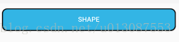
圓角矩形
<?xml version="1.0" encoding="utf-8"?>
<shape xmlns:android="http://schemas.android.com/apk/res/android">
    <solid android:color="@android:color/holo_blue_light"/>
    <stroke android:width="2dp" android:color="@android:color/black"/>
    <corners android:radius="10dp"/>
</shape>
在佈局中引用
<Button
    android:layout_width="match_parent"
    android:layout_height="wrap_content"
    android:layout_margin="10dp"
    android:background="@drawable/button_shape"
    android:textColor="#ffffff"
    android:text="shape"/>
效果圖:
虛線
<?xml version="1.0" encoding="utf-8"?>
<shape xmlns:android="http://schemas.android.com/apk/res/android" android:shape="line">
    <stroke
        android:width="2dp"
        android:color="@android:color/black"
        android:dashGap="2dp"
        android:dashWidth="5dp"/>
</shape>
紅綠灰漸變的圓
<?xml version="1.0" encoding="utf-8"?>
<shape xmlns:android="http://schemas.android.com/apk/res/android" android:shape="oval">
    <size android:width="10dp" android:height="10dp"/>
    <gradient
        android:startColor="@android:color/holo_red_light"
        android:centerColor="@android:color/holo_green_light"
        android:endColor="@android:color/darker_gray"
        android:angle="270"/>
</shape>
圓環
<?xml version="1.0" encoding="utf-8"?>
<shape xmlns:android="http://schemas.android.com/apk/res/android"
    android:shape="ring"
    android:innerRadius="50dp"
    android:thickness="10dp"
    android:useLevel="false">
    <solid android:color="@android:color/darker_gray"/>
</shape>
shape也可以結合selector一起使用
分別在drawable中建立3個檔案button_bg.xml、button_press_bg.xml、button.xml
button_bg.xml
<?xml version="1.0" encoding="utf-8"?>
<shape xmlns:android="http://schemas.android.com/apk/res/android">
    <solid android:color="@android:color/holo_blue_light"/>
    <stroke android:width="2dp" android:color="@android:color/black"/>
    <corners android:radius="10dp"/>
</shape>
button_press_bg.xml
<?xml version="1.0" encoding="utf-8"?>
<shape xmlns:android="http://schemas.android.com/apk/res/android">

    <solid android:color="@android:color/holo_red_light"/>
    <stroke android:width="2dp" android:color="@android:color/black"/>
    <corners android:radius="10dp"/>

</shape>
button.xml
<?xml version="1.0" encoding="utf-8"?>
<selector xmlns:android="http://schemas.android.com/apk/res/android">
    <item  android:drawable="@drawable/button_press_bg" android:state_pressed="true"/>
    <item android:drawable="@drawable/button_bg"/>
</selector>
在佈局中引用
<Button
    android:layout_width="match_parent"
    android:layout_height="wrap_content"
    android:layout_margin="10dp"
    android:background="@drawable/button"
    android:textColor="#ffffff"
    android:text="shape_selector"/>