ReactNative製作Component控制元件並且複用(二)
上一篇部落格ReactNative製作Component控制元件並且複用(一)簡單介紹了一下如何定義一個可複用的控制元件,並且引用他。這篇部落格繼續上一篇,介紹怎樣在使用自定義控制元件的時候傳遞資料,設定樣式等一些問題。OK 開始吧:
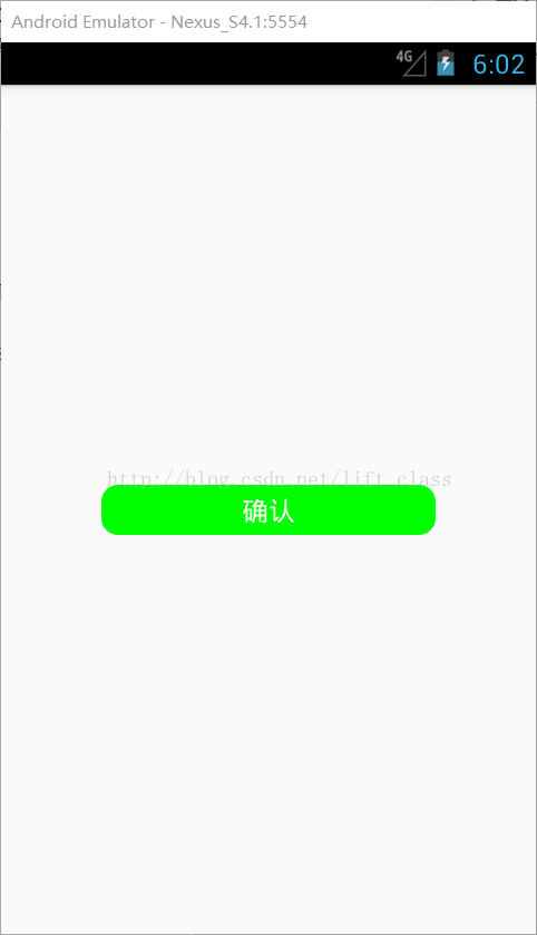
上一篇部落格中我們製作了一個長得還算過得去的Button:
接著提出了這樣一個疑問:不可能我所有的按鈕都叫確認、背景顏色都是綠色、文字都是白色、都長這個體型……吧……
當然了,這個時候第一個想到的就是給他設定樣式!好,那接下來寫一個style並且設定給button:[index.android.js]
先加一個叫button的樣式,暫時就先改個背景顏色吧:
const styles = StyleSheet.create({
  container: {
    flex: 1,
    justifyContent: 'center',
    alignItems: 'center',
  },
  button: {
    backgroundColor: '#f00',//紅色背景
  }
});
接下來給Button設定style:
    return (
      <View
        style = { styles.container }>
       {/*通過import引入了Button控制元件後,就可以像下面這樣直接使用這個控制元件*/}
        <Button
          style = { styles.button }>
        </Button>
      </View>
    );
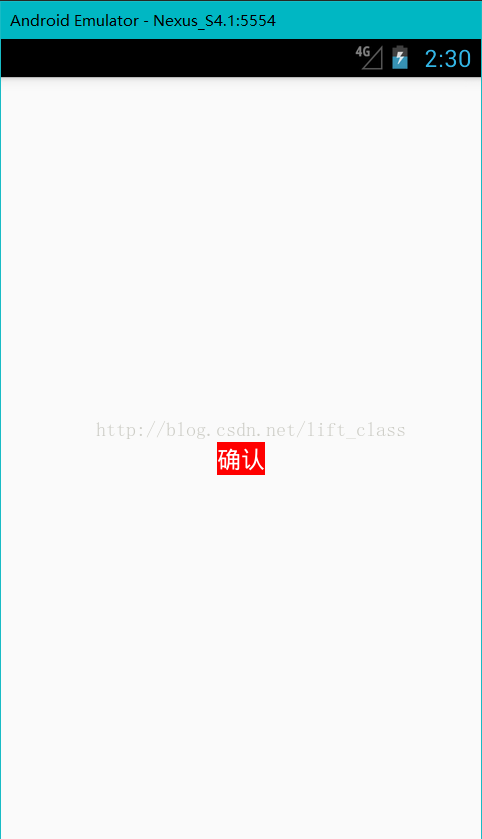
這樣是不是就給Button換了一下背景顏色呢?先看一下吧,double r:
我去,怎麼沒變化呀?那我設定寬高等其他屬性再試試!(你儘管試,能起作用算我輸)
那麼,這個按鈕的樣式到底要怎麼控制呢?還記得在【Button.js】中寫的樣式嗎?來回顧一下:
/**
 * Sample React Native App
 * https://github.com/facebook/react-native
 * @flow
 */

import React, { Component } from 'react';
import {
  StyleSheet,
  Text,
  TouchableOpacity,
} from 'react-native';

export default class Button extends Component {
  render() {
    return (
        <TouchableOpacity
          style={styles.button}>
          <Text
            style={ styles.btText }>
            {"確認"}
          </Text>
        </TouchableOpacity>
    );
  }
}

const styles = StyleSheet.create({
  button: {
    height: 30,
    width: 200,
    backgroundColor: '#0f0',
    borderRadius: 10,
    justifyContent: 'center',
    alignItems: 'center',
  },
  btText: {
    color: '#fff',
    fontSize: 16,
  },
});
看見了吧,按鈕的樣式是【Button.js】裡<TouchableOpacity>的style控制的,文字的樣式在在<Text>的style控制
的!
那難道每需要一個按鈕都要新建一個【XXButon.js】來滿足不同地方的需求?當然不是啦,還記得Props(屬性)
嗎?(這裡是Props的示例)ReactNative中的Props,這個得會才能往下看噢。
既然Props可以傳遞資料,那麼我當然可以在【index.andorid.js】中通過<Button>傳遞資料!再來看一遍剛剛寫
的:
<Button
          style = { styles.button }>
        </Button>
咦,這不就是相當於給<Button>的style屬性設定了一個值(樣式物件)嗎?可是這個值在哪兒接收呢?當然是
在定義這個控制元件的地方了:【Button.js】!這樣的話,就能在【Button.js】中取到這個”styles.button”,將他設定給
<TouchableOpacity>就行了。機智!馬上來一發:【Button.js】
……
    return (
        <TouchableOpacity
          style={this.props.style}>
          <Text
            style={ styles.btText }>
            {"確認"}
          </Text>
        </TouchableOpacity>
    );
……
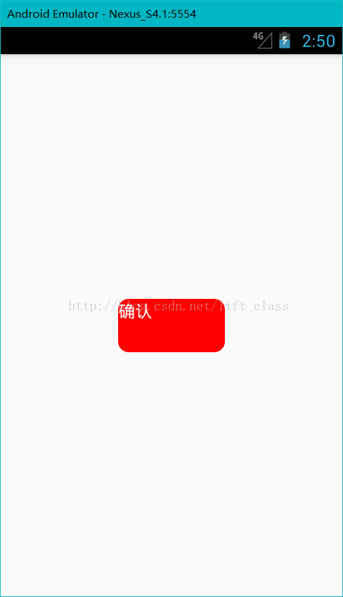
來,double r:
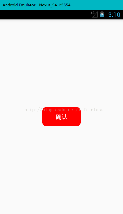
哇66666背景色成功設定!等會兒……為什麼寬高和圓角不見了??what??回頭看下程式碼,噢,原來
<TouchableOpacity>設定了style={this.props.style},而這個style從呼叫這個button的地方傳來,我們剛剛只設置
了backgroundColor,所以只有背景色一個樣式……好,那返回【index.android.js】給這個按鈕修改一下樣式:
……
  button: {
    backgroundColor: '#f00',
    width: 100,
    height: 50,
    borderRadius: 10,
  }
……
額……好吧,有點小尷尬,文字沒居中……那繼續寫樣式??我的天,這樣的話,每次使用<Button>都要寫
文字居中的程式碼?!誒,有了:給Button設定一個預設的樣式,每次引用的時候我只修改我需要修改的某幾個樣式
屬性,這樣不就OK了?【Button.js】:
        <TouchableOpacity
          style={[styles.button,this.props.style]}>
          <Text
            style={ styles.btText }>
            {"確認"}
          </Text>
        </TouchableOpacity>
發現沒,style還可以這樣賦值!賦一個樣式物件陣列!原來這樣寫的作用是取兩個樣式物件的合集,而寫在前面
的樣式物件(styles.button)的屬性,會被寫在後面的樣式物件(this.props.style)的同名屬性覆蓋,這樣說可能太抽象了,
拿這個例子來說:
styles.button(這段程式碼在【Button.js】中)是這樣的:
  button: {
    height: 30,
    width: 200,
    backgroundColor: '#0f0',
    borderRadius: 10,
    justifyContent: 'center',
    alignItems: 'center',
  }
this.props.style(這段程式碼在【index.android.js】中)是這樣的:
  button: {
    backgroundColor: '#f00',
    width: 100,
    height: 50,
    borderRadius: 10,
  }
這兩個樣式物件[合併]後應該是這樣的:
{
	height: 30,// styles.button特有
	width: 200,// styles.button特有
	backgroundColor: ‘#f00’,//兩個都有,但是值會取後面的!前者會被後者覆蓋!
borderRadius: 10,//這個其實也是被覆蓋,只是兩個都寫了10而已,你可以試試把其中任意一個10換成其他的,看看效果
	justifyContent: ‘center’,// styles.button特有
	alignItems: ‘center’// styles.button特有
}
當然了,如果是this.props.style中特有的屬性,肯定也是會出現在合併後的樣式中的,因為這還是類似於取並集,
但稍微有丟丟不一樣,因為會“覆蓋”。本例子中,this.props.style中的borderRadius其實可以不用寫,因為預設樣
式(styles.button)已經設定了!
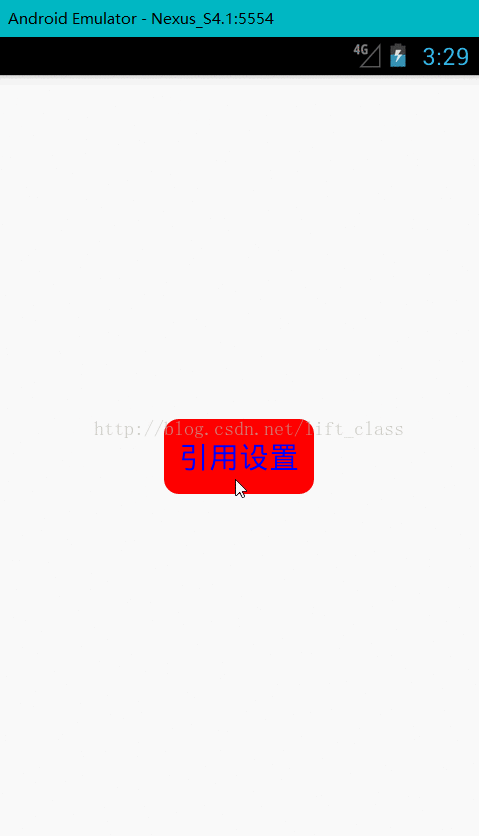
說了這麼多,看下這樣寫的效果到底是怎麼樣的吧:double r
OK,近乎完美!
那接下來,設定文字內容和文字樣式的過程就不多說了,都是一樣的,直接甩上所有程式碼!:
(注意程式碼中多寫的onPress事件觸發的函式也是一樣通過這個方法傳遞的!可以自己分析並優化一下程式碼!)
【index.android.js】:
/**
 * Sample React Native App
 * https://github.com/facebook/react-native
 * @flow
 */

import React, { Component } from 'react';
import {
  AppRegistry,
  StyleSheet,
  View,
} from 'react-native';

// 注意了!!就是這句話把剛剛寫的Button.js引入使用!
// 匯入 Button 從 './component/Button'(Buton.js檔案的路徑)
// ----最後Button不需要寫成Button.js
import Button from './component/Button';

export default class button extends Component {
  render() {

    return (
      <View
        style = { styles.container }>
        <Button
          style = { styles.button }
          {/*通過textStyle屬性傳遞了文字內容*/}
          textStyle = { styles.txStyle }
          {/*通過text屬性傳遞了文字內容*/}
          text = {"引用設定"}
          {/*通過onPress屬性傳遞了一個彈窗函式*/}
          onPress = { () => {alert("你點選了按鈕");} }>
        </Button>
      </View>
    );
  }
}

const styles = StyleSheet.create({
  container: {
    flex: 1,
    justifyContent: 'center',
    alignItems: 'center',
  },
  button: {
    backgroundColor: '#f00',
    width: 100,
    height: 50,
  },
  txStyle: {
    color: '#00f',
    fontSize: 20,
  }
});

AppRegistry.registerComponent('button', () => button);
【Button.js】:
/**
 * Sample React Native App
 * https://github.com/facebook/react-native
 * @flow
 */

import React, { Component } from 'react';
import {
  StyleSheet,
  Text,
  TouchableOpacity,
} from 'react-native';

// 這裡特別注意 export default 關鍵字,只有加上關鍵字才能在其他檔案引用本檔案
// 注意class Button 是大寫,與Button.js保持一致
export default class Button extends Component {
  render() {
    return (
        <TouchableOpacity
          style={[styles.button,this.props.style]}
          // 將接收到的onPress(即this.props.onPress)設定給TouchableOpacity的onPress
          onPress={this.props.onPress}>
          <Text
            // 設定文字樣式
            style={ [styles.btText,this.props.textStyle] }>
            {/*設定文字內容*/}
            {this.props.text}
          </Text>
        </TouchableOpacity>
    );
  }
}

const styles = StyleSheet.create({
  // button預設樣式
  button: {
    height: 30,
    width: 200,
    backgroundColor: '#0f0',
    borderRadius: 10,
    justifyContent: 'center',
    alignItems: 'center',
  },
  // 文字內容預設樣式
  btText: {
    color: '#fff',
    fontSize: 16,
  },
});
完成效果是這樣的: