Android Material Design之Toolbar與Palette實踐
前言
我們都知道Marterial Design是Google推出的全新UI設計規範,如果對其不太瞭解的可以看下:Material design非官方中文指導手冊 ,或者我的前面幾篇Material Design的譯文,相比之前Google在Android Holo風格上平平淡淡的表現不同,Material Design現在是被Google所比較重視的。在推出這門全新設計語言後,Android上自家的應用很快就使用Material Design全新設計了,如Play商店,Google Map,Google+,比較新的Inbox等;Web上的視覺體驗也是很Material的,最有幫助的當屬這個了Material Design的官方介紹
Toolbar
Toolbar是什麼?大概說一下它的官方介紹。Toolbar是應用的內容的標準工具欄,可以說是Actionbar的升級版,兩者不是獨立關係,要使用Toolbar還是得跟ActionBar扯上關係的。相比Actionbar Toolbar最明顯的一點就是變得很自由,可隨處放置,因為它是作為一個ViewGroup來定義使用的,所以單純使用ActionBar已經稍顯過時了,它的一些方法已被標註過時。
那麼它怎麼使用呢,首先我們一樣要用到v7的支援包,然後定義程式的主題樣式,在style裡得先把Actionbar去掉,有點像欲想練功,必先自宮的感覺啊。如下:
/res/values/styles.xml
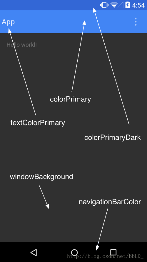
<resources xmlns:android="http://schemas.android.com/apk/res/android">

    <style name="AppBaseTheme" parent="Theme.AppCompat.Light.NoActionBar">

        <!-- toolbar(actionbar)顏色 -->
        <item name="colorPrimary">#4876FF</item>
        <!-- 狀態列顏色 -->
        <item name="colorPrimaryDark">#3A5FCD</item>
        <!-- 視窗的背景顏色 -->
        <item name="android:windowBackground">@android:color/white</item>
        <!-- SearchView -->
        <item name="searchViewStyle">@style/MySearchViewStyle</item>
    </style>

    <style name="AppTheme" parent="@style/AppBaseTheme"></style>

    <style name="MySearchViewStyle" parent="Widget.AppCompat.SearchView">
        <!--
    Background for the search query section (e.g. EditText)
    <item name="queryBackground">...</item>
    Background for the actions section (e.g. voice, submit)
    <item name="submitBackground">...</item>
    Close button icon
    <item name="closeIcon">...</item>
    Search button icon
    <item name="searchIcon">...</item>
    Go/commit button icon
    <item name="goIcon">...</item>
    Voice search button icon
    <item name="voiceIcon">...</item>
    Commit icon shown in the query suggestion row
    <item name="commitIcon">...</item>
    Layout for query suggestion rows
    <item name="suggestionRowLayout">...</item>
        -->

    </style>

</resources>
去除Actionbar最簡單的方法就是直接繼承NoActionBar的主題了。顏色的屬性說明,還是下面這張圖最清楚了:
另外,SearchView在AppCompat中提供了更強的可定製性和更多的樣式可供設定,不過一般我們用預設的就行。
還有我們可以在values-v21給API21的系統版本設定預設的底部導航欄預設的顏色:
/res/values-v21/styles.xml
<resources xmlns:android="http://schemas.android.com/apk/res/android">

    <style name="AppTheme" parent="@style/AppBaseTheme">

        <!-- 底部導航欄顏色 -->
        <item name="android:navigationBarColor">#4876FF</item>
    </style>

</resources>
設定好主題的下一步工作:在xml的layout中定義一個Toolbar:
/layout/toolbar.xml
<?xml version="1.0" encoding="utf-8"?>
<android.support.v7.widget.Toolbar xmlns:android="http://schemas.android.com/apk/res/android"
    xmlns:app="http://schemas.android.com/apk/res/com.example.toolbar"
    android:id="@+id/toolbar"
    android:layout_width="match_parent"
    android:layout_height="wrap_content"
    android:background="?attr/colorPrimary"
    android:minHeight="?attr/actionBarSize"
    app:popupTheme="@style/ThemeOverlay.AppCompat.Light"
    app:theme="@style/ThemeOverlay.AppCompat.ActionBar" >

</android.support.v7.widget.Toolbar>
<?xml version="1.0" encoding="utf-8"?>
<android.support.v7.widget.Toolbar xmlns:android="http://schemas.android.com/apk/res/android"
xmlns:app="http://schemas.android.com/apk/res/com.example.toolbar"
android:id="@+id/toolbar"
android:layout_width="match_parent"
android:layout_height="wrap_content"
android:background="?attr/colorPrimary"
android:minHeight="?attr/actionBarSize"
app:popupTheme="@style/ThemeOverlay.AppCompat.Light"
app:theme="@style/ThemeOverlay.AppCompat.ActionBar" >
</android.support.v7.widget.Toolbar>
然後在activity的佈局裡把它include進去就行了,當然一般把它放到最上面了,有需要你是可以把它放到中間、底部或其它位置的,可見它的自由度是很高的。在下一步呢就到程式碼了,在onCreate中:
		mToolbar = (Toolbar) findViewById(R.id.toolbar);
		// toolbar.setLogo(R.drawable.ic_launcher);
		mToolbar.setTitle("Rocko");// 標題的文字需在setSupportActionBar之前,不然會無效
		// toolbar.setSubtitle("副標題");
		setSupportActionBar(mToolbar);
		/* 這些通過ActionBar來設定也是一樣的,注意要在setSupportActionBar(toolbar);之後,不然就報錯了 */
		// getSupportActionBar().setTitle("標題");
		// getSupportActionBar().setSubtitle("副標題");
		// getSupportActionBar().setLogo(R.drawable.ic_launcher);

		/* 選單的監聽可以在toolbar裡設定,也可以像ActionBar那樣,通過Activity的onOptionsItemSelected回撥方法來處理 */
		mToolbar.setOnMenuItemClickListener(new Toolbar.OnMenuItemClickListener() {
			@Override
			public boolean onMenuItemClick(MenuItem item) {
				switch (item.getItemId()) {
				case R.id.action_settings:
					Toast.makeText(MainActivity.this, "action_settings", 0).show();
					break;
				case R.id.action_share:
					Toast.makeText(MainActivity.this, "action_share", 0).show();
					break;
				default:
					break;
				}
				return true;
			}
		});
mToolbar = (Toolbar) findViewById(R.id.toolbar);
// toolbar.setLogo(R.drawable.ic_launcher);
mToolbar.setTitle("Rocko");// 標題的文字需在setSupportActionBar之前,不然會無效
// toolbar.setSubtitle("副標題");
setSupportActionBar(mToolbar);
/* 這些通過ActionBar來設定也是一樣的,注意要在setSupportActionBar(toolbar);之後,不然就報錯了 */
// getSupportActionBar().setTitle("標題");
// getSupportActionBar().setSubtitle("副標題");
// getSupportActionBar().setLogo(R.drawable.ic_launcher);
/* 選單的監聽可以在toolbar裡設定,也可以像ActionBar那樣,通過Activity的onOptionsItemSelected回撥方法來處理 */
mToolbar.setOnMenuItemClickListener(new Toolbar.OnMenuItemClickListener() {
@Override
public boolean onMenuItemClick(MenuItem item) {
switch (item.getItemId()) {
case R.id.action_settings:
Toast.makeText(MainActivity.this, "action_settings", 0).show();
break;
case R.id.action_share:
Toast.makeText(MainActivity.this, "action_share", 0).show();
break;
default:
break;
}
return true;
}
});res/menu/main.xml
<menu xmlns:android="http://schemas.android.com/apk/res/android"
    xmlns:app="http://schemas.android.com/apk/res-auto"
    xmlns:tools="http://schemas.android.com/tools"
    tools:context=".MainActivity" >

    <item
        android:id="@+id/ab_search"
        android:orderInCategory="80"
        android:title="action_search"
        app:actionViewClass="android.support.v7.widget.SearchView"
        app:showAsAction="ifRoom"/>
    <item
        android:id="@+id/action_share"
        android:orderInCategory="90"
        android:title="action_share"
        app:actionProviderClass="android.support.v7.widget.ShareActionProvider"
        app:showAsAction="ifRoom"/>
    <item
        android:id="@+id/action_settings"
        android:orderInCategory="100"
        android:title="action_settings"
        app:showAsAction="never"/>

</menu>
<menu xmlns:android="http://schemas.android.com/apk/res/android"
xmlns:app="http://schemas.android.com/apk/res-auto"
xmlns:tools="http://schemas.android.com/tools"
tools:context=".MainActivity" >
<item
android:id="@+id/ab_search"
android:orderInCategory="80"
android:title="action_search"
app:actionViewClass="android.support.v7.widget.SearchView"
app:showAsAction="ifRoom"/>
<item
android:id="@+id/action_share"
android:orderInCategory="90"
android:title="action_share"
app:actionProviderClass="android.support.v7.widget.ShareActionProvider"
app:showAsAction="ifRoom"/>
<item
android:id="@+id/action_settings"
android:orderInCategory="100"
android:title="action_settings"
app:showAsAction="never"/>
</menu>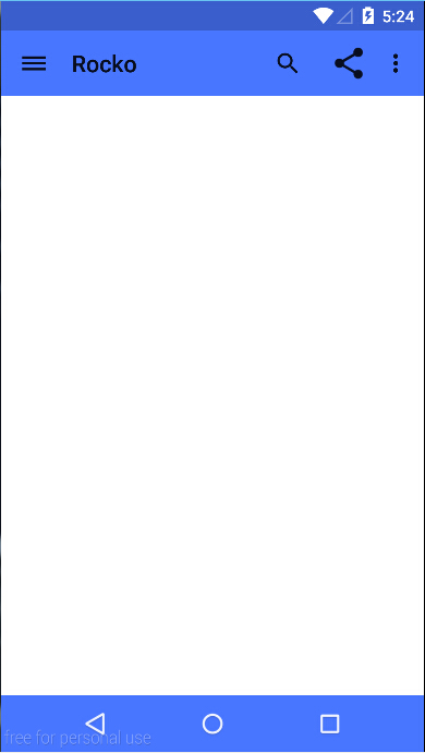 PS. Genymotion可以用5.0的模擬器了
可以感覺到這樣是不是和ActionBar沒什麼區別呢。誒,左邊的選單圖示怎麼出來的呢,其實上面還沒處理到,他就是Navigation drawer了,使用新版本的v4、v7庫的drawer明顯的一點是它帶了一個酷酷的互動動畫(請看最後的gif圖)。那麼使用Toolbar之後又怎麼去在Toolbar中使用drawer呢。下面當然也是跟著程式碼來.
/layout/activity_main.xml
<LinearLayout xmlns:android="http://schemas.android.com/apk/res/android"
    xmlns:tools="http://schemas.android.com/tools"
    android:layout_width="match_parent"
    android:layout_height="match_parent"
    android:orientation="vertical"
    tools:context="com.example.toolbar.MainActivity" >

    <include layout="@layout/toolbar" />

    <android.support.v4.widget.DrawerLayout
        android:id="@+id/drawer"
        android:layout_width="match_parent"
        android:layout_height="match_parent" >

        <!-- 內容介面 -->

        <LinearLayout
            android:layout_width="match_parent"
            android:layout_height="match_parent"
            android:orientation="vertical" >

            <com.example.toolbar.widget.PagerSlidingTabStrip
                android:id="@+id/tabs"
                android:layout_width="match_parent"
                android:layout_height="48dip" >
            </com.example.toolbar.widget.PagerSlidingTabStrip>

            <android.support.v4.view.ViewPager
                android:id="@+id/pager"
                android:layout_width="match_parent"
                android:layout_height="match_parent" >
            </android.support.v4.view.ViewPager>
        </LinearLayout>

        <!-- 側滑選單內容 -->

        <LinearLayout
            android:id="@+id/drawer_view"
            android:layout_width="match_parent"
            android:layout_height="match_parent"
            android:layout_gravity="start"
            android:background="@drawable/drawer"
            android:orientation="vertical"
            android:padding="8dp" >

            <TextView
                android:layout_width="match_parent"
                android:layout_height="match_parent" />
        </LinearLayout>
    </android.support.v4.widget.DrawerLayout>

</LinearLayout>
<LinearLayout xmlns:android="http://schemas.android.com/apk/res/android"
xmlns:tools="http://schemas.android.com/tools"
android:layout_width="match_parent"
android:layout_height="match_parent"
android:orientation="vertical"
tools:context="com.example.toolbar.MainActivity" >
<include layout="@layout/toolbar" />
<android.support.v4.widget.DrawerLayout
android:id="@+id/drawer"
android:layout_width="match_parent"
android:layout_height="match_parent" >
<!-- 內容介面 -->
<LinearLayout
android:layout_width="match_parent"
android:layout_height="match_parent"
android:orientation="vertical" >
<com.example.toolbar.widget.PagerSlidingTabStrip
android:id="@+id/tabs"
android:layout_width="match_parent"
android:layout_height="48dip" >
</com.example.toolbar.widget.PagerSlidingTabStrip>
<android.support.v4.view.ViewPager
android:id="@+id/pager"
android:layout_width="match_parent"
android:layout_height="match_parent" >
</android.support.v4.view.ViewPager>
</LinearLayout>
<!-- 側滑選單內容 -->
<LinearLayout
android:id="@+id/drawer_view"
android:layout_width="match_parent"
android:layout_height="match_parent"
android:layout_gravity="start"
android:background="@drawable/drawer"
android:orientation="vertical"
android:padding="8dp" >
<TextView
android:layout_width="match_parent"
android:layout_height="match_parent" />
</LinearLayout>
</android.support.v4.widget.DrawerLayout>
</LinearLayout> getSupportActionBar().setDisplayHomeAsUpEnabled(true);
mDrawerLayout = (DrawerLayout) findViewById(R.id.drawer);
mDrawerToggle = new ActionBarDrawerToggle(this, mDrawerLayout, mToolbar, R.string.drawer_open,
R.string.drawer_close);
mDrawerToggle.syncState();
mDrawerLayout.setDrawerListener(mDrawerToggle); getSupportActionBar().setDisplayHomeAsUpEnabled(true);
mDrawerLayout = (DrawerLayout) findViewById(R.id.drawer);
mDrawerToggle = new ActionBarDrawerToggle(this, mDrawerLayout, mToolbar, R.string.drawer_open,
R.string.drawer_close);
mDrawerToggle.syncState();
mDrawerLayout.setDrawerListener(mDrawerToggle);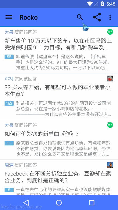
要是需要把drawer覆蓋toolbar怎麼辦呢?需要稍微調整一下介面的佈局位置就行了,效果就不貼上來了(腦補,或者改下原始碼的setContentView執行):
<android.support.v4.widget.DrawerLayout xmlns:android="http://schemas.android.com/apk/res/android"
    xmlns:tools="http://schemas.android.com/tools"
    android:id="@+id/drawer"
    android:layout_width="match_parent"
    android:layout_height="match_parent"
    android:fitsSystemWindows="true" >

    <LinearLayout
        android:layout_width="match_parent"
        android:layout_height="match_parent"
        android:orientation="vertical"
        tools:context="com.example.toolbar.MainActivity" >

        <include layout="@layout/toolbar" />
        <!-- 內容介面 -->

        <LinearLayout
            android:layout_width="match_parent"
            android:layout_height="match_parent"
            android:background="@drawable/content"
            android:orientation="vertical" >

            <com.example.toolbar.widget.PagerSlidingTabStrip
                android:id="@+id/tabs"
                android:layout_width="match_parent"
                android:layout_height="48dip"
                android:visibility="invisible" >
            </com.example.toolbar.widget.PagerSlidingTabStrip>

            <android.support.v4.view.ViewPager
                android:id="@+id/pager"
                android:layout_width="match_parent"
                android:layout_height="match_parent"
                android:visibility="invisible" >
            </android.support.v4.view.ViewPager>
        </LinearLayout>
    </LinearLayout>
    <!-- 側滑選單內容 -->

    <LinearLayout
        android:id="@+id/drawer_view"
        android:layout_width="match_parent"
        android:layout_height="match_parent"
        android:layout_gravity="start"
        android:background="@drawable/drawer"
        android:orientation="vertical"
        android:clickable="true"
        android:padding="8dp" >

        <TextView
            android:layout_width="match_parent"
            android:layout_height="match_parent" />
    </LinearLayout>

</android.support.v4.widget.DrawerLayout>
<android.support.v4.widget.DrawerLayout xmlns:android="http://schemas.android.com/apk/res/android"
xmlns:tools="http://schemas.android.com/tools"
android:id="@+id/drawer"
android:layout_width="match_parent"
android:layout_height="match_parent"
android:fitsSystemWindows="true" >
<LinearLayout
android:layout_width="match_parent"
android:layout_height="match_parent"
android:orientation="vertical"
tools:context="com.example.toolbar.MainActivity" >
<include layout="@layout/toolbar" />
<!-- 內容介面 -->
<LinearLayout
android:layout_width="match_parent"
android:layout_height="match_parent"
android:background="@drawable/content"
android:orientation="vertical" >
<com.example.toolbar.widget.PagerSlidingTabStrip
android:id="@+id/tabs"
android:layout_width="match_parent"
android:layout_height="48dip"
android:visibility="invisible" >
</com.example.toolbar.widget.PagerSlidingTabStrip>
<android.support.v4.view.ViewPager
android:id="@+id/pager"
android:layout_width="match_parent"
android:layout_height="match_parent"
android:visibility="invisible" >
</android.support.v4.view.ViewPager>
</LinearLayout>
</LinearLayout>
<!-- 側滑選單內容 -->
<LinearLayout
android:id="@+id/drawer_view"
android:layout_width="match_parent"
android:layout_height="match_parent"
android:layout_gravity="start"
android:background="@drawable/drawer"
android:orientation="vertical"
android:clickable="true"
android:padding="8dp" >
<TextView
android:layout_width="match_parent"
android:layout_height="match_parent" />
</LinearLayout>
</android.support.v4.widget.DrawerLayout>Palette
說Palette之前先說下前面提到的Pager。ViewPager是什麼大家應該都是知道的了,一般ViewPager、xxxTabStrip、Fragment三個好基友是一起出現的。這裡的xxxTabStrip是使用Github上的PagerSlidingTabStrip。當我們的Pager切換時伴隨著Fragment的變化,而Fragment裡的內容一般是不同的,所以每個Fragment裡的一般視覺效果也是不同的,所以我們可以用Palette來去提取Fragment中的主色調,那Fragment中的拿什麼給Palatte去提取顏色呢,這就需要自己根據自己的情況來決定的。比如我這個demo裡,Fragment就一個TextView和給Fragment設了背景,那麼我就可以把背景的圖片給Palette去提取顏色了。
說了上面一段你也基本知道Palatte是用來幹麼的了,它就是用來從Bitmap中提取顏色的,然後把顏色設定給title啊content啊等等。
先貼上Pager部分的程式碼:
	private void initViews() {
		mToolbar = (Toolbar) findViewById(R.id.toolbar);
		// toolbar.setLogo(R.drawable.ic_launcher);
		mToolbar.setTitle("Rocko");// 標題的文字需在setSupportActionBar之前,不然會無效
		// toolbar.setSubtitle("副標題");
		setSupportActionBar(mToolbar);
		/* 這些通過ActionBar來設定也是一樣的,注意要在setSupportActionBar(toolbar);之後,不然就報錯了 */
		// getSupportActionBar().setTitle("標題");
		// getSupportActionBar().setSubtitle("副標題");
		// getSupportActionBar().setLogo(R.drawable.ic_launcher);

		/* 選單的監聽可以在toolbar裡設定,也可以像ActionBar那樣,通過下面的兩個回撥方法來處理 */
		mToolbar.setOnMenuItemClickListener(new Toolbar.OnMenuItemClickListener() {
			@Override
			public boolean onMenuItemClick(MenuItem item) {
				switch (item.getItemId()) {
				case R.id.action_settings:
					Toast.makeText(MainActivity.this, "action_settings", 0).show();
					break;
				case R.id.action_share:
					Toast.makeText(MainActivity.this, "action_share", 0).show();
					break;
				default:
					break;
				}
				return true;
			}
		});
		getSupportActionBar().setDisplayHomeAsUpEnabled(true);
		/* findView */
		mDrawerLayout = (DrawerLayout) findViewById(R.id.drawer);
		mDrawerToggle = new ActionBarDrawerToggle(this, mDrawerLayout, mToolbar, R.string.drawer_open,
				R.string.drawer_close);
		mDrawerToggle.syncState();
		mDrawerLayout.setDrawerListener(mDrawerToggle);

		mPagerSlidingTabStrip = (PagerSlidingTabStrip) findViewById(R.id.tabs);
		mViewPager = (ViewPager) findViewById(R.id.pager);
		mViewPager.setAdapter(new MyPagerAdapter(getSupportFragmentManager()));
		mPagerSlidingTabStrip.setViewPager(mViewPager);
		mPagerSlidingTabStrip.setOnPageChangeListener(new OnPageChangeListener() {

			@Override
			public void onPageSelected(int arg0) {
				colorChange(arg0);
			}

			@Override
			public void onPageScrolled(int arg0, float arg1, int arg2) {
			}

			@Override
			public void onPageScrollStateChanged(int arg0) {
			}
		});
		initTabsValue();
	}

	/**
	 * mPagerSlidingTabStrip預設值配置
	 *
	 */
	private void initTabsValue() {
		// 底部遊標顏色
		mPagerSlidingTabStrip.setIndicatorColor(Color.BLUE);
		// tab的分割線顏色
		mPagerSlidingTabStrip.setDividerColor(Color.TRANSPARENT);
		// tab背景
		mPagerSlidingTabStrip.setBackgroundColor(Color.parseColor("#4876FF"));
		// tab底線高度
		mPagerSlidingTabStrip.setUnderlineHeight((int) TypedValue.applyDimension(TypedValue.COMPLEX_UNIT_DIP,
				1, getResources().getDisplayMetrics()));
		// 遊標高度
		mPagerSlidingTabStrip.setIndicatorHeight((int) TypedValue.applyDimension(TypedValue.COMPLEX_UNIT_DIP,
				5, getResources().getDisplayMetrics()));
		// 選中的文字顏色
		mPagerSlidingTabStrip.setSelectedTextColor(Color.WHITE);
		// 正常文字顏色
		mPagerSlidingTabStrip.setTextColor(Color.BLACK);
	}
private void initViews() {
mToolbar = (Toolbar) findViewById(R.id.toolbar);
// toolbar.setLogo(R.drawable.ic_launcher);
mToolbar.setTitle("Rocko");// 標題的文字需在setSupportActionBar之前,不然會無效
// toolbar.setSubtitle("副標題");
setSupportActionBar(mToolbar);
/* 這些通過ActionBar來設定也是一樣的,注意要在setSupportActionBar(toolbar);之後,不然就報錯了 */
// getSupportActionBar().setTitle("標題");
// getSupportActionBar().setSubtitle("副標題");
// getSupportActionBar().setLogo(R.drawable.ic_launcher);
/* 選單的監聽可以在toolbar裡設定,也可以像ActionBar那樣,通過下面的兩個回撥方法來處理 */
mToolbar.setOnMenuItemClickListener(new Toolbar.OnMenuItemClickListener() {
@Override
public boolean onMenuItemClick(MenuItem item) {
switch (item.getItemId()) {
case R.id.action_settings:
Toast.makeText(MainActivity.this, "action_settings", 0).show();
break;
case R.id.action_share:
Toast.makeText(MainActivity.this, "action_share", 0).show();
break;
default:
break;
}
return true;
}
});
getSupportActionBar().setDisplayHomeAsUpEnabled(true);
/* findView */
mDrawerLayout = (DrawerLayout) findViewById(R.id.drawer);
mDrawerToggle = new ActionBarDrawerToggle(this, mDrawerLayout, mToolbar, R.string.drawer_open,
R.string.drawer_close);
mDrawerToggle.syncState();
mDrawerLayout.setDrawerListener(mDrawerToggle);
mPagerSlidingTabStrip = (PagerSlidingTabStrip) findViewById(R.id.tabs);
mViewPager = (ViewPager) findViewById(R.id.pager);
mViewPager.setAdapter(new MyPagerAdapter(getSupportFragmentManager()));
mPagerSlidingTabStrip.setViewPager(mViewPager);
mPagerSlidingTabStrip.setOnPageChangeListener(new OnPageChangeListener() {
@Override
public void onPageSelected(int arg0) {
colorChange(arg0);
}
@Override
public void onPageScrolled(int arg0, float arg1, int arg2) {
}
@Override
public void onPageScrollStateChanged(int arg0) {
}
});
initTabsValue();
}
/**
* mPagerSlidingTabStrip預設值配置
*
*/
private void initTabsValue() {
// 底部遊標顏色
mPagerSlidingTabStrip.setIndicatorColor(Color.BLUE);
// tab的分割線顏色
mPagerSlidingTabStrip.setDividerColor(Color.TRANSPARENT);
// tab背景
mPagerSlidingTabStrip.setBackgroundColor(Color.parseColor("#4876FF"));
// tab底線高度
mPagerSlidingTabStrip.setUnderlineHeight((int) TypedValue.applyDimension(TypedValue.COMPLEX_UNIT_DIP,
1, getResources().getDisplayMetrics()));
// 遊標高度
mPagerSlidingTabStrip.setIndicatorHeight((int) TypedValue.applyDimension(TypedValue.COMPLEX_UNIT_DIP,
5, getResources().getDisplayMetrics()));
// 選中的文字顏色
mPagerSlidingTabStrip.setSelectedTextColor(Color.WHITE);
// 正常文字顏色
mPagerSlidingTabStrip.setTextColor(Color.BLACK);
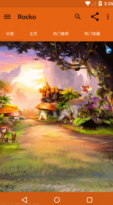
}這些都是一些基本設定,然後Palette在哪裡開始工作呢,就是在tab切換時了。在onPagerSelect方法裡即上面程式碼的45行。他是這麼幹的:
	/**
	 * 介面顏色的更改
	 */
	@SuppressLint("NewApi")
	private void colorChange(int position) {
		// 用來提取顏色的Bitmap
		Bitmap bitmap = BitmapFactory.decodeResource(getResources(),
				SuperAwesomeCardFragment.getBackgroundBitmapPosition(position));
		// Palette的部分
		Palette.generateAsync(bitmap, new Palette.PaletteAsyncListener() {
			/**
			 * 提取完之後的回撥方法
			 */
			@Override
			public void onGenerated(Palette palette) {
				Palette.Swatch vibrant = palette.getVibrantSwatch();
				/* 介面顏色UI統一性處理,看起來更Material一些 */
				mPagerSlidingTabStrip.setBackgroundColor(vibrant.getRgb());
				mPagerSlidingTabStrip.setTextColor(vibrant.getTitleTextColor());
				// 其中狀態列、遊標、底部導航欄的顏色需要加深一下,也可以不加,具體情況在程式碼之後說明
				mPagerSlidingTabStrip.setIndicatorColor(colorBurn(vibrant.getRgb()));

				mToolbar.setBackgroundColor(vibrant.getRgb());
				if (android.os.Build.VERSION.SDK_INT >= 21) {
					Window window = getWindow();
					// 很明顯,這兩貨是新API才有的。
					window.setStatusBarColor(colorBurn(vibrant.getRgb()));
					window.setNavigationBarColor(colorBurn(vibrant.getRgb()));
				}
			}
		});
	}

	/**
	 * 顏色加深處理
	 *
	 * @param RGBValues
	 *            RGB的值,由alpha(透明度)、red(紅)、green(綠)、blue(藍)構成,
	 *            Android中我們一般使用它的16進位制,
	 *            例如:"#FFAABBCC",最左邊到最右每兩個字母就是代表alpha(透明度)、
	 *            red(紅)、green(綠)、blue(藍)。每種顏色值佔一個位元組(8位),值域0~255
	 *            所以下面使用移位的方法可以得到每種顏色的值,然後每種顏色值減小一下,在合成RGB顏色,顏色就會看起來深一些了
	 * @return
	 */
	private int colorBurn(int RGBValues) {
		int alpha = RGBValues >> 24;
		int red = RGBValues >> 16 & 0xFF;
		int green = RGBValues >> 8 & 0xFF;
		int blue = RGBValues & 0xFF;
		red = (int) Math.floor(red * (1 - 0.1));
		green = (int) Math.floor(green * (1 - 0.1));
		blue = (int) Math.floor(blue * (1 - 0.1));
		return Color.rgb(red, green, blue);
	}
/**
* 介面顏色的更改
*/
@SuppressLint("NewApi")
private void colorChange(int position) {
// 用來提取顏色的Bitmap
Bitmap bitmap = BitmapFactory.decodeResource(getResources(),
SuperAwesomeCardFragment.getBackgroundBitmapPosition(position));
// Palette的部分
Palette.generateAsync(bitmap, new Palette.PaletteAsyncListener() {
/**
* 提取完之後的回撥方法
*/
@Override
public void onGenerated(Palette palette) {
Palette.Swatch vibrant = palette.getVibrantSwatch();
/* 介面顏色UI統一性處理,看起來更Material一些 */
mPagerSlidingTabStrip.setBackgroundColor(vibrant.getRgb());
mPagerSlidingTabStrip.setTextColor(vibrant.getTitleTextColor());
// 其中狀態列、遊標、底部導航欄的顏色需要加深一下,也可以不加,具體情況在程式碼之後說明
mPagerSlidingTabStrip.setIndicatorColor(colorBurn(vibrant.getRgb()));
mToolbar.setBackgroundColor(vibrant.getRgb());
if (android.os.Build.VERSION.SDK_INT >= 21) {
Window window = getWindow();
// 很明顯,這兩貨是新API才有的。
window.setStatusBarColor(colorBurn(vibrant.getRgb()));
window.setNavigationBarColor(colorBurn(vibrant.getRgb()));
}
}
});
}
/**
* 顏色加深處理
*
* @param RGBValues
* RGB的值,由alpha(透明度)、red(紅)、green(綠)、blue(藍)構成,
* Android中我們一般使用它的16進位制,
* 例如:"#FFAABBCC",最左邊到最右每兩個字母就是代表alpha(透明度)、
* red(紅)、green(綠)、blue(藍)。每種顏色值佔一個位元組(8位),值域0~255
* 所以下面使用移位的方法可以得到每種顏色的值,然後每種顏色值減小一下,在合成RGB顏色,顏色就會看起來深一些了
* @return
*/
private int colorBurn(int RGBValues) {
int alpha = RGBValues >> 24;
int red = RGBValues >> 16 & 0xFF;
int green = RGBValues >> 8 & 0xFF;
int blue = RGBValues & 0xFF;
red = (int) Math.floor(red * (1 - 0.1));
green = (int) Math.floor(green * (1 - 0.1));
blue = (int) Math.floor(blue * (1 - 0.1));
return Color.rgb(red, green, blue);
}說了這麼多,Palette呢就是一把利器,方便我們對UI介面色調的處理,所以可以說他是Material Design必不可少的一部分。
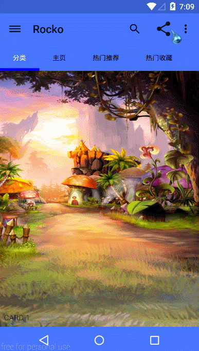
demo效果: