Android CoordinatorLayout使用 標題由圖片變純色
阿新 • • 發佈:2019-02-19
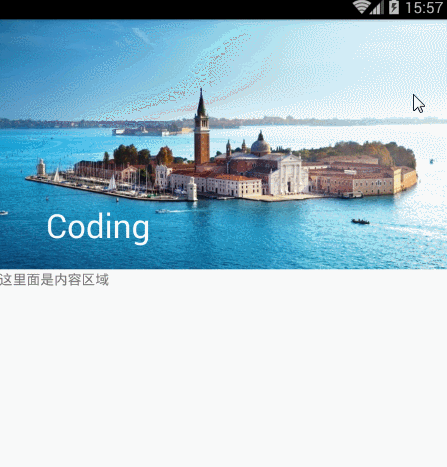
效果圖:
依賴:
compile 'com.android.support:design:23.3.0'
佈局為下:
//CoordinatorLayout是新新增的一個增強型的FrameLayout,通過它可以實現很多東西:
// 例如:
// 1.介面向上滾動逐漸隱藏Toolbar;
// 2.在其中可以放置浮動的View,就像Floating Action Button。
<android.support.design.widget.CoordinatorLayout xmlns:android="http://schemas.android.com/apk/res/android"
xmlns:app="http://schemas.android.com/apk/res-auto"
android:id="@+id/main_content"
android:layout_width="match_parent"
android:layout_height="match_parent"
android:fitsSystemWindows="true">
//AppBarLayout跟它的名字一樣,把容器類的元件全部作為AppBar。
// 將AppBarLayout放在CoordinatorLayout中,就可以實現滾動效果。
// 本例中,TabLayout在介面滾動時,隨著Toolbar的逐漸隱藏,將佔據Toolbar的位置,
// 達到節省螢幕空間,介面動畫效果的目的。
<android.support .design.widget.AppBarLayout
android:id="@+id/appbar"
android:layout_width="match_parent"
android:layout_height="256dp"
android:theme="@style/ThemeOverlay.AppCompat.Dark.ActionBar"
android:fitsSystemWindows="true">
<android.support.design.widget.CollapsingToolbarLayout
android:id="@+id/collapsing_toolbar"
android:layout_width="match_parent"
android:layout_height="match_parent"
app:layout_scrollFlags="scroll|exitUntilCollapsed"
android:fitsSystemWindows="true"
app:contentScrim="?attr/colorPrimary"
app:title="Coding"
app:expandedTitleMarginStart="48dp"
app:expandedTitleMarginEnd="64dp">
<ImageView
android:id="@+id/backdrop"
android:layout_width="match_parent"
android:layout_height="match_parent"
android:scaleType="centerCrop"
android:fitsSystemWindows="true"
android:src="@drawable/bj"
app:layout_collapseMode="parallax"
/>
//屬性解析:
// app:theme:指定Toolbar的樣式,包括ActionbarToggle和popupMenu的指示圖示顏色
// app:popupTheme:指定popupMenu溢位後的樣式
// app:title: 指定Toolbar中主Title的內容
// app:layout_scrollFlags的意思是:
設定的layout_scrollFlags有如下幾種選項:
scroll: 所有想滾動出螢幕的view都需要設定這個flag- 沒有設定這個flag的view將被固定在螢幕頂部。
enterAlways: 這個flag讓任意向下的滾動都會導致該view變為可見,啟用快速“返回模式”。
enterAlwaysCollapsed: 當你的檢視已經設定minHeight屬性又使用此標誌時,你的檢視只能以最小高度進入,只有當滾動檢視到達頂部時才擴大到完整高度。
exitUntilCollapsed: 當檢視會在滾動時,它一直滾動到設定的minHeight時完全隱藏。
// 需要注意的是,後面兩種模式基本只有在CollapsingToolbarLayout才有用,
// 而前面兩種模式基本是需要一起使用的,也就是說,這些flag的使用場景,基本已經固定了。
<android.support.v7.widget.Toolbar
android:id="@+id/toolbar"
android:layout_width="match_parent"
android:layout_height="?attr/actionBarSize"
app:popupTheme="@style/ThemeOverlay.AppCompat.Light"
app:layout_collapseMode="pin" />
</android.support.design.widget.CollapsingToolbarLayout>
</android.support.design.widget.AppBarLayout>
//app:layout_behavior 屬性,沒錯,
// 如果你使用CoordinatorLayout來實現Toolbar滾動漸變消失動畫效果,那就必須在它下面的那個控制元件中加入這個屬性,並且下面的這個控制元件必須是可滾動的。
// 當設定了layout_behavior的控制元件滑動時,就會觸發設定了layout_scrollFlags的控制元件發生狀態的改變。
<android.support.v4.widget.NestedScrollView
android:layout_width="match_parent"
android:layout_height="match_parent"
app:layout_behavior="@string/appbar_scrolling_view_behavior">
<TextView
android:layout_width="match_parent"
android:layout_height="match_parent"
android:text="這裡面是內容區域"
/>
</android.support.v4.widget.NestedScrollView>
</android.support.design.widget.CoordinatorLayout>
ok,直接編譯執行看看效果吧!(注,佈局中的android.support.v4.widget.NestedScrollView
可以更換為其他控制元件,比如ViewPager)
原始碼下載:點選下載