
SVG 學習<五> SVG動畫
阿新 • • 發佈:2017-09-06
ont class web mar anim pan 分解 pre .html
先上個動畫圖
說道SVG動畫不得不提到兩個屬性:stroke-dasharray(這個前面有提到,做虛線的)stroke-dashoffset (這個是關鍵)。
先說說stroke-dasharray 之前提過 可以把線條做成虛線狀,值可以為一個數值 也可以是一個數組。詳見:SVG 學習<二>進階 SVG世界,視野,視窗 stroke屬性 svg分組 最後一段。在動畫裏 stroke-dasharray 用來繪制路徑或者虛線環繞效果。
stroke-dashoffset : 官方解釋 svg的偏移
做了幾個demo後發現 stroke-dashoffset 類似margin只不過 stroke-dashoffset 的偏移是相對於 圖形或線段的第一個點,比如 矩形就是相對於矩形右上角的點,偏移則是相對於svg元素路徑的偏移。
案例分解
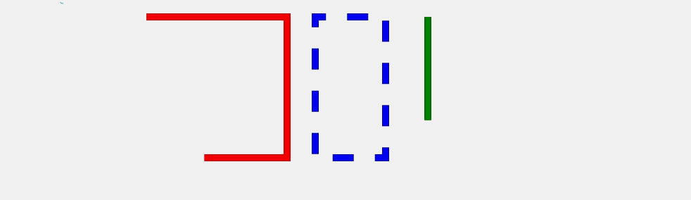
先看上圖的第二個圖形(紅色矩形)
HTML代碼
<rect class="No1" x="220" y="30" width="200" height="200" fill="none" stroke-width="10" stroke="red"/>
css代碼
.No1{ stroke-dasharray: 900; stroke-dashoffset: 900; -webkit-animation: dash 5s linear infinite; animation: dash 5s linear infinite; } /*動畫*/ @-webkit-keyframes anim { to { stroke-dashoffset: 0; } } @keyframes anim { to { stroke-dashoffset: 0; } }
代碼解析
stroke-dasharray 的值 大於等於 矩形周長,若等於周長動畫完成後動畫立刻結束,這裏我設置的值比周長多100 動畫會在圖形繪制結束後幾秒後結束,視覺效果會好一些。
stroke-dashoffset 的值 一般等於 矩形周長 ,若大於 矩形周長 動畫效果延時出現, 若小於 矩形周長 動畫效果提前出現。
第三個藍色虛線環繞矩形
HTML代碼
<rect class="No2" x="460" y="30" width="100" height="200" fill="none" stroke-width="10" stroke="blue"/>
css代碼
        .No2{
            stroke-dasharray: 30;
              stroke-dashoffset: 600;
              -webkit-animation: anim 5s linear infinite;
              animation: anim 5s linear infinite;
        }
/*動畫*/
        @-webkit-keyframes anim { to { stroke-dashoffset: 0; } }
        @keyframes anim { to { stroke-dashoffset: 0; } }
stroke-dasharray和矩形周長差值成倍數 則形成虛線環繞效果。
SVG 學習<五> SVG動畫