
python 生成圖表
阿新 • • 發佈:2018-11-09
python寫入excel(xlswriter)--生成圖表
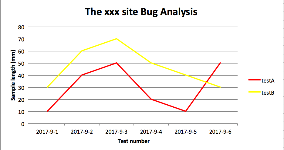
折線圖
# -*- coding:utf-8 -*- import xlsxwriter # 建立一個excel workbook = xlsxwriter.Workbook("chart_line.xlsx") # 建立一個sheet worksheet = workbook.add_worksheet() # worksheet = workbook.add_worksheet("bug_analysis") # 自定義樣式,加粗 bold = workbook.add_format({'bold': 1}) # --------1、準備資料並寫入excel--------------- # 向excel中寫入資料,建立圖示時要用到 headings = ['Number', 'testA', 'testB'] data = [ ['2017-9-1', '2017-9-2', '2017-9-3', '2017-9-4', '2017-9-5', '2017-9-6'], [10, 40, 50, 20, 10, 50], [30, 60, 70, 50, 40, 30], ] # 寫入表頭 worksheet.write_row('A1', headings, bold) # 寫入資料worksheet.write_column('A2', data[0]) worksheet.write_column('B2', data[1]) worksheet.write_column('C2', data[2]) # --------2、生成圖表並插入到excel--------------- # 建立一個柱狀圖(line chart) chart_col = workbook.add_chart({'type': 'line'}) # 配置第一個系列資料 chart_col.add_series({ # 這裡的sheet1是預設的值,因為我們在新建sheet時沒有指定sheet名# 如果我們新建sheet時設定了sheet名,這裡就要設定成相應的值 'name': '=Sheet1!$B$1', 'categories': '=Sheet1!$A$2:$A$7', 'values': '=Sheet1!$B$2:$B$7', 'line': {'color': 'red'}, }) # 配置第二個系列資料 chart_col.add_series({ 'name': '=Sheet1!$C$1', 'categories': '=Sheet1!$A$2:$A$7', 'values': '=Sheet1!$C$2:$C$7', 'line': {'color': 'yellow'}, }) # 配置第二個系列資料(用了另一種語法) # chart_col.add_series({ # 'name': ['Sheet1', 0, 2], # 'categories': ['Sheet1', 1, 0, 6, 0], # 'values': ['Sheet1', 1, 2, 6, 2], # 'line': {'color': 'yellow'}, # }) # 設定圖表的title 和 x,y軸資訊 chart_col.set_title({'name': 'The xxx site Bug Analysis'}) chart_col.set_x_axis({'name': 'Test number'}) chart_col.set_y_axis({'name': 'Sample length (mm)'}) # 設定圖表的風格 chart_col.set_style(1) # 把圖表插入到worksheet並設定偏移 worksheet.insert_chart('A10', chart_col, {'x_offset': 25, 'y_offset': 10}) workbook.close()
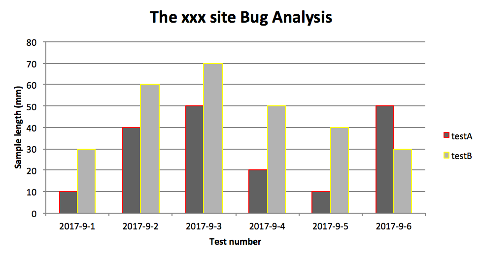
柱狀圖:
# -*- coding:utf-8 -*-

import xlsxwriter

# 建立一個excel
workbook = xlsxwriter.Workbook("chart_column.xlsx")
# 建立一個sheet
worksheet = workbook.add_worksheet()
# worksheet = workbook.add_worksheet("bug_analysis")

# 自定義樣式,加粗
bold = workbook.add_format({'bold': 1})

# --------1、準備資料並寫入excel---------------
# 向excel中寫入資料,建立圖示時要用到
headings = ['Number', 'testA', 'testB']
data = [
    ['2017-9-1', '2017-9-2', '2017-9-3', '2017-9-4', '2017-9-5', '2017-9-6'],
    [10, 40, 50, 20, 10, 50],
    [30, 60, 70, 50, 40, 30],
]

# 寫入表頭
worksheet.write_row('A1', headings, bold)

# 寫入資料
worksheet.write_column('A2', data[0])
worksheet.write_column('B2', data[1])
worksheet.write_column('C2', data[2])

# --------2、生成圖表並插入到excel---------------
# 建立一個柱狀圖(column chart)
chart_col = workbook.add_chart({'type': 'column'})

# 配置第一個系列資料
chart_col.add_series({
    # 這裡的sheet1是預設的值,因為我們在新建sheet時沒有指定sheet名
    # 如果我們新建sheet時設定了sheet名,這裡就要設定成相應的值
    'name': '=Sheet1!$B$1',
    'categories': '=Sheet1!$A$2:$A$7',
    'values':   '=Sheet1!$B$2:$B$7',
    'line': {'color': 'red'},
})

# 配置第二個系列資料(用了另一種語法)
chart_col.add_series({
    'name': '=Sheet1!$C$1',
    'categories':  '=Sheet1!$A$2:$A$7',
    'values':   '=Sheet1!$C$2:$C$7',
    'line': {'color': 'yellow'},
})

# 配置第二個系列資料(用了另一種語法)
# chart_col.add_series({
#     'name': ['Sheet1', 0, 2],
#     'categories': ['Sheet1', 1, 0, 6, 0],
#     'values': ['Sheet1', 1, 2, 6, 2],
#     'line': {'color': 'yellow'},
# })

# 設定圖表的title 和 x,y軸資訊
chart_col.set_title({'name': 'The xxx site Bug Analysis'})
chart_col.set_x_axis({'name': 'Test number'})
chart_col.set_y_axis({'name':  'Sample length (mm)'})

# 設定圖表的風格
chart_col.set_style(1)

# 把圖表插入到worksheet以及偏移
worksheet.insert_chart('A10', chart_col, {'x_offset': 25, 'y_offset': 10})

workbook.close()
效果圖
PS:
其實前面兩個圖只變動一點:把 line 個性為 column
chart_col = workbook.add_chart({'type': 'column'})
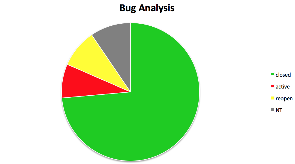
三、餅圖:

# -*- coding:utf-8 -*-

import xlsxwriter

# 建立一個excel
workbook = xlsxwriter.Workbook("chart_pie.xlsx")
# 建立一個sheet
worksheet = workbook.add_worksheet()

# 自定義樣式,加粗
bold = workbook.add_format({'bold': 1})

# --------1、準備資料並寫入excel---------------
# 向excel中寫入資料,建立圖示時要用到
data = [
    ['closed', 'active', 'reopen', 'NT'],
    [1012, 109, 123, 131],
]

# 寫入資料
worksheet.write_row('A1', data[0], bold)
worksheet.write_row('A2', data[1])

# --------2、生成圖表並插入到excel---------------
# 建立一個柱狀圖(pie chart)
chart_col = workbook.add_chart({'type': 'pie'})

# 配置第一個系列資料
chart_col.add_series({
    'name': 'Bug Analysis',
    'categories': '=Sheet1!$A$1:$D$1',
    'values': '=Sheet1!$A$2:$D$2',
    'points': [
        {'fill': {'color': '#00CD00'}},
        {'fill': {'color': 'red'}},
        {'fill': {'color': 'yellow'}},
        {'fill': {'color': 'gray'}},
    ],

})

# 設定圖表的title 和 x,y軸資訊
chart_col.set_title({'name': 'Bug Analysis'})

# 設定圖表的風格
chart_col.set_style(10)

# 把圖表插入到worksheet以及偏移
worksheet.insert_chart('B10', chart_col, {'x_offset': 25, 'y_offset': 10})
workbook.close()
效果圖:
參考資料:
http://xlsxwriter.readthedocs.io/chart_examples.html
http://xlsxwriter.readthedocs.io/chart.html