
使用JFreeChart繪製XY折線圖(工具類設計)
阿新 • • 發佈:2018-11-11
準備用Java寫通訊的模擬平臺作為畢業設計,相比matlab繪圖,Java繪圖需要自己去寫很多工具類,博主在這採用了JFreeChart的開源解決方案,摸索著自己寫了一個XY折線圖工具類,話不多說貼原始碼,原始碼中寫了很多註釋,配了一套自己用的繪圖樣式,需要的童鞋可以借鑑借鑑,希望對你有幫助。原始碼已上傳我的github上。
首先用Maven引入Jar包
<!-- Java 繪圖 -->
<dependency>
    <groupId>jfree</groupId>
    <artifactId>jfreechart</artifactId>
    <version>1.0.13</version>
</dependency>
DrawingToolsTest工具類設計
先看效果
下方是我的測試方法,準備了x和y的資料放入Map中,然後傳入已經寫好的介面中,就一行程式碼。底層的過程都封裝好了,調的話很方便
public class DrawingToolsTest {
    @Test
    public void testTools() {
        int sum = 20;//隨機生成20對數
        Map<Double, Double> map1 = new HashMap<>();
        double[] restX = RandomTools.getRadomDouble(1, 20, 1, sum);
        double[] restY = RandomTools.getRadomDouble(1, 20, 1, sum);
        for (int i = 0; i < sum; i++) {
            map1.put(restX[i], restY[i]);
        }

        Map<Double, Double> map2 = new HashMap<>();
        for (int i = 0; i < sum; i++) {
            map2.put(restY[i], restX[i]);
        }

        Map<Double, Double>[] dataSet = new Map[]{map1, map2};
        String[] types = new String[]{"A", "B"};
        //呼叫繪圖工具
        DrawingTools.drawLineChart("axin", "測試", "這是X軸",
                "這是y軸", dataSet, types);

        Scanner in = new Scanner(System.in);
        in.hasNext();
    }
}

/**
 * @author Axin
 */
public class RandomTools {
    /**
     * @param start
     * @param end
     * @param retain 保留幾位小數
     * @param sum    生成多少個數
     * @return
     */
    public static double[] getRadomDouble(int start, int end, int retain, int sum) {
        double[] res = new double[sum];

        for (int i = 0; i < sum; i++) {
            BigDecimal db = new BigDecimal(Math.random() * (end - start) + start);
            //四捨五入
            res[i] = db.setScale(retain, BigDecimal.ROUND_HALF_UP).doubleValue();
        }
        return res;
    }
}
執行後: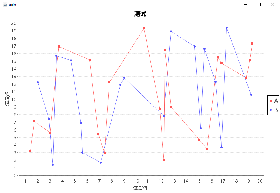
工具類原始碼
/**
 * 後端繪圖類
 *
 * @author Axin
 * @date 2018-10-16
 */

@ConfigurationProperties(prefix = "draw")
public class DrawingTools extends ApplicationFrame {
    private String titleFont;
    private int titleFontSize;
    private String xyFont;
    private int xyFontSize;

    DrawingTools() {
        this("Axin");
    }

    public DrawingTools(String appTitle) {
        super(appTitle);
        this.titleFont = "微軟雅黑";
        this.titleFontSize = 20;
        this.xyFont = "微軟雅黑";
        this.xyFontSize = 15;
    }

    /**
     * @param appTitle    標題
     * @param chartTitle  圖示題
     * @param xName       x軸命名
     * @param yName       y軸命名
     * @param dataSet     資料集
     * @param types       線條種類
     */
    public static void drawLineChart(String appTitle, String chartTitle,
                                     String xName,
                                     String yName,
                                     Map<Double, Double>[] dataSet,
                                     String[] types) {
        DrawingTools tools = new DrawingTools(appTitle);
        IntervalXYDataset dataset = tools.getLineDataset(dataSet, types);
        JFreeChart chart = tools.getLineChart(chartTitle, xName, yName, dataset);

        //繪圖模式化
        tools.setChartCSS(chart);
        ChartPanel chartPanel = new ChartPanel(chart);
        chartPanel.setPreferredSize(new java.awt.Dimension(900, 600));
        tools.setContentPane(chartPanel);
        tools.pack();
        RefineryUtilities.centerFrameOnScreen(tools);
        tools.setVisible(true);
    }

    private JFreeChart getLineChart(String title, String xName, String yName, XYDataset dataset) {
        /**
         * 圖示標題,x軸名稱,y軸名稱,資料集合,圖示顯示方向,是否使用圖示,是否生成工具欄,是否生成URL連結
         */
        JFreeChart chart = ChartFactory.createXYLineChart(
                title,
                xName,
                yName,
                dataset,
                PlotOrientation.VERTICAL,
                true,
                true,
                false
        );
        return chart;
    }


    /**
     * 自定義設定圖表字型樣式
     *
     * @param chart
     */
    private void setChartCSS(JFreeChart chart) {
        //初始化
        chart.setBackgroundPaint(ChartColor.WHITE);
        XYPlot plot = chart.getXYPlot();

        //標題
        TextTitle textTitle = chart.getTitle();
        textTitle.setFont(new Font(titleFont, Font.BOLD, titleFontSize));
        LegendTitle legendTitle = chart.getLegend();
        legendTitle.setItemFont(new Font(titleFont, Font.PLAIN, titleFontSize));


        //圖表xy軸字型設定
        plot.getDomainAxis().setLabelFont(new Font(xyFont, Font.PLAIN, xyFontSize));
        plot.getDomainAxis().setTickLabelFont(new Font(xyFont, Font.PLAIN, xyFontSize));
        plot.getRangeAxis().setTickLabelFont(new Font(xyFont, Font.PLAIN, xyFontSize));
        plot.getRangeAxis().setLabelFont(new Font(xyFont, Font.PLAIN, xyFontSize));

        //設定背景色-xy軸格子色
        plot.setBackgroundPaint(ChartColor.WHITE);
        plot.setRangeGridlinePaint(ChartColor.lightGray);
//        plot.setDomainGridlinePaint(ChartColor.lightGray);

        //折線圖渲染
        XYLineAndShapeRenderer renderer = new XYLineAndShapeRenderer();
        plot.setRenderer(renderer);
//        renderer.setPaint(ChartColor.BLACK);
        chart.getLegend().setPosition(RectangleEdge.RIGHT);

    }

    /**
     * @param dataSets int:double
     * @param types    折線的種類
     * @return
     */
    private IntervalXYDataset getLineDataset(Map<Double, Double>[] dataSets, String[] types) {

        XYSeriesCollection dataSet = new XYSeriesCollection();
        int index = 0;
        for (String type : types) {
            XYSeries series = new XYSeries(type);
            for (Map.Entry<Double, Double> data : dataSets[index++].entrySet()) {
                series.add(data.getKey(), data.getValue());
            }
            dataSet.addSeries(series);
        }
        return dataSet;
    }
}
結語
其實在真實生產環境中,後端已經不渲染報表圖片之類了,都是後端傳資料給前端,由前端來進行視覺化,這裡使用JFreeChart是為了後端做單元測試而編寫的。