進度條製作-CSS動畫
阿新 • • 發佈:2018-11-15
溫馨提示
程式碼參考
[本人部落格]:【https://blog.csdn.net/qq_41115965/article/details/83713343】
程式碼修改
不同於使用 GIF 圖片,使用 CSS3 動畫的時候 loading 佈局,應做以下改變:
html檔案
<div class="loading">
<div class="picture">
<i></i>
<i></i>
<i></i>
<i></ CSS檔案
/* 載入動畫樣式start */
.loading {
width: 100%;
height: 100%;
position: fixed;
top: 0;
left: 0;
z-index: 100;
background: #ffffff;
}
.loading .picture {
position: absolute;
top: 0;
left: 0;
bottom 注意事項
對應的 JS 檔案不需要做修改。
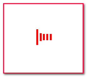
效果圖