
css3帶缺口圓環的步驟條進度條動畫製作
阿新 • • 發佈:2019-02-03
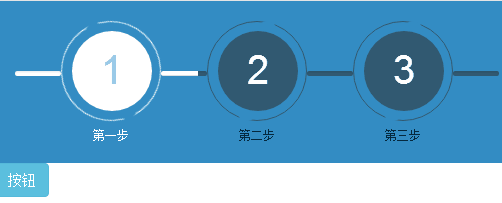
在網上找了好久的步驟條外掛,可惜不盡人意,只能自己動手寫一個,下面直接展示效果圖
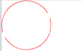
1.首先是帶缺口圓環動畫的製作
思路:一個圓加兩個小圓(圓顏色與背景顏色一致),小圓遮蓋住大圓環形成缺口,動畫執行(0到360deg)
	.round {
		            position: relative;
		            width: 100px;
		            height: 100px;
		            display: inline-block;
		            animation: move 2s infinite linear;
		        }
		         .round .out-round {
		            width: 100px;
		            height: 100px;
		            line-height: 100px;
		          	border: 1px solid red;/* 圓環 */
		        }
		        .round .emp-round {
		            width: 20px;
		            height: 20px;
		            border-radius: 50%;
		            position: absolute;
		            background-color: white;/* 小圓顏色應該與背景顏色一致 */
		        }
		        .round .r1 {
		            left: 50px;
		            top: 0;
		        }/* 小圓1位置 */
		        .round .r2 {
		            bottom: 0;
		            left: 30px;
		        }/* 小圓2位置 */
		        @keyframes move {
		            from {
		                transform: rotate(0);
		            }
		            to {
		                transform: rotate(360deg);
		            }
		        }
html結構:
    <div class="round" >
	        <div class="out-round img-circle"></div><!-- img-circle是bootstrap的樣式類使div為圓形 -->
	        <div class="emp-round r1"></div><!-- 小圓1 -->
	        <div class="emp-round r2"></div><!-- 小圓2 -->
	    </div>
效果展示:
2.進度條的製作,結構採用bootstrap的進度條樣式,並發現若想要進度條動起來只需讓類名為progress-bar的div寬度由0%變為100%即可,顏色可任意設定
html結構:.bar-mv { background-color: blue;/* 即進度條的顏色 */ animation: move2 4s linear forwards;/* forwards是當進度為100%時保留在這一屬性 */ } .bar{ height: 10px; width: 100%; margin-top: 50px; background-color: #315971; } @keyframes move2 { from { width: 0%; } to { width: 100%; } }
<div class="progress">
    <div class="progress-bar bar-mv" role="progressbar"  aria-valuemin="0" aria-valuemax="100"></div>
</div>
3.最終實現的效果是頁面載入時進度條動起來到達第二步,點選按鈕由第二步運動到第三步,整體程式碼如下

1.步驟未啟用時使用的類是all-unactive,啟用時使用all-active
 <link rel="stylesheet" href="https://cdn.bootcss.com/bootstrap/3.3.7/css/bootstrap.min.css">
<script src="https://cdn.bootcss.com/jquery/3.2.1/jquery.min.js "></script>
<script src="https://cdn.bootcss.com/bootstrap/3.3.7/js/bootstrap.min.js"></script>
<style>
.box1 {
background-color: #338cc3;
display: flex;
justify-content: space-between;
padding: 20px;
}
.round {
position: relative;
width: 100px;
height: 100px;
display: inline-block;
}/* 相對定位 */
@keyframes move {
from {
transform: rotate(0);
}
to {
transform: rotate(360deg);
}
}
@keyframes move2 {
from {
width: 0%;
}
to {
width: 100%;
}
}
.round .out-round {
width: 100px;
height: 100px;
line-height: 100px;
border-radius: 50%;
}
.round .emp-round {
width: 20px;
height: 20px;
border-radius: 50%;
position: absolute;
background-color: #338cc3;;
}/* 絕對定位 */
.round .r1 {
left: 50px;
top: 0;
}
.round .r2 {
bottom: 0;
left: 30px;
}
.inner-round {
position: absolute;
width: 80px;
height: 80px;
left: 11px;
top: 10px;
line-height: 80px;
font-size: 40px;
}
.bar{
height: 5px;
width: 100%;
margin-top: 50px;
background-color: #315971;
}
.bar-active {
height: 5px;
width: 100%;
margin-top: 50px;
background-color: white;
}
.all{
position: relative;
}
.all-active .round {
animation: move 2s infinite linear;
}
.all-active .round .out-round {
border: 1px solid white;
}
.all-active .inner-round {
background-color: white;
color: lightskyblue;
}
.all-active .text {
color: white;
font-size:12px;
}
.all-unactive .round .out-round {
border: 1px solid #315971;
}
.all-unactive .inner-round {
background-color: #315971;
color: white;
}
.all-unactive .text {
color: #04283e;
font-size:12px;
}
.bar-mv {
background-color: white;
animation: move2 1s linear forwards;
}
</style> <div class=" box1" >
<div class="progress bar-active">
<div class="progress-bar " role="progressbar" aria-valuemin="0" aria-valuemax="100"></div>
</div>
<div class="all all-active">
<div class="round">
<div class="out-round img-circle"></div><!-- 外部圓環 -->
<div class="emp-round r1"></div><!-- 小圓1 -->
<div class="emp-round r2"></div><!-- 小圓2 -->
</div>
<div class="img-circle inner-round text-center ">1</div>
<div class="text text-center ">第一步</div>
</div>
<div class="progress bar">
<div class="progress-bar bar-mv" role="progressbar" aria-valuemin="0" aria-valuemax="100"></div>
</div>
<div class="all all-unactive">
<div class="round">
<div class="out-round img-circle"></div>
<div class="emp-round r1"></div>
<div class="emp-round r2"></div>
</div>
<div class="img-circle inner-round text-center">2</div>
<div class="text text-center">第二步</div>
</div>
<div class="progress bar">
<div class="progress-bar " role="progressbar" aria-valuemin="0" aria-valuemax="100"></div>
</div>
<div class="all all-unactive">
<div class="round">
<div class="out-round img-circle"></div>
<div class="emp-round r1"></div>
<div class="emp-round r2"></div>
</div>
<div class="img-circle inner-round text-center">3</div>
<div class="text text-center">第三步</div>
</div>
<div class="progress bar">
<div class="progress-bar " role="progressbar" aria-valuemin="0" aria-valuemax="100"></div>
</div>
</div>
<button id="start" class="btn btn-info">按鈕</button><script>
$(function () {
setTimeout(function () {
$(".bar-mv").parent().next().removeClass("all-unactive").addClass("all-active");
$("#start").on('click',function () {
$(".bar").eq(1).children().addClass("bar-mv");
setTimeout(function () {
$(".bar").eq(1).next().removeClass("all-unactive").addClass("all-active");
$(".bar").eq(2).children().addClass("bar-mv");
},1000)
})
},1000)
})
</script>