
BootStrap table 自定義變色
在css中
.table-striped > tbody > tr:nth-child(2n+1) > td,
.table-striped > tbody > tr:nth-child(2n+1) > th {
    background-color: rgb(242, 245, 247);//此處是自己想用的顏色
 }
對於jq中想要變色,會發現,table中的淺色tr可以自定義,深色的無效,解決辦法:把 table 的class中的table-striped去掉
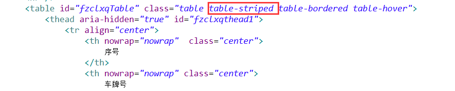
例如:
 去掉之後,table 的tr就都沒有色的,然後再進行自定義變色就不會受影響了
相關推薦
BootStrap table 自定義變色
在css中 .table-striped > tbody > tr:nth-child(2n+1) > td, .table-striped > tbody > tr:nth-child(2n+1) > th { background-col
bootstrap-table自定義複選框樣式
在使用bootstrap-table外掛時發現上面的複選框還是原生樣式比較醜 修改後的樣式 直接上程式碼 需引入樣式 .bella-checkbox{ position: relative; } /** 將初始的checkbox的樣式改變 */ .be
bootstrap table 自定義checkbox樣式
this inline move for padding col 表格 poi app //css <style> .checkbox-custom { position: relative;
vue element table 自定義表頭 el-popover DOM
最近專案是一個銷售後臺的專案 裡面有很多的表格 但是內容是一樣的 這就要使用element的表格自定義事件新增 el-popover 提示 開始我的效果是這樣的: html程式碼: js程式碼: 要是單頁面也就好了 但是我的專案都是元件複用的 所以元件裡面的提示就要
table自定義表格樣式
前言: 自定義表格樣式,有一些自定義的需求,整理成通用樣式就可以複用了 1,table表格每一列可以自定義寬度 2,table表格每一列中的每一項超出寬度不換行並顯示省略號... <!DOCTYPE html> <html lang="zh"> <he
element table 自定義表尾
簡單介紹下專案:後端管理系統,頁面樣式用的是 element,資料繫結用的是 vue.js。 功能需求:需要新增繳藥記錄,這些記錄要顯示在一個 table 中,但是 table 末尾一行不做資料展示,只負責觸發資料新增的動作。 先看最終實現的效果: 紅框處就是自定義的表尾,
element ui框架 table 自定義列顯示
<el-table :data="pageData" stripe border> <el-table-column label="序號" align="center" width
bootstrap 如何自定義按鈕
bootstrap 按鈕在開發中很方便。直接定義btn btn-xxx就可以自己生成自己需要的按鈕,但是在實際開發裡bootstrap提供的幾組按鈕不能滿足我們我們所有的要求,一般公司網站的不同會有對應的主題色。說這麼多就是為了推介一款按鈕自定義神器。 htt
bootstroop table 自定義搜尋
<div class="col-sm-12 "> <div class="box"> <div class="box-header"> <h3 class="box
bootstrap Datatable自定義表格工具欄
Bootstrap DataTable提供的表格樣式是這樣的: 但是如果想實現如圖的效果: 需要在jquery函式中修改成如下: $(document).ready(function() { $('#dataTables-example').dataTable( {
ant-design-vue中table自定義列
#### 1. 使用背景 在專案中使用`ant-vue`的`a-table`控制元件過程中,需要顯示序號列或者在列中顯示圖片,超鏈,按鈕等UI資訊。經過查詢文件`customCell`和`customRender`可以實現以上需求,比如實現如下表格資料渲染 自定義模板列功能介紹
Bootstrap Blazor 是一套企業級 UI 元件庫,適配移動端支援各種主流瀏覽器,已經在多個交付專案中使用。通過本套元件可以大大縮短開發週期,節約開發成本。目前已經開發、封裝了 70 多個元件,歡迎有興趣的同學試用。 Gitee 開源地址為:https://gitee.com/LongbowEnt
bootstrap-自定義列表組
bootstrap-自定義列表組1.運行效果如圖所示2.實現代碼如下<!DOCTYPE html> <html> <head> <meta charset="utf-8"> <meta http-equiv="X-UA-Compatible
bootstrap自定義——柵格列數修改
-1 切換 下載 ima 技術 最好 http png 分享 從下載的bootstrap文件中找到less文件夾裏面的variables.less,然後可以找到柵格列數進行修改 然後執行一下bootstrap.less,通過命令行,切換到其所在的目錄D:\03 學習\
bootstrap table 怎麽自適應寬度
表格樣式 table name -name wrap resp spa 使用 控制 <div class="table-responsive"> <table class="table text-nowrap"> <
關於Bootstrap自定義圖標
bsp AI 引入 很慢 中一 網站 spa 原因 沖突 1、網站:http://fontello.com/(可能是網站本身原因,總是加載很慢,需要等待一下) 2、eps格式即AI文件,所需畫布大小是512*512的,且需要布滿整個畫布,否則存儲出來的圖標顯示不全或者有
VUE 自定義表頭實現table的過濾功能
html程式碼 下面是table <el-table-column v-for="(data,index) in mydata" //下面呼叫的是自定義的函式
table內容自定義換行
$("#rep").datagrid({ singleSelect: true, //選中一行的設定 AllowPaging: true, pagination: true, pageSize: 20, pageList: [20, 50, 200, 1000
【vue】element實現el-table-column設定寬度百分比(%)以及插入自定義內容
<el-table :data="tableData" style="width: 100%" stripe= "true"&g