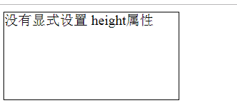
width 和 height 值為 auto 總結
盒子模型(Box Model):
當對一個文件進行佈局(laying out)的時候,瀏覽器渲染引擎會根據CSS-Box模型(CSS Basic Box model)將所有元素表示為一個矩形盒子(box)。
CSS決定這些盒子的大小,位置以及屬性(顏色,背景,邊框尺寸...)
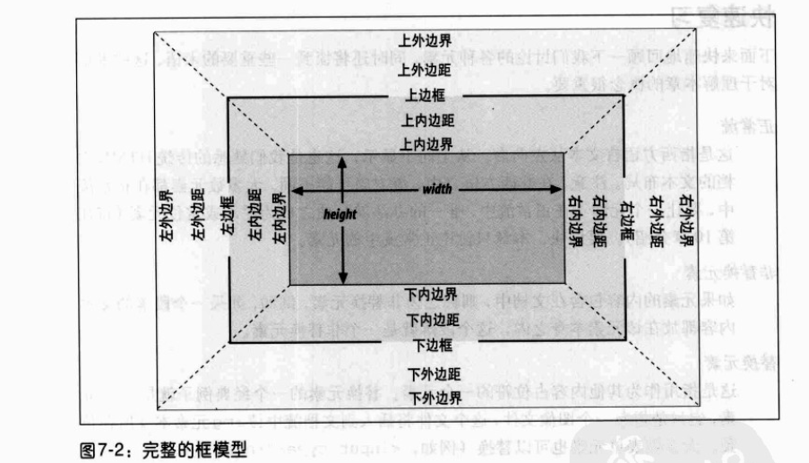
在CSS中,使用標準盒模型描述這些矩形盒子中的每一個。這個模型描述了元素所佔空間的內容。每個盒子有四個邊:外邊距邊, 邊框邊, 內填充邊 與 內容邊。
對應的屬性名稱分別如下:
水平格式化7大屬性: margin-left、border-left、padding-left、width、padding-right、border-right、margin-right
垂直格式化7大屬性: margin-top、border-top、padding-top、height、padding-bottom、border-bottom、margin-bottom
正常流中塊級元素框的水平部分總和等於其包含塊的 width
水平格式化7大屬性,其中 width和 margin-left、margin-right這3個屬性可以設定為 auto,其餘屬性必須設定特定值或預設為0
一、這3個屬性都設定為非 auto值
此時格式化屬性過分受限,這是總會把 margin-right強制為 auto
<div style="width:100px; margin-left: 100px; margin-right: 100px; height: 100px; background-color: aquamarine;"> </div>
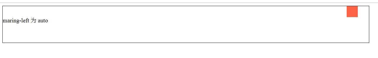
二、這3個屬性中的某一個設定為 auto值
此時設定了 auto屬性的元素會確定所需要的長度,從而使元素框的寬度等於父元素的 width
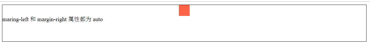
<div style="width:30px; margin-left: auto; margin-right: 30px; height: 30px; background-color: tomato;"> </div>
三、這3個屬性中的其中兩個都設定為 auto值
其一:設定兩個 margin為 auto,則會使得左右 margin值相等,內容居中
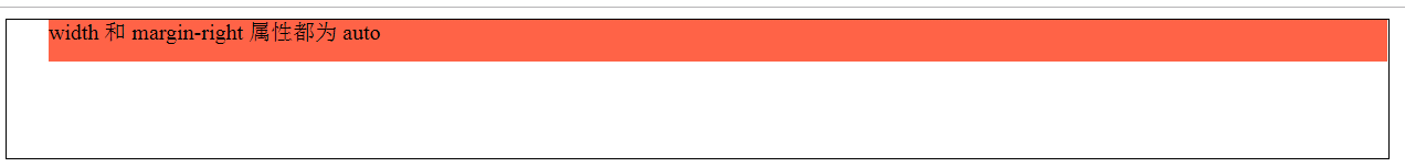
其二:設定 width和其中的某個 margin為 auto,則設為 auto的那個 margin會變成0,而 width會設定為所需要的值,使得元素完全填充其包含塊
<div style="width:30px; margin-left: auto; margin-right: auto; height: 30px; background-color: tomato;"> </div>
<div style="width:auto; margin-left: 30px; margin-right: auto; height: 30px; background-color: tomato;"></div>
四、這3個屬性都設定為 auto值
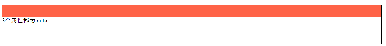
此時兩個外邊距都會變成0,width會盡可能寬(這與預設情況相同,即沒有顯示設定這3個屬性,則外邊距預設由 auto變為0,width預設為 auto)
<div style="width:auto; margin-left: auto; margin-right: auto; height: 30px; background-color: tomato;"> </div>
上述內容適用於非替換元素和替換元素(例外:替換元素中 width:auto時,元素寬度則為內容的固有寬度)
助記:
一:從左往右,即先考慮左外邊距,再考慮右外邊距,因此取左邊距和 width設定的值,而把右外邊距設定為 auto值
二: 先 width後 margin,即在有多個 auto需要確定寬度時,先考慮 width再考慮 margin,如設定外邊距等長或為0
正常流中塊級元素的垂直部分總和等於其包含塊的 height()
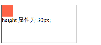
垂直格式化7大屬性,其中 height和 margin-top、margin-bottom這3個屬性可以設定為 auto,其餘屬性必須設定特定值或預設為0
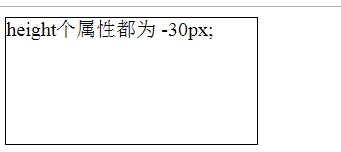
一、height必須設定為 auto或某種型別的非負值
<div style="                width: 30px; background-color: tomato;"></div>
<div style=" height: -30px; width: 30px;  background-color: tomato;"></div>
<div style=" height: 30px; width: 30px;  background-color: tomato;"></div>
二、一個正常流中的塊級元素中的 margin-top或者 margin-bottom設定為 auto,它會自動計算為0
<div style=" height: 30px; margin-top: auto; margin-bottom: auto; width: 30px; background-color: tomato;"></div>

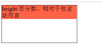
三、如果一個塊級正常流元素中的 height設定為 百分數,則這個值是相對包含塊而言的一個百分數,如果沒有顯式宣告包含塊的 height,百分數高度會重置為 auto
<div style="height: 100px; width: 200px;">
    <div style=" height: 30%; margin-top: auto; margin-bottom: auto; width: 30px;  background-color: tomato;"></div>
</div>
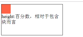
<div style="height: auto; width: 200px;">
    <p style=" height: 30%; background-color: tomato;">
        height:百分數,相對於包含塊而言
    </p>
</div>
四、當 height:auto時
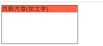
其一: 如果塊級元素正常流的高度設定為 height:auto,子元素為內聯內容(如文字),則該塊級元素的高度將恰好包含足以包含其中的內聯內容
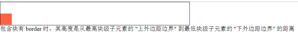
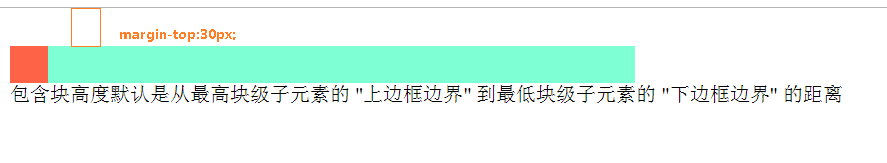
其二:如果塊級元素正常流的高度設定為 height:auto,只有塊級子元素,則該塊級元素高度預設是從最高塊級子元素的 "上邊框邊界" 到最低塊級子元素的 "下邊框邊界" 的距離,
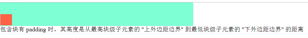
若該塊級元素設定了 padding或border,則該塊級元素高度是從最高塊級子元素的 "上外邊距邊界" 到最低塊級子元素的 "下外邊距邊界" 的距離
<div style=" height: auto; background-color: tomato;"> 內聯內容(如文字) </div>
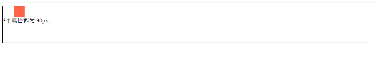
<div style="width: 500px; height: auto; background-color: aquamarine;">
    <div style=" height: 30px; width: 30px; margin-top: 30px; background-color: tomato;"></div>
</div>
<div style="width: 500px; height: auto; background-color: aquamarine; padding: 1px;">
    <div style=" height: 30px; width: 30px; margin-top: 30px; background-color: tomato;"></div>
</div>
<div style="width: 500px; height: auto; border: 1px solid black;">
    <div style=" height: 30px; width: 30px; margin-top: 30px; background-color: tomato;"></div>
</div>