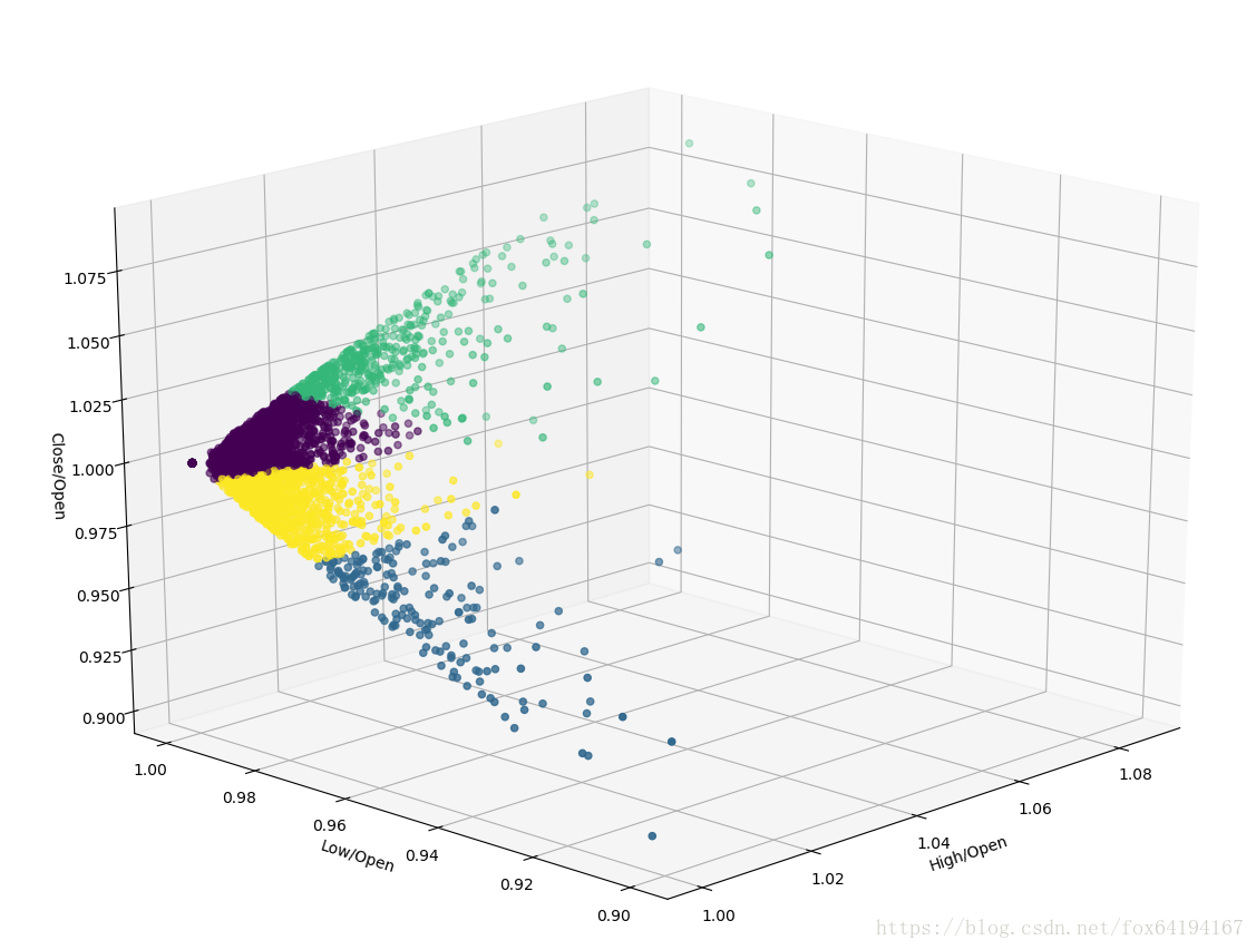
sklearn kMeans 分類實戰,對滬深300的每日漲跌進行分類
阿新 • • 發佈:2018-12-12
# ohlc_clustering.py
import copy
import datetime
import pymysql
import matplotlib.pyplot as plt
from mpl_toolkits.mplot3d import Axes3D
# from matplotlib.finance import candlestick_ohlc
import matplotlib.dates as mdates
from matplotlib.dates import (
DateFormatter, WeekdayLocator, DayLocator, MONDAY
)