
一文看懂機器學習流程(客戶流失率預測)
1 定義問題
客戶流失率問題是電信運營商面臨得一項重要課題,也是一個較為流行的案例。根據測算,招攬新的客戶比保留住既有客戶的花費大得多(通常5-20倍的差距)。因此,如何保留住現在的客戶對運營商而言是一項非常有意義的事情。 本文希望通過一個公開資料的客戶流失率問題分析,能夠帶著大家理解如何應用機器學習預測演算法到實際應用中。
當然, 實際的場景比本文例子複雜的多,如果想具體應用到專案, 還需要針對不同的場景和資料進行具體的分析。
從機器學習的分類來講, 這是一個監督問題中的分類問題。 具體來說, 是一個二分類問題。 所有的資料中包括一些特徵, 最後就是它的分類:流失或者在網。接下來我們就開始具體的處理。
2 分析資料
首先我們來匯入資料, 然後檢視資料的基本情況。
2.1 資料匯入
通過pandas來匯入csv, 然後我們來檢視一下資料的基本情況
from __future__ import division
import pandas as pd
import numpy as np

ds = pd.read_csv('./churn.csv')
col_names = ds.columns.tolist()
print "Column names:"
print col_names
print(ds.shape)
輸出:
Column names:
['State', 'Account Length', 'Area Code', 'Phone', "Int'l Plan", 'VMail Plan', 'VMail Message', 'Day Mins', 'Day Calls', 'Day Charge', 'Eve Mins', 'Eve Calls', 'Eve Charge', 'Night Mins', 'Night Calls', 'Night Charge', 'Intl Mins', 'Intl Calls', 'Intl Charge', 'CustServ Calls', 'Churn?']
(3333, 21)
可以看到, 整個資料集有3333條資料, 20個維度, 最後一項是分類。
2.2 基本資訊以及型別
我們可以列印一些資料, 對資料和取值有一個基本的理解。
peek = data.head(5)
print(peek)
輸出:
State Account Length Area Code Phone Int'l Plan VMail Plan \
0 KS 128 415 382-4657 no yes
1 OH 107 415 我們可以看到, 資料集有20項特徵,分別是州名, 賬戶長度, 區號, 電話號碼, 國際計劃,語音郵箱, 白天通話分鐘數, 白天電話個數, 白天收費, 晚間通話分鐘數,晚間電話個數, 晚間收費, 夜間通話分鐘數,夜間電話個數, 夜間收費, 國際分鐘數, 國際電話個數, 國際收費, 客服電話數,流失與否。
- 可以看到這裡面有個人資訊,應該可以看到有些資訊與流失與否關係不大。 州名, 區號可以指明客戶的位置, 和流失有關係麼, 不知道, 具體位置如果不分類, 應該完全沒有關係。 而州名, 也許某個州有了某個強勁的競爭對手? 這也是瞎猜, 暫時意義不大, 刪除。
- 賬號長度, 電話號碼, 不需要
- 國際計劃, 語音郵箱。 可能有關係, 先留著吧。
- 分別統計了白天, 晚間, 夜間的通話分鐘, 電話個數, 收費情況。 這是重要資訊保留
- 客服電話, 客戶打電話投訴多那流失率可能會大。 這個是重要資訊保留。
- 流失與否。 這是分類結果。
然後我們可以看一下資料的型別, 如下:
ds.info()
輸出:
RangeIndex: 3333 entries, 0 to 3332
Data columns (total 21 columns):
State             3333 non-null object
Account Length    3333 non-null int64
Area Code         3333 non-null int64
Phone             3333 non-null object
Int'l Plan        3333 non-null object
VMail Plan        3333 non-null object
VMail Message     3333 non-null int64
Day Mins          3333 non-null float64
Day Calls         3333 non-null int64
Day Charge        3333 non-null float64
Eve Mins          3333 non-null float64
Eve Calls         3333 non-null int64
Eve Charge        3333 non-null float64
Night Mins        3333 non-null float64
Night Calls       3333 non-null int64
Night Charge      3333 non-null float64
Intl Mins         3333 non-null float64
Intl Calls        3333 non-null int64
Intl Charge       3333 non-null float64
CustServ Calls    3333 non-null int64
Churn?            3333 non-null object
dtypes: float64(8), int64(8), object(5)
memory usage: 546.9+ KB
看見, 有int, float, object。 對於不是資料型的資料, 後面除非決策樹等演算法, 否則應該會轉化成資料行。 所以我們把churn? 結果轉化, 以及"Int’l Plan",“VMail Plan”, 這兩個引數只有yes, no 兩種, 所以也進行轉化成01值。
2.3 描述性統計
describe() 可以返回具體的結果, 對於每一列。
數量 平均值 標準差 25% 分位 50% 分位數 75% 分位數 最大值 很多時候你可以得到NA的數量和比例。
TODO 對於非資料性的是沒有返回的的
 Account Length    Area Code  VMail Message     Day Mins    Day Calls  \
count     3333.000000  3333.000000    3333.000000  3333.000000  3333.000000
mean       101.064806   437.182418       8.099010   179.775098   100.435644
std         39.822106    42.371290      13.688365    54.467389    20.069084
min          1.000000   408.000000       0.000000     0.000000     0.000000
25%         74.000000   408.000000       0.000000   143.700000    87.000000
50%        101.000000   415.000000       0.000000   179.400000   101.000000
75%        127.000000   510.000000      20.000000   216.400000   114.000000
max        243.000000   510.000000      51.000000   350.800000   165.000000

        Day Charge     Eve Mins    Eve Calls   Eve Charge   Night Mins  \
count  3333.000000  3333.000000  3333.000000  3333.000000  3333.000000
mean     30.562307   200.980348   100.114311    17.083540   200.872037
std       9.259435    50.713844    19.922625     4.310668    50.573847
min       0.000000     0.000000     0.000000     0.000000    23.200000
25%      24.430000   166.600000    87.000000    14.160000   167.000000
50%      30.500000   201.400000   100.000000    17.120000   201.200000
75%      36.790000   235.300000   114.000000    20.000000   235.300000
max      59.640000   363.700000   170.000000    30.910000   395.000000

       Night Calls  Night Charge    Intl Mins   Intl Calls  Intl Charge  \
count  3333.000000   3333.000000  3333.000000  3333.000000  3333.000000
mean    100.107711      9.039325    10.237294     4.479448     2.764581
std      19.568609      2.275873     2.791840     2.461214     0.753773
min      33.000000      1.040000     0.000000     0.000000     0.000000
25%      87.000000      7.520000     8.500000     3.000000     2.300000
50%     100.000000      9.050000    10.300000     4.000000     2.780000
75%     113.000000     10.590000    12.100000     6.000000     3.270000
max     175.000000     17.770000    20.000000    20.000000     5.400000

       CustServ Calls
count     3333.000000
mean         1.562856
std          1.315491
min          0.000000
25%          1.000000
50%          1.000000
75%          2.000000
max          9.000000
2.4 圖形化理解你的資料
之前的一些資訊, 只是一些很初步的理解, 但是對於機器學習演算法來講是不夠的。 下面我們從幾個維度去進一步理解你的資料。工具可以用數字表格, 也可以用圖形(matplotlib) 這裡畫圖較多。
- 特徵自己的資訊
- 特徵和分類之間的關係
- 特徵和特徵之間的關係 – 這裡鑑於時間的關係, 有些關係並沒有直接應用於演算法本身, 但是在進一步的演算法提升中是很有意義的, 這裡更多的是一種展示。
2.4.1 特徵本身的資訊
我們先來看一下流失比例, 以及關於打客戶電話的個數分佈
import matplotlib.pyplot as plt
%matplotlib inline
fig = plt.figure()
fig.set(alpha=0.2)  # 設定圖表顏色alpha引數

plt.subplot2grid((2,3),(0,0))             # 在一張大圖裡分列幾個小圖
ds['Churn?'].value_counts().plot(kind='bar')# plots a bar graph of those who surived vs those who did not.
plt.title(u"stat for churn") # puts a title on our graph
plt.ylabel(u"number")

plt.subplot2grid((2,3),(0,2))
ds['CustServ Calls'].value_counts().plot(kind='bar')# plots a bar graph of those who surived vs those who did not.
plt.title(u"stat for cusServCalls") # puts a title on our graph
plt.ylabel(u"number")

plt.show()
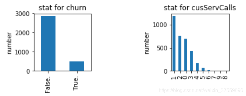
很容易理解。
然後呢, 我們的資料的特點是對白天, 晚上, 夜間,國際都有分鐘數, 電話數, 收費三種維度。 那麼我們拿白天的來舉例。
import matplotlib.pyplot as plt
%matplotlib inline
fig = plt.figure()
fig.set(alpha=0.2)  # 設定圖表顏色alpha引數

plt.subplot2grid((2,5),(0,0))             # 在一張大圖裡分列幾個小圖
ds['Day Mins'].plot(kind='kde')    # plots a kernel desnsity estimate of customer
plt.xlabel(u"Mins")# plots an axis lable
plt.ylabel(u"density")
plt.title(u"dis for day mins")

plt.subplot2grid((2,5),(0,2))
ds['Day Calls'].plot(kind='kde')    # plots a kernel desnsity estimate of customer
plt.xlabel(u"call")# plots an axis lable
plt.ylabel(u"density")
plt.title(u"dis for day calls")

plt.subplot2grid((2,5),(0,4))
ds['Day Charge'].plot(kind='kde')   # plots a kernel desnsity estimate of customer
plt.xlabel(u"Charge")# plots an axis lable
plt.ylabel(u"density")
plt.title(u"dis for day charge")

plt.show()
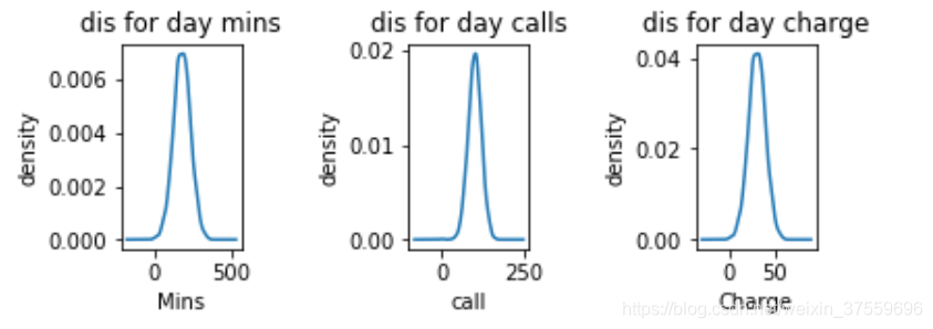
可以看到分佈基本上都是高斯分佈, 這也符合我們的預期, 而高斯分佈對於我們後續的一些演算法處理是個好訊息。
2.4.2 特徵和分類的關聯
我們來看一下一些特徵和分類之間的關聯。 比如下面int plan
import matplotlib.pyplot as plt
fig = plt.figure()
fig.set(alpha=0.2)  # 設定圖表顏色alpha引數

int_yes = ds['Churn?'][ds['Int\'l Plan'] == 'yes'].value_counts()
int_no = ds['Churn?'][ds['Int\'l Plan'] == 'no'].value_counts()
df_int=pd.DataFrame({u'int plan':int_yes, u'no int plan':int_no})
df_int.plot(kind='bar', stacked=True)
plt.title(u"statistic between int plan and churn")
plt.xlabel(u"int or not")
plt.ylabel(u"number")

plt.show()
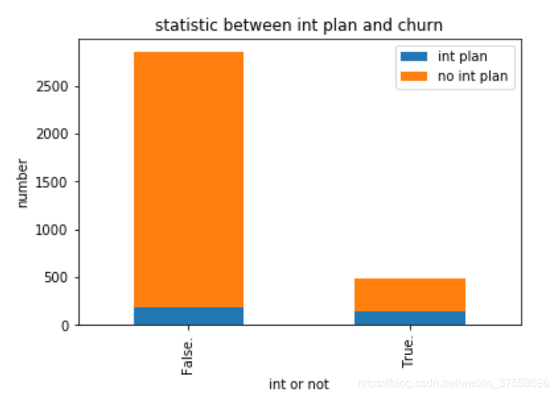
我們可以看到, 有國際電話的流失率較高。 猜測也許他們有更多的選擇, 或者對服務有更多的要求。 需要特別對待。 也許你需要電話多收集一下意見了。
再來看一下
#檢視客戶服務電話和結果的關聯
fig = plt.figure()
fig.set(alpha=0.2)  # 設定圖表顏色alpha引數

cus_0 = ds['CustServ Calls'][ds['Churn?'] == 'False.'].value_counts()
cus_1 = ds['CustServ Calls'][ds['Churn?'] == 'True.'].value_counts()
df=pd.DataFrame({u'churn':cus_1, u'retain':cus_0})
df.plot(kind='bar', stacked=True)
plt.title(u"Static between customer service call and churn")
plt.xlabel(u"Call service")
plt.ylabel(u"Num")

plt.show()
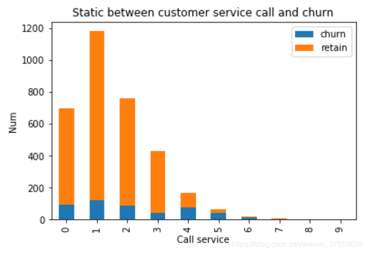
基本上可以看出, 打客戶電話的多少和最終的分類是強相關的, 打電話3次以上的流失率比例急速升高。 這是一個非常關鍵的指標。
基本上可以看出, 打客戶電話的多少和最終的分類是強相關的, 打電話3次以上的流失率比例急速升高。 這是一個非常關鍵的指標。
3 準備資料
好的, 我們已經看了很多,對資料有了一定的理解。 下面我們開始具體對資料進行操作。
3.1 去除無關列
首先, 根據對問題的分析, 我們做第一件事情, 去除三列無關列。 州名, 電話, 區號。
我們和下一步一起做
3.2 轉化成數值型別
對於有些特徵, 本身不是數值型別的, 這些資料是不能被演算法直接使用的, 所以我們來處理一下
# Isolate target data
ds_result = ds['Churn?']
Y = np.where(ds_result == 'True.',1,0)

dummies_int = pd.get_dummies(ds['Int\'l Plan'], prefix='_int\'l Plan')
dummies_voice = pd.get_dummies(ds['VMail Plan'], prefix='VMail')

ds_tmp=pd.concat([ds, dummies_int, dummies_voice], axis=1)

# We don't need these columns
to_drop = ['State','Area Code','Phone','Churn?', 'Int\'l Plan', 'VMail Plan']
df = ds_tmp.drop(to_drop,axis=1)

print "after convert "
print df.head(5)
輸出:
after convert 01
   Account Length  VMail Message  Day Mins  Day Calls  Day Charge  Eve Mins  \
0             128             25     265.1        110       45.07     197.4
1             107             26     161.6        123       27.47     195.5
2             137              0     243.4        114       41.38     121.2
3              84              0     299.4         71       50.90      61.9
4              75              0     166.7        113       28.34     148.3

   Eve Calls  Eve Charge  Night Mins  Night Calls  Night Charge  Intl Mins  \
0         99       16.78       244.7           91         11.01       10.0
1        103       16.62       254.4          103         11.45       13.7
2        110       10.30       162.6          104          7.32       12.2
3         88        5.26       196.9           89          8.86        6.6
4        122       12.61       186.9          121          8.41       10.1

   Intl Calls  Intl Charge  CustServ Calls  _int'l Plan_no  _int'l Plan_yes  \
0           3         2.70               1               1                0
1           3         3.70               1               1                0
2           5         3.29               0               1                0
3           7         1.78               2               0                1
4           3         2.73               3               0                1

   VMail_no  VMail_yes
0         0          1
1         0          1
2         1          0
3         1          0
4         1          0
我們可以看到結果, 所有的資料都是數值型的, 而且除去了對我們沒有意義的列。
3.3 scale 資料範圍
我們需要做一些scale的工作。 就是有些屬性的scale 太大了。
- 對於邏輯迴歸和梯度下降來說, 個屬性的scale 差距太大, 會對收斂速度有很大的影響。
- 我們這裡對所有的都做, 其實可以對一些突出的特徵做這種處理。
#scale
X = df.as_matrix().astype(np.float)

# This is important
from sklearn.preprocessing import StandardScaler
scaler = StandardScaler()
X = scaler.fit_transform(X)

print "Feature space holds %d observations and %d features" % X.shape
print "Unique target labels:", np.unique(y)
輸出:
Feature space holds 3333 observations and 19 features
Unique target labels: [0 1]
其他的呢, 還可以考慮降維等各種方式。 但是再實際使用中, 我們往往首先做出一個模型, 得到一個參考結果, 然後逐步優化。 所以我們準備資料就到這裡。
4 評估演算法
我們會使用多個演算法來計算結果, 然後選擇較好的。 如下
# prepare models
models = []
models.append(('LR', LogisticRegression()))
models.append(('LDA', LinearDiscriminantAnalysis()))
models.append(('KNN', KNeighborsClassifier()))
models.append(('CART', DecisionTreeClassifier()))
models.append(('NB', GaussianNB()))
models.append(('SVM', SVC()))
# evaluate each model in turn
results = []
names = []
scoring = 'accuracy'
for name, model in models:
    kfold = KFold(n_splits=10, random_state=7)
    cv_results = cross_val_score(model, X, Y, cv=kfold, scoring=scoring)
    results.append(cv_results)
    names.append(name)
    msg = "%s: %f (%f)" % (name, cv_results.mean(), cv_results.std())
    print(msg)
# boxplot algorithm comparison
fig = pyplot.figure()
fig.suptitle('Algorithm Comparison')
ax = fig.add_subplot(111)
pyplot.boxplot(results)
ax.set_xticklabels(names)
pyplot.show()
LR: 0.860769 (0.021660)
LDA: 0.852972 (0.021163)
KNN: 0.896184 (0.016646)
CART: 0.920491 (0.012471)
NB: 0.857179 (0.015487)
SVM: 0.921091 (0.016828)
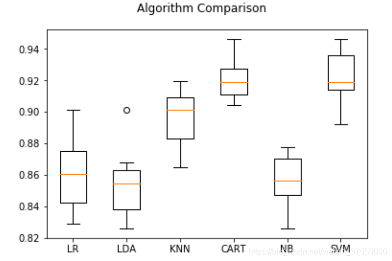
可以看到什麼呢, 看到SVM 和 CART 效果相對較好。
5 提升結果
提升的部分, 如何使用提升演算法。 比如隨機森林: xgboost
from sklearn.ensemble import RandomForestClassifier
num_trees = 100
max_features = 3
kfold = KFold(n_splits=10, random_state=7)
model = RandomForestClassifier(n_estimators=num_trees, max_features=max_features)
results = cross_val_score(model, X, Y, cv=kfold)
print(results.mean())
# 0.954696013379
from sklearn.ensemble import GradientBoostingClassifier
seed = 7
num_trees = 100
kfold = KFold(n_splits=10, random_state=seed)
model = GradientBoostingClassifier(n_estimators=num_trees, random_state=seed)
results = cross_val_score(model, X, Y, cv=kfold)
print(results.mean())
# 0.953197209185
可以看到, 這兩種演算法對單個演算法的提升還是很明顯的。 進一步的, 也可以繼續調整tree的數目, 但是效果應該差不多了。
6 展示結果
這裡展示瞭如何儲存這個演算法, 以及如何取出然後應用。
#store
from sklearn.model_selection import train_test_split
from pickle import dump
from pickle import load
X_train, X_test, Y_train, Y_test = train_test_split(X, Y, test_size=0.33, random_state=7)
from sklearn.ensemble import GradientBoostingClassifier
seed = 7
num_trees