
vue-sticky元件詳解
阿新 • • 發佈:2018-12-17
sticky簡介
- sticky的本意是粘的,粘性的,使用其進行的佈局被稱為粘性佈局。
- sticky是position屬性新推出的值,屬於CSS3的新特性,常用與實現吸附效果。
- 設定了sticky佈局的元素,在檢視視窗時,與靜態佈局的表現一致。
- 但當該元素的位置移出設定的檢視範圍時,其定位效果將變成fixed,並根據設定的left、top等作為其定位引數。
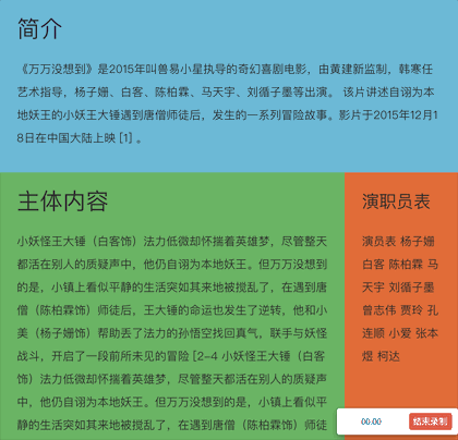
- 具體效果如下,當頁面滾動至下方,原本靜態佈局的「演職員表」將變為fixed佈局,固定在頁面頂部。
sticky相容性
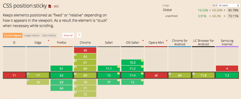
下圖可見,除了IE以外,目前絕大部分瀏覽器都是支援sticky佈局。
需求背景
- 但是實際情況並不如上圖展示的那麼美好,在360安全瀏覽器上,並不支援sticky佈局,即使使用極速模式(使用chrome核心執行)也不支援。
- 另外,筆者在網上找過相關的vue-sticky元件。但是使用起來並不是那麼順手,而且看其原始碼也是一頭霧水,用著不踏實。
- 所以自己寫了一個,希望通過本文能將元件分享出去,也希望將本元件的原理講清楚。讓其他同學在使用的時候能更踏實一些。遇到坑也知道該怎麼去填。希望能幫到大家。
面向人群
- 急於使用vue-sticky元件的同學。直接下載檔案,拷貝程式碼即可執行。
- 喜歡看原始碼,希望瞭解元件背後原理的同學。
其實本sticky元件原理很簡單,看完本文,相信你一定能把背後原理看懂。
剛接觸前端的同學也可以通過本文章養成看原始碼的習慣。打破對原始碼的恐懼,相信自己,其實看原始碼並沒有想象中的那麼困難
元件完整原始碼如下
<!--sticky元件-->
<template>
  <!--盒子容器-->
  <section ref="$box" class="c-sticky-box" :style="boxStyle">
    <!--內容容器-->
    <div ref="$content" class="content" :style="contentStyle">
      <slot></slot>
    </div>
  </section>
</template>

<script>

export default {
  props: {
    top: {
      type: [String],
      default: 'unset',
    },
    left: {
      type: [String],
      default: 'unset',
    },
  },

  data() {
    return {
      boxStyle: {
        position: 'static',
        top: 0,
        left: 0,
        width: 'auto', // 佔位,為了形成資料繫結
        height: 'auto',
      },
      contentStyle: {
        position: 'static',
        top: 0,
        left: 0,
        width: 'auto',
        height: 'auto',
      },
      isFixedX: false, // 是否已經設定為fixed佈局,用於優化效能,防止多次設定
      isFixedY: false, // 是否已經設定為fixed佈局,用於優化效能,防止多次設定
      isSupport: this.cssSupport('position', 'sticky'),
      // isSupport: false,
    }
  },

  mounted() {
    if (!this.isSupport) { // 不支援sticky
      this.getContentSize() // 獲取內容寬高
      this.scrollHandler() // 主動觸發一次位置設定操作
      window.addEventListener('resize', this.onResize)
      window.addEventListener('scroll', this.scrollHandler, true)
    } else {
      this.boxStyle = {
        position: 'sticky',
        top: this.top,
        left: this.left,
      }
    }
  },

  beforeDestroy() {
    if (!this.isSupport) {
      window.removeEventListener('resize', this.onResize)
      window.removeEventListener('scroll', this.scrollHandler, true)
    }
  },

  methods: {
    // 判斷是否支援某樣式的函式
    cssSupport(attr, value) {
      let element = document.createElement('div')
      if (attr in element.style) {
        element.style[attr] = value
        return element.style[attr] === value
      } else {
        return false
      }
    },

    // 獲取dom資料
    getContentSize() {
      // 獲取內容容器寬高資訊
      const style = window.getComputedStyle(this.$refs.$content)

      // 設定盒子容器的寬高,為了後續佔位
      this.boxStyle.width = style.width
      this.boxStyle.height = style.height
    },

    // 頁面縮放重置大小時,重新計算其位置
    onResize() {
      const { $box } = this.$refs
      const { contentStyle } = this
      const boxTop = $box.getBoundingClientRect().top
      const boxLeft = $box.getBoundingClientRect().left

      if (contentStyle.position === 'fixed') {
        contentStyle.top = this.top === 'unset' ? `${boxTop}px` : this.top
        contentStyle.left = this.left === 'unset' ? `${boxLeft}px` : this.left
      }
    },

    scrollHandler() {
      const { $content, $box } = this.$refs
      const { contentStyle } = this
      const boxTop = $box.getBoundingClientRect().top
      const boxLeft = $box.getBoundingClientRect().left
      const contentTop = $content.getBoundingClientRect().top
      const contentLeft = $content.getBoundingClientRect().left

      if (this.top !== 'unset') {
        if (boxTop > parseInt(this.top) && this.isFixedY) {
          this.isFixedY = false
          contentStyle.position = 'static'
        } else if (boxTop < parseInt(this.top) && !this.isFixedY) {
          this.isFixedY = true
          contentStyle.position = 'fixed'
          this.onResize()
        }

        // 當位置距左位置不對時,重新設定fixed物件left的值,防止左右滾動位置不對問題
        if (contentLeft !== boxLeft && this.left === 'unset') {
          this.onResize()
        }
      }

      if (this.left !== 'unset') {
        if (boxLeft > parseInt(this.left) && this.isFixedX) {
          this.isFixedX = false
          contentStyle.position = 'static'
        } else if (boxLeft < parseInt(this.left) && !this.isFixedX) {
          this.isFixedX = true
          contentStyle.position = 'fixed'
          this.onResize()
        }

        // 當位置距左位置不對時,重新設定fixed物件left的值,防止左右滾動位置不對問題
        if (contentTop !== boxTop && this.top === 'unset') {
          this.onResize()
        }
      }
    },
  },

}
</script>
技術難點
sticky效果需要解決這麼幾個問題
- 佔位問題,sticky實現原理,無非是在特定超出檢視時,將內容的佈局設為fixed。但將內容設定為fixed佈局時,內容將脫離文件流,原本佔據的空間將被釋放掉,這將導致頁面空了一塊後其他內容發生位移。
- 頁面resize後位置問題。當使用fixed定位時,其定位將根據頁面進行。若頁面大小發現變化,原顯示的位置可能與頁面變化後的不一致。這時需要重新設定。
- 橫向滾動條問題。本質上和resize是同一個問題,需要監聽scroll事件,當頁面傳送無相關方向的位移時,需要重新計算其位置,例如前面的sticky效果示例中設定了「演職員表」的top值,當其fixed後,滾動X軸,需要重新設定fixed的left引數。讓元素始終位於頁面相同位置
實現思路
-
元件有兩層容器
- 一個是內容slot的容器$content
- 一個是內容容器$content的sticky盒子容器$box
- 即包圍關係為$sticky-box($content(slot))
-
監聽vue的mounted事件
- 這時內容slot已經被渲染出來
- 獲取slot容器$content的寬高,設定到$box容器上
- 設定$box容器寬高是為了當後續$content容器Fixed後,$box容器仍在頁面中佔據空間。
-
監聽scroll事件
- 在事件中獲取容器$content在頁面中的位置,並將其與預設值進行大小比較,判斷$content是否應該fixed
- 怎麼便捷地獲取$content在頁面中的位置呢?直接使用Element.getBoundingClientRect()函式,該函式將返回{left,top}分別表示dom元素距離視窗的距離。詳細可參看MDN文件
- 比較boxTop與預設值top的大小,當boxTop比預設值值要小時,即內容即將移出規定的檢視範圍。這時將內容容器$content設定為fixed。並設定其top值(即預設的top值,吸頂距離),left值與盒子位置相同,故設定為盒子距離的left值
- 當boxTop比預設值值要大時,即內容重新返回的檢視範圍。則將內容容器$content重新設定會靜態佈局,讓其重新回到盒子佈局內部。由於靜態佈局不受left和top的影響,所以不需要設定left和top
- 在scroll事件中,除了Y軸方向上的滾動,還可能發生X軸方向的滾動。這些需要重新設定fixed元素的left值,讓其與盒子容器的left值一致
-
最後,是監聽頁面的resize事件,防止頁面大小變化時,fixed相對頁面的變化。同樣的,重新設定left值
``` // 當位置距左位置不對時,重新設定fixed物件left的值,防止左右滾動位置不對問題 const { $box } = this.$refs const { contentStyle } = this const boxTop = $box.getBoundingClientRect().top const boxLeft = $box.getBoundingClientRect().left if (contentStyle.position === 'fixed') { contentStyle.top = this.top === 'unset' ? `${boxTop}px` : this.top contentStyle.left = this.left === 'unset' ? `${boxLeft}px` : this.left } ```
需要注意的地方
- 目前僅支援top與left值的單獨使用,暫不支援同時設定
- 目前僅支援px單位,暫不支援rem及百分比單位
-
設定內容樣式時需要注意,設定定位相關屬性需要設定在box容器上,例如設定'displCy: inline-block;','verticCl-Clign: top;','margin'
- 設定外觀樣式,如背景,邊框等,則設定在slot內容中
- 即內容content-box以外的設定在box容器中,content-box以內的樣式,則設定在slot內容中
- 盒子容器不需要設定position屬性,即使有也會被沖刷掉。因為程式將內部重新設定position的值
- 同樣的,在樣式中設定盒子容器的left和top值也是無效的,會被程式內部重新設定。只能通過dom屬性值傳遞到元件中進行設定
後續優化
目前本元件僅實現了基本功能,後續還將繼續優化以下功能
-
slot內容中,如果有圖片,如果獲取設定寬高,(監聽所有圖片的load事件,重新設定容器的高寬)
- 目前僅在mounted中獲取slot的寬高,這僅僅是dom元素被渲染,但是dom內容是否載入完畢並不知道的,如img標籤,後續在slot中,監聽所有img標籤的load事件,load中,重新設定元件容器的大小
-
slot內容有變化時,設定容器
- 同樣的,當slot內容變化後,重新設定$content的寬高
- 具體如何實現,暫時還沒有頭緒
-
移動端適配
- 目前只測試了在PC中的效果,暫未在移動端做測試。不排除移動端使用存在坑
-
單位適配
- 目前只支援PX單位,未支援rem,百分百等單位
- left和top值的混合使用,目前只支援單個屬性的使用,暫不支援同時設定