
SVM支援向量機和美麗的畫圖方法
阿新 • • 發佈:2018-12-19
SVM支援向量機python
線性可分的資料初探
生成一點線性可分的資料看看
- 利用sklearn中make_blobs函式,其引數為
- n_samples: int, optional (default=100) The total number of points equally divided among clusters. 待生成的樣本的總數。
- **n_features: **int, optional (default=2) The number of features for each sample. 每個樣本的特徵數。
- centers: int or array of shape [n_centers, n_features], optional (default=3) The number of centers to generate, or the fixed center locations. 要生成的樣本中心(類別)數,或者是確定的中心點。 要生成的樣本中心(類別)數,或者是確定的中心點。
- cluster_std:float or sequence of floats, optional (default=1.0) The standard deviation of the clusters. 每個類別的方差,例如我們希望生成2類資料,其中一類比另一類具有更大的方差,可以將cluster_std設定為[1.0,3.0]。
- center_box: pair of floats (min, max), optional (default=(-10.0, 10.0))
The bounding box for each cluster center when centers are generated at random. - shuffle: boolean, optional (default=True) Shuffle the samples.
- random_state: int, RandomState instance or None, optional (default=None)
If int, random_state is the seed used by the random number generator; If RandomState instance, random_state is the random number generator; If None, the random number generator is the RandomState instance used by np.random.
簡而言之,選擇生成樣本的個數,特徵數,類別數,類方差就足夠用了
%matplotlib inline
import numpy as np
import matplotlib.pyplot as plt
from sklearn.datasets.samples_generator import make_blobs #類資料的生成
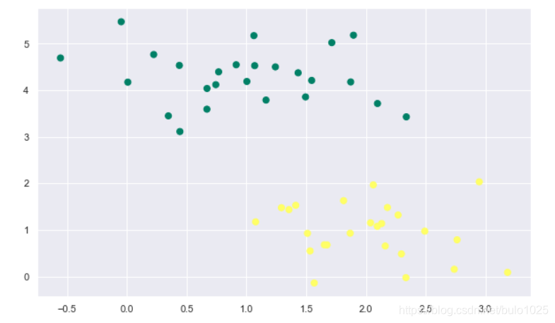
X, y = make_blobs(n_samples=50,n_features=2,centers = 2,
random_state=0, cluster_std=0.60)
print(X.shape) #完全是自己想看一看X的格式
plt.scatter(X[:, 0], X[:, 1], c=y, s=50,marker='o',cmap='summer')
什麼樣的直線可以分開這些點呢
plt.figure(figsize = (10,6))
xfit = np.linspace(-1, 3.5)
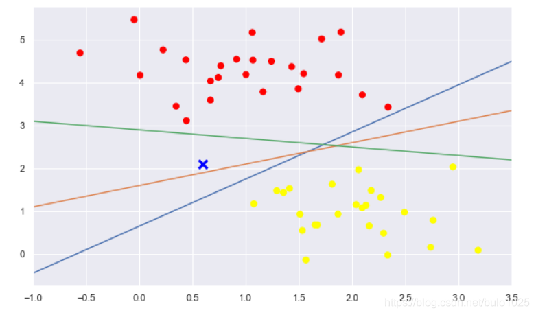
plt.scatter(X[:, 0], X[:, 1], c=y, s=50, cmap='autumn')
plt.plot([0.6], [2.1], 'x', color='blue', markeredgewidth=3, markersize=10)
for m, b in [(1.1, 0.65), (0.5, 1.6), (-0.2, 2.9)]:
plt.plot(xfit, m * xfit + b,)
plt.xlim(-1, 3.5)
選取了三條直線,均可以將這兩類點分離。直觀上,X點歸屬於哪一類,線就應該相應的變化。
SVM的獨特思想:最小間隔最大化
直觀理解
plt.figure(figsize = (8,5))
xfit = np.linspace(-1, 3.5)
plt.scatter(X[:, 0], X[:, 1], c=y, s=50, cmap='autumn')

for m, b, d in [(1, 0.65, 0.33), (0.5, 1.6, 0.55), (-0.2, 2.9, 0.2)]:
    yfit = m * xfit + b
    plt.plot(xfit, yfit, )
    plt.fill_between(xfit, yfit - d, yfit + d, edgecolor='blue',
                     color='#AAAAAA', alpha=0.5)

plt.xlim(-1, 3.5);
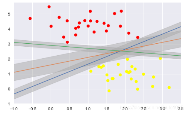
本質上就是陰影部分的區域最大化,分類邊界到最近的點的距離最大化。
訓練
from sklearn.svm import SVC    # "Support vector classifier"
model = SVC(kernel='linear')   #kernel選擇線性的
model.fit(X, y)
進行繪圖
#繪圖函式
def plot_svc_decision_function(model, ax=None, plot_support=True):
"""Plot the decision function for a 2D SVC"""
if ax is None:
ax = plt.gca()
xlim = ax.get_xlim()
ylim = ax.get_ylim()
# create grid to evaluate model
x = np.linspace(xlim[0], xlim[1], 30)
y = np.linspace(ylim[0], ylim[1], 30)
Y, X = np.meshgrid(y, x)
xy = np.vstack([X.ravel(), Y.ravel()]).T
P = model.decision_function(xy).reshape(X.shape)
# plot decision boundary and margins
ax.contour(X, Y, P, colors='k',
levels=[-1, 0, 1], alpha=0.5,
linestyles=['--', '-', '--'])
# plot support vectors
if plot_support:
ax.scatter(model.support_vectors_[:, 0],
model.support_vectors_[:, 1],
s=300, linewidth=1, facecolors='black');
ax.set_xlim(xlim)
ax.set_ylim(ylim)
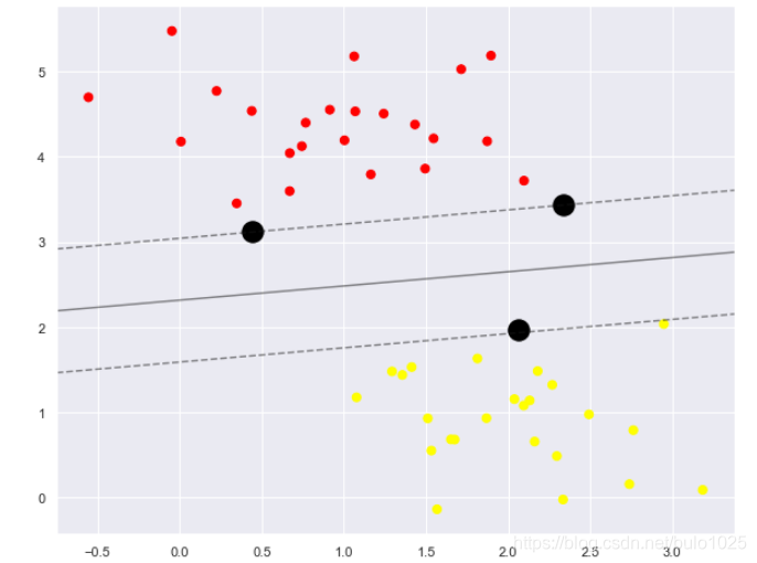
plt.figure(figsize = (10,8))
plt.scatter(X[:, 0], X[:, 1], c=y, s=50, cmap='autumn')
plot_svc_decision_function(model)
-
這條線就是我們希望得到的決策邊界啦
-
觀察發現有3個黑色的點點,它們恰好都是邊界上的點就是我們的support vectors(支援向量)
-
在Scikit-Learn中, 它們儲存在這個位置
support_vectors_(一個屬性)
model.support_vectors_
只要支援向量不變,資料點增加無所謂。