
Draw a Path: Rendering Android VectorDrawables
Draw a Path: Rendering Android VectorDrawables
https://medium.com/androiddevelopers/draw-a-path-rendering-android-vectordrawables-89a33b5e5ebf
In the previous article, we looked at Android’s VectorDrawable format, going into its benefits and capabilities.
We covered how you can define paths which make up the shapes in your assets. VectorDrawable supports a number of ways of actually drawing these shapes that we can use to create rich, flexible, theme-able and interactive
Simple Colors
The simplest way to draw a path is to specify a hard-coded fill/stroke color.
You can define one or both of these properties and only a single fill/stroke can be applied per path (unlike some graphics packages). Fills are drawn first, then any stroke is applied. Strokes are always centered (again unlike some graphics apps which allow inner or outer strokes), require a strokeWidth
strokeLineCap, strikeLineJoinproperties which control the shape of the ends/joins of stroked lines (also strokeMiterLimit for miter line joins). Dashed strokes are not supported.
Both fills and strokes offer separate alpha properties: fillAlpha and strokeAlpha [0–1] both of which default to 1 i.e. fully opaque. If you specify a fillColor or strokeColor with an alpha component then these two values are combined. For example if you specified a 50% transparent red fillColor(#80ff0000) and a 0.5 fillAlpha then the result would be 25% transparent red. The separate alpha attributes make it easier to animate the opacity of a path.
Color Resources
Vectors support the @color resource syntax for both fill and stroke colors:
This allows you to factor out colors for easier maintenance and helps you to restrict your app to a consistent palette.
It also enables you to supply different color values in different configurations using Android’s resource qualifiers. For example you could provide alternate color values in night mode (res/colors-night/colors.xml) or if the device supports wide color gamuts (res/colors-widecg/colors.xml).
Theme Colors
All versions of vectors (back to API14 through AndroidX) support using theme attributes (e.g. ?attr/colorPrimary) to specify colors. These are colors provided by a theme and prove extremely useful for creating flexible assets that you can use in different places in your app.
There are 2 main ways to use theme colors.
Themed fills/strokes
You can directly reference theme colors to fill or stroke paths:
This is useful if you have elements in an asset that you want to differ based on the theme. For example a sports app may theme a placeholder image to display the team’s color; using a single drawable:
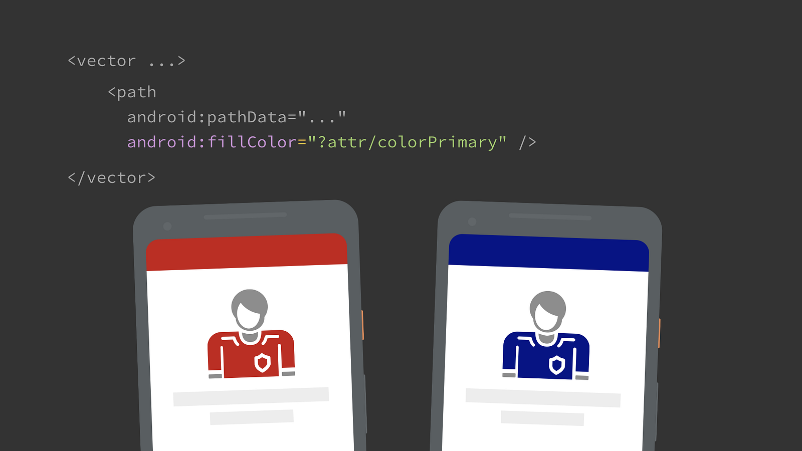
Filling a path with a theme color
Tinting
The root <vector> element offers tint & tintMode attributes:
While you could use this to apply a static tint, this is much more useful in combination with theme attributes. This allows you to change the color of the entire asset depending upon the theme it is inflated against. For example you could tint the icon using ?attr/colorControlNormal which defines the standard color for icons and varies across light and dark themes. This way you can use a single icon across differently themed screens:
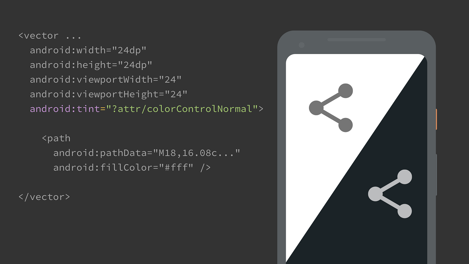
Tinting an icon so that it is appropriately colored on light/dark screens
A benefit of using tints is that you aren’t reliant on the source artwork for your assets (usually from your designer) being the correct color. Applying a standard tint like ?attr/colorControlNormal to icons both gets you themeing and guarantees that assets are exactly the same, correct color.
The tintMode attribute lets you change the blending mode used to tint the drawable, it supports: add, multiply, screen, src_atop, src_over or src_in; corresponding to the equivalent PorterDuff.Mode. The default src_in is usually what you want and treats the image as an alpha mask applying the single tint color to the entire icon, ignoring any color information in the individual paths (although the alpha channel is maintained). For this reason, if you plan to tint icons then it’s best to use a fully opaque fill/stroke color (convention is to use #fff).
You might wonder when to tint the assets and when to use theme colors on individual paths as both can attain similar results? If you want to use theme colors on only some paths, then you have to use them directly. Another consideration can be if your asset has any overlapping rendering. If so then filling with a semi-opaque theme color may not produce the effect you want, but applying a tint may.
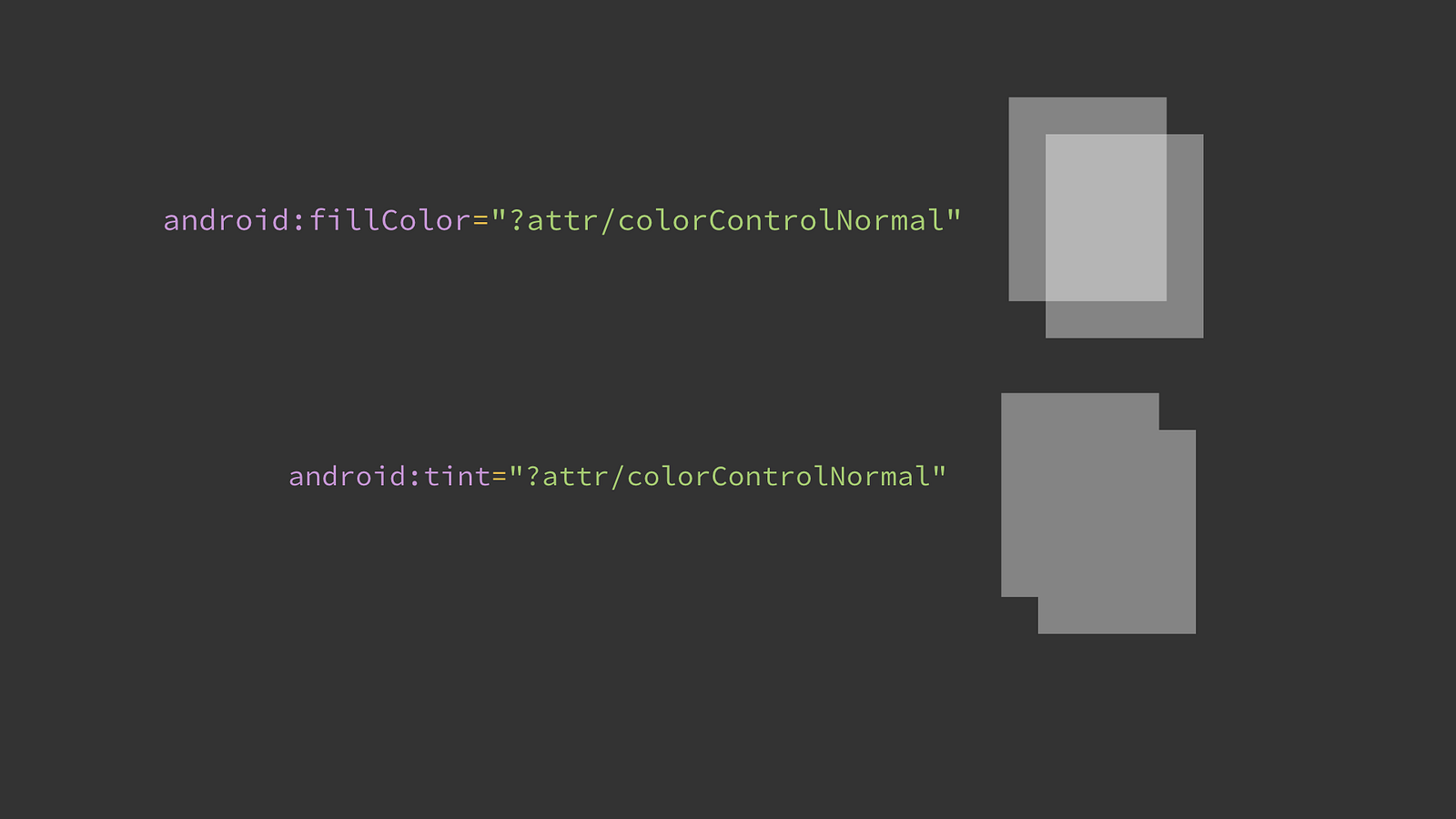
Assets with overlapping paths & semi-opaque theme colors: comparing tint vs fills
Note that you can vary the theme used to inflate the drawable either at the Activity/View level by setting the android:theme attribute, or in code using a ContextThemeWrapper with a specific theme to inflate the vector.
Overlaying the theme `baz`
ColorStateLists
VectorDrawable supports referencing ColorStateLists for fills/strokes. In this way, you can create a single drawable where path(s) change color depending upon the view/drawable’s state (such as pressed, selected, activated etc).

Examples of vectors responding to pressed and selected states
This was introduced in API24 but recently added to AndroidX, from version 1.0.0 bringing support back to API14. This also uses the AndroidX ColorStateList inflater which means that you can also use theme attributes and alpha in the ColorStateList itself (which were themselves only added to the platform in API23).
While similar results could be achieved using multiple drawables in a StateListDrawable, if the rendering differs little between states this reduces duplication and can be easier to maintain.
I’m also a big fan of creating your own states for custom views which can be combined with this support to control elements within an asset e.g. making paths transparent unless a certain state is set.
Gradients
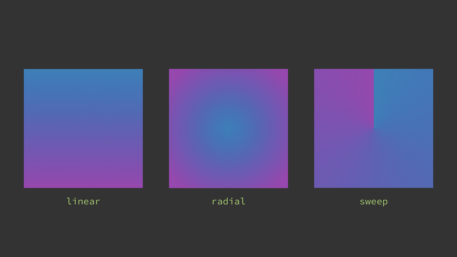
The 3 types of gradients supported
VectorDrawable supports linear, radial and sweep (also known as angular) gradients for both fills and strokes.This is also supported back to API14 via AndroidX. Gradients are declared in their own file in res/colors/ but we can use the inline resource technique to instead declare the gradient within a vector—which can be more convenient:
At build time, the gradient is extracted to its own resource and a reference to it is inserted in the parent element. If you’re going to use the same gradient multiple times it’s better to declare it once and reference it as the inline version will create a new resource each time.
When specifying gradients, any coordinates are in the viewport space from the root vector element. Let’s take a look at each type of gradient and how to use them.
Linear
Linear gradients must specify start/end X/Y coordinates and type="linear".
Radial
Radial gradients must specify a center X/Y and a radius (again in viewport coordinates) and type="radial".
Sweep
Sweep gradients must specify just a center X/Y and type="sweep".
Color Stops
As a convenience gradients let you specify a startColor, centerColor and endColor directly in the gradient. If you need finer grained control or more color stops you can also achieve this by adding child item elements specifying a color and a [0–1] offset (think of this as a percentage of the way through the gradient).
Tile Modes
Linear and radial (but not sweep) gradients offer a concept of tiling — that is if the gradient doesn’t cover the entirety of the path it’s filling/stroking, what to do. The default is clamp, which just continues the start/end colors. Alternatively you can specify repeat or mirror tile modes which… do as their names imply! In the below examples, a radial gradient is defined over the central blue→purple circle, but fills the larger square path.
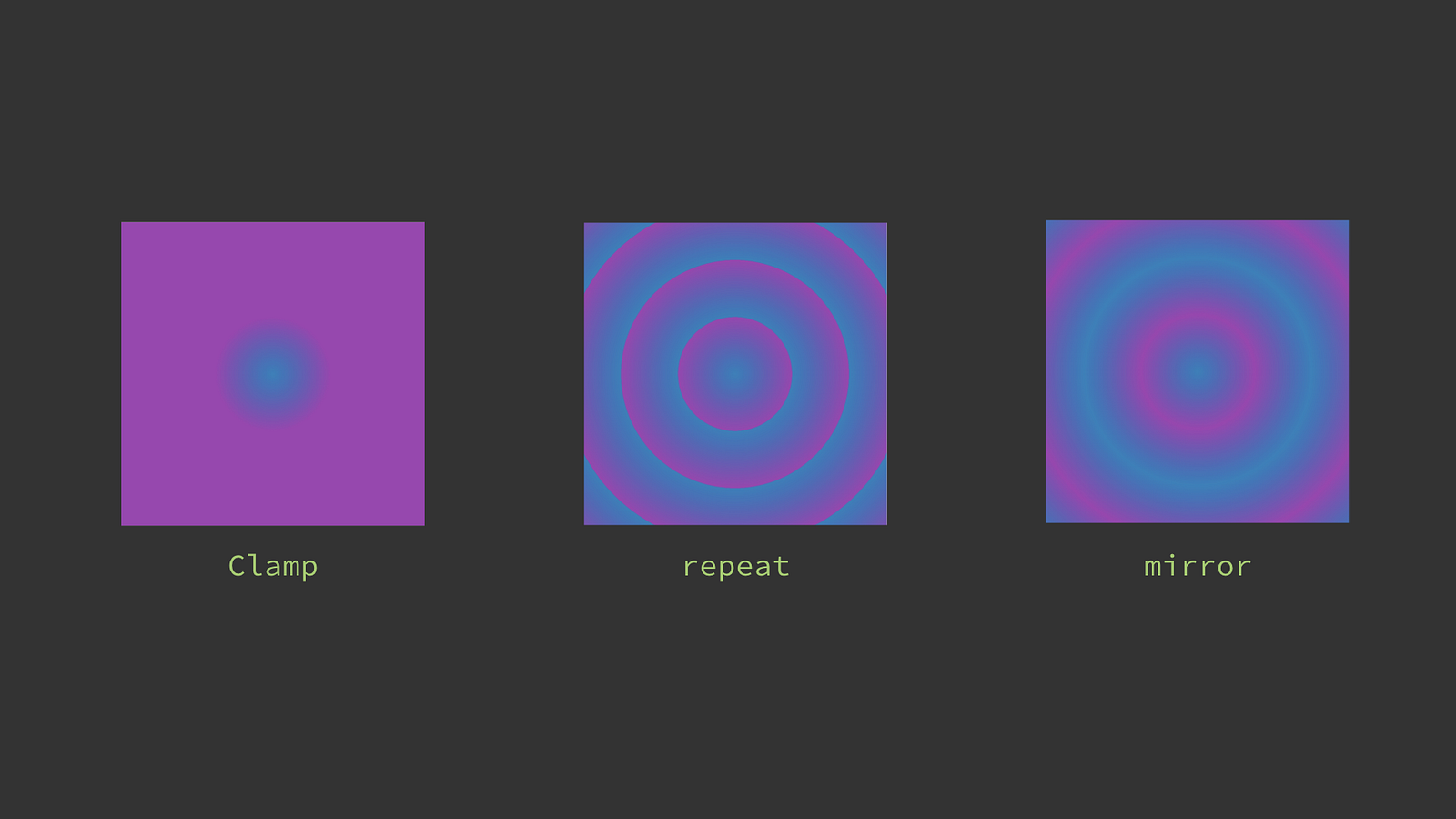
Gradient tile modes
Patterns
We can combine using color stops and tile modes to achieve rudimentary pattern support in vectors. For example, if you specify coinciding color stops, you can achieve abrupt color changes. Combine this with a repeated tile mode and we can create striped pattern. For example here’s a loading indicator made of a single pattern filled shape. By animating the translateX property on the group holding this pattern, we can achieve this effect:
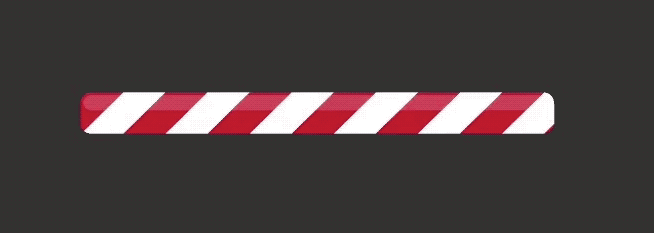
Note that this technique is a far cry from full SVG Pattern support, but it can be useful.
Illustrations

Another lovely illustration by the very talented Virginia Poltrack
Gradients are extremely common in larger vector artwork like illustrations. Vectors can be a good fit for illustrations but be aware of the memory tradeoffs when inflating them at large sizes. We’ll revisit this later in the series.
Shadows
VectorDrawables do not support drop shadow effects; however simple shadows can be approximated using gradients. For example this app icon uses radial gradients to approximate the drop shadow of the white circles and a linear gradient for the shadow below the triangle:
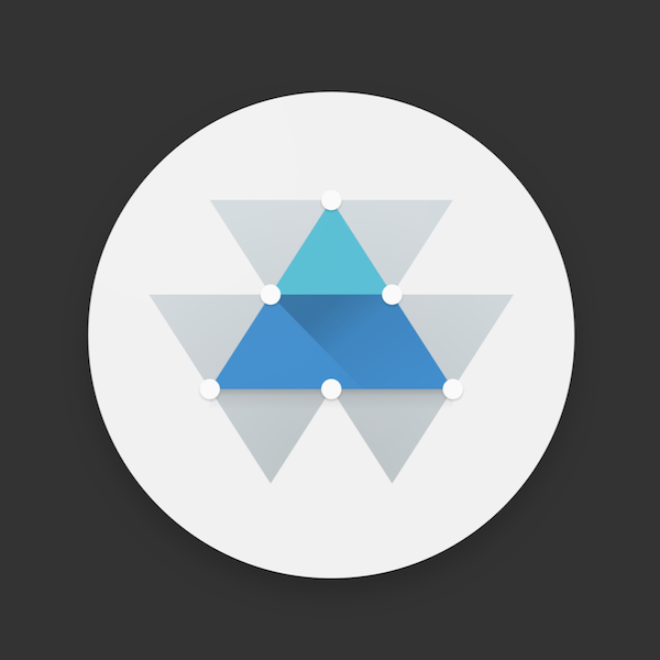
Approximating shadows using gradients
Again, this is a long way from full shadow support as only linear/radial/sweep gradients can be drawn and not along an arbitrary paths. You can approximate some shapes; especially by applying transforms to gradient elements like this example which uses the scaleY property to transform a circle with a radial gradient to an oval shape to create the shadow:

Transforming a path containing a gradient
Color by Numbers
Hopefully this post has shown that VectorDrawables support a number of advanced features that you can use to render more complex assets in your app or even replace multiple assets with a single file, helping you to build slimmer apps.
I’d suggest that all apps should be using theme color tints for icons. ColorStateList and gradient support is more niche, but if you need it, it’s good to know that vectors support those use cases.
The compatibility story with vectors is good so these features can be used today in most apps (more on this in the next installment).
Join us in the next part of our adventures in vector-land:
Coming soon: Using vector assets in Android apps
Coming soon: Creating vector assets for Android
Coming soon: Profiling Android VectorDrawables