
將button變成圓形(有弧度)
阿新 • • 發佈:2018-12-20
border-radius可以將button變成圓形,也可以給div加有弧度邊框
border-radius 規則:
一個值: 四個圓角值相同
兩個值: 第一個值為左上角與右下角,第二個值為右上角與左下角
三個值: 第一個值為左上角, 第二個值為右上角和左下角,第三個值為右下角
四個值: 第一個值為左上角,第二個值為右上角,第三個值為右下角,第四個值為左下角。
樣式:
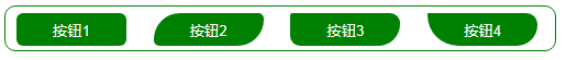
<!DOCTYPE html>
<html>
	<head>
		<meta charset="UTF-8">
		<title></title>
		<style type="text/css">

			.btn{
				width: 100px;
				height: 30px;
				background: green;
				border: none;
				color: white;
				margin: 6px 10px;
			}
			.btnStyle1{
				border-radius: 6px;
			}
			.btnStyle2{
				border-radius: 26px 6px;
			}
			.btnStyle3{
				border-radius: 6px 26px 60px;
			}
			.btnStyle4{
				border-radius: 6px 126px 236px 346px;
			}
			.bolder{
				border: solid 1px green;
				width: 500px;
				height: 40px;
				border-radius: 10px;
			}
		</style>
	</head>
	<body>
		<div class="bolder">
		<button class="btn btnStyle1">按鈕1</button>
		<button class="btn btnStyle2">按鈕2</button>
		<button class="btn btnStyle3">按鈕3</button>
		<button class="btn btnStyle4">按鈕4</button>
		</div>
	</body>
</html>
有時候border-radius會失效
解決辦法:萬能的!important;
在border-radius屬性裡面新增 !important,讓瀏覽器首選執行這個語句
border-radius: 6px !important;CSS中的!important一般都是用於對低版本的除了iE 6 ,用來做hack的,後面綴上了!important的css語句,讓瀏覽器首選執行這個語句,因為css有繼承的樣式,加上!importanrt可以覆蓋父級的樣式。