Jquery軌道圖外掛 Subway Map 解釋
I have always been fascinated by the visual clarity of the London Underground map. Given the number of cities that have adopted this mapping approach for their own subway systems, clearly this is a popular opinion. At a conference some years back, I saw a poster for the Yahoo! Developer Services. They had taken the concept of a subway map and applied it to create a
- University departments, offices, student groups
- Government
- Open Source projects
- Internet startups by category
Fast-forward to now. Finally, with the advent of HTML5 <canvas> element and jQuery, I felt it was now possible to implement this in a way that with a little bit of effort, anyone who knows HTML can easily create a subway map. I felt a jQuery plugin was the way to go as I had never created one before and also it seemed like the most well-suited for the task. My goals:
- Anyone should be able to create a beautiful, interactive subway map visualization for their website using HTML markup
- The map should be as faithful as possible to the London Underground map style with smooth curves and interchange connectors and 45-degree diagonals
- The map size, line width and colors should all be customizable
- Stations, interchanges and linked interchanges should be distinguishable from each other
- The markup used to create the map should be search engine friendly
With these goals in mind, I started creating my jQuery plugin. A few days of concentrated effort later, I had a working subwayMap plugin and am quite pleased with the result. You can download the plugin below and documentation follows in this post. I hope you will give the plugin a try and find it useful.
Download
[download id=”11″] or get it on GitHub
Step-by-Step Guide
Here is a guide to using the Subway Map Visualization jQuery Plugin. Before you get started, there’s one thing you’ll want to keep in mind — beautiful subway maps are never automatic; they are almost always the result of care in design and placement to ensure that the resulting map is functional, legible and beautiful. This plugin is just a tool…you will still need to plan and design your map in order to produce a good result.
Demo: Here’s a demo of the finished map described in this guide.
Referencing the Plugin
The subwayMap plugin is referenced similar to other jQuery plugins by adding a script element to the HTML markup.
2.<script src="jquery.subwayMap-0.5.0.js" type="text/javascript">
Using the Plugin
The subwayMap plugin is called using a jQuery selector as follows:
1.$("#sampleselector").subwayMap({ debug: true });
The only supported option (at present) is “debug” which has a default value of “false”. Setting it to true will display some debug statements in the JS console.
HTML Markup for Plugin
Like most navigation plugins, subwayMap uses an unordered list. The basic markup consists of the following:
- An outer DIV element to control general placement, background etc.
- One UL element for each “line” desired in the map.
- For each UL element, one or more LI elements with either plain text or an A element with plain text. An LI element provides coordinates for drawing lines and/or markers on the map.
Each of the DIV, UL and LI elements make use of custom attributes to convey how the map should be rendered. These are explained in the Step-by-Step section below.
Map Rendering
The subwayMap plugin renders the map on a grid with the origin at top left (i.e. X coordinates extend from left to right and Y coordinates extend from top to bottom). The size of this grid depends on a value you define called “cellSize.” For example, if you define a cellSize of 50 and specify a grid of 20 columns by 10 rows, then you will have a map that is 1000 pixels wide and 500 pixels high. For each UL element, a <canvas> element that is the size of the grid is created and positioned at (0,0). Subsequent <canvas> elements are stacked on top of the prior <canvas> elements. Station and interchange markers for each line are also created in separate, stacked <canvas> elements, however their z-Index is always higher than that of the <canvas> elements containing the lines. Finally, all labels are added aselements with the highest z-Index of all the elements in the map.
Creating a SubwayMap Step-by-Step
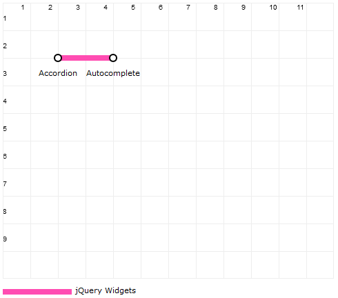
Now that the basics are out of the way, let’s step through the process of creating a subway map from scratch. I am using jQuery UI as my mapping subject, creating a line for Widgets, Interactions and Effects. Here’s a map and the markup used to create it:
01.<div data-columns="12" data-rows="10" data-cellSize="40" data-legendId="legend" data-textClass="text" data-gridNumbers="true" data-grid="true" data-lineWidth="8">
02.<ul data-color="#ff4db2" data-label="jQuery Widgets">
05.</ul>
06.</div>
07.<div id="legend"></div>
08.
09.<script type="text/javascript">
10.$(".subway-map").subwayMap({ debug: true });
11.</script>
This code looks way more complicated than it actually is. Most of the verbosity comes from the many “data-*” attributes that the plugin uses for all customizations. Here are the attributes being used in the code above:
(DIV) data-columns: The number of columns the map will display (12 in this example)
(DIV) data-rows: The number of rows the map will display (10 in this example)
(DIV) data-cellSize: The width and height of each cell in pixels (40 in this example, resulting in a grid that is 480px wide by 400px tall)
(DIV) data-legendId: The ID of an HTML element into which the map legend will be appended (“legend” in this example)
(DIV) data-textClass: The CSS class to use for text labels in the map (“text” in this example)
(DIV) data-grid: True or false, to show or hide a grid that is useful during map construction. The default is false (“true” in this example)
(DIV) data-gridNumbers: True or false, to show or hide numbers on the grid. Only applies if data-grid=”true” (“true” in this example)
(DIV) data-lineWidth: The width in pixels for each line. The default is 10 pixels. (8 in this example)
(UL) data-color: The color of the line in standard CSS RGB notation (#ff4db2 in this example)
(UL) data-label: The label for the line that will be displayed in the legend (“jQuery Widgets” in this example)
(LI) data-coords: The X,Y coordinate pair where the line should be drawn to from its last location (or the starting location if it’s the first LI element)
As you can see from the illustration, the result of the sample markup was a grid with numbers, a line drawn from (2,2) to (4,2) and finally markers at both coordinate locations. The markers are automatically added whenever you have any content in your LI element and later, we’ll see how you can override the marker type.
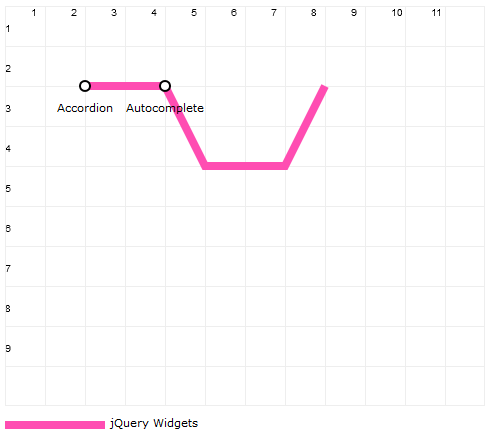
Now, let’s extend this line a bit, by adding a few more LI elements. For brevity, I will omit the overall definition and just show the LI elements here:
3.<li data-coords="5,4"></li>
4.<li data-coords="7,4"></li>
5.<li data-coords="8,2"></li>
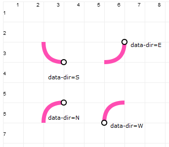
The resulting image is as you would expect. However, it is not very pretty to look at. To make it nicer, we need to add some curves. The plugin provides four directional curves that can be used anytime the difference between both X and Y start and end coordinates is exactly 1. Think of it like plumbing pipes…in order to make a right angle, you introduce an elbow joint. This is somewhat similar. In order to make a smooth, 90-degree curve, you use one cell for the curve as illustrated below:
To make a curve, you add a “data-dir” attribute to the LI element that defines the coordinates for the end of the curve. The value of this attribute is directional – E, W, N or S – indicating the direction in which the line will first go before making a right-angle to the coordinate referenced by that LI element. Let’s continue with our example to see this in action:
3.<li data-coords="5,3" data-dir="E"></li>
4.<li data-coords="6,4" data-dir="S"></li>
5.<li data-coords="7,4"></li>
6.<li data-coords="8,3" data-dir="E"></li>
7.<li data-coords="8,2"></li>
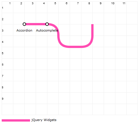
To get the curves, some of the coordinates had to be changed in order to achieve the X and Y coordinate difference of exactly “1”. Note the additional “data-dir” attribute that determines the direction of the curve. The final result is a line that is similar, but not the same as the original and definitely more pleasing to the eye.
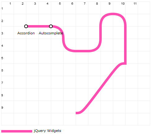
Let’s make the line loop around a bit and then go south on a diagonal run.
3.<li data-coords="5,3" data-dir="E"></li>
4.<li data-coords="6,4" data-dir="S"></li>
5.<li data-coords="7,4"></li>
6.<li data-coords="8,3" data-dir="E"></li>
7.<li data-coords="8,2"></li>
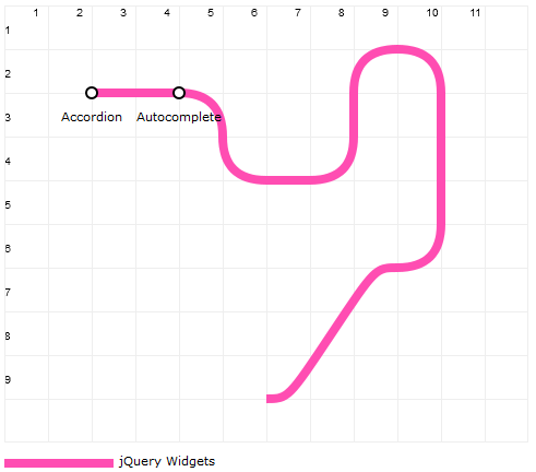
The diagonal line was drawn correctly, but notice the small curves at the beginning and end. These are automatically added when the difference between the X and Y coordinates of the start and end are equal and greater than 1 (i.e. a diagonal). Unfortunately, this isn’t pretty to look at. To correct this we have to reduce our diagonal by one row and one column and introduce a curve like this:
3.<li data-coords="5,3" data-dir="E"></li>
4.<li data-coords="6,4" data-dir="S"></li>
5.<li data-coords="7,4"></li>
6.<li data-coords="8,3" data-dir="E"></li>
7.<li data-coords="8,2"></li>
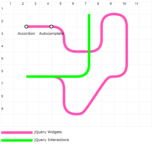
And there we have it, nice curves again and no sharp turns. Let’s wrap-up this line (no pun intended) and move on to multiple lines, markers and labels. I have now updated the markup to extend the first line a little and then added a second line shown in green labeled “jQuery Interactions.”
01.<div data-columns="12" data-rows="10" data-cellsize="40" data-legendid="legend" data-textclass="text" data-gridnumbers="true" data-grid="true" data-linewidth="8">
02.<ul data-color="#ff4db2" data-label="jQuery Widgets">
03.<ul data-color="#ff4db2" data-label="jQuery Widgets"><li data-coords="2,2"><ahref=>Accordion</a></li></ul>
04.</ul>
05.<ul data-color="#ff4db2" data-label="jQuery Widgets">
06.<ul data-color="#ff4db2" data-label="jQuery Widgets"><li data-coords="4,2"><ahref=>Autocomplete</a></li></ul>
07.</ul>
08.<ul data-color="#ff4db2" data-label="jQuery Widgets">
09.<ul data-color="#ff4db2" data-label="jQuery Widgets"><li data-coords="5,3" data-dir="E"></li></ul>
10.</ul>
11.<ul data-color="#ff4db2" data-label="jQuery Widgets">
12.<ul data-color="#ff4db2" data-label="jQuery Widgets"><li data-coords="6,4" data-dir="S"></li></ul>
13.</ul>
14.<ul data-color="#ff4db2" data-label="jQuery Widgets">
15.<ul data-color="#ff4db2" data-label="jQuery Widgets"><li data-coords="7,4"></li></ul>
16.</ul>
17.<ul data-color="#ff4db2" data-label="jQuery Widgets">
18.<ul data-color="#ff4db2" data-label="jQuery Widgets"><li data-coords="8,3" data-dir="E"></li></ul>
19.</ul>
20.<ul data-color="#ff4db2" data-label="jQuery Widgets"><li data-coords="8,2"></li></ul>
21.</div>
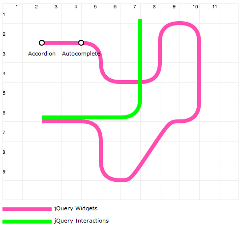
In this map, there is a portion where both lines overlap. This is a fairly common situation and if you do nothing, the line that is drawn last will be at the top. This is less than ideal for communicating information, let alone train routes. To solve this problem, the plugin allows you to “shift” a line in X and/or Y directions by a multiple of the chosen line thickness.
(UL) data-shiftCoords: The number of line-widths by which line should be shifted in any direction specified as an X,Y pair with negative values indicating shift closer to the origin (0,0). You could manually do the shift by specifying precise coordinates, however this can make the line more complicated to define. (Example: data-shiftCoords=”-1,0″ means move the line to the left by 1 line width.)
1.<ul data-color="#00ff00" data-label="jQuery Interactions" data-shiftCoords="0,-1">
With the above change, our map now looks like this:
Much nicer and simpler since we did not have to make any changes to the individual line coordinates. Next, let’s add some markers. The plugin supports three types of markers: stations, interchanges and extended interchanges. These are always black-and-white (or white-and-black) and can be placed anywhere on a line. The attributes for markers are:
(UL) data-reverseMarkers: If the markers should be rendered white on black instead of the default, black on white. The default is “false”.
(LI) data-marker: Can be either “station” or “interchange.” Will produce a different marker for each. Value may be prefixed by “@” to indicate that the LI element is solely for indicating the position of the marker and should not be used as a coordinate defining the path of the line. (Examples: data-marker=”station” or data-marker=”@interchange”)
IMPORTANT: Markers are displayed only if the LI element contains content. Interchange markers ignore any coordinate shift values specified for the line.
(LI) data-markerInfo: For “interchange” or “@interchange” markers, this attribute is used to define scenarios in which the interchange marker has to “stretch” across multiple lines or connect lines that are not next to each other. The attribute value consists of a letter “v” for vertical or “h” for horizontal, followed by a number representing the number of line widths to stretch (example: v3 or h4). The marker is rendered at the coordinate position specified and extends either vertically upwards or horizontally to the right.
While it is easy and convenient to use the LI elements that define line coordinates to also define markers, sometimes this does not yield the best result. The marker may appear off by a few pixels. In these cases, it is best to add an LI element for the marker, use the “@” prefix and provide precise coordinates with decimal places (Example: 1.5,2.25).
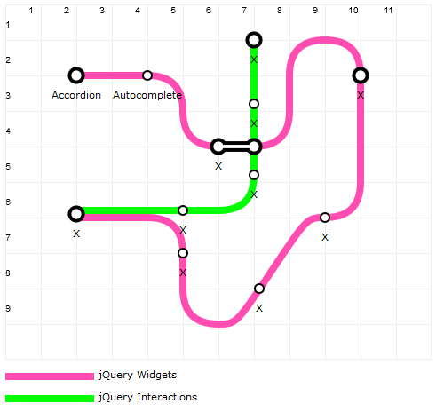
Here is the markup and map again, updated with station and interchange markers.
01.<div data-columns="12" data-rows="10" data-cellsize="40" data-legendid="legend" data-textclass="text" data-gridnumbers="true" data-grid="false" data-linewidth="8">
02.<ul data-color="#ff4db2" data-label="jQuery Widgets">
03.<ul data-color="#ff4db2" data-label="jQuery Widgets">
04.<li data-coords="2,2" data-marker="interchange"><ahref=>Accordion</a></li>
06.<li data-coords="5,3" data-dir="E"></li>
07.<li data-coords="5,7" data-marker="@station">X</li>
08.</ul>
09.</ul>
10.<!-- marker-only node -->
11.<ul data-color="#ff4db2" data-label="jQuery Widgets">
12.<ul data-color="#ff4db2" data-label="jQuery Widgets">
13.<li data-coords="6,4" data-dir="S" data-marker="interchange" data-markerinfo="h5">X</li>
14.<li data-coords="7,4"></li>
15.<li data-coords="7.15,8" data-marker="@station">X</li>
16.</ul>
17.</ul>
18.<!-- marker-only node, moved to the right by 0.15 -->
19.<ul data-color="#ff4db2" data-label="jQuery Widgets">
20.<li data-coords="8,3" data-dir="E"></li>
21.<li data-coords="8,2"></li>
22.<li data-coords="9,1" data-dir="N"></li>
23.<li data-coords="10,2" data-dir="E" data-marker="interchange">X</li>
24.<li data-coords="10,5"></li>
25.<li data-coords="9,6" data-dir="S" data-marker="station">X</li>
26.<li data-coords="6,9"></li>
27.<li data-coords="5,8" data-dir="W"></li>
28.<li data-coords="5,7"></li>
29.<li data-coords="4,6" data-dir="N"></li>
30.<li data-coords="2,6">Tabs</li>
31.</ul>
32.<ul data-color="#00ff00" data-label="jQuery Interactions" data-shiftCoords="0,-1">
33.
34.<!-- marker-only node, moved up by 0.10 -->
35.<ul>
36.<li data-coords="5,6" data-marker="@station">X</li>
37.<li data-coords="6,6"></li>
38.<li data-coords="7,3" data-marker="@station">X</li>
39.<li data-coords="7,5" data-dir="E" data-marker="station">X</li>
40.<li data-coords="7,1" data-marker="interchange">X</li>
41.</ul>
42.</div>
43.<div id="legend"></div>
I used the label “X” for all the station or interchange names. The only thing left to do is change the labels and also position them so they don’t appear on top of the line. The attribute used for positioning the labels is:
(LI) data-labelPos: Specifies where the label should be displayed using a directional abbreviation. Supported values are N, E, S, W, NE, NW, SE, SW. (Default is “S”). Sometimes your label may be too long and text-wrap may be needed. To do this, you can use “\n” within the text of the label (<br />will not work since the only markup supported for a label is the <a> element).
Labels are added as absolutely positioned <span> elements and when the map is added inside a DOM element with a complex, CSS layout, they may not always appear in the right place.
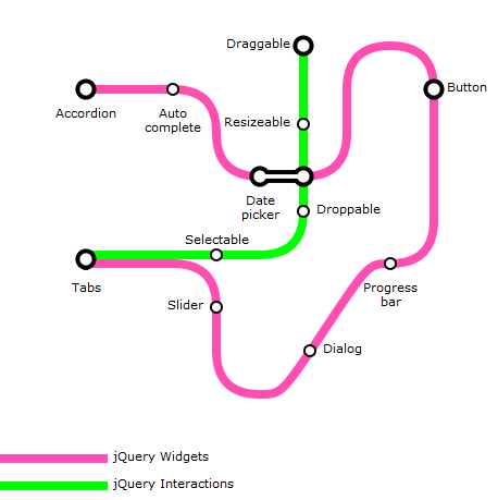
Let’s set the label text and position, turn off the grid and look at the final markup and rendered map.
01.<div data-columns="12" data-rows="10" data-cellsize="40" data-legendid="legend" data-textclass="text" data-gridnumbers="true" data-grid="false" data-linewidth="8">
02.<ul data-color="#ff4db2" data-label="jQuery Widgets">
03.<ul data-color="#ff4db2" data-label="jQuery Widgets">
04.<li data-coords="2,2" data-marker="interchange"><ahref=>Accordion</a></li>
06.<li data-coords="5,3" data-dir="E"></li>
07.<li data-coords="5,7" data-marker="@station" data-labelpos="W">Slider</li>
08.</ul>
09.</ul>
10.<!-- marker-only node -->
11.<ul data-color="#ff4db2" data-label="jQuery Widgets">
12.<ul data-color="#ff4db2" data-label="jQuery Widgets">
13.<li data-coords="6,4" data-dir="S" data-marker="interchange" data-markerinfo="h5">Date\npicker</li>
14.<li data-coords="7,4"></li>
15.<li data-coords="7.15,8" data-marker="@station" data-labelpos="E">Dialog</li>
16.</ul>
17.</ul>
18.<!-- marker-only node, moved to the right by 0.15 -->
19.<ul data-color="#ff4db2" data-label="jQuery Widgets">
20.<li data-coords="8,3" data-dir="E"></li>
21.<li data-coords="8,2"></li>
22.<li data-coords="9,1" data-dir="N"></li>
23.<li data-coords="10,2" data-dir="E" data-marker="interchange" data-labelpos="E">Button</li>
24.<li data-coords="10,5"></li>
25.<li data-coords="9,6" data-dir="S" data-marker="station">Progress\nbar</li>
26.<li data-coords="6,9"></li>
27.<li data-coords="5,8" data-dir="W"></li>
28.<li data-coords="5,7"></li>
29.<li data-coords="4,6" data-dir="N"></li>
30.<li data-coords="2,6">Tabs</li>
31.</ul>
32.<ul data-color="#00ff00" data-label="jQuery Interactions" data-shiftCoords="0,-1">
33.
34.<!-- marker-only node, moved up by 0.10 -->
35.<ul>
36.<li data-coords="5,6" data-marker="@station" data-labelpos="N">Selectable</li>
37.<li data-coords="6,6"></li>
38.<li data-coords="7,3" data-marker="@station" data-labelpos="W">Resizeable</li>
39.<li data-coords="7,5" data-dir="E" data-marker="station" data-labelpos="E">Droppable</li>
40.<li data-coords="7,1" data-marker="interchange" data-labelpos="W">Draggable</li>
41.</ul>
42.</div>
43.<div id="legend"></div>
There you have it…a map that faithfully reproduces the style of the London Underground map, but hopefully, is not too difficult for you to create once you get familiar with the custom attributes required in the HTML markup to render the map. Enjoy!
Reference
(DIV) data-columns: The number of columns the map will display (default=10)
(DIV) data-rows: The number of rows the map will display (default=10)
(DIV) data-cellSize: The width and height of each cell in pixels (default=100)
(DIV) data-legendId: The ID of an HTML element into which the map legend will be appended
(DIV) data-textClass: The CSS class to use for text labels in the map
(DIV) data-grid: True or false, to show or hide a grid that is useful during map construction (default=false)
(DIV) data-gridNumbers: True or false, to show or hide numbers on the grid. Only applies if data-grid=”true” (default=true)
(DIV) data-lineWidth: The width in pixels for each line (default=10)
(UL) data-color: The color of the line in standard CSS RGB notation
(UL) data-label: The label for the line that will be displayed in the legend
(UL) data-shiftCoords: The number of line-widths by which line should be shifted in any direction specified as an X,Y pair with negative values indicating shift closer to the origin (default=0,0)
(UL) data-reverseMarkers: If the markers should be rendered white on black instead of the default, black on white (default=false)
(LI) data-coords: The X,Y coordinate pair where the line should be drawn to from its last location (or the starting location if it’s the first LI element)
(LI) data-marker: Can be either “station” or “interchange.” Will produce a different marker for each. Value may be prefixed by “@” to indicate that the LI element is solely for indicating the position of the marker and should not be used as a coordinate defining the path of the line
(LI) data-markerInfo: For “interchange” or “@interchange” markers, this attribute is used to define scenarios in which the interchange marker has to “stretch” across multiple lines or connect lines that are not next to each other. The attribute value consists of a letter “v” for vertical or “h” for horizontal, followed by a number representing the number of line widths to stretch (example: v3 or h4). The marker is rendered at the coordinate position specified and extends either vertically upwards or horizontally to the right.
(LI) data-labelPos: Specifies where the label should be displayed using a directional abbreviation. Supported values are N, E, S, W, NE, NW, SE, SW (default=S)


