
CSS3設定元素顯示3D效果
阿新 • • 發佈:2018-12-26
顯示效果:
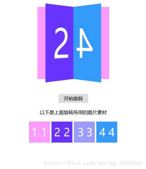
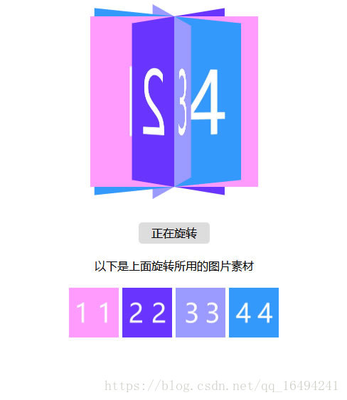
以下是圖片素材


以下是頁面程式碼部分
<!doctype html> <html> <head> <meta charset="utf-8"> <title>CSS3設定圖片顯示3D效果</title> <meta charset="UTF-8"> <meta http-equiv="X-UA-Compatible" content="IE=edge,chrome=1"/> <meta name="viewport" content="width=device-width,initial-scale=1, maximum-scale=1, minimum-scale=1, user-scalable=no"> <meta http-equiv="pragma" content="no-cache"> <meta http-equiv="Cache-Control" content="no-cache"> <meta http-equiv="Expires" content="0"> <meta name="apple-mobile-web-app-capable" content="yes"> <meta name="apple-mobile-web-app-status-bar-style" content="black"> <meta name="format-detection" content="telephone=no"> <meta name="apple-mobile-web-app-title" content=""> <style type="text/css"> *{ margin:0; padding:0;} html{ max-width:640px; min-width:320px; margin:0 auto;} html,body{ display:block; width:100%; height:100%;} body{ font-family:"PingFangSC-Regular","sans-serif","STHeitiSC-Light","微軟雅黑","Microsoft YaHei"; -webkit-user-select:none; user-select:none; -webkit-touch-callout:none; touch-callout:none; } #box{ width:300px; height:300px; margin:0 auto; position:relative; /*設定從何處檢視一個元素的角度*/ -webkit-perspective:1200px; perspective:1200px; /*設定一個3D元素的基數位置*/ -webkit-perspective-origin:center center; perspective-origin:center center; /*讓轉換的子元素保留3D轉換 -- preserve-3d:表示所有子元素在3D空間中呈現*/ -webkit-transform-style:preserve-3d; transform-style:preserve-3d; -webkit-transform:scale(.8); transform:scale(.8); } .roateBox{ -webkit-animation:roateBox 10s linear infinite; animation:roateBox 10s linear infinite; } @-webkit-keyframes roateBox{ 0%{ -webkit-transform:rotateY(0) scale(.8);} 100%{ -webkit-transform:rotateY(-360deg) scale(.8);} } @keyframes roateBox{ 0%{ transform:rotateY(0) scale(.8);} 100%{ transform:rotateY(-360deg) scale(.8);} } #box img{ width:100%; height:100%; object-fit:contain; position:absolute; left:0; top:0;} #box img:nth-child(1){ -webkit-transform:rotateY( 0deg); transform:rotateY( 0deg);} #box img:nth-child(2){ -webkit-transform:rotateY( 45deg); transform:rotateY( 45deg);} #box img:nth-child(3){ -webkit-transform:rotateY( 90deg); transform:rotateY( 90deg);} #box img:nth-child(4){ -webkit-transform:rotateY(135deg); transform:rotateY(135deg);} #btn{ width:100px; height:30px; line-height:30px; margin:20px auto; text-align:center; border-radius:5px; background-color:#ddd; cursor:pointer;} #list{ text-align:center;} #list img{ width:70px;} </style> </head> <body> <div id="box"> <img src="1.jpg" /> <img src="2.jpg" /> <img src="3.jpg" /> <img src="4.jpg" /> </div> <div id="btn">開始旋轉</div> <div id="list"> <div>以下是上面旋轉所用的圖片素材<br> </div> <div> <img src="1.jpg" /> <img src="2.jpg" /> <img src="3.jpg" /> <img src="4.jpg" /> </div> </div> <script type="text/javascript"> document.getElementById('btn').onclick = function(){ document.getElementById('box').setAttribute('class','roateBox'); document.getElementById('btn').innerHTML = '正在旋轉'; } </script> </body> </html>