Integrating DIY Feature into IKEA App
With the User Journey Map, Consumer’s Pain points were understood, and the opportunities were uncovered.
With the newly integrated feature we’re designing, consumers should be able to find DIY projects, tutorial and visual instruction to do the DIY on IKEA app.
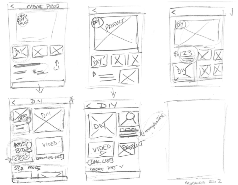
IdeationWe conducted Design Studio, in which we took 5 minutes to hand-sketch the wireframes of the first 2 screens of the app. We did 2 rounds of sketching to generated ideas. We critiqued and voted on the features we liked from each sketch of each round.


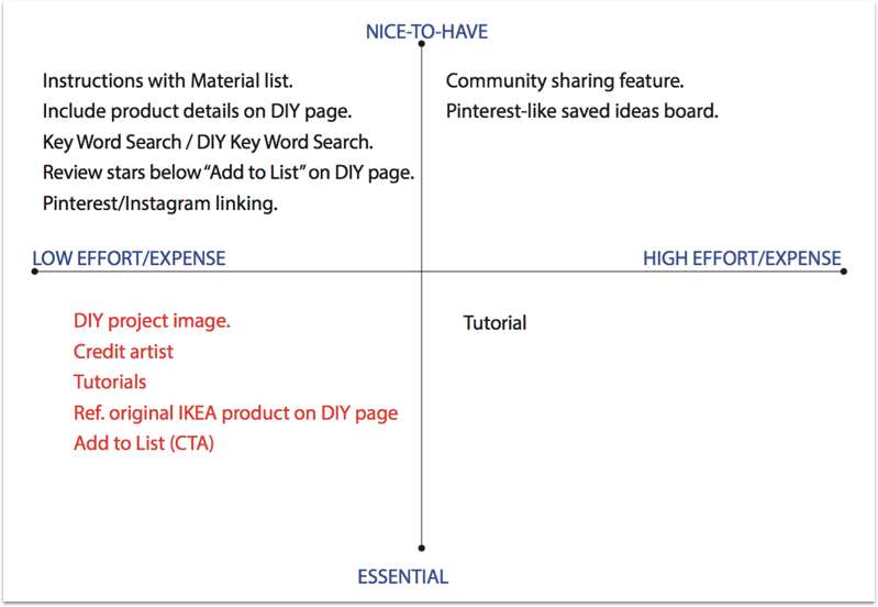
We then discussed about the features we wanted to be included in the prototype towards Minimum Viable Product. Some features are nice to have, but could be overwhelming at launch, so we saved them for future potential upgrades.


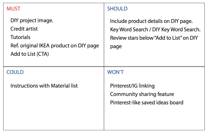
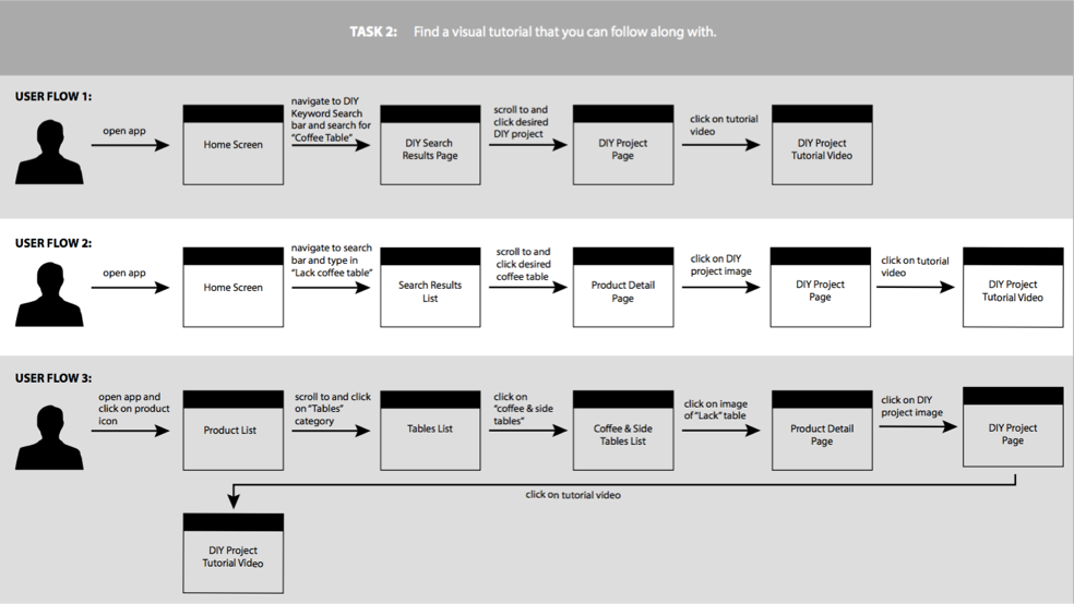
By using the MoSCoW method, we did Feature Prioritization, and Identified the features Must have, Should have, Could have and Won’t have, we prioritized Must-Have features in the prototype. We then created the User Flow to visualize how consumers should navigate to app and get what they want.
User Flow

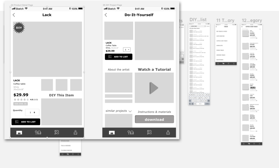
We created Wireframes and low-fi prototype.

Usability TestThe purpose of this usability research study is to evaluate the learnability and easiness of using the app, efficiency of completing tasks, memorability of navigating, number of errors made, and the satisfaction of using the app.
We designed Scenarios & Tasks as following.
- You would like to update your living room with a new coffee table for a more personalized style. Add the LACK coffee table to your shopping list and view your shopping list.
- You saw a DIY project featuring the Lack coffee table and want to recreate this project. Find the visual tutorial you can follow along with.
- You are inspired to DIY your LACK coffee table to give your apartment a unique style. Find the materials that are needed for this project.We tested the low-fi prototype by conducted two rounds of Usability Testing with four participants each round. Each participant was given three tasks and a post-test questionnaire to complete. Each designer facilitated, observed, and audio recorded their usability testing session.
We also designed Metrics for Evaluation as following. The Learnability of using the system measured by easiness of use, the Efficiency of the system measured by the completion rate, the number of Errors experienced, and the Satisfaction, likelihood of using the app.
After each session was over, we asked the 4 testing participants to take a post-test questionnaire for which we asked them to rate the statements below from a scale of 1–5 with 1 being Strongly Disagree and 5 being Strongly Agree.

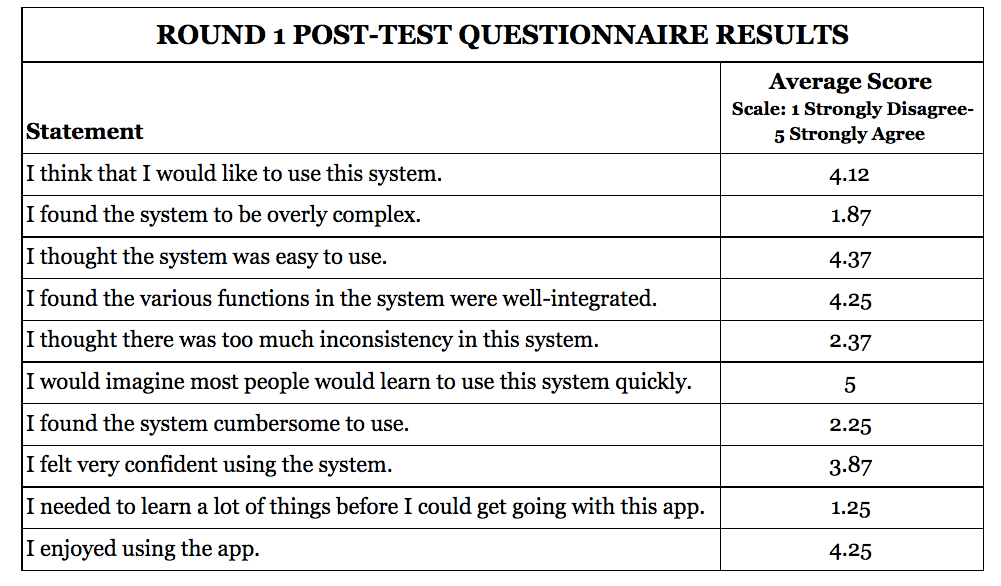

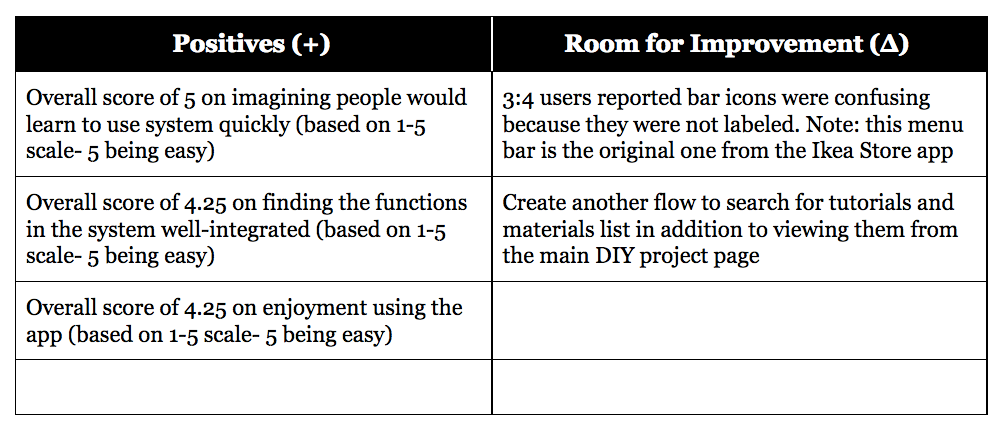

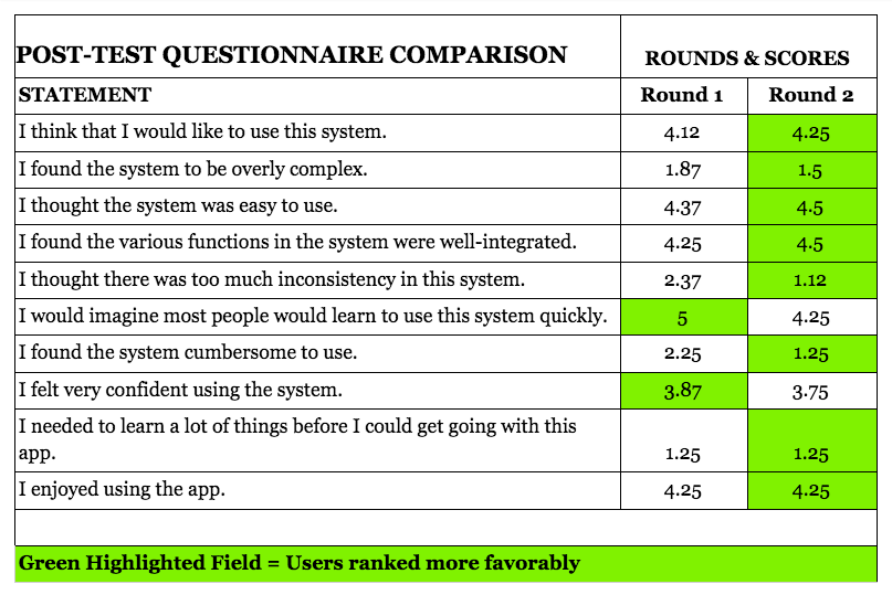
After each round of the 2 rounds testing, we revised prototype to reflect the founding. We also compared the 2nd round testing result with that of the first round, to check if the improvement occurred. We created and submitted the Usability Test Report.
We annotated the wireframes and finalized the prototype (see link here: https://invis.io/G7OASPPXAPD) at the end of current stage, alone with the next step suggestion of further Usibility Testing.

