The 3 Elements of Great UX Writing
The 3 Elements of Great UX Writing
So you’ve finally released the very first version of your product. Your designs are beautiful, your core functionality is rock-solid, and your user journeys are smooth, logical, and engaging. Your first product or app might look good, but does it sound good?
Put another way, is your copy as elegant as your wireframes?
When it comes to UX, word choice doesn’t tend to get as much attention as, say, how to cultivate deeper engagement among your users. However, the copy of your app — the words you choose to use in your interfaces, the language you use to create your guided tutorials, and even the phrasing of your push notifications — can have an immense impact on the overall feel and success of your product.
Really great UX writing can help your product stand out in even the most crowded markets. In this post, we’ll be covering the three elements of really good UX writing that will take your product or app to the next level. By the time you’re done reading, you’ll be able to apply these principles to your next UX project.
The First Element of Great UX Writing: Usability
One of the biggest challenges you’ll face as a UX practitioner is leveraging your UX writing to improve usability. This sounds simple, but it’s deceptively difficult — and that’s before you take audiences’ declining attention spans into account.
With user attention spans seemingly decreasing all the time, you have a very limited window in which to help new users understand your product and highlight how it can help improve their lives. There are two ways to accomplish this with good UX writing.
Keep It Simple
Every word of copy in your product should be as simple as it possibly can be. There are already dozens of potential places you could lose a user in your product. Why create more by writing overly complicated language?
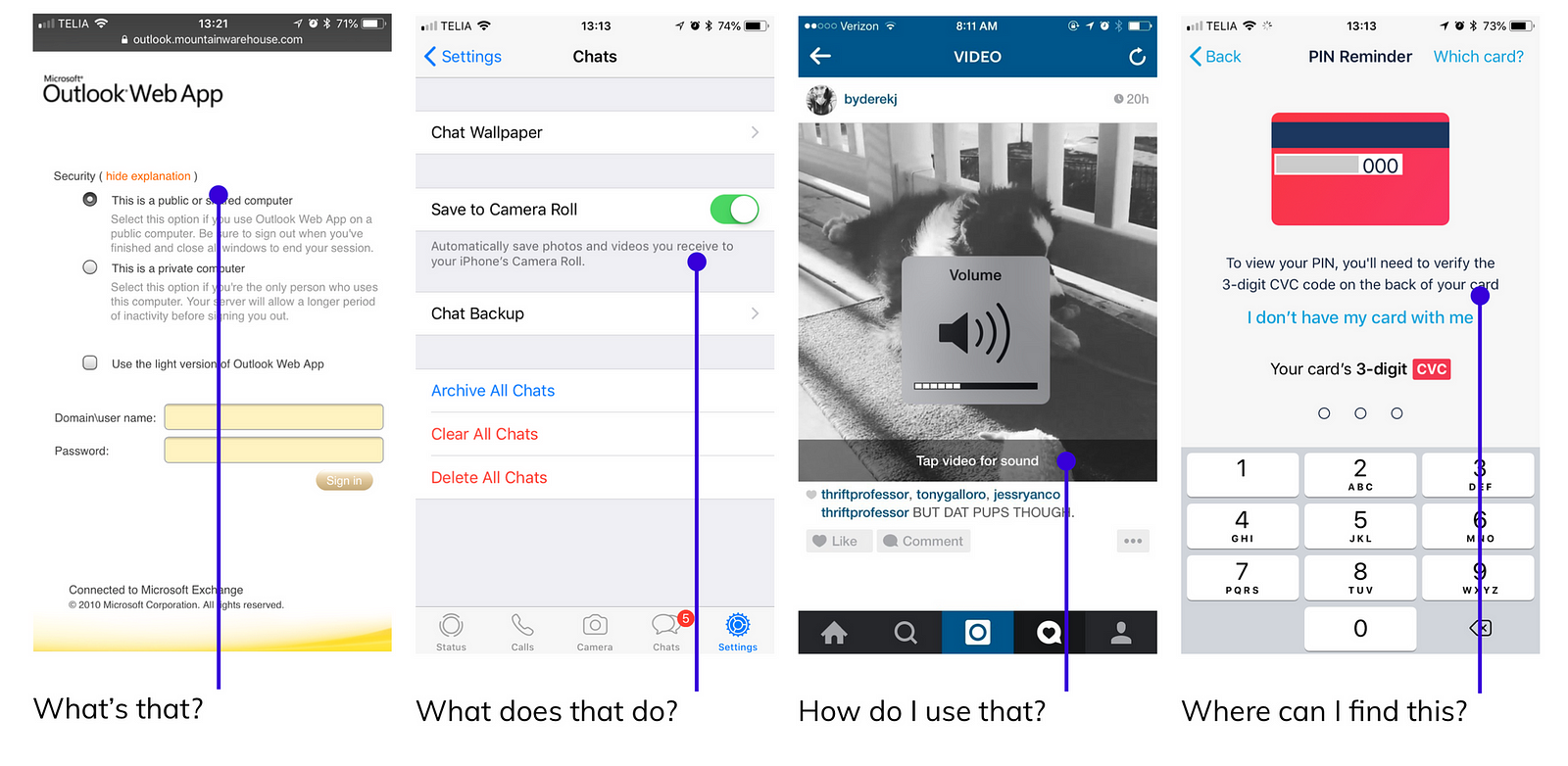
One of the reasons that so many products use archaic technical jargon in their UX writing is because the copy was written by engineers, not UX practitioners. Consider the following examples:
- “An authentication error has occurred.” vs. “The password you entered was incorrect.”
- “You must be an authorized user to access this page.” vs. “Log in to comment.”
- “You have examined 17,652 data points this period.” vs. “You’ve used 90% of your reports for the month.”
The above examples show how differently the same point can be made simply by using more straightforward language. There’s no good reason to use copy that sounds like it was written by a robot when you’re trying to help your users.
It’s also worth bearing in mind that usability doesn’t necessarily mean friendly; the usability of your UX writing is defined solely by how well it helped your users accomplish a specific task, not how it made them feel while they did it.
Preempt User Questions
Trainee sales professionals are often taught to bear in mind the “five magic words” that are never far from a prospect’s mind — what’s in it for me? The reason this is a fundamental part of so many sales training programs is that salespeople can effectively preempt many of the more common objections they’re likely to experience as they try to persuade a prospect to make a sale.
In much the same way, it’s your job as a UX practitioner to preempt your users’ questions as they use your product. Even the best-designed user pathways are sure to elicit questions from your users, and it’s your job to anticipate these questions so you can answer them in your UX writing.


Although you can probably anticipate many of your users’ potential questions, assumptions are a poor substitute for cold, hard data. During this phase of your UX writing, be sure to draw upon actual user testing data to help identify potential questions your users may have.
The Second Element of Great UX Writing: Motivation
The precise moment when a user really “gets” your product and fully realizes its potential value can be a truly magical moment. As a UX practitioner, you are uniquely positioned to help your users get there, and one of the most effective ways to do so is by using aspirational language in your copy.
Write Benefit-Driven copy, Not Feature-Driven copy
Remember the “five magic words” from our sales training example earlier? Well, those same five magic words can and should inform your entire approach to UX writing for your product.
Say, for example, you’re writing UX copy for an online advertising product. Your marketing team might be incredibly proud of its proprietary, three billion keyword database — but your users couldn’t care less about the size of your database. Your users want more accurate data so they can make better business decisions about their ad spend.
The same principle applies to your calls-to-action. Countless websites ask visitors to “sign up for our newsletter” without giving a single reason why visitors should sign up for their newsletter. Which of the following is more compelling?
- “Sign up for our newsletter.”
- “Subscribe to receive insightful, actionable tips for busy UX professionals, every Monday morning.”
It’s definitely harder to fit the second line of copy on a button, but it tells your audience exactly why signing up for your newsletter will help them succeed at work, which is what they really want.
Excite, Entertain, and Reassure Your Users
Every line of UX writing in your product is an opportunity to excite, entertain, and reassure your users. Sometimes, it’s easy to overlook these opportunities in favor of larger, more obvious bottlenecks, but small touches can make a big difference.
Tumblr’s sign-up process is a great example of how UX writing can delight and reassure your users. Choosing a username on a popular online service can be a major obstacle in user onboarding. Some users might spend hours trying to find a username that suits their tastes, but most users probably won’t stick with it for long, significantly increasing the likelihood of the user abandoning your product or app altogether.


By contrast, Tumblr not only offers whimsical username suggestions for new users — an opportunity to delight new users, albeit in a small way — but crucially, it also clearly states that users can change their mind later. This significantly reduces the potential for users to become apprehensive about choosing a username for their new blog. Google also leverages this technique to great effect in Google Docs, which assigns amusing temporary animal-themed usernames to otherwise anonymous users accessing shared public documents.
The Third Element of Great UX Writing: Personality
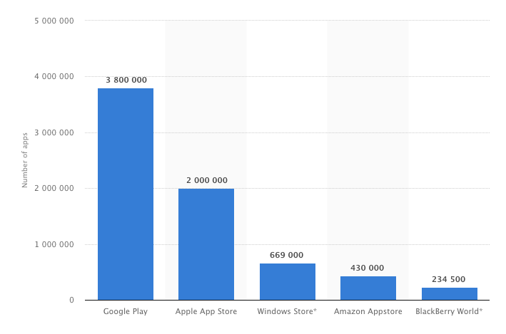
As of Q1 2018, there were more than 3.8 million apps available for download via Google Play, and more than 2 million on Apple’s App Store.


With so many apps competing for users’ time — and attention — standing out is becoming increasingly difficult, even for genuinely innovative apps and products. That’s why the third element of great UX writing is personality and character.
Great UX writing helps your users, but it also helps define your brand’s voice and the character of your product. It’s no longer enough to just create great products; you also have to clearly define your brand and what it stands for if you hope to appeal to today’s increasingly discerning consumers.
Defining Brand Voice with UX Writing
Defining personality isn’t as easy as it sounds. When it comes to people, personality is a complex combination of thought patterns, behaviors, ideas, and personal values. Although people change and grow over time, usually these core components — particularly the core values that drive motivation — are often pretty static, remaining reasonably consistent over the course of our lives. That’s why we’re often inherently distrustful of people whose personalities swing wildly from one extreme to another; their unpredictability makes them untrustworthy.
The same principle applies to brands and products.
Before you can define the voice of your brand, you need to identify your brand’s values and principles. What does your brand stand for? What values does your product represent? How do these qualities align with your company’s mission? The answers to these questions should form the basis of your brand principles. In turn, every word of copy in your product, from guided tutorial prompts to button text, should reflect and reinforce these values.
Adapting Tone in UX Writing
A common mistake many UX practitioners make when writing UX copy is failing to consider how tone can — and should — change, depending on the situation and where the user is in their journey in your product.
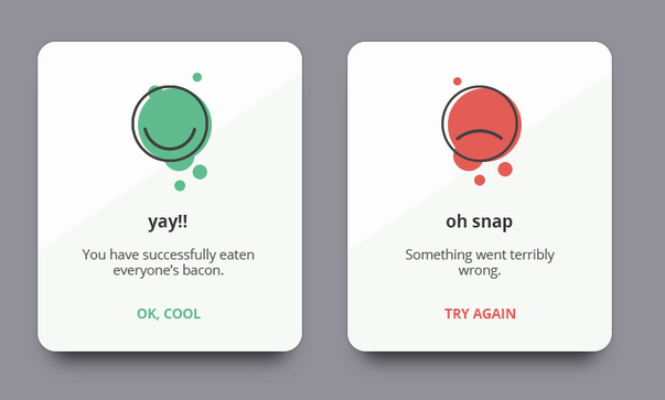
For example, let’s say a user has successfully completed their very first action in your product or app. This would be a great opportunity to use a more casual, conversational tone and appropriate language. Many apps use moments like these to reinforce a sense of fun, playfulness, and irreverence, like so:


Even if the user’s action was incorrect or incomplete, using a phrase like “Oh snap” is probably preferable to using stiff, formal language like “User input failed” or something similarly utilitarian. Conversely, using phrases like “Yay!” reinforces the idea that your product or app is fun, approachable, and accessible, and also provides the user with positive reinforcement, which can further boost engagement.
There are times, however, when the style and tone of your brand voice should be a little more reserved. For example, if you’re asking a user to make a considerable decision, such as completing a transaction or signing up for a subscription plan, it’s probably best to use more reassuring language.
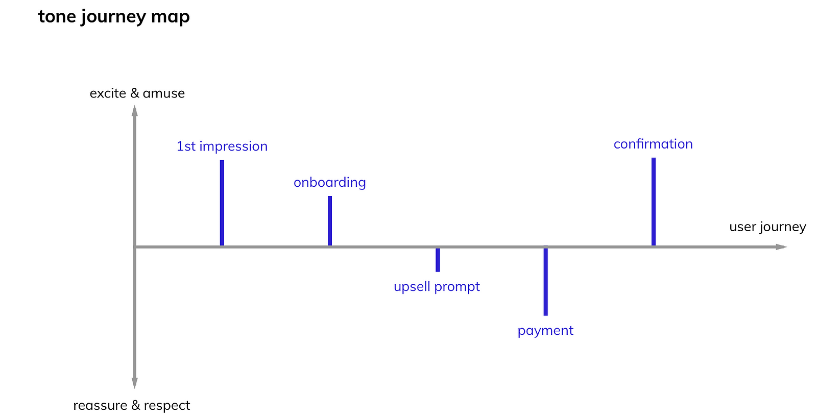
One way to plan for these touchpoints and the tone your UX writing should take is to create a tone journey map for each of the major milestones in your user pathways:


Creating a visualization of the touchpoints users will experience as they move through your product or app is an excellent way of establishing a baseline for the style and tone of your brand voice. As with virtually everything in UX, there are situational exceptions to these “rules,” but a tone journey map is a great foundation for your UX writing that can help reinforce your brand values and principles and help users get the most out of your product.
Write for Humans, Not Robots
Many people often forget that computers can only do what their human operators tell them to do. An inadvertent by-product of this is that we often interact with computers, products, and apps as if they’re as human as we are. This means that, whether by design or accident, your product is a conversation with your users — and a crucial interaction that cannot and should not be left to chance or based on assumptions.
UX writing is one of the most direct, immediate ways your users experience your product. There’s more to great UX writing than meets the eye, but with a little planning and some thought for your users, it doesn’t have to be complicated. Remember — you’re writing for other humans, not robots.
