The Riddle of UX Writing
I’m a product designer at Medium, where I get to work with some of the best writers and editors in the business. These collaborations opened my eyes to something obvious I had somehow overlooked: every product has a voice.
You may think this sounds like a metaphor, but far from it. Apps and websites are littered with text, and when most of us read, we hear the words as if spoken. This voice exists in our minds, but it’s as “real” as our perception of colors or movement on a screen. It’s all an illusion, and it’s there for you to design.
Designers spend a lot of time working with words, but often without the same conviction that we have for other elements of design. I think one reason for this is that when it comes to traditional product design, we have core values and the vocabulary to talk about them.


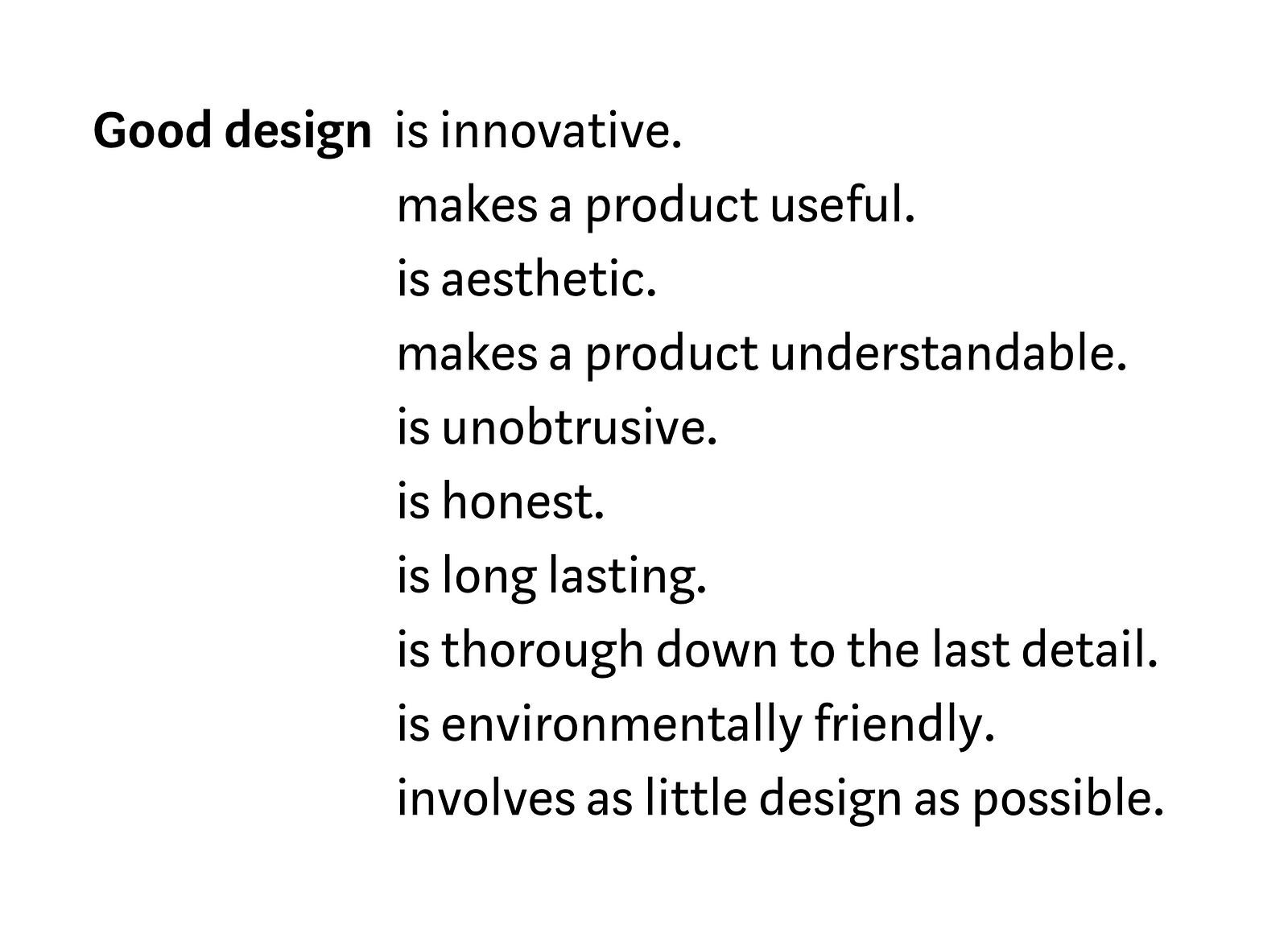
You’re probably familiar with Dieter Rams’ 10 principles of good design. So much of what we do boils down to personal taste and chasing trends that it’s important to feel connected to something more grounded and timeless. We get principles like “good design is honest,” and it reminds us to design with integrity. “Good design is innovative,” gives us a license to try new things. These principles are powerful because we internalize them it let them guide what we do.
When it comes to writing, most of what you’ll find are style guides that tell you how to compose an error message, or when to say ‘ok’ instead of ‘got it.’ We have plenty of rules and best practices, but I don’t think we have meaningful guiding principles.
At Medium I began to wonder… why not? I wanted to anchor my own functional writing to something deeper than personal taste. I went back to my roots and looked for inspiration in psychology and neuroscience, and consider yourself warned, this is going to get nerdy.
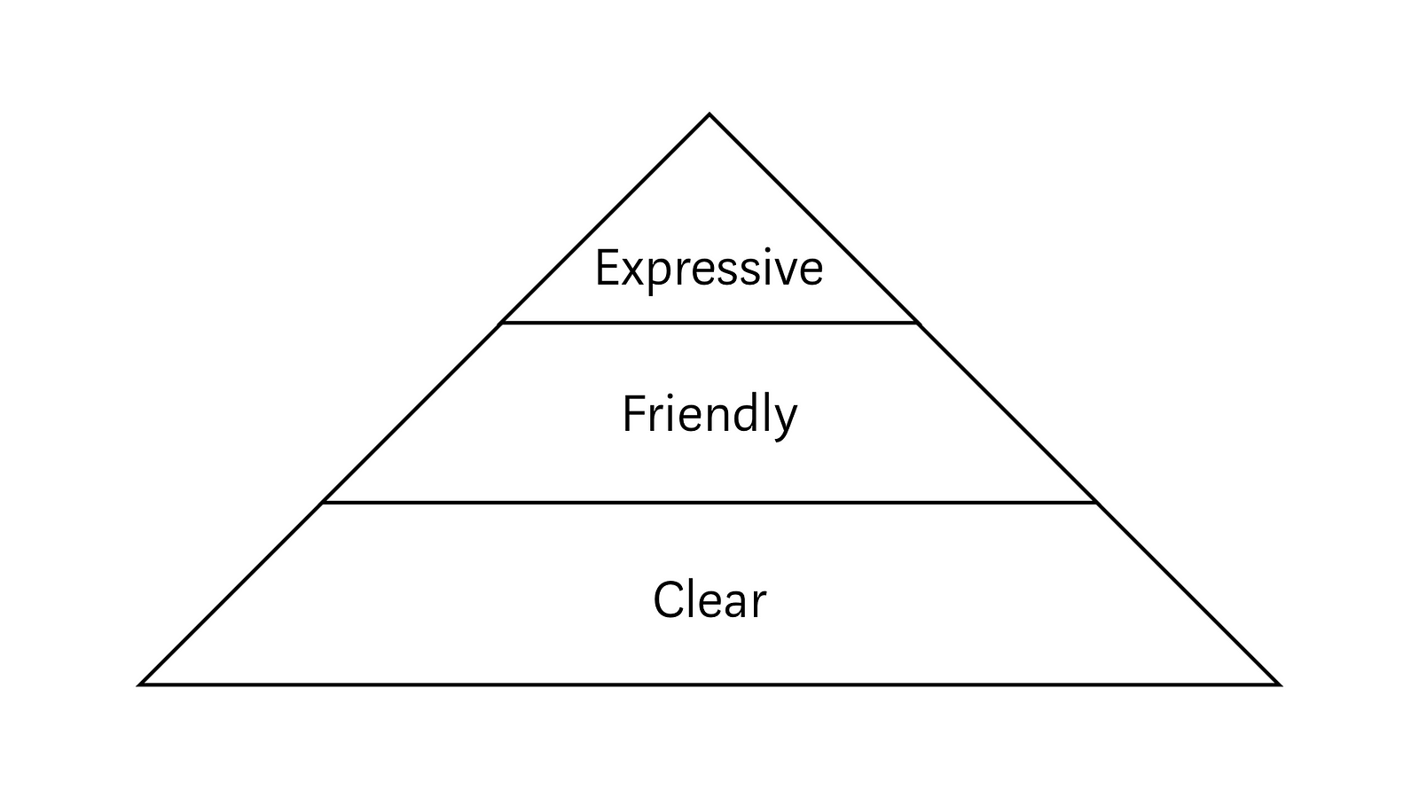
In the spirit of Dieter Rams, I propose three simple guiding principles. First, be clear. Second, be a friend. And third, be expressive. You may find this a bit obvious — sometimes obvious things have the most to teach us.


I found it helpful to visualize a hierarchy of needs. This helps us see how these ideas relate to one another.
Each layer supports the one above it. A friendly conversation without clarity is just confusing. And a strong personality without social grace is just irritating.
Each layer also amplifies the one below it. Striking the right tone makes a reader more receptive to your message. And if you do it with personality, they might remember it.
BE CLEAR
The first principle is to be clear. This is more complicated than it sounds.


Let’s play a game. I’ll share two quotes representing opposing political figures in a recent election. See if you can guess who won, based only on the language they used.
A: I stand for a bold, progressive internationalism that stands in stark contrast to the too often belligerent and myopic unilateralism of the current administration.
B: Let’s go it alone.
Who do you think won?
These quotes are both “clear,” but reflect two different aspects of clarity. First, there’s precision. A paints a vivid picture and elaborates on the details. Second, there’s ease. B distills the message into a few simple words. You don’t have to work very hard to grasp the general meaning.
A was John Kerry in 2004, and B was George Bush.
Bush won.
