
Let’s code email campaigns (3/6): Preheader, header and footer
Let’s code email campaigns (3/6): Preheader, header and footer


Preheader
Lets start from the top. First part of the email campaign is an optional preheader. It’s a good practice to keep it in your template but it’s not required. Preheader is a copy that will display as a description next to the subject line in your email client.

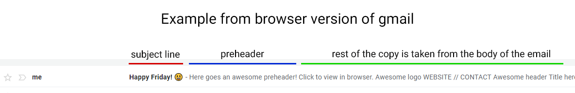

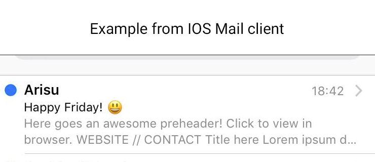
If you don’t include preheader, email client will display first available copy in the email (including alt tags). Same goes for too short preheader as you can see in the above example. Different email clients display different amount of preheader characters, as best practice it’s recommended to use 50–100. You might want to hide preheader from your subscribers though so it’s not visible in the campaign when they open the email. To hide it, we can style it as follows:
<tr> <td style=”display: none; height: 0px; width: 0px; opacity: 0; font-size: 0px”>Here goes an awesome preheader!</td> </tr>
In short — hide it in any way you can ;) It will still display as a preheader :)
Always remember to check your preheaders. They won’t be visible in the email campaign (if you use the above code) so it’s easy to forget and leave an old one there, or even worse… a placeholder!
‘View in browser’
It’s not required to include a ‘view in browser’ link, but it’s a good practice in case email client goes mental and doesn’t display your beautiful email correctly. URL for that link is taken from the email service provider you use. For Mailchimp it’s: *|ARCHIVE|*. Where you want to put that link is up to you. It could be in the header, footer or above the email… wherever you chose. I believe keeping it at the top makes most sense since that’s where most subscribers will be looking for it. Don’t forger to style your <a> tag for ‘view in browser’ link with color so it doesn’t stay as the default blue (unless that’s what you’re going for)
<a href=”*|ARCHIVE|*” style=”color: black;”>Click to view in browser.</a>
Header
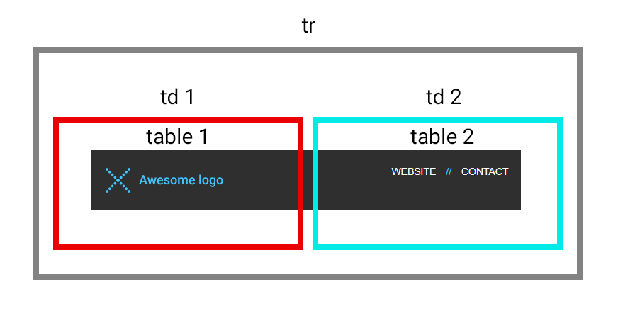
As a general rule you should make your header look similar to your website header. Put a logo there and maybe few important links from your site, try to keep your branding consistent.For our example we have a logo on the left and two links on the right. Html structure is as follows:
<tr style=”background-color: #2b2b2b; color: #ffffff”> <td> <table border=”0" cellpadding=”0" cellspacing=”0" width=”100%” style=”max-width: 600px;”> <tr> <td height=”20"> <img src=”https://gallery.mailchimp.com/99296cba23fe4aa7d71093a67/images/79f65f55–8608–41ae-9b94–8345b2eef6c9.png" style=”height: 20px;”> </td> </tr> <tr> <td> <! — [if (gte mso 9)|(IE)]> <table border=”0" cellspacing=”0" cellpadding=”0" width=”600"> <tr> <td align=”left” valign=”top” width=”300"> <![endif] → <div style=”width: 50%; float: left; vertical-align: top” class=”resp-full-440"> <table border=”0" cellpadding=”0" cellspacing=”0" width=”100%”> <tr> <td style=”width: 20px” class=”resp-equal-space”></td> <td><a href=”https://www.arisu.co.uk/”><img src=”https://gallery.mailchimp.com/99296cba23fe4aa7d71093a67/images/ffc413ad-813e-4388–9e59–425f2db61973.png” alt=”Awesome logo” title=”Awesome logo” style=”display: block” class=”resp-image-mid”></a></td> </tr> </table> </div> <! — [if (gte mso 9)|(IE)]> </td> <td align=”right” valign=”top” width=”300"> <![endif] → <div style=”width: 50%; float: left; vertical-align: top” class=”resp-full-440"> <table border=”0" cellpadding=”0" cellspacing=”0" width=”100%” style=”font-family:Arial, Helvetica, sans-serif; font-size: 14px;”> <tr style=”text-align: right” class=”resp-top-nav-center”> <td><a href=”#” style=”text-decoration: none; color: #ffffff;”>WEBSITE</a> <span style=”padding-left: 10px; padding-right: 10px; color: #1ec4fa”>//</span> <a href=”#” style=”text-decoration: none; color: #ffffff; “>CONTACT</a></td> <td style=”width: 20px” class=”resp-equal-space”></td> </tr> </table> </div> <! — [if (gte mso 9)|(IE)]> </td> </tr> </table> <![endif] → </td> </tr> <tr> <td height=”20"> <img src=”https://gallery.mailchimp.com/99296cba23fe4aa7d71093a67/images/79f65f55–8608–41ae-9b94–8345b2eef6c9.png” style=”height: 20px;”> </td> </tr> </table> </td> </tr>
Above code can be translated into this:

It might look weird for you since there are <div> tags and outlook conditional formatting… why all that?
<div> is used as wrappers for our tables so they are mobile responsive. If you wrap ‘table1’ and ‘table 2’ in divs that are 50% wide they will display as two columns on big screens and then expand to full screen on smaller devices. You achieve that by using media queries. You simply specify on which breakpoint (in our case it’s 440px for header) div should expand to 100%. Make sure table inside <div> is set to 100% width.Media queries for our div:
@media screen and (max-width: 440px) {.resp-full-440 { width: 100% !important; }}
Important point here: you need to remember to put white space between your style and !important, otherwise some Outlook versions will ignore those styles. The breakpoints of 440 was chosen based on how header behaved when testing different breakpoints. You can use Chrome developer tools to check what breakpoints would be best for your template.
And while on topic of Outlook…it can’t render widths in percentages so we have to wrap our tables in a conditional formatting where we set table width in pixels.
<! — [if (gte mso 9)|(IE)]> <table border=”0" cellspacing=”0" cellpadding=”0" width=”600"> <tr> <td align=”left” valign=”top” width=”300"> <![endif] →[logo and a bit of space on the left goes here] <! — [if (gte mso 9)|(IE)]> </td> <td align=”right” valign=”top” width=”300"> <![endif] →[header links go here] <! — [if (gte mso 9)|(IE)]> </td> </tr> </table> <![endif] →
This conditional formatting translates to ‘gte’ = greater than ‘mso 9’ = Microsoft Outlook 2000.
Footer
You should include an unsubscribe link to comply with anti-spam laws and your physical address in the footer. Most common practice is to use social media links, privacy policy, copyright, explanation why customer received this email… plenty of things you could put there. Maybe some info about delivery options for your online store…Still, try to make it simple, don’t overload your footer with too many things.
Since our footer consists of two columns with tables inside I have used same logic as for header to make it mobile responsive. I have not added responsiveness to the last part with ‘Unsubscribe’ and ‘Forward’ links since they behave well on small devices.
Links for unsubscribe or forward to friend can be taken from your esp. For Mailchimp unsubscribe is *|UNSUB|* and forward is *|FORWARD|*