
Why analysing your product is essential when ux
Yes, Flutter is known to enable “fast development” and “native performance” but for the UX and UI design it’s not “fast designing” or “native looking” with simply using Flutter’s specific platform Widgets. For the software developers it would be way more effort to develop a Flutter app which looks on iOS exactly iOS-like and on Android Android-like. That’s another reason to keep the UI design of Flutter apps brand-first. But don’t totally forget the Flutter Widgets, just put the own identity and character of your project into the foreground and make your Flutter app identity-centric

Navigation in focus

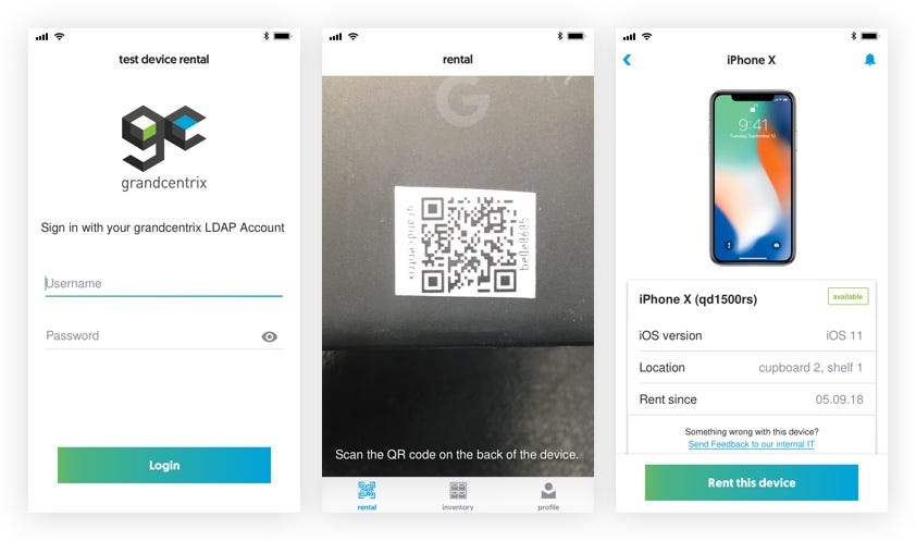
Beginning with the brand-oriented UI design the app navigation is in the focus. At first our mobile test device rental app has only core functions for the MVP like scanning test devices for rental or showing an inventory of all mobile test devices. Despite that, users have to be guided through all different functions and screens. To not complicate the software development of the app for both platforms I came back to the Flutter widget catalogue
The devil is in the detail

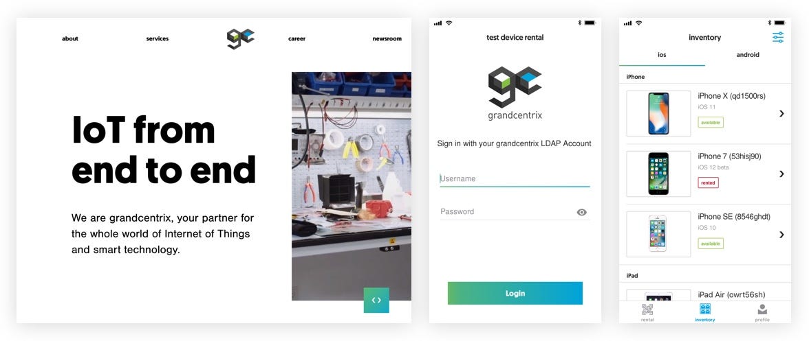
While looking at our company’s corporate identity and UI elements on the website one thing directly catches one’s eye: the button style. They contain a smooth and balanced gradient, consisting of grandcentrix’ main colours: cyan and green. Including the sans-serif company font in clean, white letters it fits conspicuously but not too persistent in the overall picture of whitespace, imagery and living typography. I also need to mention that they have a nice hover effect with changing the gradient’s color. These buttons and it’s effect should also be the main style element of the test device rental app. They fill it with life and provide a consistent eye catcher within the overall clean, fact-and image-focused style of the app. Following the website’s corporate style, the buttons within the app are not rounded. So the rule for tappable elements like buttons is that they have sharp corners.

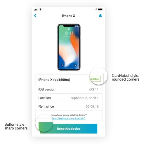
Compared to the grandcentrix website the text on the button is centred instead of left-adjusted. For me personally, centred text on buttons support the call-to-action function by bringing the text into the focus. Besides, the buttons within the mobile test device rental app always have the same margins to the left and right edge of the screen. Because of that, the text length has enough space to be adjusted to the buttons. The website buttons also have a disclosure on them. Following some general ui patterns these disclosures are on the right side to imply that a new underside will be opened. I explicitly designed buttons without these disclosures because there is less space available on mobile apps in comparison to websites - especially with the many different screen sizes on Android devices and small screens like on an iPhone SE. In general one can also assume that mobile app users will recognise the button pattern and understand their function.
Hidden highlights
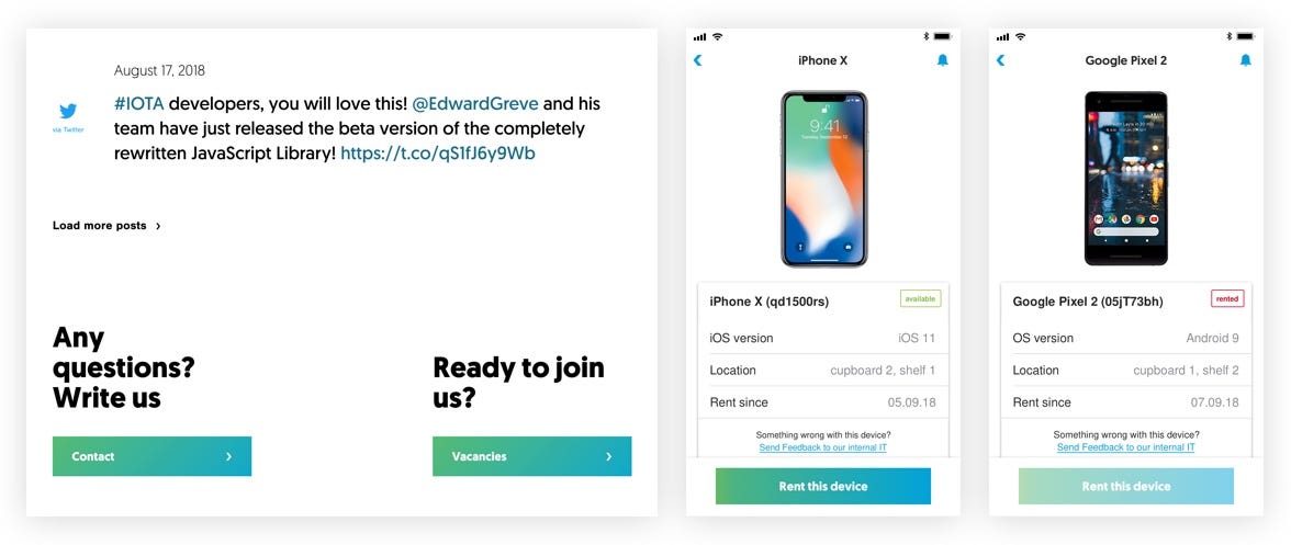
A contrast to the sharp cornered button forms should be other elements like cards and labels which are also rectangular. As seen on the grandcentrix website itself, it doesn’t have card or labels. This iswhy I set my own rule for them to have small rounded corners of 2 pt in comparison to the tappable elements on the website. Also iOS and Android use non-tappable components, like cards and labels, which users easily recognise from other apps.
Attention to the finer details highlights the brand-first design of the test device rental app made with Flutter. To be consistent with the website’s design language all icons follow the grandcentrix logo style with sharp corners. The custom fonts from the website finally bring the grandcentrix look to mobile and replaces Roboto and San Francisco everywhere. These little things are used on purpose because they are effective and easy to implement. They form the unobtrusive highlights of a brand-centric UX/UI design.