Data Visualization for Color Accessibility
Let’s talk about color accessibility — the ability to view all colors on a screen regardless of a reader’s visual ability. A crucial feature to low-visibility and colorblind readers, color accessibility can be achieved with good design and attention to color contrast. And it’s important to consider when designing any product, digital or physical — especially
This is the story of how we addressed the design challenge of visualizing data for color accessibility at Kiddom.
New Product; New Design Challenge
Earlier this year we launched a new digital product for administrators to measure and act upon classroom intelligence system-wide.
As we began working on the newest product, we saw an opportunity to define a new visual language. Prior to Academy, our product had been tailored towards teachers and younger students who would be using the products to create, complete, assess, and communicate about assignments, so we optimized the design for these tasks, with some simple reporting and a color scheme that was based largely on the role using the product. For example, teachers had a blue theme, and students had a purple theme.


But, as Academy would stand as the highest-level dashboard for schools or districts to understand what was going on at every level (district, school, class, and student), the newest product would require a greater amount of data visualization.
So the challenge was to keep the visual design consistent and on brand while addressing a functional design change to work with more data — this meant more colors, and those colors needed to be accessible to all. It soon became clear to us that the new product would call for a radical redesign of our existing color palette.
Step One: Analyze the Starting Palette
For the first step, we put all of our color palettes together to analyze the overlap and discrepancies.

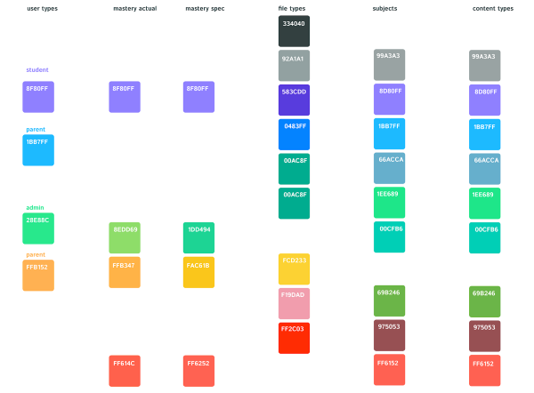
This was the palette at the start of our project. As you can see, it’s complex, has tons of overlap, and doesn’t address accessibility for the colorblind.

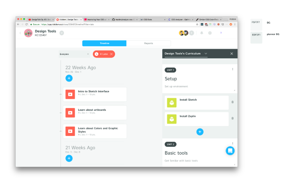
An overlap example: as you can see here, the colors quickly became muddled in the UI. The primary action color was conflated with the English subject color.

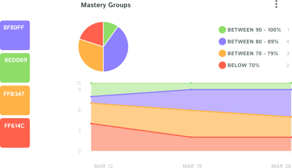
Let’s take a look at reports in the earlier versions of the product. As you see here, there were four colors in the Mastery chart, two of which were already being used in other contexts. There was also no logical progression to the color scheme (red-yellow-purple-green), making it hard to parse at a glance.
It was clear we would need to simplify, and we were beginning to gain a sense of our constraints, but before reinventing the wheel, we decided to check industry standards to see what norms existed in the education technology space.
Step Two: Study Industry Norms
In our study of industry-specific norms, we would be looking at how others may have handled the color accessibility problem, as well as general color scheme; if teachers expected a particular color for their data, we’d be fighting an uphill battle by changing it.

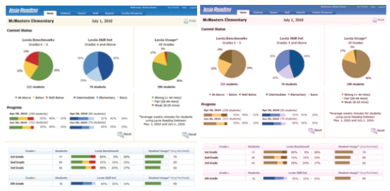
In normal vision, these charts are pretty clear. The red is bad, green is good. However, turn on colorblind mode, and it’s not clear what each of the slices means. The difference between red and green just isn’t visible.
Let’s take a look at a wider palette that incorporates more colors.

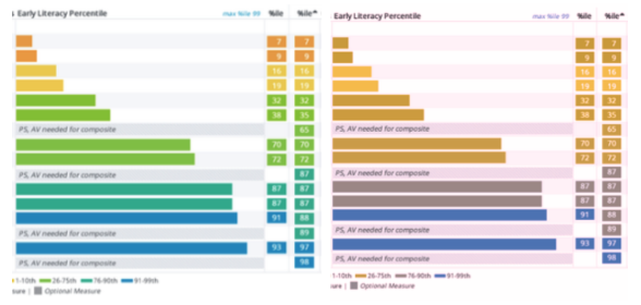
In this example, the middle point isn’t overly obvious, and the ends of the spectrum, although contrasting from each other, are hard to pick out. Upon studying the norms, it became clear there were some common approaches, but no standard. We would have to make the call on what was best for our users.
Step Three: Define Your Constraints
Thanks to our analysis, we identified two constraints important to us, and a number of action items. As mentioned, our first constraint was color accessibility: Our colors should have enough contrast so that colorblind people can differentiate them from each other. This would be particularly important in any view that shows data reporting.

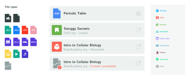
The second constraint was to reduce color overlap. This was simple enough, as we had a lot of similar colors used for totally different purposes. So, we decided it was clearly time to trim some fat.
It’s time for solutions!
Step Four: Determine Color Overlap
First, we looked at how much overlap we could remove. Let’s take a look at where each column’s colors were used in the product.

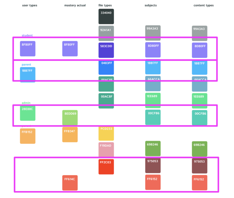
These colors were almost the same as our subject palette. Since our subjects were more integrated in the design, we chose to remove the content type.
As mentioned, our original intent was to theme the app depending on which role you were using. The available roles in the earlier products were Student, Teacher, and Parent.


However, with the addition of the Admin in Academy (green), we were adding a lot of complexity to this palette. So we made the decision to simplify by removing the overlaps of each role’s primary color.


Step Five: Improve Color Accessibility
To exemplify how we improved color accessibility for data visualization, we’ll use the example of our Student Mastery scale. On the surface, this design worked pretty well. With the exception of the purple, there was a clear progression. The middle point was extremely visible and the endpoints stood out nicely.

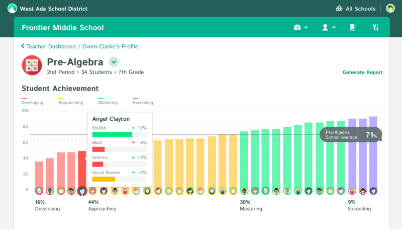
However, when we put our colorblind shades on, you’ll notice the contrast was super reduced. The mid point became almost invisible, and the ends were still visible, but only the “Exceeding” section really stands out. From here, we decided we could do better.

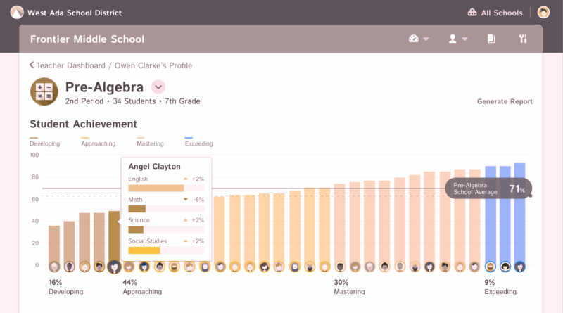
From here, a number of iterations followed. First, we tried red and green with higher contrast. This worked to highlight the ends of the spectrum, so users knew where to focus. The middle point was still obvious, but when we took a look in color blind mode… Sadly, although the middle point was still obvious, the ends of the spectrum were almost identical.
Then we tried an approach with more blue. This was the ‘hot and cold’ concept. And generally worked fine. However, we became concerned with the potential palette overlap with the Interaction Blue our buttons (mentioned below), so we tried a bit of purple. The purple gave us a similar issue, but overlapped with the purple in our Subject palette.
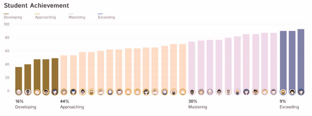
In the end, the teal approach was the most successful. We could have an obvious, contrasting middle point, while still highlighting the ends of the spectrum:


Step Six: Simplify Color Palette
Now let’s move back to the complex palette. Instead of predefining every variant of a color, every tint, every shade, we thought perhaps we could be smarter about the way we define our palette?
So we changed our approach and defined a layering system. There are now two layers: the primary color, and the overlay (tint).
