4 Data Visualization and Web Reporting Tools for your BI solution
Making complex simple with smart data analysis
It is hard to overestimate the value of insightful analytics nowadays as all the business processes have become data-driven: marketing, accounting, human resources, customer service, finance, etc.
Moreover, to convince the decision makers you need to convey the meaning of the data properly. One of the possible techniques is a composing of analytical web report. Furthermore, an essential part of it is a high-powered data visualization which helps you to understand business trends of your company.
Having performed some research, I would like to give a comprehensive overview of 4 popular tools for web reporting and data analysis. The first two of them are free, the following two are more advanced. These tools will be useful for both the developers and data analysts.
Free tools
The following components provide opportunities for basic web reporting.
PivotTable.js


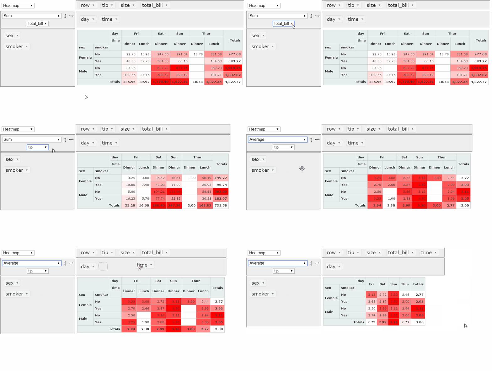
PivotTable.js is an open-source JavaScript Pivot Table. It is aimed to provide the functionality for data analysis and requires a good knowledge of JavaScript to reach its full potential.
Built-in web reporting features
- Support of CSV & JSON data sources
- Aggregation, filtering, sorting and grouping are available. There are 22 functions which include functions for statistical research
- You can move the fields from columns to rows and vice versa with the help of drag & drop functionality
- Custom cells formatting
- TSV renderer for exporting to TSV format
- Ability to define multiple aggregators
- A Heat Map rendering option.
View customization features
- Mobile-enabled renderers for touch devices are available
- Cells of the grid can be colorized
- There is an Excel-like layout available: each hierarchy is displayed in a separate column or row
- Custom formatting is possible as well as making a custom Heat Map color-scale
- Language localization: the pivot table is available in English and French but it’s possible to write your own ‘language pack’ in JavaScript.
Integration and compatibility
- There is a React version with Plotly charts being integrated into
- It is compatible with Python/Jupyter and R/RStudio.
Limits: Handles up to 100k rows. Unfortunately, subtotals can be rendered only via an additional plugin; built-in renderers for export to CSV and Excel are not available. To save the configuration of the report, it’s needed to implement this functionality on one’s own. PivotTable.js provides a freedom in customization, though.
Creating charts
You can use the renderers for integration with C3 Charts, D3.js, Plotly and Google Charts. It is possible to use Highcharts along with the pivot table with the help of a 3rd-party plugin.
Learn more:
Demos on JSFiddle:
WebDataRocks


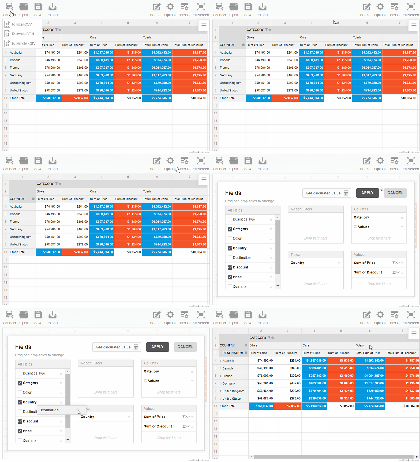
WebDataRocksis an embeddable web pivot table written in JavaScript. It is a lightweight component which you can use in a web application and build an interactive report based on your data. It can be viewed on mobile devices and desktop clients. It is suitable for less technical end-users but offers advanced customization options for developers.
Built-in web reporting features
- Support of local and remote JSON & CSV data sources
- The main functionality is accessible via the special extra-part of the pivot table — the Toolbar
- Aggregation, multiple filtering, sorting and grouping are easy with UI: there are 13 aggregation functions and the ability to create a custom calculated value
- Configuring fields via the Field List and moving them from columns to rows and vice versa with the help of drag & drop functionality
- Creation of multi-level hierarchies
- Each cell of the grid can be drilled through
- Sharing your results with colleagues: you can save the report and export it to PDF, Excel and HTML formats or print it.
View customization features
- The Look & Feel of the reporting tool can be changed: there are 4 predefined themes for your taste and possibility to create your own theme
- You can use a conditional formatting feature to highlight the most important cells of the pivot table based on particular values
- Number formatting
- If you need to change the layout, you can choose a classic, compact or flat form of the pivot table. (As for me, the compact form has the most laconic and neat style)
- Language localization: you can choose among available languages or translate your pivot table into the needed language using a simple template JSON file.
Integration and compatibility
WebDataRocks can be embedded into AngularJS, Angular and React applications.
Limits: Maximum data size is 1Mb.
Creating charts
It is easy to integrate WebDataRocks with Google Charts, Highcharts or any other charting library. There are tutorials available in the documentation.
Learn more:
CodePen demos:
Advanced solutions
Let’s move on to tools that deserve to be called embedded BI tools and provide more advanced web reporting experience.
A free 30-days trials are available for testing both tools.
Flexmonster


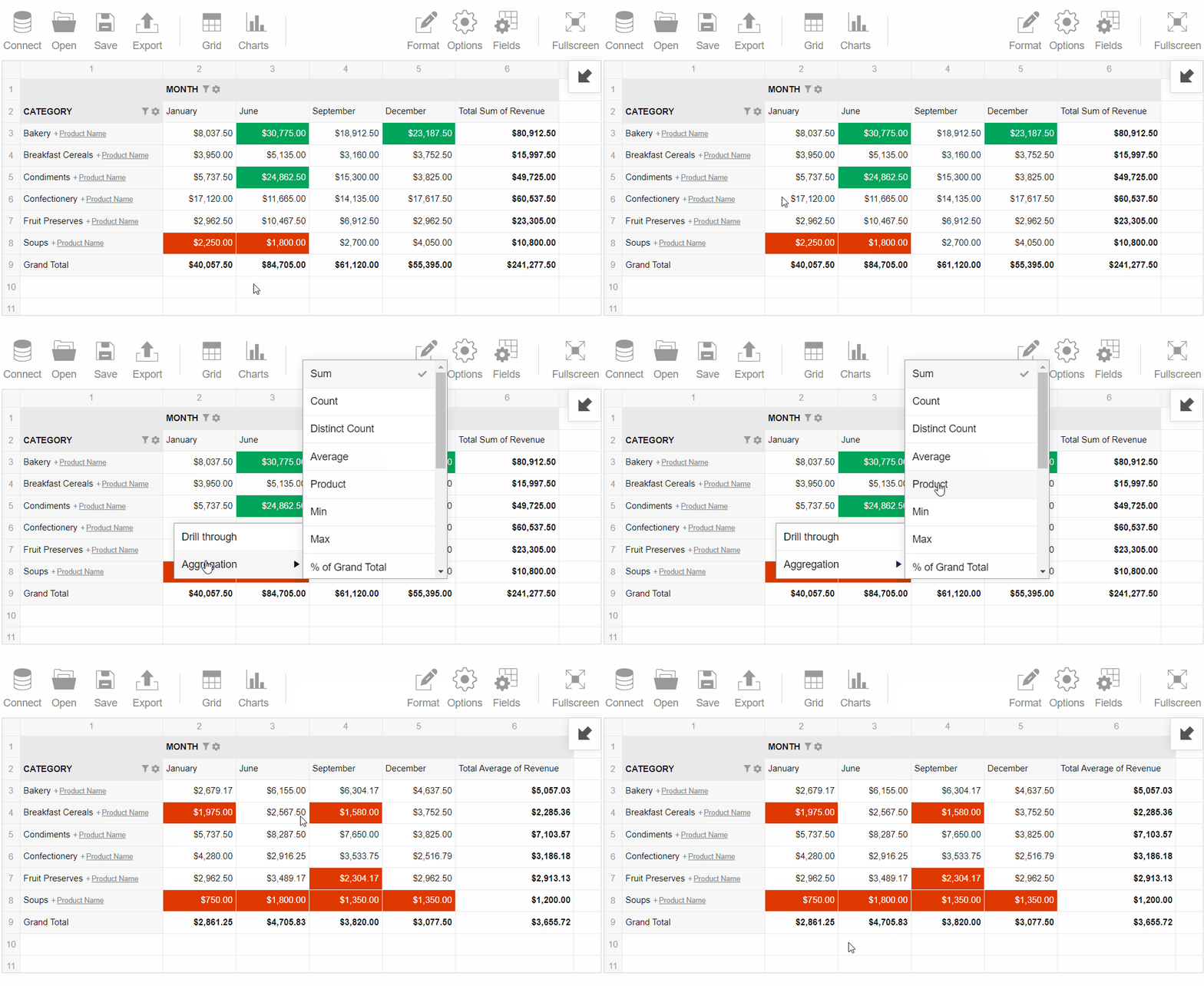
Flexmonster Pivot Table & Chartsis a JavaScript pivot table component. It is well-suited for deep analysis of tabular and multidimensional data and building visual reports based on it. The main difference is an availability of OLAP cubes support and more integration options.
Built-in web reporting features
- Supported data formats are CSV, JSON, data from SQL and NoSQL databases, OLAP cubes (such as Microsoft Analysis Services and Pentaho Mondrian cubes)
- You can use multiple aggregations to summarize numerical data. There are 16 aggregation functions available and the ability to create a calculated value
- Sorting and grouping of the data
- Filtering can be performed by values (to display Top/Bottom N records), member names and or applied to the whole report
- You can add an interactivity to your pivot table by using event handlers
- The final report can be saved in a JSON file with all the configurations and formatting being applied. You can load it later for further work
- Exporting the report to HMTL, Image, CSV, Excel or PDF formats without the need to connect any 3rd-party plugins.
View customization features
- It is possible to choose one of the 5 stylish themes or create a custom one
- Grid customization. This functionality allows creating a Heat Map visualization
- Conditional formatting of cells
- Number formatting
- Date values can be displayed in a user-defined formatting
- Component localization includes 7 languages. You can translate the pivot table by yourself with the help of a template JSON file
- A mobile-friendly design.
Integration and compatibility
- Flexmonster can be included to the simple web page or integrated into AngularJS, Angular or React application. There are also tutorials on the official website on integrating with jQuery and Webpack
- MongoDB data analysis is of special interest for those who have huge amounts of data stored in documents. Connection to MongoDB is supported via Node.js.
Limits: Handles up to 1 million rows so there is no problem with big datasets
Creating charts
Flexmonster has pivot charts as a part of the component. To get access to other charts, you can use guides on integration with Google Charts, Highcharts, FusionCharts or any other 3rd party charting libraries. All these approaches help to create interactive dashboards.
Learn more:
Demos:
DhtmlxPivot


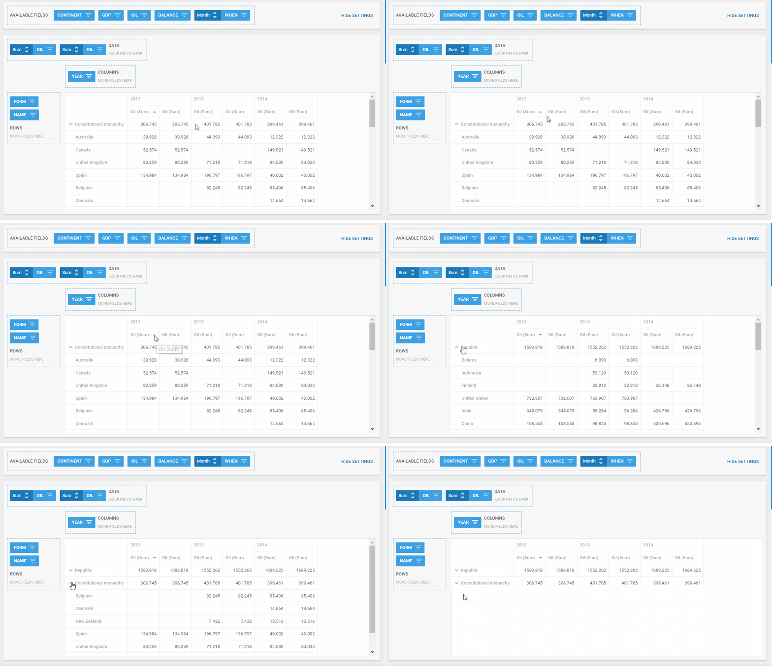
DhtmlxPivotis a JavaScript Pivot Grid for analytical reports creation. It is a part of dhtmlxSuite but can be purchased separately from the bundle. It offers a modern UI and integration with different server-side technologies.
Built-in web reporting features
- Support of connection to JSON, CSV, XML data sources. Data can be loaded from JavaScript array and HTML table
- There are only 4 aggregation functions (Max, Min, Sum and Count) and the ability to define a custom one
- Grouping, searching and sorting of the data
- Filtering using UI or pre-defined string, number and dates filters. Also, you can define global filters and set the number of rows to display per page on the grid
- Drag and drop functionality
- Cells can be editable and filled with the custom content
- Built-in module for exporting the report to Excel file with all the configurations saved
View customization features
- The layout can be adjusted: you can change width of columns, left margin, turn on a ‘read-only’ mode for the pivot table, etc.
- Conditional formatting and custom CSS of the cells
- It has a mobile-friendly design as well
- Localization of the interface is possible via the special method.
Integration and compatibility
- Support of integration with PHP, Java, .NET, Node.js, Ruby on Rails, ASP.NET, ColdFusion, Typescript and other technologies.
Limits: There is no information about a data size on the official website, but while testing it turned out that the pivot table renders up to 10k rows.
Creating charts
To use charts in your web reports, it is the best option to use dhtmlxChart. If you purchased dhtmlxSuite, they are already included into the bundle. However, you can purchase it separately.
Learn more:
Summary
To my mind, a perfect tool combines in itself a bundle of built-in features such as loading of CSV, JSON and multidimensional data, support of aggregation pipeline via UI; the ability to display the data in charts and integrate with any server-side & front-end technology. Exporting should be easy as well, without the need to include any 3rd party modules. Furthermore, the tools should always evolve to meet new demands of end-users. It is up to you which one to choose for your project and I hope it will help to improve the way you work with the data.
