How we work with microcopy
Finding the tone of voice
Before the writers craft a single word, we want to establish the tone of voice for the brand or product we’re working on. The more thorough, the better, as it’s the reference point for the writers on the team. Together with the visual branding and tech stack, it’s one of the first things we want to get approved from the client.
A good way to start is to make some good and bad examples of the tone of voice. If you’re writing for a product that already exists, this task is simple. Just find the wording that doesn’t follow the tone of voice, and write examples that do.
Weighing every single word
The decisions made for the branding and tone of voice will affect both the actual wording and the sentence structure when we start writing.

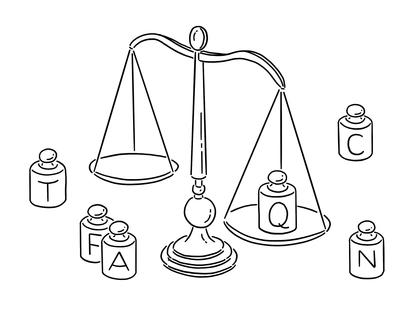
We recently designed and helped develop the new Vipps app — Norway’s most popular app for making payments. In that process, we also wrote and edited all the copy for the app. Their tone of voice had already been established before we started, summarised in three words:
- Simple
- Playful
- Near
We needed a bit more before we started working on the nitty-gritty wording choices in the app. For this project, we made an extensive dictionary with words and sentences for what Vipps would or wouldn’t say. By discussing actual sentences and words, we showcased what simple, playful and near
Examples from the dictionary
- We say Hi there, what’s your name? not Enter your full name
- We say Create a new code, not Make a new 4 digit PIN code
- We say Fee, not Transaction feeorTransaction cost
A dictionary is useful as a reference point for further development and design and is a part of an extended tone-of-voice guide. It’s also a great way to test a direction with the client early in the process. If there are issues with compliance or wording, it’s always better to solve them early on. If the product deals with money, it might be nice to elaborate on how to write different digits and currencies. For some clients, we make guidelines for how to use emojis, because even too much of a good thing is still too much.
Exploring the map and terrain
Ideally, writers or content designers are part of finding out what the content should be before any wireframes or flows are carved out. We don’t like to end up in what used to be the classic scenario where there’s either too little or too much space for the final copy.

In our experience, it’s always better when writers, designers, and developers work together on the concept and content from the start. It saves time and frustration when everybody is on the same page from the beginning.
What we need to map out:
- The audience — who are they, what do they know and what language do they use about what we’re going to write about?
- The sections — home screen, different settings, and account or profile options.
- The flows — with all the content of every screen, like title, body, buttons, fields, and placeholders.
- And last but not least, every single success and error message. There’s always way more than anyone could possibly imagine.
Staying organised
Instead of getting lost in wireframes and design files, arranging the copy in docs is usually a more organised and civilised way of keeping track. Tables like these are never joyful for the eyes, but it makes it possible to keep an overview of all the different states that can occur in a screen or flow. With everything from headings to error messages, we want to make sure everything is covered.

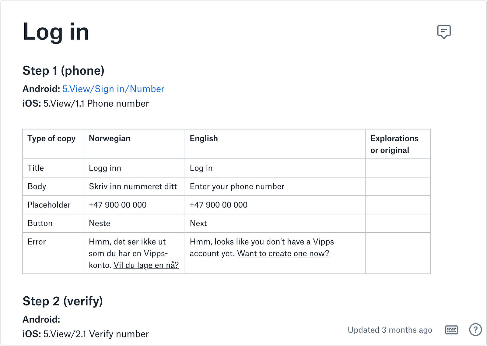
Keeping it all in one place is convenient whenever a designer needs to update the design files with the final copy, or a developer creates a new string. It also makes it possible for others to comment on the copy, or to do several explorations before landing on a final version.
When we’re stuck, we google
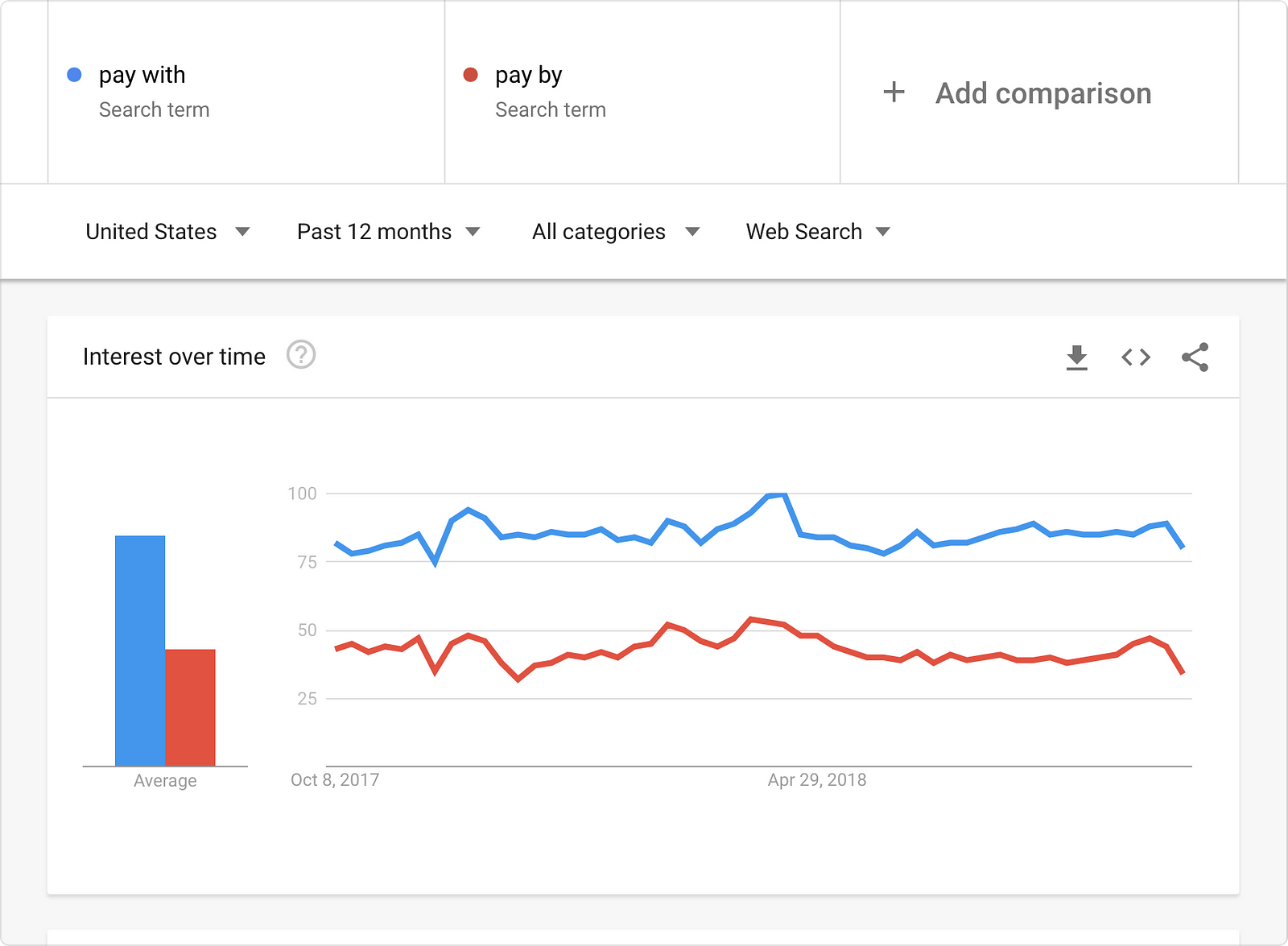
Whenever we’re unsure of how to make the error message more human or what the typical term for a menu item is, we avoid getting stuck by seeing what others do. This is also a great way to check if we’re staying consistent.
Google Trends is one of our favourites, especially to see what the general term is for a phrase or function. If both iOS and Android calls a function Settings, it’s probably not a good idea to change the wording, unless there’s a really good reason for it.

Writing for apps and websites
The process of writing microcopy for apps is pretty similar to writing for websites. The ecosystem of an app, however, is much more closed off. This leaves us with both constraints and technical issues that we don’t normally encounter on websites.
Because it’s usually only possible to do one thing at a time in an app, we want to make sure that every screen makes sense, so users can complete what they set out to do. Understanding the infrastructure and constraints makes it easier to know when it’s necessary to add help or hints to let all the different flows, well, flow.
In the end, it’s all about the same thing. For both websites, apps, and all other digital products for that matter, we only want the copy that’s actually useful — not too much or too little. Good microcopy isn’t just icing on the cake or making the brand personality shine through: it’s about making the product easy to use.
Multiple languages and platforms
Localising and translating the copy while safekeeping the identity can be a challenge. First of all, we need to make sure that the design is flexible enough to work with words and sentences in several languages.

We make the wireframes, prototypes and design in English, and use that as a base for further translations. We’ve recently explored Lokalise as a tool to set up the strings for translation, which works great for our needs. It makes it easy to get the copy into the app or product, without relying on manual labour by the developers.
Making sure the copy is useful
Whenever we’re working with an app or product that already exists, we love to get a grip on the general experience early on by reading the reviews from App Store, Google Play, social media and any other platform we can get our hands on. This is a great way to start gaining insight into what users feel, what words they use and outline the biggest challenges we need to address in the copy.
If we’re aiming full WCAG compatibility, we have to be extra diligent to make sure everything makes sense for everybody. Sometimes we write additional copy, like aria-labels, to make sure it works smoothly for people who use screen readers or other aids to use the product. We can still make human interfaces with a personality, but when it comes to accessibility, being clear and concise is much more important than being funny or minimalistic. Test it, and test it again
Our experience is that flows always feel slightly different when you’re in the actual app, compared to static design. We’ve figured out that what usually works best is to provide a lot of different alternatives and then test and adjust the copy — with both design and prototypes — until it’s just right.
References we love
- The Microcopy Book — a great toolbox with examples and tips
- Designing inside out for better results —nobody visits your website or app just to look at the homepage or navigate the information architecture. They do because they want to get something done.
- Copywrong to copywriter — a neat and practical little guide for everybody who wants to up their copy-game.
