Building The Talabat Design System
Walkthrough of building the Talabat Design System
Without a doubt, Talabat is the most popular, trusted food ordering brand across GCC. Despite its exponential growth, we continued to owe our customers a lot of design debts in terms of UI/UX. They face inconsistencies & asymmetries in standards, controls, gestures & elements across platforms. Ironically, it all happened due to lack of clear, unified, scalable design direction, philosophy or approach.
Building a flexible, maintainable, scalable Design System would indeed be a perfect solution to address any such design grievances. This would not only help the product to grow and scale organically with new features & initiatives, but will also help us to accelerates the design process, and build bridges between teams working in concerts to bring products to life faster.
My special thanks go to our Head Product Manager Karim Ali, who pitched this initiative of having a single underlying system that unifies the user experience across platforms & devices. I would also thank my awesome fellow product designers Vel Murugan & Amr Younes who decided to entrust me in charge of Design System & shadowed me throughout the development cycle.
Here is how our approach goes on building a Design System.
- Discover — UI Inventory Audit
- Rules — Define Goals & Principles
- Establish — Global Design Manual
- Build — Library of Patterns
- Test — Validate Concepts
- Documentation — Entire Design System
- Implementation — Engineering a Design System
Step 1.
Discover — UI Inventory Audit
This phase helped us to discover all the different versions of patterns, components & usage perspectives in our current application. We start by collecting all the screenshots to easily investigate various version existing in our application. All key findings were maintained in proper grouping format in google slides.
Captured Patterns :
- Global Elements: Components/elements like header, search etc.
- Navigation: Navigation, pagination, breadcrumbs, etc
- Images: logos, hero images, avatars, thumbnails, backgrounds etc.
- Icons: All types of icons like line, glyph etc.
- Colors: Capture all unique colors primary, secondary, tertiary etc
- Typography: All typographic headings, subheadings, labels, copy etc
- Forms: Inputs, text areas, select, checkboxes, switches, radio buttons and other forms of user input.
- Buttons: Primary, secondary, big, small, disabled, active, text links etc
- Lists: Bulleted, numbered, lined etc.
- Messaging: success, errors, warnings, information, alerts, popups, tooltips, and so on.
- Interactive components: accordions, tabs, carousels, and other functional modules with moving parts.
- Ads: all ad formats and dimensions.
Here it goes the spliced screenshots of UI Audit Investigation
We found out +20 colors shades, different styled CTA buttons, icon style variations and many other inconsistencies in other interfaces.


Step 2.
Rules — Define Goals & Principles
The 2nd phase was all about to define the key design and business goals & principles we wanted to achieve through DS;
Goal — Develop a single underlying system that unifies the user experience across platforms & devices.
Principles -
- It must solves users problem.
- Understand motivations, needs, and frustrations
- Everything must work seamlessly and transparent
- Abide by KISS methodology (Keep it simple, stupid)
- Avoid all sorts of ambiguity
- Be conversational
- Provide timely feedback
- Maintain consistency in standards, controls, gestures & elements you are habituating users with
- It must be visually appealing and interactively rewardable with delightful feedbacks
Step 3.
Establish — Global Design Manual
This phased was the true game-changer, that helped us to articulate design direction, philosophy & approach. Laying down a strong foundation enabled us to develop a single underlying system that unifies the user experience across platforms & devices.
It includes;
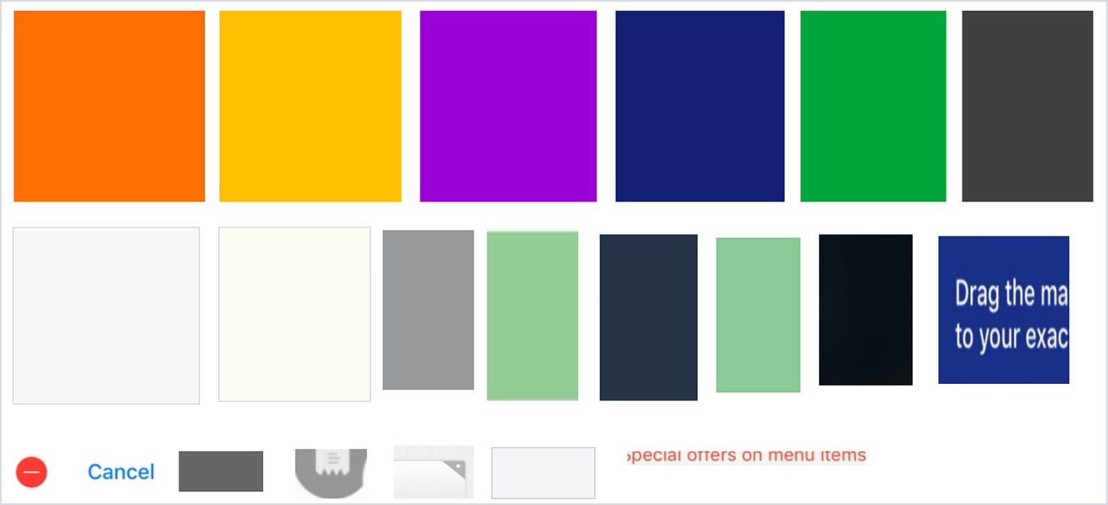
- Color
We sticked to the 60–30–10 Formula — 60% is our dominant hue, 30% is a primary color and 10% is an accent color. This proportion creates a sense of balance and allows the eye to move comfortably from one focal point to another.

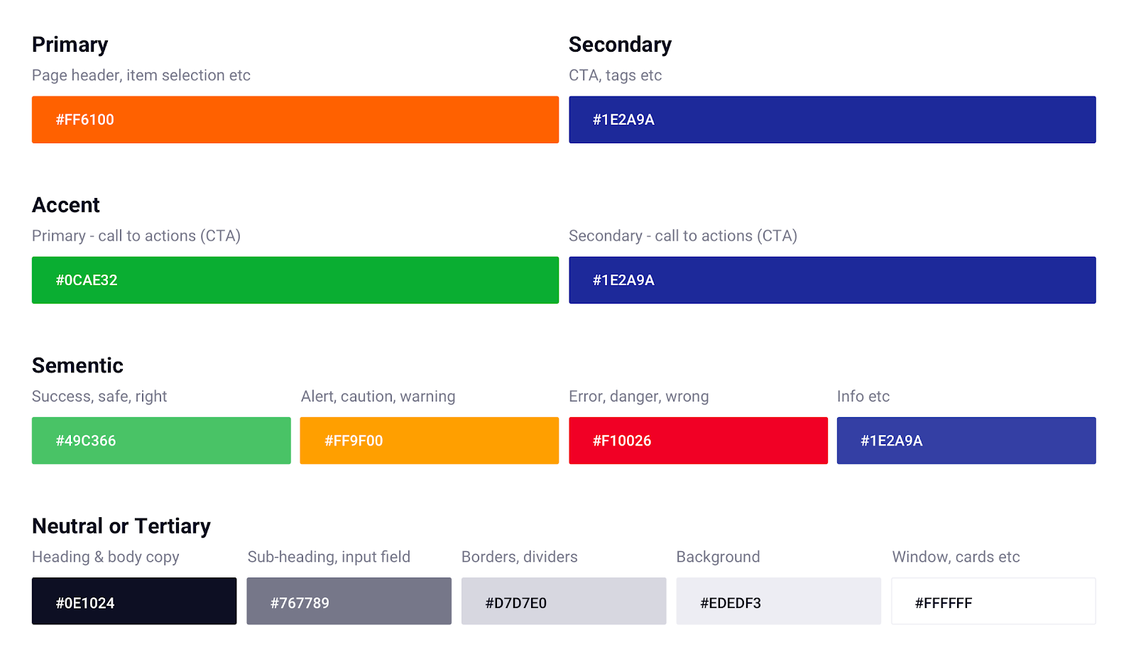
Primary: We maintained the same our “Orange” for our primary brand color. (We changed its toning slightly around to make it more vibrant and live)
Secondary & Variant: We also maintained its complementary counterpart “Blue” (We changed its toning slightly around to make it more vibrant and live)
Accent & Variant: We also maintained our “Green” for our primary action color. (We changed its toning slightly around to make it more vibrant and live)
(Accent is to emphasize actions & highlight information. e.g Making CTA buttons flaring among other content)
Semantic: Success, error, warning, information
(These color are chosen based on research about the color psychology of signal & has become common design pattern across industries:
- Red for error, danger, wrong.
- Green for success, safe, right.
- Yellow for alert, caution, warning.
- Blue for information.
Neutral or Tertiary: It includes Text, Background, Borders, Strokes, Dividers.
- A dark grey for main headings, body copy
- A medium grey for subheadings and supporting body copy
- A slightly darker grey for borders, lines, strokes or dividers
- A very light grey for backgrounds
Tips: Avoid using gray colors without saturation. In real life, pure gray colors almost never exist. The same goes for blacks. Add a bit of saturation to your color. Subconsciously it will look more natural and familiar to users.
- Typography
“Typography is key to setting mood, tone, and style in your designs.”

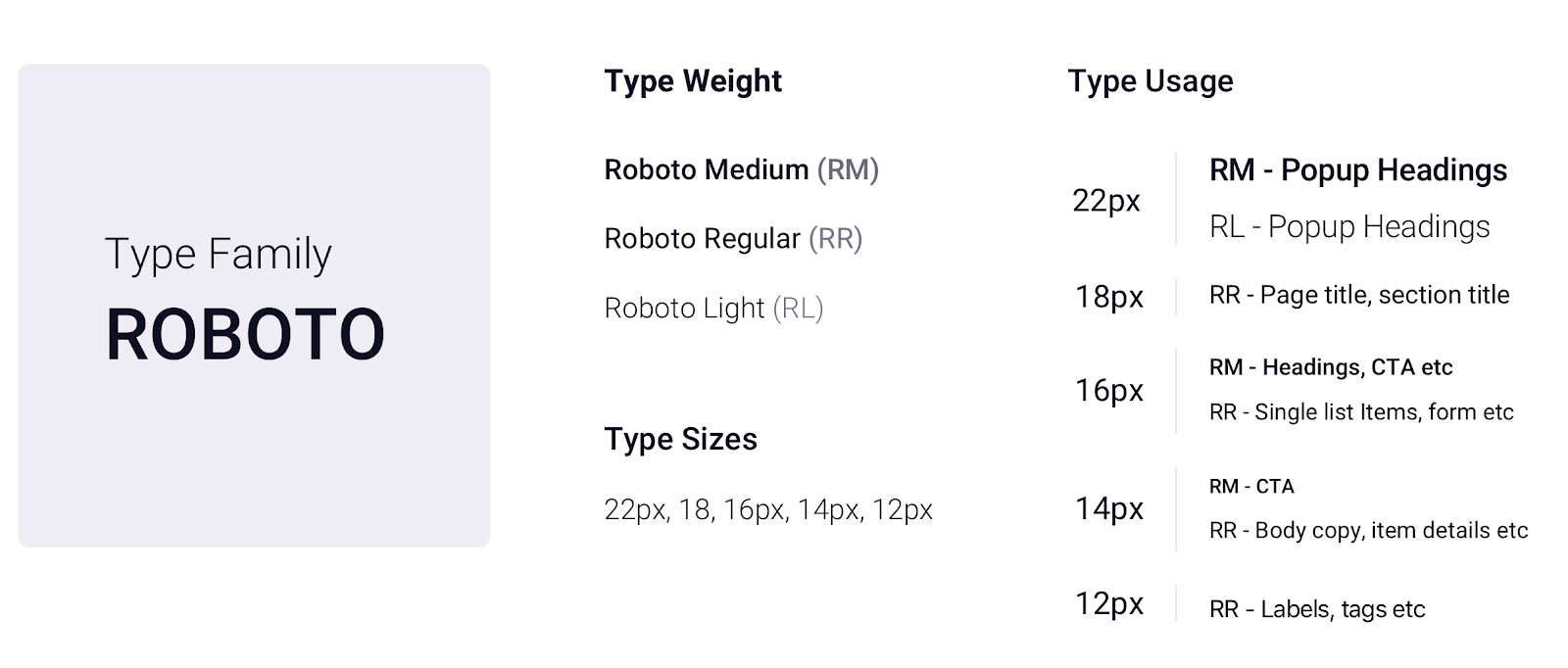
In our design manual, we defined all the properties of typography & gave proper naming conventions with usage examples:
- Font definitions: H1, H2, Subtitle, Copy, Button, Caption
- Font sizes : 22px, 18px, 16px, 14px, 12px
- Font weight : Light, Regular & Medium
- Font colors: Dark & Medium Grey
- Font Cases: All capital letter for Button & Actions
- Letter Spacing : H1 : -spacing , H2 : Normal , Subtitle1 & body1 : Normal, Subtitle2 , body2, Button, Captions: + Spacing
- Line length: As a typography rule, the preferredline lengths of copy should be between 40 to 60 characters. For desktop, line length should contain up to 120 characters.
- Line height: This will be determined by Golden Ratio 1.618 rule.Line height should always be proportional to its type size.
- Spacing
It is the most popular and widely used measurement technique. It basically means that any defined height or width, margin or padding will be an increment or multiple of 8pt or 4pt

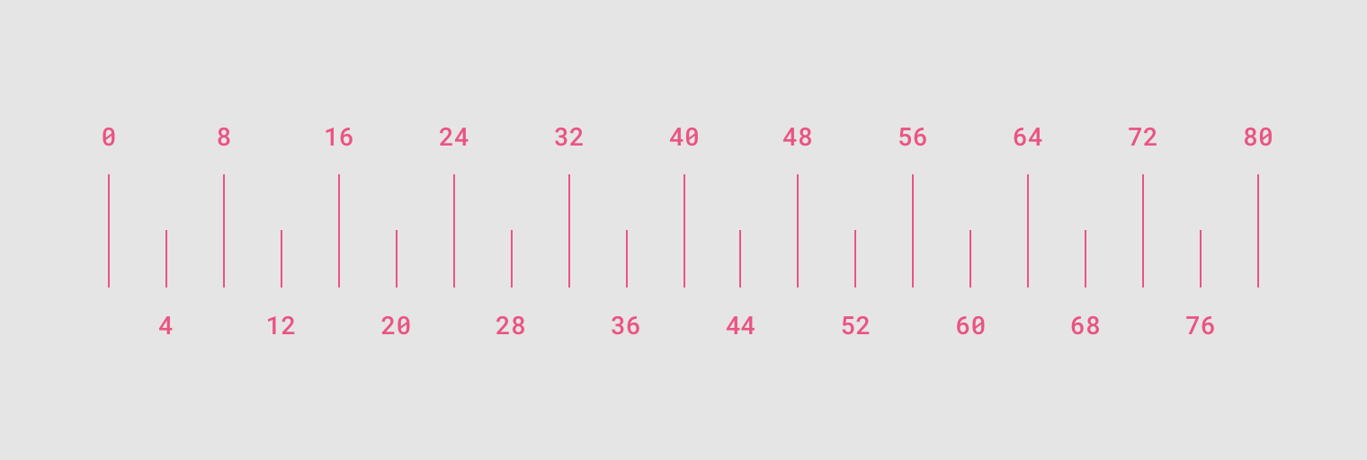
8-Point Grid
This measurement technique we widely used in all our elements and components
4-Point Grid
This we kept for smaller components, like iconography and typography etc.
- Layers & Elevation
Layers are the surfaces on which content and components live. Layers are differentiated by its shadow elevation or property.

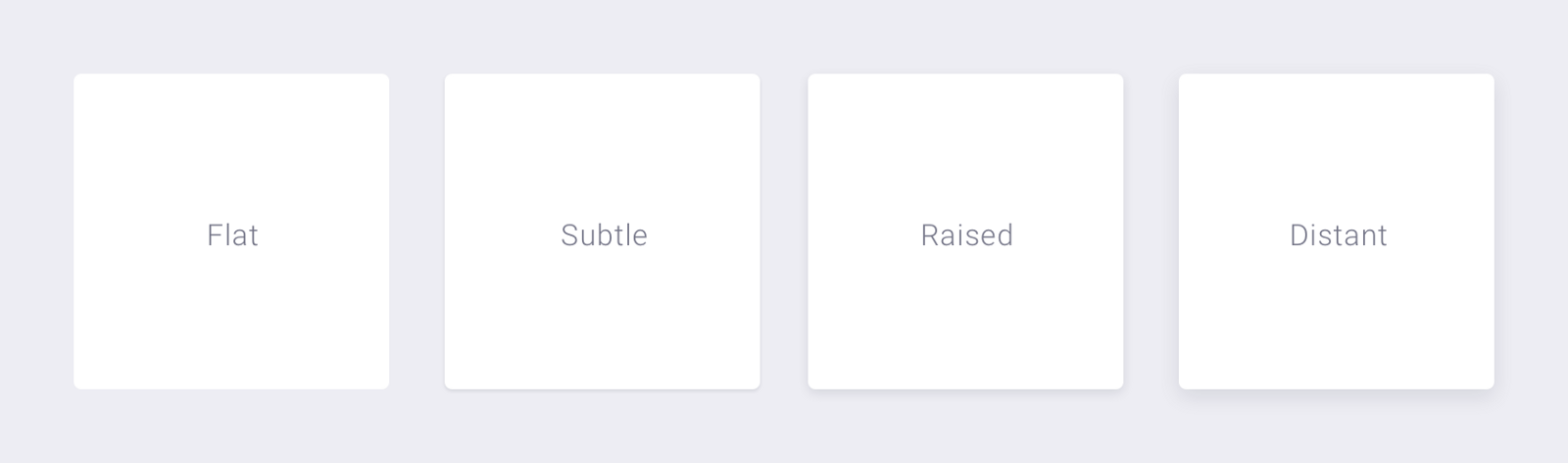
Flat: None
Subtle: Ideal for card components etc
Raised: Ideal for overlay components
Distant: Ideal for dialog components
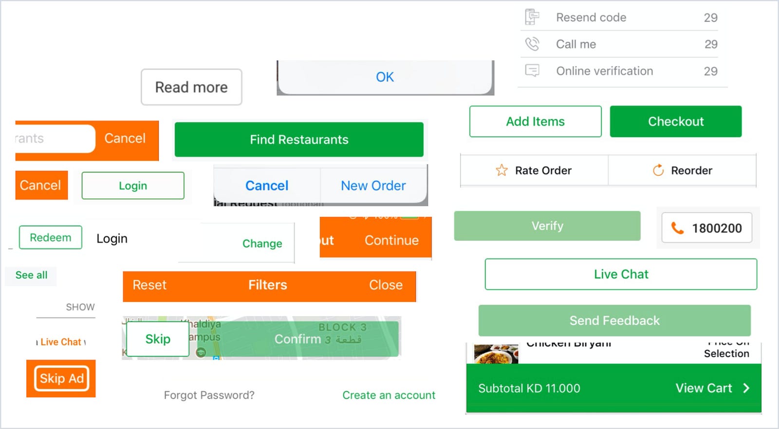
- Call to Actions (CTA)
We tried to make our CTA’s stand out clearly in terms of color & typeface styling. Here go basics;

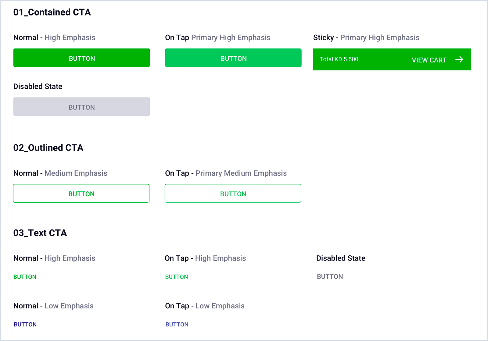
Contained — Ideal for high emphasis action
Outline — Ideal for medium emphasis action
Text — Ideal for both high & low emphasis action
- Corner Radius
This helps in delights the eyes and brain to scan elements smoothly;


- 2px Small:Ideal for tiny elements like checkboxes, tags & labels.
- 4px Medium: Ideal for cards, overlay, buttons, containers, inputs, and similar components.
- 8px Large: Ideal for action sheets, dialogs, and other large components.
- 50 %: Ideal for building circular components like avatars, chips etc.
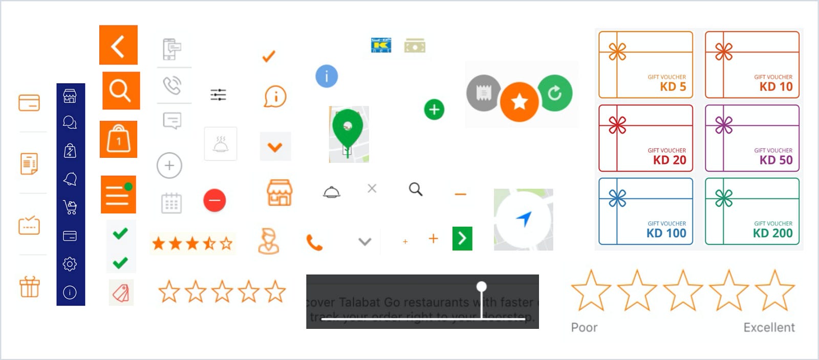
- Iconography & Illustration
We are aiming to be more personalized in future to make all our product icons & illustrations unified through concept, theme, and execution. For time being we planned to use Material Icons.

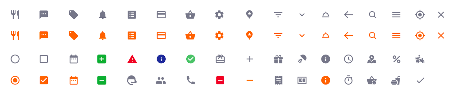
Following are the key factor consideration in our iconography.
Clarity :
To preserves sharp edges and correct alignment, we will be following unit grid & keyline concept in both square & circular type of icons & illustrations.
Style : We finalize two popular icon styles;
- Line icons — Ideal for 36x36px, 48x48px, 56x56px, 140x140px, 208x208px
- Glyph icons — Ideal for 18x18px, 24x24px
Viewport : To maintain consistency in spacing we abide to viewport concept.
Color: We adopted 2 type of color styling;
- Multicolor inline icon
- Monochromatic in glyph Icon
- Interactions
Interaction design focuses on creating engaging interfaces with well thought out behaviors.
Principal: All our interactions should provide realistic, directional responses to gestures/actions. Hidden gestures should clearly indicate the affordances to users e.g animating element before the user interacts with them to suggest a gesture. Some common gestures/actions interaction includes:
- Tap — Ideal for any interactive element e.g CTA, list, cards etc.
- Double Tap — Ideal for zoom in & zoom out
- Scroll and pan — Ideal for Map etc.
- Drag — Ideal for overlay contents etc
- Swipe — Ideal for cards, images, list, overlay contents etc
- Pinch — Ideal for zoom in & zoom out.
- Dividers
Dividers are used to segregate content into groups. We decided to rely on 3 type of dividers;
Full-bleed dividers: Full-bleed dividers (solid line, 1px thickness) to separate content into sections.
Inset dividers: Inset dividers (solid line) to separate related content
Center Divider: Center dividers (solid line) are used to separate content into sections. Ideal for popups.
- Dialogs
Dialogs by nature are interruptive. Therefore, they should be used only when any critical information that requires a specific user task, decision, or acknowledgment.
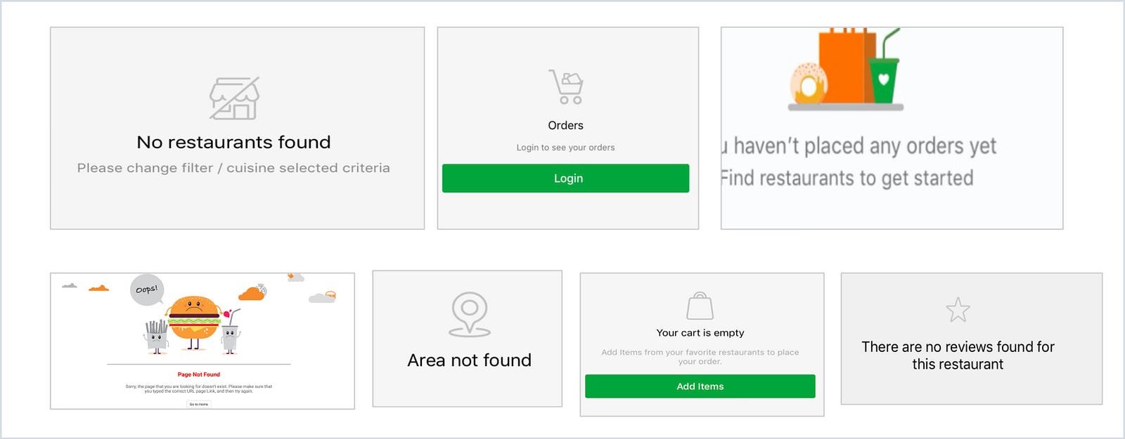
- Imagery
Imagery helps us to communicate a product through visuals. Our imagery is unified in style, function & intention.

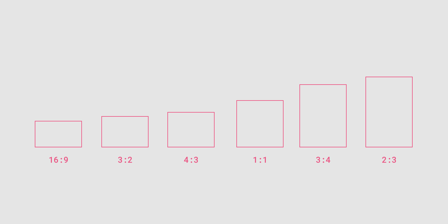
Hero Image: Hero images provide context about content. The ideal size of the hero image is based on standards ratio, but due to our business requirement, we have sticked to a custom size.
Thumbnail: It appearing within components like cards & lists. The ideal size ratio is 1:1 ratio
Informational: It assists in understanding content as a whole, without being the prime focal point in a UI. It can be considered for icon or image etc. The ideal ratio is 1:1 in circular type & 16:9 ratio for rectangular type images.
Step 4
Build — Library of Patterns
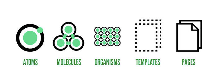
We constructed a pattern library based on Brad Frost’s Atomic Design Theory. It includes atoms & components which can be stitched together to make up a page.