Developing the Zomato design system
Before we get to how the goals were achieved, let’s take a look at the process of making a UIkit.
Process
For inspiration we looked at some UIkits on UI8, Dribbble for visual reference to understand the current trends.
One major design constraint we had to take into account was reducing learnability. We have 120 million foodies coming to our app every month, and changing everything from ground-up would mean making them learn again. They’ll need to relearn how to use the app, and this might result in loss of business transactions and users. So it was important for us to have a fair balance between the old and the new design language so that the user’s predictability doesn’t go for a toss.
What should we build first?
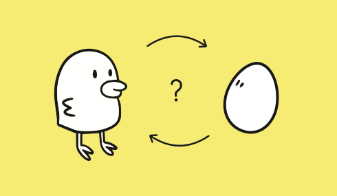
How do we build the UIkit first without knowing how it the interface will turn out? But also, how do we make the interface when we don’t even have a defined the UIkit?


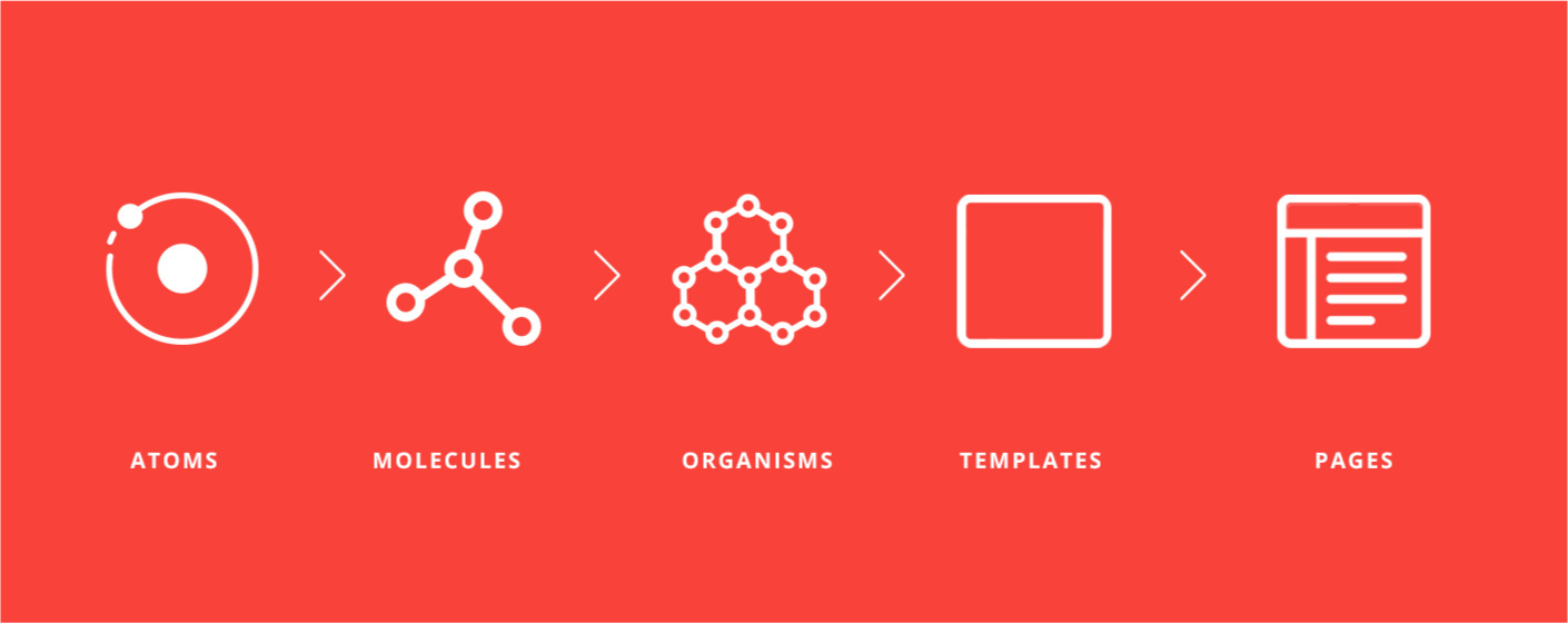
There were a lot of endless (heated) debates around “this element looks good”, or “no, this looks shabby.” Then we started research on a design system and tried to understand the process of how other companies build it. That’s when we read about Brad Frost, who introduced the
We’re not designing pages, we’re designing systems of components”. — Stephen Hay
Reading this statement we concluded that moving directly to pages to develop a UIkit was not probably the best idea. The answer lied in building both of them parallelly and making changes to them simultaneously. We looked at all products across all platforms and businesses to make a list of all app pages. While studying those pages, we listed down all the common components that our interface is comprised of. This exhaustive library helped us construct a design system in a more methodical way.


To begin with, we started designing basic atoms of our design system like font, primary colors, icon set. Things got more interesting and tangible when we started combining these atoms together to form molecules like buttons, form fields, table cells etc.
