Case Study: Typographical Specimen
I felt the hi-fi wireframe was strongest in communicating the versatility of the typeface in areas where there was more overlapping textures and tones and so decided to implement this across the entire landing page.
At this stage I also considered the use of more eye-catching tones (black or white) where I would place CTAs and important information.
Style Tiles


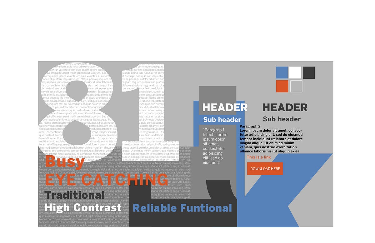
At this stage I looked back at my Design Inception Worksheet to draw colours from the original mood words. How would I show a functional but dynamic mood? Eye-catching but reliable?
Style Tile 1I liked the base of multiple greys from my hi-fi wireframe. I added blue to communicate reliability, then yellow as a complementary colour. However this seemed too safe and not very dynamic. So I added orange. It would clash nicely with the blue to pop out and shout slogans and CTAs loudly.
After trying to add this colour palette to my hi-fi wireframe I realised it felt too… nice, friendly and not bold enough.
Style Tile 2 On my second style tile I took out the yellow. This was an immediate improvement. It made it feel more serious. But now the dull blue felt dreary and sad. So I changed this for a more joyful blue which together with the orange produced a more exciting juxtaposition.
However, these colours are still a work in progress.
Prototype
(Scroll to the bottom of the page to see the full landing page)
I feel that the final website communicates my intended personality of Benton Sans dynamic versatility. I filled the website with poems, song lyrics and quotes from New York artists and reporters. This added a fun edge to the landing page.
Final Reflections
I was happy with the overall effect of the landing page within the time frame. However, there is definitely room for improvement on the functionality of the landing page and refining the layout.
During the design process I found the Design Inception Worksheet vital. It was a constant reminder of the basis of the project. It was a guiding star every time I lost my train of thought or if I got carried away with an idea that wasn’t quite on track.
Colour was my biggest challenge on this project. Perhaps it would have been easier if I had created a third moodboard that focused on the use of colour.
Although initially the project seemed quite a complex task to complete in one week, I found that as long as I trusted the process (DIW, moodboard, wireframes, style tiles, prototype) I was able to run away with ideas, get messy and then come back to these stable components. It allowed me to be creative but focused.
