Design Systems and Agility (Part 1 of 2)
Our working environments
In modern working contexts, our awareness of change still can freeze teams and can cause delays in decision making. This is because we are working within Complex Adaptive Systems environments, which makes things difficult to predict and chaotic. Lauren Currie spoke of complex adaptive systems in her amazing opening keynote at #UX2018, where she showed a flock of birds hovering in wind currents.
Perhaps as a legacy of Murphy’s Law, people are worried about chaos or things that seem messy. Generally, unless used to design thinking process, organisations may lean towards assumptions and quantitative ‘certainties’ for comfort, perhaps until it’s too late.
“If anything can go wrong, it will”- Murphy’s Law (1952)
Human-centered design approaches help us all navigate ambiguity and chaos. However, unless we work with human-centred advocates or those who understand and trust in ‘the process’, as designers we may experience challenges in the perception of our roles. Organisations might be more comfortable to see us as visual designers than designers of experiences.
Designers often attempt to negotiate in these environments and, sometimes successfully, to speak business and technical language in order to help others understand the value of our approaches. Designers need to onboard others into our worlds, so we can enable them to understand the value of what we do, which adds complexity to our roles in the form of additional advocacy and leadership skills.
What doesn’t help the situation is that organisations are trying to speed up to keep with the times, sometimes at the expense of their own understanding of the problems we need to solve, together.
Things are getting faster
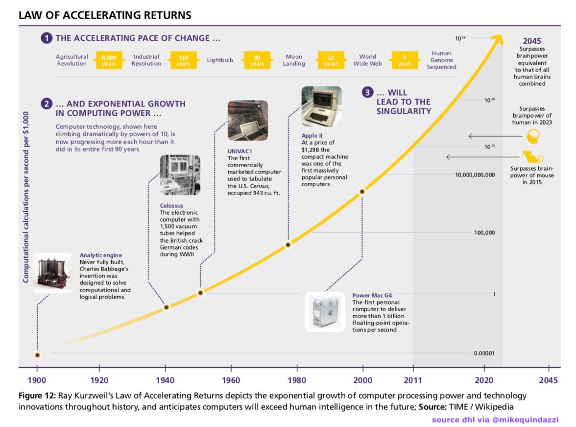
We are moving in an exponentially faster working world than ever before. As people we are struggling to conceptualise change. The Law of Accelerating Returns ( Kurzweil, 1999) is actually happening — right now.
“Most long-range forecasts of what is technically feasible in future time periods dramatically underestimate the power of future developments because they are based on what I call the “intuitive linear” view of history rather than the “historical exponential” view.”- Ray Kurzweil, The Singularity is Near (2005)
As designers, we need to challenge what “Singularity” means to us. Should a future defined by science fiction really be a reality we should follow as a community or in society? I believe we need to be “good ancestors” and create a legacy for generations after ourselves. Alan Cooper spoke of this in his impressive closing keynote at #UX2018.

Science fiction as a vision of the future
Tesla, the car company, I’m assuming was named after Nikola Tesla, the inventor of the Alternating Current. Tesla has made impressive innovations in technology.
Nikola Tesla is quoted at the beginning of Kurzweil’s book The Singularity is Near, with the statement:
“I do not think there is any thrill that can go through the human heart like that felt by the inventor as he sees some of the creation of the brain unfolding to success”- Nikola Tesla (1896)
Of course you can understand Tesla’s excitement. How might we feel though, if we create ‘a Frankenstein’ unwittingly?
In The Singularity is Near, Kurzweil talks about the “magic of technology” and favourite science fiction books. Many of those stories were great, but some are troubling too. As a society we often forget the lessons of history. As a community in technology we don’t seem to be paying attention to science fiction questions enough.
I see this playing out in contemporary media, such as Bladerunner 2049 last year. Personally, I thought the film was pants and felt disappointed. Forgive me if you disagree. Perhaps I was the wrong generation in the audience… even though the film was marketed as a blockbuster to everyone on the planet who was over eighteen years of age and could attend a cinema.
For me, the 1985 original had more substance, paid attention to the ethical themes of Do Androids Dream of Electric Sheepand was faithful to Philip K Dick’s discussion of the implications of synthetic memories in androids who think they are human. Was it inhumane to allow robots to think they were human? You decide.


My point is that designers have the capacity to change the world, influence people around us and be humanitarian in what we do professionally either by ourselves, with our teams or in partnership with the organisations we serve. And bring that humanity to technology. The capacity to be humanitarian and ethical can be unlocked by allowing ourselves to be human-centred.
You don’t need to build ‘things’ to be a good designer
As ‘designers’ we are often perceived as people, in organisations that do not understand human-centered design, who make things pretty. We might also self identify the value of our process with making or executing things. I did a talk about this at UX Gatherings in January 2018.
“Anything that can go wrong will go wrong while Murphy is out of town”- Mrs. Murphy’s Law
As designers we, ourselves, are challenged at separating our value from owning our execution work. In this light, think about Mrs. Murphy’s Law as a bit of a spin on Murphy’s Law (1953). We could easily apply this to designers. Let’s admit it, it’s difficult to hand over the driving wheel if there’s no system in place to help someone else make the best decision with the right support. Also we may not trust them to do it well.
As designers, we can’t just be about the look and feel exclusively. In technology this is naive and doesn’t serve the user. If you don’t care about the user experience, please don’t design… anything.
Designers need to put the air masks on occasionally and let others execute, or risk becoming a blocker in an Agile team.
Sometimes we need to rely on our teams and even people who work in other functions to ‘do’ the design. If we, as designers, don’t trust our Agile cross-functional team member’s capacity to understand how to make the right decision based on a experience and professional knowledge, we need to give them the ability to do it. We can’t blame them for not having a shared understanding.


Sometimes this is even a problem within design teams, never mind with other functions. This is not to suggest you shouldn’t care about design or owning work, but the genius of Jonathan Ive was supported by user experience greats in his team, then at Apple, such as Don Norman and dare I say it, Steve Jobs *insert joy emoji here*. We just need to create the scaffolding so people don’t fall down. Enter the value of design systems.
UX designers are often the intersection between business, other disciplines and our users. We have a responsibility to the users and organisation we are serving. However, our need for control needs to be smarter. We may need to hand over the reigns occasionally, but let’s get the horse ready first.
Keeping the cowboys at bay
Our perceived preciousness about design execution is because of a lack of trust due to things like the Cowboy (below). Perhaps our concerns are warranted, especially if we don’t have build standards, play books or design systems, yet. The Cowboy can create poor decisions without support, ignore recommendations and cause chaos where there shouldn’t be any.


We’re in new technology frontiers, there’s a lot of cowboys and it’s easy to freak on the details. Relinquishing a level of control is ok though if we have a system to support us.
Remember, we’re working in fast moving times now and in technology we have to be prepared to be ‘less precious’ whilst still maintaining quality of interactions and the way we design information.
We need systems to help us, not only to defend our users from cowboys, but, more positively, to enable teams to cross-functionally support designers with well thought out decisions.
And also let you have a holiday occasionally, right?
The beginning of design systems in web GUI
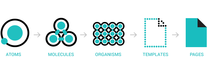
For me, web GUI systems started when Brad Frost created his responsive design framework. He called it Atomic Design and it was based on the periodic table of elements. For many, it sought to answer the multi-device context and content parity issue designers and front-end engineers were experiencing in the web, as well as increasing system and device ubiquity. User adoption of mobile phones was rising. Around the same period Luke Wroblewski was also leading discussions on mobile first design.
Agile at this time, for many engineering teams was being adopted more ubiquitously as a way of working. Designers and front-end engineers were moving fast. It just wasn’t efficient to design one thing for a single use-case anymore, we had omni-channel experiences and small teams to build large quantities of things. This point in around 2013–14 was where I saw front-end interfaces becoming like micro-services or a component relating to a ‘moment’ in a service design blueprint. For UX designers, this was important, so we could get on with other stuff.

Economy of scale
Brad Frost introduced into GUI web design an economy of scale. Use this term as part of a benefits statement next time you need to sell your design system to your product and service delivery teams. The term came from a person called Adam Smith, a Scottish economist and moral philosopher wrote a book called Wealth of Nations (1776). His work influenced many generations of modern economists. It might help your agenda.
Our attention should be on new frontiers
I am not going to suggest that as designers we shouldn’t care about visual interactions, information or visual design, we absolutely should, however designing experiences isn’t only about the screen, the presentation layer or indeed about graphical user interfaces (GUI).
Bill DeRouchey talked about the science fiction future (in a good way) extensively at #UX2018 in relation to design professions. Remember the interface/interactions we design can and will be any of these things and more:
- Screen user interfaces;
- Human to human;
- Multi-sensory (including Touch and Voice);
- Machine/AI;
- Virtual/mixed reality; and/or
- Ethical.
We all have these things to look forward to, as well as designing systems and standards for these new interfaces to eg. how might we design a voice interface design system? Given the changes that are coming with the future of work, it’s time we all, as a community become more human-centred.
As a design community getting usable and accessible front-end GUI design systems feeling good and well adopted in engineering for graphic interactions could mean that we have so many opportunities:
a) GUI interactions have a better chance of feeling good for users;
b) we can spend more time learning about humans we are designing for and problem solving;
c) we’d have an industry benchmark on interface systems thinking that we could replicate and extend for other types of interaction contexts; and
d) a population of really amazing people can start looking at the next frontier, and possibly stop a robot war or dystopian future too.

Are design systems helping us make our design response to systems that are complex and adaptive more consistent? Next, I’ll define Complex Adaptive Systems (CAS) for you and how it relates to Agile.
Then, I’ll tell you a story about the weather as a metaphor for Complex Adaptive Systems to help you understand the theory.
Complex Adaptive Systems (CAS) and Agility
As designers of experiences, we seek to make sense of complex relationships between things. These things include:
- People and/or teams who design, build or deliver products, systems or services;
- The product, system or service and components of each;
- Users/customers who interact with products, systems or services we design and also interact with and their networks; and
- ourselves.
The systems we design are complex and adaptive, not unlike the weather, or teams! Complex Adaptive Systems are defined as:
- Made up of many individual parts or agents;
- Individual parts or agents, or agents, in a CAS follow simple rules;
- There is no leader or individual co-ordinating the action of others;
- Via the interactions of the agents new patterns are generated; and
- If elements in the system are altered, the system adapts or reacts.
How CAS relates to the Agile Manifesto
The first part of each statement in the Agile Manifesto speaks to dealing with change; short iterative cycles, incremental learning, being close to users and the empowerment of self-organised teams to make decisions.
The Agile Manifesto states:
- Individuals and interactions over processes and tools
- Working software over comprehensive documentation
- Customer collaboration over contract negotiation
- Responding to change over following a plan
GUI designers might freak out over Agile not favouring processes and tools. However, have faith friends, as GUI design systems, ideally, should manifest as a working software artefact. And it might help you be better friends with your engineering colleagues. Own it together, don’t get factional, ok?
And before you hate Agile forever
Agile principles support great human-centered design process and interaction. Check these awesome principles that will make your fears about design quality fade away:
- Principle #1 Our highest priority is to satisfy the customer through early and continuous delivery of software
- Principle #9Continuous attention to technical excellence and good design enhances agility
- Principle #11The best architectures, requirements and designs emerge from self-organising teams
- Principle #12At regular intervals the team reflects on how to become more effective, then tunes and adjusts it’s behaviour accordingly.
So many opportunities for great work, great collaboration and great user experience design, if done well.
You might ask, “how are Complex Adaptive Systems like people, teams or design systems?”
Ok, so let’s move to the weather… and explaining Complex Adaptive Systems metaphorically. Then you’ll see how GUI Design Systems in technology and the weather have much in common, they might almost be kindred spirits.
A Story about the Weather: Explaining Complex Adaptive Systems
Weather is an example of a complex adaptive system.


As a designer of complex adaptive systems, we may sometimes act like satellites, observing patterns and the changing system’s effects.


We may also interact with, influence or change the effects of complex adaptive systems periodically, eg. daily or per sprint.


We might also have different ways to help us monitor change and methods to help us increase predictability eg. with analytics, data or via observation.

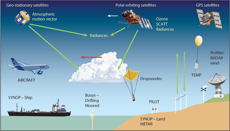
However, nothing is as reliable as the ability to understand change retrospectively eg. via trends and behaviour over weeks or months.


There are barriers to predictability and we must consider how to make system adjustments responsibly, perhaps incrementally.


The people who interact with these changes might say, “Is this wierd?”


The effects of weather can be chaotic given the nature of the system and limited predictability.


“Oh no, it’s snow” (below) versus “Oh, yay it’s snow” (below next).


Not only is the user prepared for the weather but she is enjoying it.


As designers of an experience that interacts with users we may wish to understand initial conditions, in order to make incremental adjustments to limit the potential of chaos.

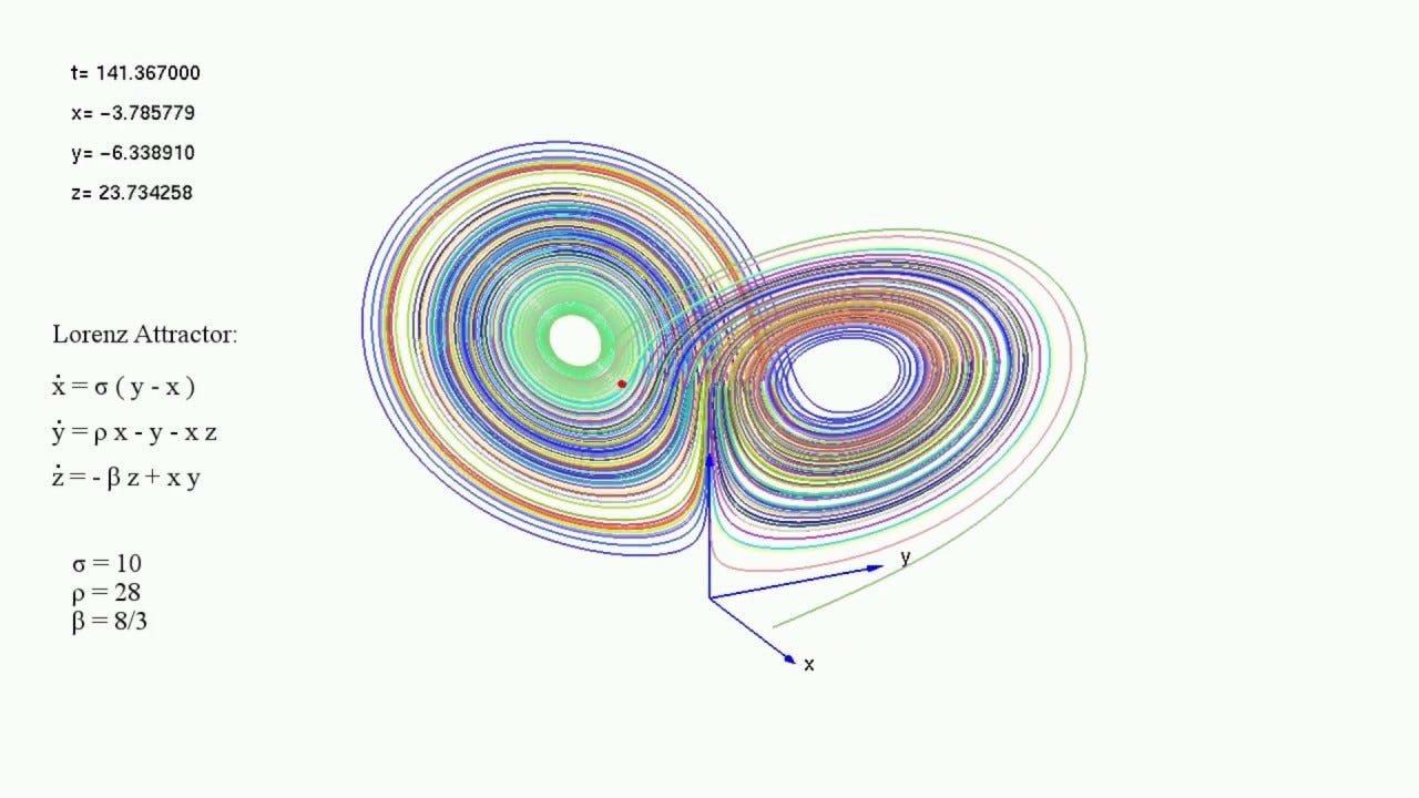
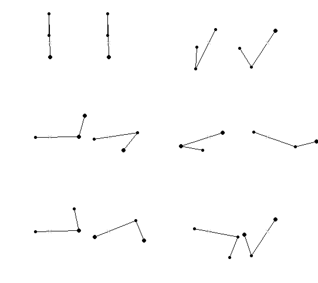
In the design of complex adaptive systems, we may favour incremental change, as the effects could be chaotic eg. double pendulum swing.

When sailing, it might be difficult to predict weather more than a few days in advance. Which is why we might rely on north stars or beacons, rather than the wind or the tides, as the latter systems change repeatedly, with different effects. What a beautiful world, if we choose to navigate it carefully.


THE END.
Hopefully you get the gist. There’s a bit of an environmentalist agenda in there too. Did you pick it?
In Conclusion
Humans interact with Complex Adaptive Systems every day. If it’s not what is outside our bodies and minds, the complex adaptive system is ourselves. Perhaps that’s why meditation has had a revival!
Seriously though, that is why becoming more human-centred as a designer and is really important. I’m thinking in particular of lone UX and product designers in Agile teams. Design systems create a way for designers and other people of all shapes and sizes to work together in order to make better decisions in the things we create for people. Well considered design systems will help us get there, certainly in the short term.
Thanks for reading. Part 2 of Design Systems and Agility is coming. See you there soon! In the meantime find me at @daughterofbev
