Creating visualizations to better understand your data and models (Part 1)
The Cancer Genome Atlas Breast Cancer Dataset
The Cancer Genome Atlas (TCGA) breast cancer RNA-Seq dataset (I’m using an old freeze from 2015) has 20,532 features (genes for which expression is measured) but only 204 samples of either a primary tumor or normal tissue. This makes for a very fun machine learning problem — can we build a reliable model that uses gene expression to distinguish normal tissue from cancer tissue?
If we try and train a model on all 20,532 features, we’re going to run into many issues. Instead, let’s take a look at whether we can generate some interpretable principal components for visualization and model building.
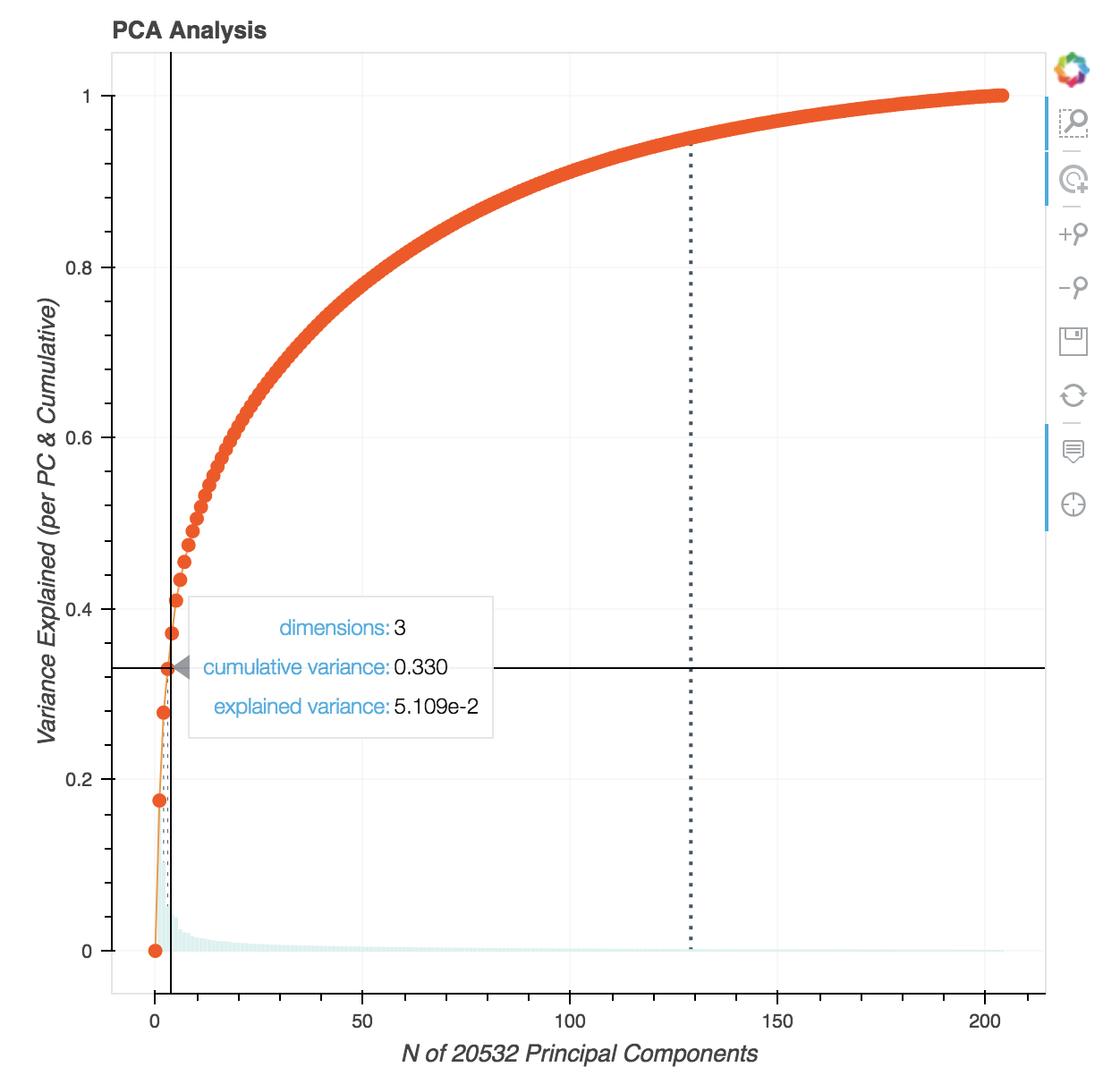
First, let’s look at the interactive PCA plot with these data:


From this, we see that it takes ‘only’ 129 features to explain 95% of the variance. Importantly, 33.0% of the variance is explained from just three principal components.
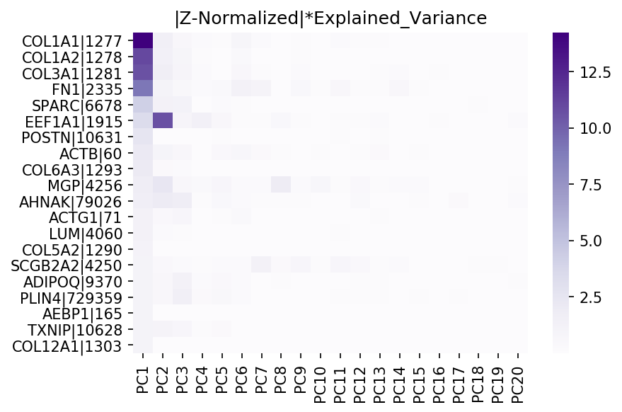
Let’s dive deeper. We can also use the heatmaps from before to inspect the data— but have you ever tried to create a 20,532 x 20,532 dimensional heatmap? This kills the kernel. Instead, we can modify the code to cap the number of features/PCs for visualization to a reasonable number (a future, more elegant solution might only generate a heatmap for features/PCs that explain up to a certain amount of variance, say 95%.)
Below is a heatmap showing correlation between the ‘top 20’ features and principal components:


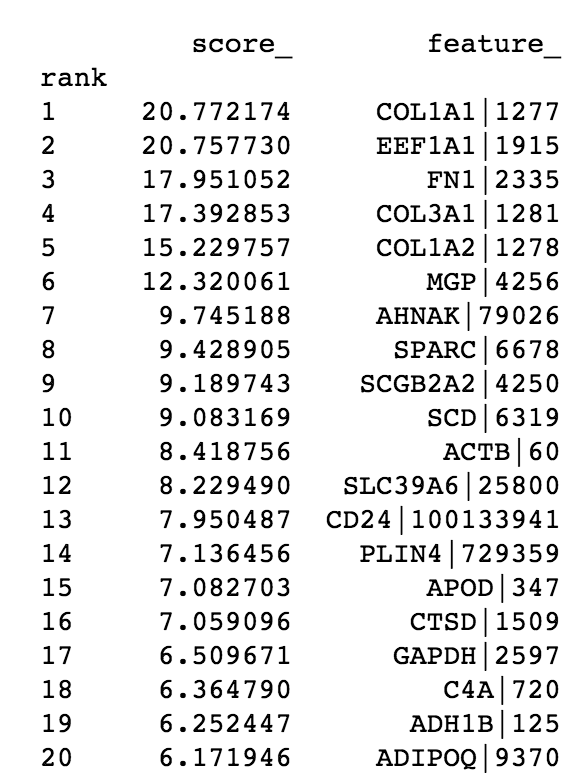
In addition, the code also gives us a printout the ‘top’ features, for easier inspection:


From these, we see that PC1 has strong contributions from four extracellular matrix proteins and PC2 has contributions from the gene EEF1A1. From a molecular biology standpoint, this makes sense — extracellular matrix remodeling is frequently seen in breast cancer [1, 2], and EEF1A1 expression is associated with poor outcomes in certain breast cancer patients [3].
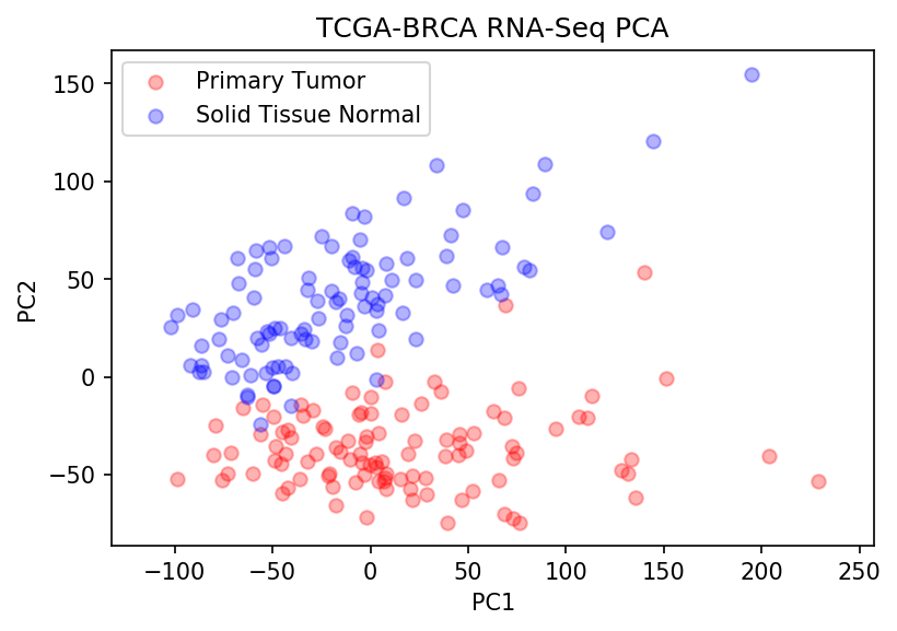
Now let’s step back — we seem to see strong signal in PC1 and PC2. And from the first plot, we see that they explain ~25% of the variance in the data. So what does it look like when we plot PC1 vs. PC2?


The above plot shows all Primary Tumor (red) and Solid Tissue Normal samples (blue) along PC1 and PC2. You can almost draw a line with the naked eye between both groups — which strongly suggests that we can successfully train a classifier with just two principal components using a simple linear model.
That’s pretty incredible when you think about it. From over 20,000 genes, we can define two linear, uncorrelated features that explain enough variance in the data to allow us to differentiate between two groups of interest. Further, we already have some indication of genes that help discriminate normal tissue from breast cancer tissue, and could have value for prognosis, diagnosis, or as therapeutic targets.
