
Create compelling Documentation with Github Pages
Technology
Git-Playbook comes as a VueJS app, its purely Frontend— no need for any backend or API Services so its easily capable to be deployed to Github Pages, Gitlab Pages or some simple web container of your choice.
From a package.json perspective, Git-Playbook is based on the following main dependencies (besides others): fontawesome, axios, vue, vue-markdown, vue-tree-navigation.
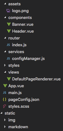
Git-Playbook comes with a Banner and Header Vue component, a Router thats picking up the document hierarchy from configManager, a number of css styles, the DefaultPageRenderer view (which is the primary core component to render the UX of the Playbook), the main.js which defines the Font icons we want and the pageConfig.json
PageConfig
This JSON file holds the high-level configuration of Git-Playbook and the document structure.
{ # configures the name of the app on the top-left corner "appName": "Git", # configures the header (showing up on the top-right) "headerNavigation": [ { "name": "Playbook", "path": "/playbook" } ],
# which of the pages on the playbook is the default landing "landingPage": "/playbook",
# configuration of the default page hierarchy "pages": [ { # the URL route we use to directly navigate to this page "route": "/playbook", # title of this page "name": "Playbook",# description that shows up on the tile "description": "This is the playbook", # font awesome 5 icon from https://fontawesome.com/icons "icon": "address-book",
# nested children that belong to this document "children": [ { # relative route to this nested doc, absolute route is # /playbook/whatsNew "route": "/whatsNew","name": "Whats new ?", "description": "recent announcements, news, ...", "icon": "bullhorn",
# reference to the actual content (markdown on static) "markdown" : "/static/markdown/whatsnew/Current.md" }, { "route": "/links", "name": "Helpful Links", "description": "how to go from here ?", "icon": "link", "markdown" : "/static/markdown/Links.md" }, { "route": "/faq", "name": "FAQs", "description": "frequently asked questions are ...", "icon": "question-circle", "markdown" : "/static/markdown/FAQ.md" }, { "route": "/roadmap", "name": "Our Roadmap", "description": "aligning our development plans ...", "icon": "map-marked-alt", "markdown" : "/static/markdown/Roadmap.md" }, { "route": "/process", "name": "Process Documentation", "description": "anything about support process ...", "icon": "project-diagram", # grand-children from the root node perspective "children": [ { "route": "/introduction", "name": "Process Introduction", "description": "how to read the process doc", "icon": "project-diagram", "markdown" : "/static/markdown/process/Intro.md" }, { "route": "/newPagesHowto", "name": "New Pages HowTo", "description": "how to create new Pages on ...", "icon": "file-alt", "markdown" : "/static/markdown/process/NewPages.md" } ] } ] } ]}To add a new Page into the document hierarchy, simply duplicate one of the objects from pages and fill its appropriate values. If you want a ToC page, you need to use nested “children”. If you want a content page, you need to create the actual Content file (in Markdown) stored on the static folder and then reference its path on the “markdown” field. This procedure allows you to create whatever complexity you need for your product documentation on whatever levels of depth you want.
If you clone the “Git-Playbook” repository, this is the only file you need to touch.
ConfigManager
This service file exposes a number of utilities for the DefaultPageRenderer and the Router:
- generateRoutingConfig — recursively iterates through the document hierarchy (based on processElement function) given by pageConfig.json. Is creating the compatible config structure for Vue Router and for the Vue Tree Navigation component.
/** * generateRoutingConfig - generates the routing for VueRouter out * of the pageConfig.pages */function generateRoutingConfig (baseConfig) { let pages = JSON.parse(JSON.stringify(baseConfig.pages)) for (let i in pages) { let element = pages[i] processElement(element, null) } // configure the default landing page pages.push( { path: '/', redirect: baseConfig.landingPage } ) return pages}DefaultPageRenderer
This vue component is the actual heart of Git-Playbook since it renders the main view area depending on the nature of the document is is expected to display. Table of Content pages will be rendered in the tiles-based experience mentioned above, whilst for pages that carry actual contents their markdown contents is rendered. The full source of the component can be inspected at the GH repo, here’s just the HTML template portion.
<template> <div class="container" @scroll="handleScroll">
<!-- display the banner on the page --> <section class="banner" :class="{ active: isActive }" v-if="pageConfig && !pageConfig.tiles" :data-name="pageConfig.name"> <h2 class="banner__title heading-1">{{pageConfig.name }}</h2> <h4 class="banner__title heading-4">{{pageConfig.description}} </h4> <p class="banner__text banner__text--timestamp"> {{ lastModified }} </p> </section><!-- render the markdown when content is available --> <vue-markdown class="content" :source="markdown"></vue-markdown>
<-- display the tiles, when children are available --> <ul class="cards" v-if="pageConfig.tiles"> <li class="card" @click="switchPage(tile)" v-for="tile in pageConfig.tiles" v-bind:style="{ backgroundColor: tile.bgColor }"> <font-awesome-icon class="card__icon" size="2x" :icon="tile.icon"/> <h4 class="card__title">{{tile.name}}</h4> <p class="card__text">{{tile.description}}</p> </li> </ul> </div></template>Deploy to GH Pages & Search Index generation
Building GIT Playbook including its search index is very straight forward:
npm run build
To deploy your Playbook to GH pages, run
npm run gh-pages
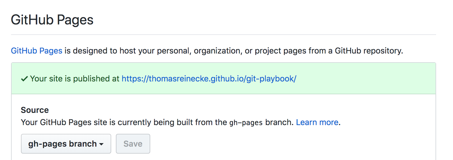
In your GH repository > Settings > scroll down to “Github Pages”, make sure it points to your “gh-pages” branch. You’ll find the link to your GH page deployment on that screen aswell:

Checkout the Demo of the playbook here. You’ll notice that also the Search index now works (which usually isn’t available on your development environment unless you serve it locally):