Announcing Statusmap Grafana plugin to visualize status over time
Announcing Statusmap Grafana plugin to visualize status over time
Grafana has an ability to show the status, Grafana has an ability to show data over time. However, paradoxically, there was nothing to visualize status over time in a convenient way… until now!
Introduction
We are happy to introduce our new Grafana plugin —


Here we can see that Nicki saves energy, Gerry is fast on water refill, Valera’s coffee maker is not doing well, and Bifrost lobby has better Wi-Fi than Moon station where water is quite a rare substance.
Does it look promising? Let’s start from the very beginning though — how we have come to this necessity at all…
Why?
To make our data visualization better, we had a simple task — to show a set of timeseries statuses over time period. This set may be composed of a variety of timeseries, they may differ in labels and names. Timeseries values should be easily
Here are few examples of how we can take an advantage of such visualization in our business (we are deploying and maintaining a lot of Kubernetes clusters):
- servers health state;
- Kubernetes pods health state;
- HTTP services health checks.
That’s why Flant has created new Grafana plugin and we are here to share it with a wide community. Because we love Open Source and we can see vast possibilities where applying of this plugin may bring huge benefits. You might wonder whether it’s a NIH syndrome: has nobody else dealed with the same problem before? Okay, let’s see.
Why not just use something we have?
If you dig a bit, it’s easy to see this problem is quite popular, and we are not the very pioneers here. Like many others, we have started from a few dashboards with Status Panel & Status Dot plugins in use. These plugins allow you to show current state for a set of objects, e.g. hosts or pods… or coffee machines from all over the world.


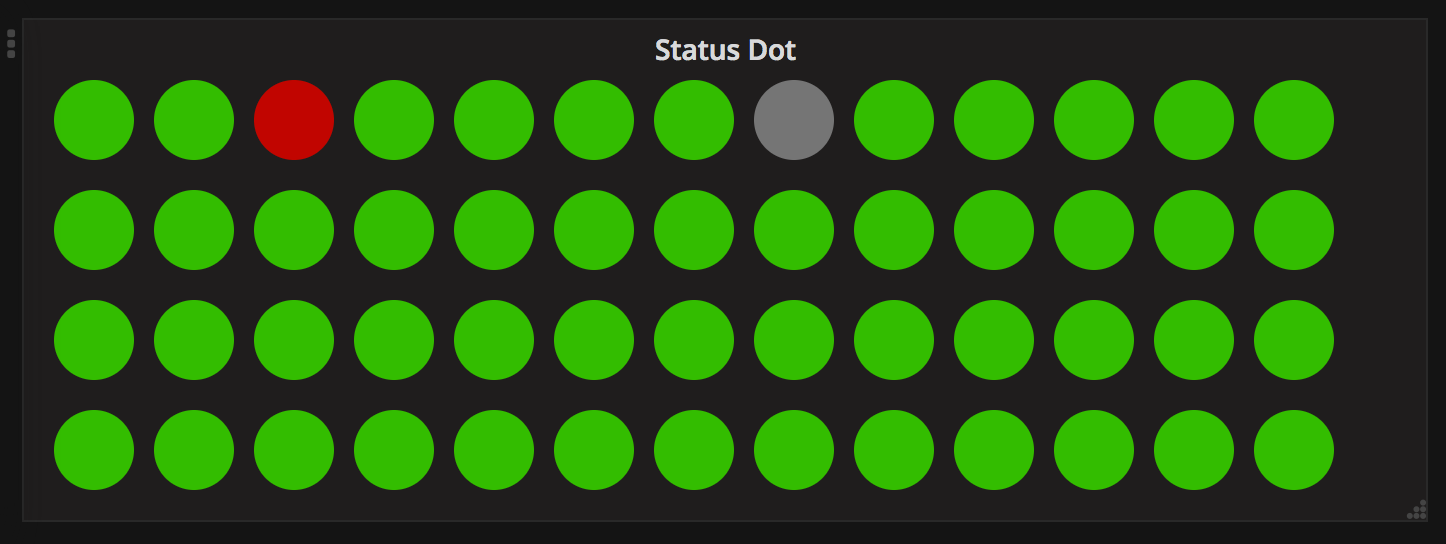
Everything has been fine until we need to see these objects’ status over time. The first and the most easy solution was to add regular graph with stacked option enabled:


It seemed that Status Panel and stacked graph would allow us to see objects’ status for now as well as continuing in time. However, stacked graph was not clear enough:
- it uses different colors for different timeseries instead of values which are mapped into colors in Status Dot or Status Panel. Due to this, we have different colors for two graphs and it’s really confusing;
- as soon as you get
nullas a value, graphs fall in.
We’ve tried to adjust Heatmap plugin but it’s been a failure: on Y-axis, it can work with values only and it can’t display labels there. Then we have tried the following Grafana plugins:
- Carpet plot which groups values into buckets by day and by selected fragment of the day;
- Discrete Panel is great but we need to display status discreetly over time;
- Status By Group Panel is a great enhancement over Status panel plugin which is able to display multiple statuses but it still lacks what we need.
As a result of all this work, we’ve got the following requirements for a plugin:
- dedicated, easily visible row of graph for every object;
- object’s name should be displayed on Y-axis and specified in legend field;
- one object can have different statuses — in this case, the major (most significant) status should be visible as a color and all others are still available via tooltip;
- rows or buckets should be displayed having a minimal width (i.e. 5 px) which can be specified — otherwise (if it’s too small), it may be difficult to use;
- manual color mapping, so you can specify a color to each numeric value from a discrete set.
Now, let’s dive into Heatmap graphs, Prometheus and discrete status…
A bit of theory
Classical heatmap is a 3-dimensional graph:
- X-axis is for time;
- Y-axis is for allowed values of something being measured;
- Z-axis is for number of observed values for this moment.
Heatmap plugin applies a color for Z-axis — for example, from white to red or through green-yellow-red gradient. It works well with continuous values: response time, queue length, server’s requests… When it comes to discrete status of a set of objects, you will need to:
- map names of the objects we‘re observing — on Y-axis;
- show current status (may be multiple!) of each object — on Z-axis.
Wait! What does it mean, multiple statuses for object in a point of time? Let’s see.
If you use Prometheus with Grafana, you probably know about step or interval — it’s a setting at Query tab. If you specify 1m there and collect data every 5s, simple querying of coffee_maker_status metric in Prometheus will return every 12th value but there will be no chance to see 11 values on the graph. What can we do to make things better?
The first idea is to use aggregation functions, e.g. *_over_time(coffee_maker_status[1m]). Which one should we use? Firstly, we should understand how status is represented in Prometheus metrics. In most cases, status is represented by a set of values. For example, coffee_maker_status may have such status values:
0—ok,1—off,2—no beans,3—no water,4—fail.
Everything seems to be easy now: we just need to count 0’s, 1’s, 2’s, etc… for 1 minute and we have great data to be visualized! However, Prometheus has its own understanding of these things: coffee_maker_status[1m] is a range vector, so expressions like max_over_time(coffee_maker_status[1m]==2) or count_values_over_time(coffee_maker_status[1m], 3) which would be just perfect for us… are impossible.
In fact, everything works perfect while you have two values in the metric: 0 (status hasn’t been observed) and 1 (status has been observed), — and store the status itself in label. Then, you can query something like this: (max_over_time(coffee_maker_status{status=”3"}[1m]) == 1) *3
So what should we do with metrics having multiple values? “Composing range vector functions in PromQL” blog post has given us an idea to convert metrics having discrete values into metrics with labels. It can be done with the following recording rule:
- record: coffee_maker_status:discrete expr: | count_values("status", coffee_maker_status)It makes coffee_maker_status to work this way: if 3 is given as a value, Prometheus creates coffee_maker_status:discrete{status="3"} metric which value is 1. The same will happen to each new value observed.
Since statuses are normally specified in advance, we can make a set of queries which will help us not to miss all the values we need. Legend of these queries should be the same, so we can group the values:

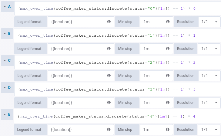
Now, if a coffee maker has been turned off (status 1 meaning off) during 30 seconds of 1 minute and has been working (status 0 meaning ok) all other time — we will know it’s been off because plugin will get two values with one legend for the same 1-minute period (0 from query A and 1 from query B).
Great, now we know how to aggregate data for discrete statuses and to lose nothing. What’s left? To combine data using legend and to draw it on the panel.
Statusmap panel plugin
We hadn’t come to all these thoughts in a day, however when we had pieced all these details together it turned out we’re missing just one thing — visualization. That’s why we have created Statusmap panel plugin, and here are its features:
- values from every point in time are grouped into buckets based on the text of legends specified in Query;
- each legend has its own row at the chart, its text is displayed as labels on Y-axis while empty values are displayed as a space or
0:


- each value may have its own color for a bucket:

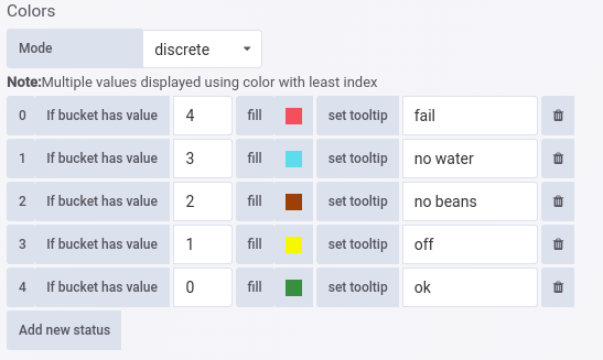
- if bucket has multiple values, its color will be determined by the uppermost value specified at Colors tab while all bucket’s values may be seen when you put your mouse pointer on this bucket:

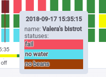
- an
intervalfor queries is increased, so buckets will never become thin lines.
As a result, we have a convenient status’ visualization for multiple objects. What’s important, you can see not just current status of each object (the rightmost buckets) but its status over time as well.
Where can I get it?
Grafana Statusmap plugin is Open Source (licensed under MIT license) and is available in our GitHub repository. And we hope it won’t take much time to accept it to official Grafana plugins directory.
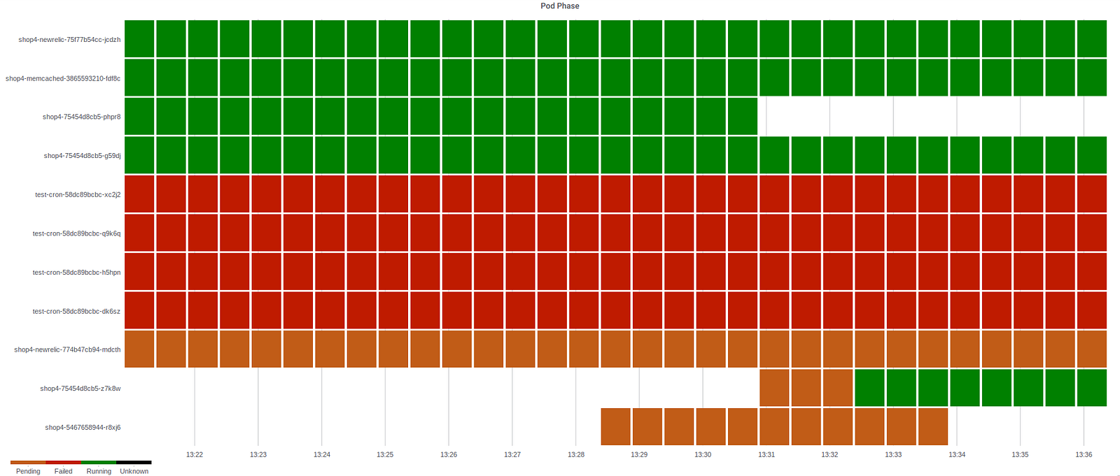
Finally, here is our last screenshot which illustrates how Statusmap helps us to visualize Pods status in Kubernetes production cluster:

P.S.
Since it’s our first post on Medium, we would also like to mention our other major Open Source projects you may find interesting:
