
Kickstarter-ing a Design Solution for Habitat for Humanity…
Slow, no or poor application feedback and response from charities made many feel unsure.
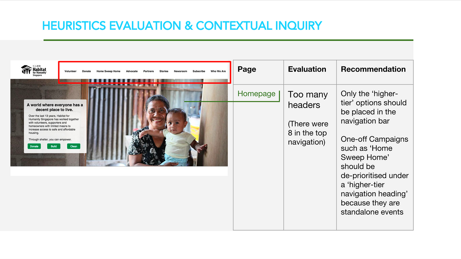
Most charities required the applicant to write-in by sending an email enquiry. However, these were often not replied to in a timely manner due to lack of staff manpower, leaving them to guess if they have been accepted or whether they did not meet unknown criteria. As seen above, for our client’s website, there were no visual indicators on the main details page on volunteer slot availability and the user was not informed until they clicked to apply.

Most volunteered with friends and family, and what mattered most was the emotional experience derived while helping beneficiaries.
The emotional aspect proved hard to capture, as shown even in our user testings of our Mid-Fi prototype later, where testers repeatedly commented our content was extremely logic and fact-based at the expense of a more emotionally-driven narrative.
Donors and Volunteers wanted to help out at their convenience, but the site didn’t support this.

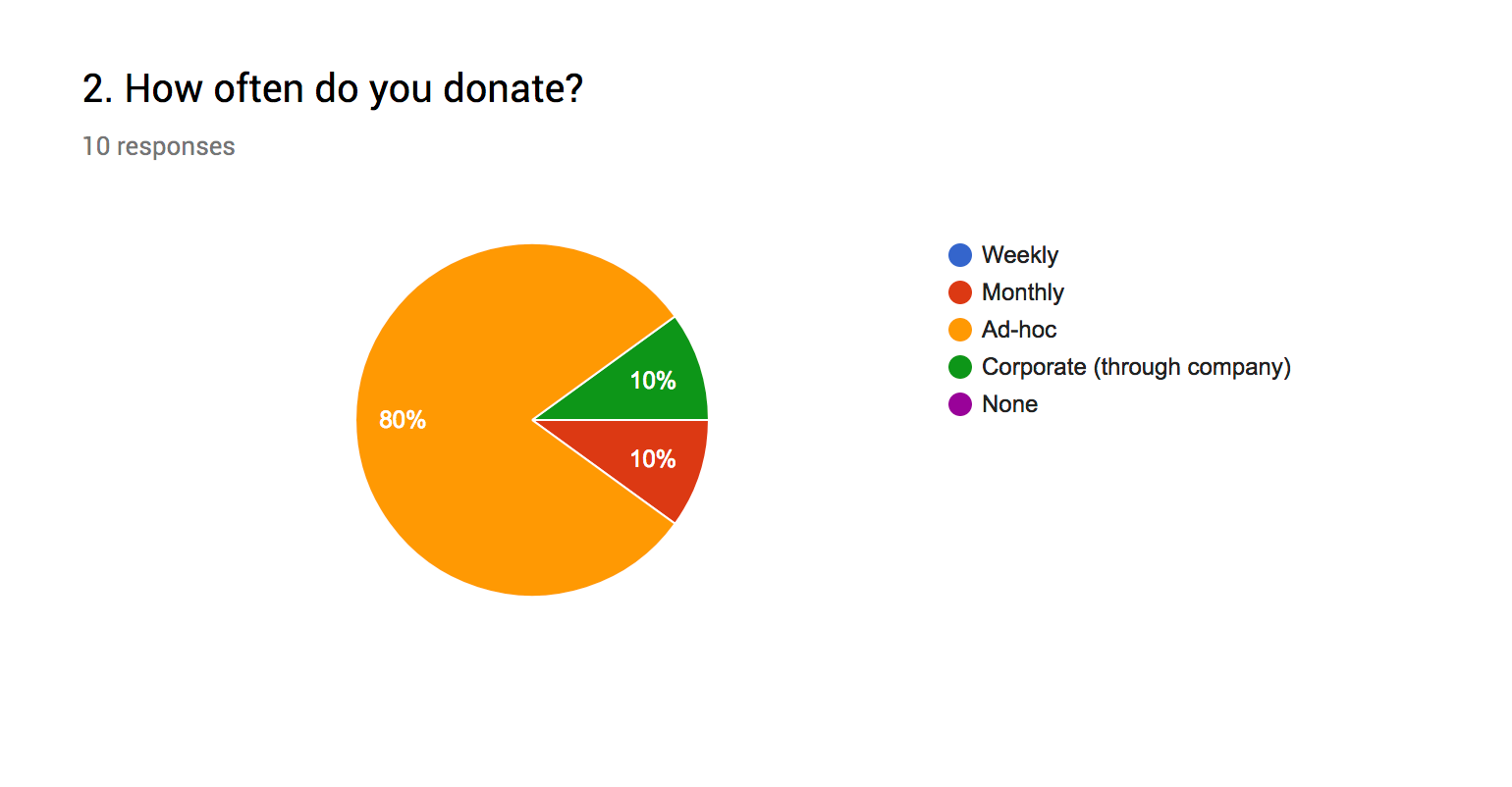
Ad-hoc donations were often made as an on-the-way after-thought, say when someone was approached with a flag-day tin can by a canvasser. Most busy executives wanted to volunteer specialised skillsets they were comfortable in, such as areas like finance or marketing; and they preferred timings that catered to their schedules and availability.
However, our client’s site did not facilitate for this convenience as decisions on what features or programs get showcased were based entirely on organisational goals without considering user goals. For instance, the navigation bar had too many primary/top-level headings, with “Home Sweep Home” a single one-off event highlighted to bring more attention when advertising it in the hero banner could have sufficed.

Most users just wanted to get straight to the point. But the Volunteer and Donate sections either lacked essential information, information was hidden or users had to write-in via email to get them. Users also had to navigate down convoluted paths, with some ending in a 12-page Google sign-up form. Our client had only manual work for most volunteering positions to offer, and specialised roles were limited to translation and photography work.
