Finding the Perfect 10: How We Developed the Foursquare Venue Rating System
Finding the Perfect 10: How We Developed the Foursquare Venue Rating System
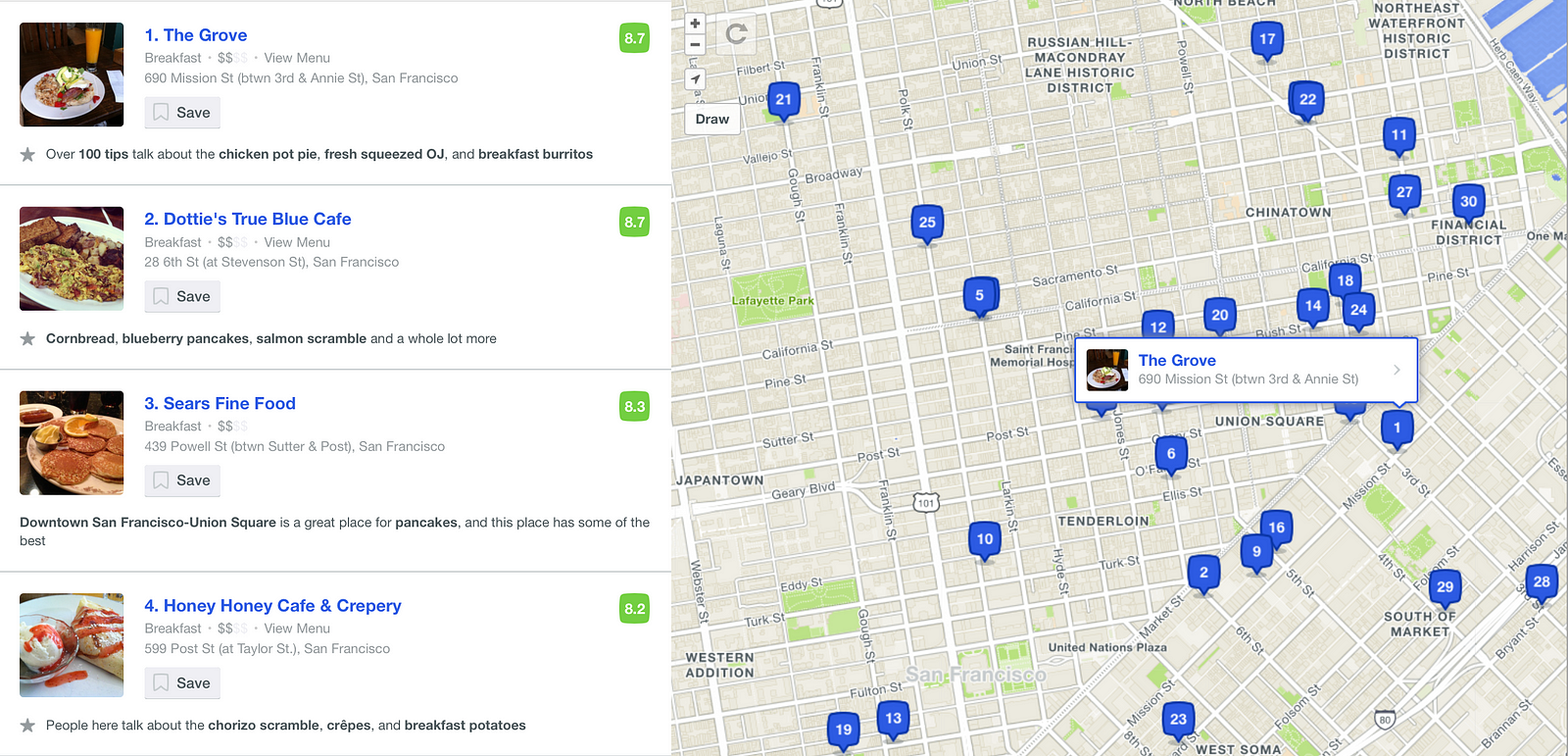
Looking for a great cheeseburger near you? Or want to learn how we provide information like that for our users? Foursquare City Guide calculates and displays venue ratings on a ten-point scale in order to provide our users with first-hand information about the best places nearby. In this post, we’ll explain how we calculate our ratings, which are trusted by millions of users for their accuracy and reliability — along with some lessons we learned while developing our algorithm.


Dozens of signals go into our venue ratings, but the most important ones are generated by our users. Our strongest signals include explicit feedback, quick tips, and verified check-ins. We also use passive location data generated by our flagship apps, Foursquare City Guide and Foursquare Swarm, as well as through our partner data, which rely on our proprietary
Explicit User Feedback
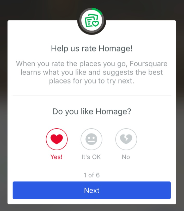
The Foursquare City Guide app encourages users to rate the places they visit. There are three ways to leave feedback: a user can say they “liked” it, a user can say they “disliked” like it, or a user can say they thought it was “okay.” To date, Foursquare has collected 175 million of these explicit ratings.


It’s clear that a “like” should pull a venue’s rating closer to 10.0 and a “dislike” should pull it down towards 0.0, but what about an “okay”? It should count for something between a like and a dislike, but where on the spectrum should this fall?
Because our goal is to provide accurate venue ratings, we designed a metric to measure the consistency of our ratings against user feedback. This metric is the number of inversions in our database. An inversion is when a user likes a venue with a rating lower than a venue they’ve disliked. For example, a user gives a “like” at a convenience store, which has a rating of 6.4, and gives a “dislike” to the upscale restaurant next door, which has a rating of 8.5, we pick up on that inconsistency (which we measure in aggregate and by venue category).
Although it is impossible to avoid inversions altogether, we can minimize the inversion rate by tuning the value of “okay.” When we plotted the total numbers of inversions as a function of “okay,” the result was surprising: an optimal “okay” is worth only 10% of a like. In other words, if a venue receives 10 “okays” from our users, the effect on its rating is exactly the same as if it received 9 dislikes and 1 like.
We interpret this finding as follows: “Okay” is a polite person’s dislike. It usually means the food and service is forgettable, whereas “dislike” is often saved for experiences that are memorably awful. This also provides a great deal of real humanity to our measurement.
User Tips
Foursquare has a database of 95 million tips written in more than 100 different languages. Every tip is analyzed with an NLP pipeline to extract information about tastes, phrases such as “bacon” or “vegetarian,” which describe a venue’s specialty. We can also pick up on sentiment such as sarcasm or positivity.
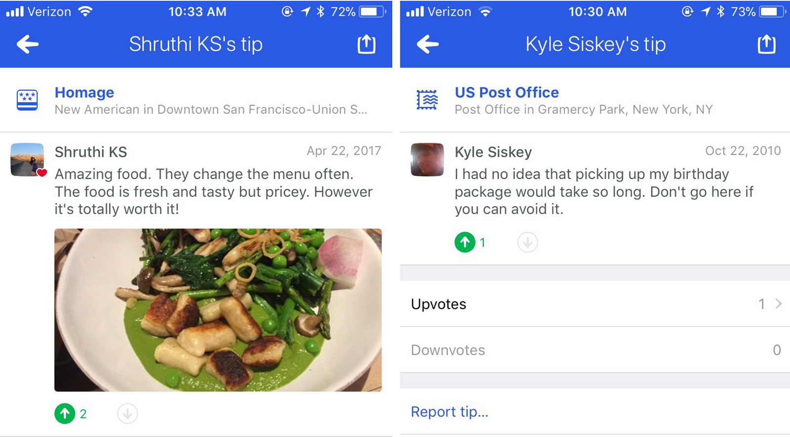
The NLP pipeline breaks every tip into n-grams that are between 1 and 4 words long. If a user leaves both a tip and a rating at a venue, as Shruthi did below for Homage, then the n-grams from this tip become part of the training data for a trinomial logistic regression. The model is regularized using the elastic net method. Because elastic net incorporates “lasso” or L1 regression, most phrases are assigned a score of 0. This way, we don’t need to store the enormous collection of all 4-grams ever written on Foursquare City Guide, only the fraction that have a non-zero sentiment score. This particular implementation was written in Python and optimized using the Cython framework, which compiles certain key parts of the learning code into C. The source code is provided in the link.


According to our model, the positive, neutral, and negative English phrases most commonly used in our tips are:
╔════════════════╦════════════════╦════════════════╗ ║ POSITIVE ║ NEUTRAL ║ NEGATIVE ║ ╠════════════════╬════════════════╬════════════════╣ ║ "amazing" ║ "average" ║ "worst" ║ ║ "awesome" ║ "okay" ║ "disgusting" ║ ║ "delicious" ║ "ok" ║ "terrible" ║ ╚════════════════╩════════════════╩════════════════╝
After the model is trained, it is used to score all of the n-grams extracted from all tips. We aggregate all of the scores per tip and convert it to a three-part score, where the three parts correspond to “like,” “dislike,” and “okay.” For each venue, we aggregate the scores of all of the n-grams to get a final percentage breakdown of each tip into positive, neutral, and negative sentiment.
Denormalizing cultural bias
After we developed the explicit rating and sentiment scores, we noticed an anomaly in our data. Ratings for certain countries were shifted noticeably higher or lower than ratings in the US. After some exploration, we noticed a strong cultural bias in user feedback.


Here is an example of some of our findings: users in Russia leave negative feedback twice as often as users in the US, while users in Japan are about 10% less likely to leave negative feedback than users in the US. We now normalize for this bias based on the country where a venue is located.
Foot Traffic from Verified Check-ins
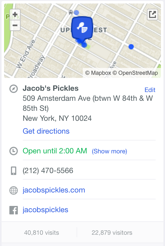
In general, we know that people like to go to quality venues and tend to shy away from poor quality ones. High quality restaurants, such as a popular upscale restaurant on New York City’s Upper West Side specializing in soul food, consistently draw a steady stream of distinct visitors. We can detect whether someone is local to the neighborhood, a foodie who lives in another borough, or an out-of-town visitor looking for a memorable meal, by analyzing when they checked-in and where else they normally do so.


The more foot traffic a venue gets, the higher its rating. We normalize our foot traffic signals signals by neighborhood, city, and category, so that a small “mom-and-pop” store around the corner doesn’t have to compete on the same scale as a venue like JFK airport. Incorporating foot traffic into our ratings gives us a unique advantage in that our rating system is difficult to scam. We also can detect spammers who leave biased tips at places they never visit, which provides a safety net. Conversely, we can detect repeat visitors, and we have a loyalty-based signal, which counts positively towards a venue’s rating.
Sign of the Times
In addition to what we’ve discussed above, we have a library of other scores that aggregate information derived from user expertise, uploaded user photos, and new venues that don’t yet have a large amount of data. All of these signals are recalculated on a daily basis in order to provide our users with the most up-to-date information. With regard to our mission to make the world a more delightful place, that includes developing a one-of-a-kind rating system that empowers our users to make the best choices for their day-to-day lives.
If you want to keep up with data science at Foursquare, follow Foursquare Engineering on Medium and sign up to receive our upcoming newsletters.
