Principles of Component API (Prop) Design
Principles of Component API (Prop) Design
Working with well-designed and maintained components can be delightful. It’s a great feeling when things just work and you are able to quickly compose a beautiful UI with preexisting components.
On the other end of the spectrum, we’ve all probably felt the pain of working with components that have been poorly designed. It results in confusion and a lot of extra effort figuring out how to use the building blocks at your disposal. I’ve found myself saying the following:
- What is the name of the prop I need here?
- Why is it red right now, shouldn’t it be blue?
- I wish there was a prop to…
There are an infinite number of different ways you could design the APIs for your components, and it can be difficult knowing what will provide the best developer experience. Luckily, I think there are some principles that can be followed to make it easier for others to consume and contribute to your components.
Make it hard to do the wrong thing
It can be easy to allow combinations of props that conflict or override each other. One common example I see is with a Button component that can have different levels of emphasis or color.
It’s common for a consumer to be able to accidentally use a bad combination of boolean props (e.g. secondary
negative). The syntax of using boolean props is really nice, but be careful you don’t give your users too many combinations of props to pick from.As an alternative, consider using enums for things like color, spacing, and size. For example, rathern than having small, medium, and large as boolean props, use a size prop that accepts "small", "medium", and "large".
Less is more
We’ve all used components that have a seemingly endless number of props. It‘s great when you discover that a component will behave the way you need it to if you pass the right combination of props to it, but it‘s sometimes impossible for engineers to remember all the options. There is a high cost to the context switching of jumping between docs and code, so try to save consumers of your components from this time sink.
I consider a large number of props on a component a bit of a code smell. When looking at why there are so many props on a component I’ve found that it’s usually because it is trying to do too many things. Try to follow the Single Responsibility Principle (SRP) in your components and consider breaking large components down into smaller components that solve a single problem.
Quick Tip: Consider making these components accessible via dot notation from the main component. e.g. Table.Row and Table.Cell instead of TableRow and TableCell. Hat tip to my co-worker, Spencer Miskoviak, for an article he recently wrote on this subject.
Use types
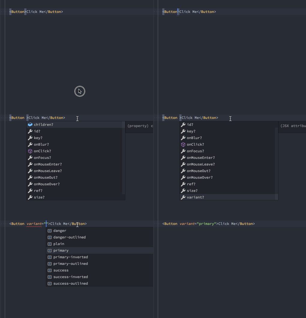
With TypeScript, Flow, and PropTypes available, there’s no reason not to provide some level of type safety on your components. This doesn’t only ensure that your components are used correctly, but it also lets you tap into an additional level of tooling that makes it easier for consumers to see what props are available and assign them correctly.
Quick Tip: Use enums instead of strings for prop types so you can make it easy to pass the specific values allowed by your prop.


Be consistent
If you have props that do the same thing across your entire component system make sure you name them the same thing. Don’t use disabled in one prop and enabled in the next.
If you have color, size, or spacing props on multiple components, try to have them accept the same values from one component to the next. For example, don’t have a variant="primary|secondary|danger” prop on one component and a color="blue|grey|red".
Be clear
Especially with boolean props, it can be tempting to use words that read nicely but aren’t clear in their meaning. For example, we used to have a fitted prop to remove margin on some components. This was problematic for a few reasons:
- It wasn’t clear to developers what
fitteddoes. We always had to explain it and people had to think “what’s the name of that prop that removes margin?” ? - The usage of this prop became inconsistent over time. Visually, it just removed some extra spacing around an element, but sometimes it was bottom margin, sometimes top, sometimes padding. There weren’t clear guidelines around when or how to use it.
- We started getting requests from design to create additional variations of components that had different padding and margin. We considered adding props like
tight,heavy,fluffy,relaxed, andloose. Introducing prop names like this would definitely have compounded the problems mentioned ☝️
If a prop is going to control padding, it’s often best to be explicit about it, which is what we landed on with props like padding="small|large". You can make the argument that this doesn’t read as well, but it’s easy to remember and our tooling gives us the ability to quickly select from the available options.
Conclusion
I can say with confidence that these principles have helped me build components that are easier to maintain and more enjoyable to work with, but they are still evolving. I’ve learned a lot through feedback from my teammates and trial and error, but I’d also love to learn from you and your experiences. Please share what has worked for you and your team!
