
Enough with the Data Tables
Enough with the Data Tables


There’s a new restaurant coming to town. Everything on the menu will be curated by a well-known chef. It touts fresh, high-quality ingredients and impeccable service. To make it even better, the restaurant claims it will bring your food out nearly as fast as your favorite fast food joint. With these factors in place, you know that this restaurant will be a big hit, so you make a reservation for opening night.
You get there and the excitement builds. Everything on the menu sounds delicious. You go through the list and, after a few minutes of alternating joy and trepidation (since you can only order one of these stellar options), you make your selection. Now you wait for the meal to arrive. As advertised, the food arrives within minutes of your order. The server places everything in front of you…and disappointment washes over your face.
Instead of serving you a well-prepared meal, the server places the individual ingredients for your meal on your table. You shoot the server a questioning look but it’s clear, you are on your own now.


You do your best and follow the provided instructions but you can’t quite get things right. You season your food unevenly. The stove temperature is a bit too high and you cook your chicken a little too long. At the end of the meal you complain. This is not the experience you were hoping for. The chef comes out and says, ‘You have everything you need for a world-class meal. You are the one that messed this up.’
Yes, this is a far-fetched tale. No restaurant would ever do this. You don’t go to a 5-star restaurant to prepare your own meal. So why do product designers do this to their customers all the time? Why do we expect our users to filter, sort, and manipulate their own data to make decisions? We need to rethink how we use data tables.
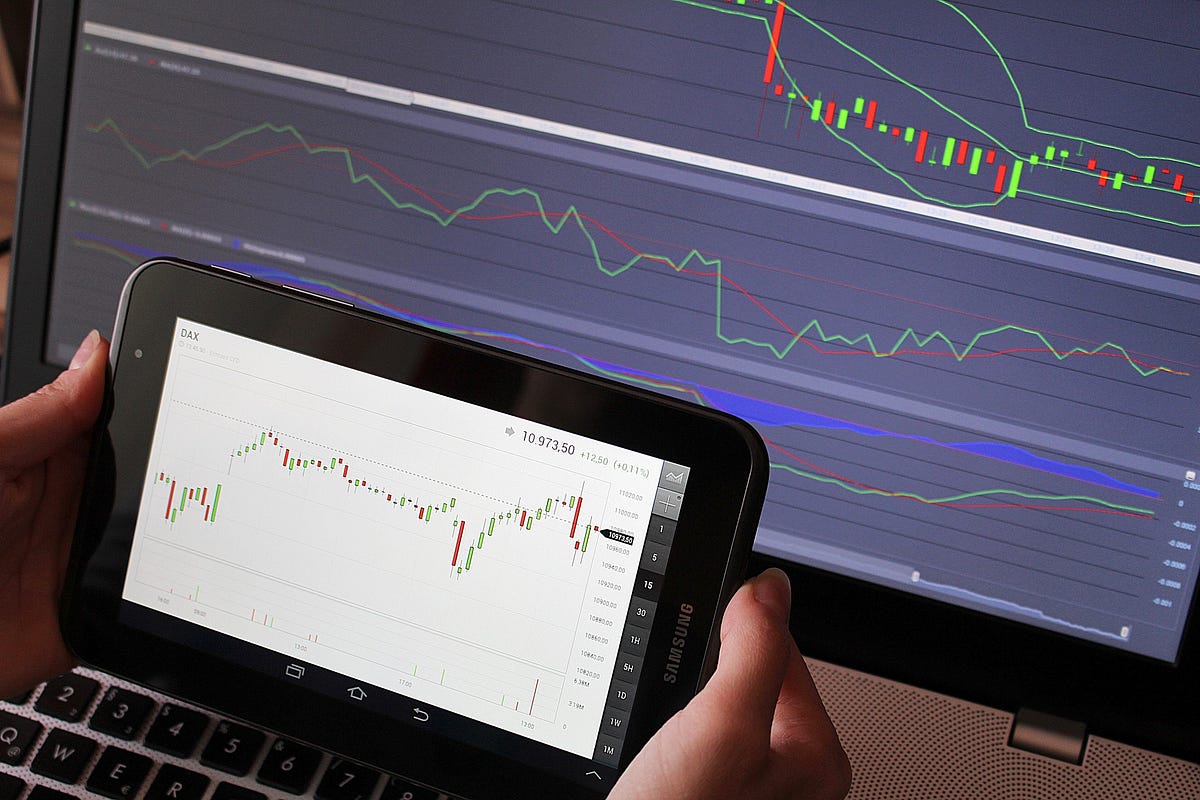
The Proliferation of Data Tables
Data is important. For many systems, it is the basis for everything we do. People cannot make decisions effectively without it. But as we see from the restaurant example, simply shoving data into a table and making your users do all the work does not make for a well-designed system.
There are four scenarios that address 99% of cases involving data: 1) The user needs to understand the data set (as a whole or in subsets), 2) the user needs to compare parts of the data, 3) the user needs to find interesting data points to explore further, and 4) the user needs to find a specific data point. Having a large data list doesn’t by itself help with any of these.
So why are data tables everywhere? Because they’re easy. It’s easy for a developer to create an API and show that the desired data is coming back — usually in a data table reflecting how the data is structured in the database. Unfortunately, as Alan Cooper points out in “The Inmates are Running the Asylum”, once something is prototyped out to prove effective, it becomes very difficult to throw that away. People see the data is there and the work has been done and the time pressures dictate that this will be all that ever gets designed for the interface. It also happens that since they are so commonly available, users will ask for these and demand that they are on the screen. It’s a never-ending cycle of sub-optimal design.
We as designers should know better. And yet too many products still rely on only data tables to tell their story. We use a lot of excuses to let this pattern proliferate. We tell ourselves that customers may want to tailor the data in unique ways and the table gives them that freedom. We add in filters, so that the user can limit the amount of data to a manageable size. We decide that any other solution will cause performance to be to slow and that we are doing it to provide a good experience with our product.
But these are all excuses. And we get away with it because no one on the product team that will tell us we are wrong for using them.
We get away with it because no one on the product team that will tell us we are wrong for using them.
What’s the clearest sign that people hate using data tables? Whenever we provide a table we MUST also include an export option which will allow the user to take their data and bring it into Excel, where they have to do all the work. But it doesn’t have to be this way. There is more we should be doing as designers.
What To Do Instead
I am not arguing that the data should be removed. But data availability is not enough; we need to do more. We need to help users understand the world and take actions in it using the data. Christofferson and Woods labeled this insight into the data ‘Observability’.
Data availability is not enough. We need to help users understand and take actions from their data.
While they originally introduced the concept of Observability for designing for automation, it extends seamlessly to any similarly complex environment. The goal is to help users understand the problem state — the focus of the first three cases listed above. Providing just the data does a poor job of this. It takes the user focus off of domain work and makes them do support work.
Forcing people to do work from data tables foists the responsibility of manipulating the data on the user and opens up the possibility of calculation and interpretation errors in the process. Calculations are the type of things that automation is particularly suited for, so it should be an obvious choice to offload this work. But what exactly should we be having the computer (bot, algorithm, analytic, etc…) calculate, you ask?
Congratulations, you are a designer. That’s exactly what designers ask in this type of situation. Great design seeks to understand what users are trying to accomplish and create solutions that make task completion easier — looking at what your users are doing with the data in Excel is a great place to start. The end result is a data visualization that allows your users to draw insights and respond appropriately.
You begin with the goals the system is responsible for and work down from there. Define the decisions users must make to satisfy these goals and the information users need to make these decisions. You provide the right information, the right data in the right context, and you are on your way to creating a great representation of your data.

This is one of the many reasons design is difficult. Discovering this information (and the goals and everything else) takes a lot of work. It takes practice to know what questions to ask your users and how to ask them. Designing the right representation takes in-depth study of human perception and visualization best practices. Then you take these visualizations and pair them with the data tables. The tables become less prominent on the screen, but are available when users want to inspect more closely. Once the user has found data of interest, they go dive deep and get the details.
Note that this is different than simply summarizing the data. The easiest way to visualize data is to summarize the data in the tables. While averages and sums provide some use, this is not usually the information that the user will need. Unfortunately for the product team, complex systems often call for specially tailored solutions that require great thought and care and detailed discussions with the users. It is possible, it just takes a lot of time and effort to get right. But when you do, you will place your users in a position to succeed.
***
The point of design is not simply to help people accomplish a task; merely providing the data does this — albeit very slowly and at significant risk of error. We are here to create products and environments that allow the people in them (and impacted by them) to thrive. Data visualizations, done properly, help make this possible. They can allow people to make better, faster decisions. They can help people understand the context of their decisions. They can show people multiple options easily and help them muddle through when the world is vague and no answer is perfect — as is usually the case. Simply providing a data table to your users does none of these things.
Data is great, but without designers to help make it come alive through visualizations, our users will spend all their time trying to make sense of their data and not enough time acting on it. Pairing the data with thought-out data visualizations provides the user with the best of all worlds and allows them to have total control over how they understand and act in their problem.
Thanks for reading. For more of my UX ramblings, follow me on Twitter: @bkenna1 or here on Medium.