
Introduction to Google Data Studio
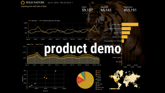
Product Demo

Nick then took us through a quick demo of some Data Studio features. We began with a blank report and added a few data sets via Google Analytics. Nick mentioned that CSV uploading would be available in 2017 — something they’re currently working on. In managing the product and your Data Studio reports, the interface follows the Office productivity pattern — as seen in Google Docs — with the simple toolbar layout. All you have to do is add some sort of visualization mechanism to bring the data to life.
In our quick session, Nick added visualization components around date parameters and their associated user sessions, Geo map of countries by sessions, and top sources (I should mention this was all real, live data).

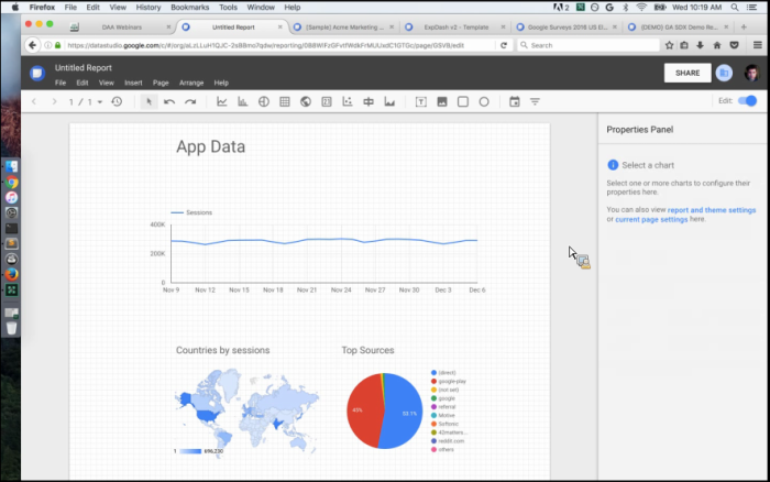
Once you’re done editing the data and wish to View or Share your report(s), you’ll simply click the Edit

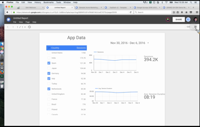
Note: In this report above, Nick added a few additional fields and mentioned to be wary of data figures and ratios when adding additional sources. Often the axis values will throw off your graphs/charts, so that’s something to be aware of. Once you become more comfortable with Data Studio, you’re able to insert metric pickers that will update your values/visuals live and in real-time. The reports are set up in this way to allow report consumers that are viewing the visuals to answer any of their own questions simply by adjusting whichever variables they’d like to control. This optimizes the experience for the end reader, with the ability to adjust and filter the data you’re looking at right there in the report.
In sharing and collaborating — you’ll email a link to users just like in traditional Google Docs. They can join with either editing or viewing permissions, and different colors will be used to visualize each user’s activity. This way, you can compile reports as a team simultaneously, and then share to groups and folders of people. Very easy and organized collaboration.
Sample Reports
We then took a look at specific interfaces built for specific Google customers.
Check out this beautiful DoubleClick sales dashboard:

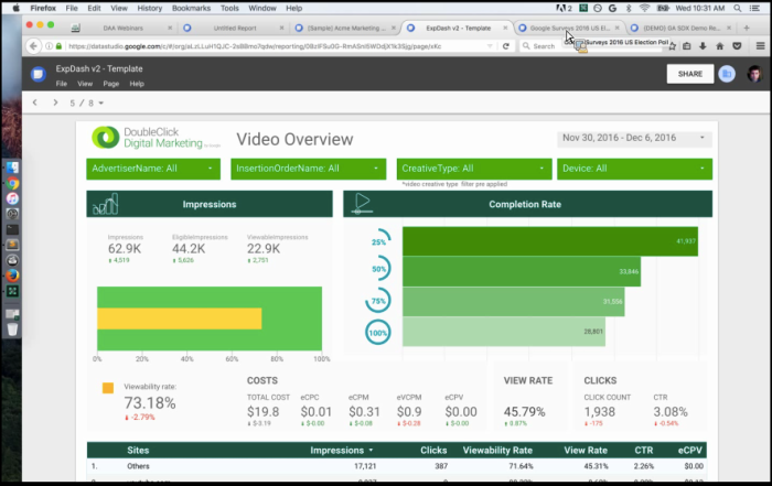
This report is actually eight pages, and includes an introduction/overview page on how to best leverage and consume the dashboard as well as a space for customer feedback.
Another example is seen in the Google Consumer Survey Data report (below). This report focused specifically on the 2016 Election results, getting a ton of views from the public as there was a large demand to see what Google’s data is predicting. The interface is designed with everyone in mind, and allows you to answer your own questions in regards to demographics, ages, and locations.


A final report we reviewed was the Google Cloud Data Center report, dealing with insanely large amounts of data. As you can see below, we first looked at a report processing ~ 196M hits, followed by a report processing over 2.7 BILLION hits. The way the Data Studio was able to seamlessly plug in this massive amount of data was seriously impressive.

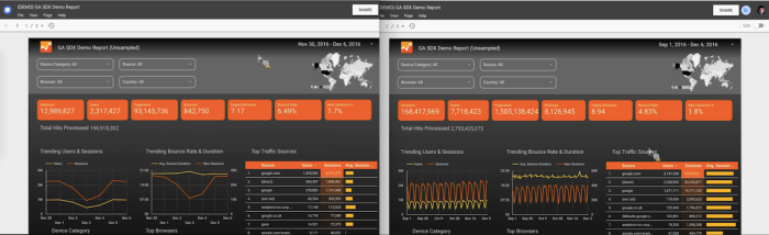
Again, this allows for the users to focus on the insights and presentation of data, as opposed to wrangling the analytics themselves. The concept was built around following Google’s simplicity and sharing model in their app ecosystem, then leveraging the power of the cloud and big data all meshed together. It’s no wonder the Studio, even in beta, is receiving praise from early adopters.