
Building Bullet Graphs and Waterfall Charts with Bokeh
Waterfall Chart
I decided to take Bryan’s comments as an opportunity to create a waterfall chart in
Bokeh and see how hard (or easy) it is to do. He recommended that the candlestick chart
would be a good place to start and I did use that as the basis for this solution.
All of the code is in a notebook that is available
Let’s start with the Bokeh and pandas imports and enabling the notebook output:
from bokeh.plotting import figure, show from bokeh.io import output_notebook from bokeh.models import ColumnDataSource, LabelSet from bokeh.models.formatters import NumeralTickFormatter import pandas as pd output_notebook()
For this solution, I’m going to create a pandas dataframe and use Bokeh’s
ColumnDataSource
to make the code a little simpler. This has the added benefit of making this code
easy to convert to take an Excel input instead of the manually created dataframe.
Feel free to refer to this cheatsheet if you need some help understanding how to create the dataframe as shown below:
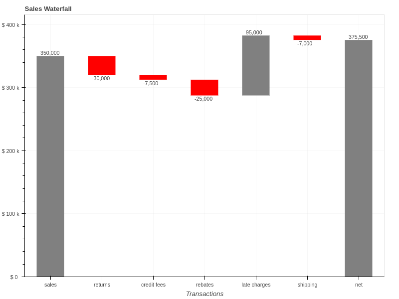
# Create the initial dataframe
index = ['sales','returns','credit fees','rebates','late charges','shipping']
data = {'amount': [350000,-30000,-7500,-25000,95000,-7000]}
df = pd.DataFrame(data=data,index=index)

# Determine the total net value by adding the start and all additional transactions
net = df['amount'].sum()
| amount | |
|---|---|
| sales | 350000 |
| returns | -30000 |
| credit fees | -7500 |
| rebates | -25000 |
| late charges | 95000 |
| shipping | -7000 |
The final waterfall code is going to require us to define several additional attributes for each segment including:
- starting position
- bar color
- label position
- label text
By adding this to a single dataframe, we can use Bokeh’s built in capabilities to simplify the final code.
For the next step, we’ll add the running total, segment start location and the position of the label:
df['running_total'] = df['amount'].cumsum()
df['y_start'] = df['running_total'] - df['amount']

# Where do we want to place the label?
df['label_pos'] = df['running_total']
Next, we add a row at the bottom on the dataframe that contains the net value:
df_net = pd.DataFrame.from_records([(net, net, 0, net)],
                                   columns=['amount', 'running_total', 'y_start', 'label_pos'],
                                   index=["net"])
df = df.append(df_net)
For this particular waterfall, I would like to have the negative values a different color and have formatted the labels below the chart. Let’s add columns to the dataframe with the values:
df['color'] = 'grey'
df.loc[df.amount < 0, 'color'] = 'red'
df.loc[df.amount < 0, 'label_pos'] = df.label_pos - 10000
df["bar_label"] = df["amount"].map('{:,.0f}'.format)
Here’s the final dataframe containing all the data we need. It did take some manipulation of the data to get to this state but it is fairly standard pandas code and is easy to debug if something goes awry.
| amount | running_total | y_start | label_pos | color | bar_label | |
|---|---|---|---|---|---|---|
| sales | 350000 | 350000 | 0 | 350000 | grey | 350,000 |
| returns | -30000 | 320000 | 350000 | 310000 | red | -30,000 |
| credit fees | -7500 | 312500 | 320000 | 302500 | red | -7,500 |
| rebates | -25000 | 287500 | 312500 | 277500 | red | -25,000 |
| late charges | 95000 | 382500 | 287500 | 382500 | grey | 95,000 |
| shipping | -7000 | 375500 | 382500 | 365500 | red | -7,000 |
| net | 375500 | 375500 | 0 | 375500 | grey | 375,500 |
Creating the actual plot, is fairly standard Bokeh code since the dataframe has all the values we need:
TOOLS = "box_zoom,reset,save"
source = ColumnDataSource(df)
p = figure(tools=TOOLS, x_range=list(df.index), y_range=(0, net+40000),
           plot_width=800, title = "Sales Waterfall")
By defining the
ColumnDataSource
as our dataframe, Bokeh takes care of creating
all segments and labels without doing any looping.
p.segment(x0='index', y0='y_start', x1="index", y1='running_total',
          source=source, color="color", line_width=55)
We will do some minor formatting to add labels and format the y-axis nicely:
p.grid.grid_line_alpha=0.3
p.yaxis[0].formatter = NumeralTickFormatter(format="($ 0 a)")
p.xaxis.axis_label = "Transactions"
The final step is to add all the labels onto the bars using the
LabelSet
:
labels = LabelSet(x='index', y='label_pos', text='bar_label',
                  text_font_size="8pt", level='glyph',
                  x_offset=-20, y_offset=0, source=source)
p.add_layout(labels)
Here’s the final chart:
Once again, I think the final solution is simpler than the matplotlib code and the resulting output looks pleasing. You also have the added bonus that the charts are interactive and could be enhanced even more by using the Bokeh server (see my Australian Wine Ratings article for an example). The code should also be straightforward to modify for your specific datasets.