
New Plot Types in Seaborn’s Latest Release
scatterplot and lineplot examples
For this article, I will use a small data set showing the number of traffic
fatalities by county in the state of Minnesota. I am only including the top 10 counties
and added some additional data columns that I thought might be interesting and
would showcase how seaborn supports rapid visualization of different relationships.
The base data was taken from the
| County | Twin_Cities | Pres_Election | Public_Transport(%) | Travel_Time | Population | 2012 | 2013 | 2014 | 2015 | 2016 | |
|---|---|---|---|---|---|---|---|---|---|---|---|
| 0 | Hennepin | Yes | Clinton | 7.2 | 23.2 | 1237604 | 33 | 42 | 34 | 33 | 45 |
| 1 | Dakota | Yes | Clinton | 3.3 | 24.0 | 418432 | 19 | 19 | 10 | 11 | 28 |
| 2 | Anoka | Yes | Trump | 3.4 | 28.2 | 348652 | 25 | 12 | 16 | 11 | 20 |
| 3 | St. Louis | No | Clinton | 2.4 | 19.5 | 199744 | 11 | 19 | 8 | 16 | 19 |
| 4 | Ramsey | Yes | Clinton | 6.4 | 23.6 | 540653 | 19 | 12 | 12 | 18 | 15 |
| 5 | Washington | Yes | Clinton | 2.3 | 25.8 | 253128 | 8 | 10 | 8 | 12 | 13 |
| 6 | Olmsted | No | Clinton | 5.2 | 17.5 | 153039 | 2 | 12 | 8 | 14 | 12 |
| 7 | Cass | No | Trump | 0.9 | 23.3 | 28895 | 6 | 5 | 6 | 4 | 10 |
| 8 | Pine | No | Trump | 0.8 | 30.3 | 28879 | 14 | 7 | 4 | 9 | 10 |
| 9 | Becker | No | Trump | 0.5 | 22.7 | 33766 | 4 | 3 | 3 | 1 | 9 |
Here’s a quick overview of the non-obvious columns:
- Twin_Cities: The cities of Minneapolis and St. Paul are frequently combined and called the Twin Cities. As the largest metro area in the state, I thought it would be interesting to see if there were any differences across this category.
- Pres_Election: Another categorical variable that shows which candidate won that county in the 2016 Presidential election.
- Public_Transport(%): The percentage of the population that uses public transportation.
- Travel_Time: The mean travel time to work for individuals in that county.
- 2012 - 2016: The number of traffic fatalities in that year.
If you want to play with the data yourself, it’s available in the repo along with the notebook.
Let’s get started with the imports and data loading:
import seaborn as sns
import pandas as pd
import matplotlib.pyplot as plt

sns.set()
df = pd.read_csv("https://raw.githubusercontent.com/chris1610/pbpython/master/data/MN_Traffic_Fatalities.csv")
These are the basic imports we need. Of note is that recent versions of seaborn
do not automatically set the style. That’s why I explicitly use
sns.set()
to turn on the seaborn styles. Finally, let’s read in the CSV file from github.
Before we get into using the
relplot()
we will show the basic usage of the
scatterplot()
and
lineplot()
and then explain how to use the more powerful
relplot()
to draw these types of plots across different rows and columns.
For the first simple example, let’s look at the relationship between the 2016 fatalities
and the average
Travel_Time
. In addition, let’s identify the data based on the
Pres_Election
column.
sns.scatterplot(x='2016', y='Travel_Time', style='Pres_Election', data=df)
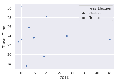
There are a couple things to note from this example:
- By using a pandas dataframe, we can just pass in the column names to define the X and Y variables.
- We can use the same column name approach to alter the marker
style. - Seaborn takes care of picking a marker style and adding a legend.
- This approach supports easily changing the views in order to explore the data.
If we’d like to look at the variation by county population:
sns.scatterplot(x='2016', y='Travel_Time', size='Population', data=df)
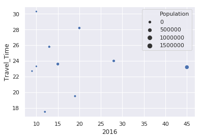
In this case, Seaborn buckets the population into 4 categories and adjusts the size of the circle based on that county’s population. A little later in the article, I will show how to adjust the size of the circles so they are larger.
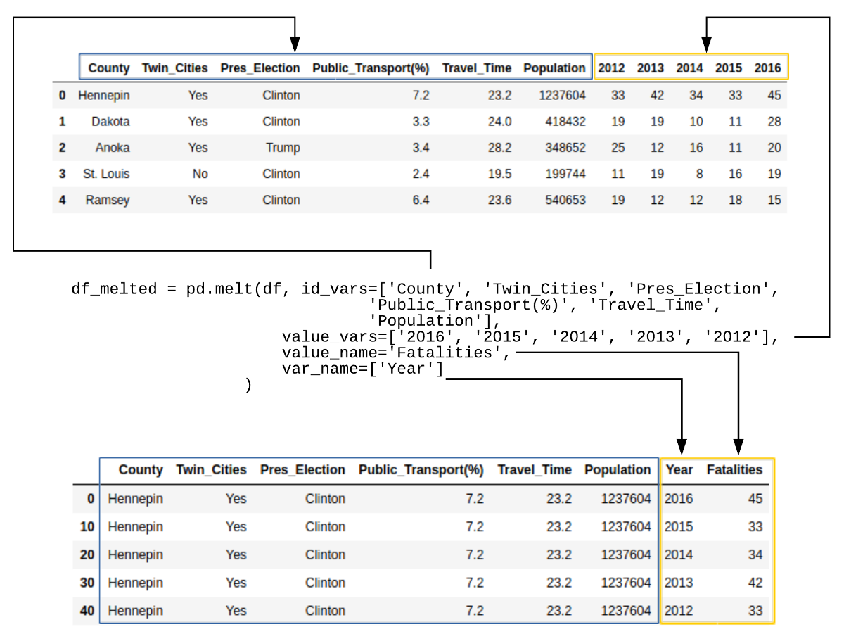
Before we go any further, we need to create a new data frame that contains the data in tidy format. In the original data frame, there is a column for each year that contains the relevant traffic fatality value. Seaborn works much better if the data is structured with the Year and Fatalities in tidy format.
Panda’s handy melt function makes this transformation easy:
df_melted = pd.melt(df, id_vars=['County', 'Twin_Cities', 'Pres_Election',
                                 'Public_Transport(%)', 'Travel_Time', 'Population'],
                    value_vars=['2016', '2015', '2014', '2013', '2012'],
                    value_name='Fatalities',
                    var_name=['Year']
                   )
Here’s what the data looks like for Hennepin County:
| County | Twin_Cities | Pres_Election | Public_Transport(%) | Travel_Time | Population | Year | Fatalities | |
|---|---|---|---|---|---|---|---|---|
| 0 | Hennepin | Yes | Clinton | 7.2 | 23.2 | 1237604 | 2016 | 45 |
| 10 | Hennepin | Yes | Clinton | 7.2 | 23.2 | 1237604 | 2015 | 33 |
| 20 | Hennepin | Yes | Clinton | 7.2 | 23.2 | 1237604 | 2014 | 34 |
| 30 | Hennepin | Yes | Clinton | 7.2 | 23.2 | 1237604 | 2013 | 42 |
| 40 | Hennepin | Yes | Clinton | 7.2 | 23.2 | 1237604 | 2012 | 33 |
If this is a little confusing, here is an illustration of what happened:
Now that we have the data in tidy format, we can see what the trend of fatalities looks
like over time using the new
lineplot()
function:
sns.lineplot(x='Year', y='Fatalities', data=df_melted, hue='Twin_Cities')
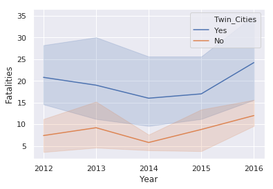
This illustration introduces the
hue
keyword which changes the color
of the line based on the value in the
Twin_Cities
column. This plot also
shows the statistical background inherent in Seaborn plots. The shaded areas
are confidence intervals which basically show the range in which our true value lies.
Due to the small number of samples, this interval is large.