
bootstrap優美的彈出框
阿新 • • 發佈:2018-12-30
使用bootstrap框架發現沒有好的提示框
在網上還找到一個效果比較炫一點的提示框:sweetalert
(1)文件
sweetalert Api:http://t4t5.github.io/sweetalert/
開源專案原始碼:https://github.com/t4t5/sweetalert
在頁面引入:
 <link href="~/Styles/sweetalert.css" rel="stylesheet" />
 <script src="~/Scripts/sweetalert.min.js"></script>
使用方法:
swal({
                title: "操作提示",      //彈出框的title
                text: "確定刪除嗎?",   //彈出框裡面的提示文字
                type: "warning",        //彈出框型別
                showCancelButton: true, //是否顯示取消按鈕
                confirmButtonColor: "#DD6B55",//確定按鈕顏色
                cancelButtonText: "取消",//取消按鈕文字
                confirmButtonText: "是的,確定刪除!",//確定按鈕上面的文件
                closeOnConfirm: true
            }, function () {
                    $.ajax({
                        type: "post",
                        url: "/Home/Delete",
                        data: { "": JSON.stringify(arrselections) },
                        success: function (data, status) {
                            if (status == "success") {
                                toastr.success('提交資料成功');
                                $("#tb_departments").bootstrapTable('refresh');
                            }
                        },
                        error: function () {
                            toastr.error('Error');
                        },
                        complete: function () {

                        }

                    });
            });
操作完成提示框
toastr.js元件
官方文件以及原始碼
原始碼網站:http://codeseven.github.io/toastr/
api:http://www.ithao123.cn/content-2414918.html
<link href="~/Content/toastr/toastr.css" rel="stylesheet" />
<script src="~/Content/toastr/toastr.min.js"></script>
將這個屬性值設定為不同的值就能讓提示資訊顯示在不同的位置,如toast-bottom-right表示下右、toast-bottom-center表示下中、toast-top-center表示上中等,更過位置資訊請檢視文件。
	toastr.options = {
		    closeButton: false,  // 是否顯示關閉按鈕,(提示框右上角關閉按鈕)
		    debug: false,        // 是否使用deBug模式
		    progressBar: true,    // 是否顯示進度條,(設定關閉的超時時間進度條)
		    positionClass: "toast-top-center",   // 設定提示款顯示的位置
		    onclick: null,         // 點選訊息框自定義事件
		    showDuration: "300",   // 顯示動畫的時間
		    hideDuration: "1000",   //  消失的動畫時間
		    timeOut: "2000",          //  自動關閉超時時間
		    extendedTimeOut: "1000",   //  加長展示時間
		    showEasing: "swing",      //  顯示時的動畫緩衝方式
		    hideEasing: "linear",      //   消失時的動畫緩衝方式
		    showMethod: "fadeIn",     //   顯示時的動畫方式
		    hideMethod: "fadeOut"     //   消失時的動畫方式
		};
用法:
1 toastr.success('提交資料成功');
2 toastr.error('Error');
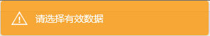
3 toastr.warning('只能選擇一行進行編輯');
4 toastr.info('info');

對toastr進行封裝:
Success:
//提示資訊
function toastrSuccess(content){
	toastr.options = {
		    closeButton: false,  // 是否顯示關閉按鈕,(提示框右上角關閉按鈕)
		    debug: false,        // 是否使用deBug模式
		    progressBar: true,    // 是否顯示進度條,(設定關閉的超時時間進度條)
		    positionClass: "toast-top-center",   // 設定提示款顯示的位置
		    onclick: null,         // 點選訊息框自定義事件
		    showDuration: "300",   // 顯示動畫的時間
		    hideDuration: "1000",   //  消失的動畫時間
		    timeOut: "2000",          //  自動關閉超時時間
		    extendedTimeOut: "1000",   //  加長展示時間
		    showEasing: "swing",      //  顯示時的動畫緩衝方式
		    hideEasing: "linear",      //   消失時的動畫緩衝方式
		    showMethod: "fadeIn",     //   顯示時的動畫方式
		    hideMethod: "fadeOut"     //   消失時的動畫方式
		};
	    if (content == null) {
	        content = '';
	    }
	    var len = content.length;
	    if (len <= 10 && len > 0) {
	        toastr.options.timeOut = "1800";
	    } else if (len <= 20) {
	        toastr.options.timeOut = "2800";
	    } else if (len <= 30) {
	        toastr.options.timeOut = "3800";
	    } else if (len > 30) {
	        toastr.options.timeOut = "4800";
	    }
	    toastr.success(content);
}