Building for Android TV — Episode 3
Building for Android TV — Episode 3
Bells and whistles for the custom interface.
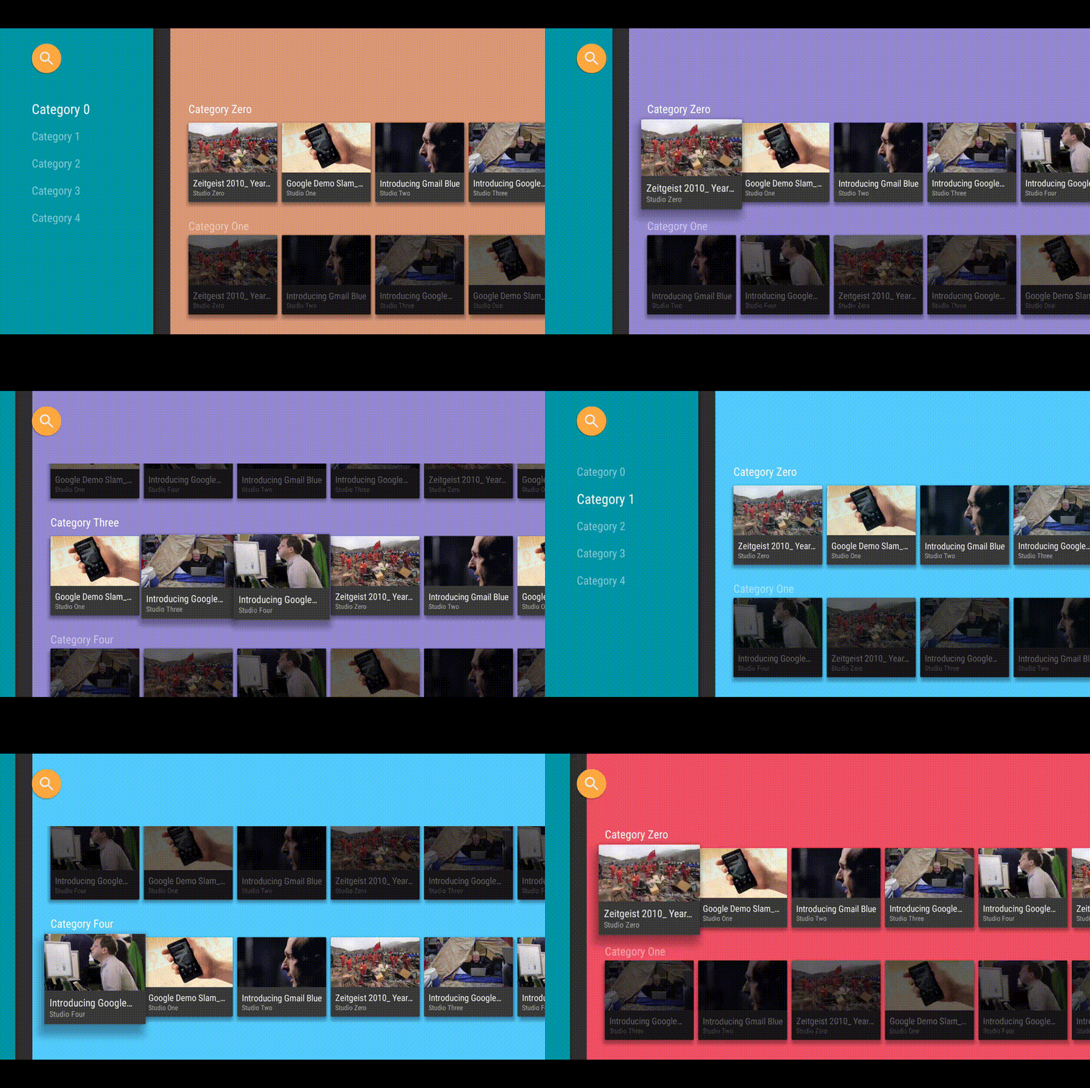
This third article concludes the process of building a custom UI for your TV application. I will go through the rough edges of the interface and the missing elements, in order to replicate the behavior of the stock UI offered by Google as much as possible.
The (not-so-) little things that matter
In the previous episode (the full collection can be found here), we managed to obtain a working example of a custom BrowseFragment, which is able to load any kind of Fragment we want it to. It should look like this:
We can immediately notice that many elements are missing or are off:
- The padding is wrong, both for CustomHeadersFragment and CustomRowsFragment
- The so called SearchOrb is missing (that lens thing on the upper left)
- The navigation drawer doesn’t open/close
Let’s begin.
Padding correction
Changing the padding of those custom fragments is pretty trivial. All it takes is calling the
SearchOrb
The SearchOrb is a UI widget that allows the user to search for content within the application, as we saw in the first episode. Luckily, it is part of the Leanback support library, hence it comes with sources and documentation. At this point, it is only a matter of adding the widget to our layout (by declaring the full package android.support.v17.leanback.widget.SearchOrbView) and adjusting padding and position.
We can use its setOrbColors() and setOrbIcon() methods to customize the SearchOrb widget, which is extremely convenient. When the view is clicked, simply launch the TVSearchActivity, as shown here.
TIP: avoid using the View.setOnClickListener(), use the SearchOrbView.setOnOrbClickedListener() method instead!
Navigation drawer in motion
The last issue we need to face involves the navigation drawer: it stands too still. And it should be moving.
Well, “moving” the view itself is no big deal: we just need to create an animation that adjusts the view’s left margin to the appropriate value. The real question is: when do we trigger the animation?
If we take a look at the demo application, we can see that the drawer closes when the user moves to one of the rows on the right, and opens when the user navigates back to the left list of categories. This behavior suggests that we need to be able to understand which element has the focus, and trigger the appropriate animation.
Hokus-Focus
Let’s analyze the situation. We need to detect focus change for several elements in our custom BrowseFragment: the search orb, the headers and the rows. While there are many complicated solutions around this problem, I wanted to see how Google handled it, and their approach is called BrowseFrameLayout. Combining its source code with the BrowseFragment one, we see that it is basically used to detect which child should get the focus and to act once the focus is obtained. Sounds about right! We can ninja that little handy layout and make it our own.
There are two main listeners that we need to implement: setOnChildFocusListener and setOnFocusSearchListener. Again, the BrowseFragment code reveals that we also need two additional methods: isVerticalScrolling() and getVerticalGridView(). The former is defined in the original BrowseFragment class, and it is used not to run transitions while the user is scrolling (prevents UI glitches). The latter is instead defined in the base class BaseRowFragment and it is used, well, to retrieve the grid view of the shown elements. Turns out this method is declared final (i.e., we cannot override it) and with package visibility (i.e., quite hard to get access to it). Our last resort is turning our faith to Reflection: here comes our getVerticalGridView(Fragment) method!
The last step involves defining the animation code that opens and closes the navigation drawer: the toggleNavigationDrawer(boolean) method.
Animating back and forth
Now that we have our focus callbacks, we simply need to write the code that animates the navigation drawer back and forth. The most easy way of doing it is adjusting the margin of both the CustomHeadersFragment and the CustomRowsFragment by a fraction of the full width of the former. I went with 90%, which seems small enough to be out of the way, but still big enough for it to be noticed. Big plus: it resembles the BrowseFragment’s one.
There’s nothing much worth noticing in the toggleNavigationDrawer code. We only need to adjust the padding of our CustomRowsFragment when closing the drawer, otherwise we will be left with cropped content. That’s exactly what the refresh() method does.
Conclusion
It took quite some time (3 articles!), but we finally did it. We have our custom BrowseFragment, which behaves almost like the original one but it sports a lot more flexibility, since it has no restriction in what type of UI widgets it can load.


This is what YouTube for Android TV does, and musixmatch TV (which is based on this tutorial, since I was one of the developers) looks and feels a lot like it.
If you enjoyed this series of articles, be sure to follow me as I will be posting other articles on the Android TV platform. Thanks! ☺
Code
All the code is available on GitHub: Episode 3.
Can I use the code as the base structure for my application?
Sure, be my guest! If you happen to mention where you took your inspiration from, even better ;)
What’s next?
You tell me! Be sure to let me know what you would like to see in the next tutorial, and I will make sure to cover it!
