
CSS旋轉效果
阿新 • • 發佈:2019-01-04
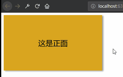
效果圖:
<!DOCTYPE html>
<html lang="zh">
<head>
<meta charset="UTF-8">
<title>CSS旋轉效果</title>
<style>
html, body {
width: 100%;
height: 100%;
}
/*設定外中內三層div的大小一致*/
.container, .item, .page {