
CSS3&JavaScript 圖片分隔切換
阿新 • • 發佈:2019-01-06
這個切換效果在firebox上測試正常,但到了chrome上就沒有切換效果了。原因可能是它們在處理transition的流程上有差別,解決方案就是用animation來實現更精細的動畫。
(通常只有兩個狀態,這種簡單的情況適用transition比較方便;多個狀態就需要適用animation進行詳細的控制了)
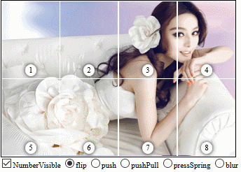
<!DOCTYPE html>
<html lang="en">
<head>
<meta charset="utf8">
<style>
/*
圖片分隔動畫有兩種思路
(1)大背景是一張靜圖,每個小方格做動畫
(2)連每個小方格都是靜態的,方格里面的偽元素做動畫
 */
/* 這裡提一下 column-count 這個屬性,他可以將一段文字分隔成多列,就跟報紙中的分欄一樣 */
.louver {
	width: 30em;
	height: 20em;
	border: 1px solid black;
	background-size: 100% 100%;
	position: relative;
	display: flex;
	/** flex-wrap: nowrap|wrap|wrap-reverse|initial|inherit; 預設值是nowrap */
	flex-wrap: wrap;
	overflow:hidden;
}
.louver>span {
	/** border: 1px solid black; */
	position: relative;
	/** width和height對於inline元素是無效的 */
	display:inline-block;
	/** 只有邊框佔據內部寬高,才能填滿整個父元素 */
	box-sizing: border-box;
	/** CSS3的attr 目前還只能用在偽元素裡,如果非要這麼用,建議使用LESS/SESS
	attr( <attr-name> <type-or-unit>? [ , <fallback> ]? )
	width:  calc(100% / attr(data-row px));
	height: calc(100% / attr(data-column px));
	*/
	overflow: hidden;
	border: 1px solid white;
}
.louver>span>span {
	position: absolute;
	width: 1.5em;
	height: 1.5em;
	color: black;
	background-color: white;
	border-radius: 50%;
	/** box-shadow不指定color的話,預設用的是元素的color */
	box-shadow: 0 0 .5em;
	display: flex;
	justify-content: center;
	align-items: center;
	bottom: .3em;
	left: 50%;
	transform: translateX(-50%);
	z-index: 1;
}
.louver>span::before, .louver>span::after {
	/** border: 1px solid red; */
	content: '';
	position: absolute;
	width: 100%;
	height: 100%;
	background-size: inherit;
	background-position: inherit;
}
</style>
<style>
.card-transition::before, .card-transition::after {
	transition: all 1s;
}
/* import表示優先生效,如果沒加important的話,如果兩個class都指定了相同的屬性哪個生效就說不清楚了
(一般是後面的覆蓋前面的,詳細的覆蓋模糊的【比如nth-child就比普通樣式優先順序高,即使它定義在前面】,行內樣式>內嵌>外部) */

.card-flip {
	/** preserve是保持;perspective是透視
	transform-style和perspective都是作用於它們的子元素的
	*/
	transform-style: preserve-3d;
	/** 透視距離必須和3d同時定義才會有3d效果 */
	perspective: 15em;
	/** overflow 屬性規定當內容溢位元素框時發生的事情。
	visible 預設值。內容不會被修剪,會呈現在元素框之外。
	hidden 	內容會被修剪,並且其餘內容是不可見的。
	scroll 	內容會被修剪,但是瀏覽器會顯示滾動條以便檢視其餘的內容。
	auto 	如果內容被修剪,則瀏覽器會顯示滾動條以便檢視其餘的內容。
	inherit 規定應該從父元素繼承 overflow 屬性的值。
	*/
	overflow: visible !important;
}
.card-flip::before, .card-flip::after {
	/** 隱藏背面 */
	backface-visibility: hidden;
}
.card-flip::after {
	transform: rotateY(180deg);
}
.card-flip-run::before {
	transform: rotateY(180deg) !important;
}
.card-flip-run::after {
	transform: rotateY(360deg) !important;
}
/* 推拉擠出 */
.card-push::before {
	left: 0;
}
.card-push::after {
	left: -100%;
}
.card-push-run::before {
	left: 100% !important;
}
.card-push-run::after {
	left: 0 !important;
}

/* 交叉推拉 */
.card-pushPull::before {
	left: 0;
}
/** odd表示奇數,會被翻譯為2n+1;even是偶數,會被翻譯為2n */
.card-pushPull:nth-child(odd)::after {
	left: -100%;
}
.card-pushPull:nth-child(even)::after {
	left: 100%;
}
.card-pushPull-run:nth-child(odd)::before {
	left: 100% !important;
}
.card-pushPull-run:nth-child(even)::before {
	left: -100% !important;
}
.card-pushPull-run::after {
	left: 0 !important;
}

/* 按下反彈 */
.card-pressSpring::before {
	top: 0;
}
.card-pressSpring:nth-child(odd)::after {
	top: -100%;
}
.card-pressSpring:nth-child(even)::after {
	top: 100%;
}
.card-pressSpring-run:nth-child(odd)::before {
	top: 100% !important;
}
.card-pressSpring-run:nth-child(even)::before {
	top: -100% !important;
}
.card-pressSpring-run::after {
	top: 0 !important;
}

/** 毛玻璃淡出
.card-blur::before, .card-blur::after {
	transition: transform .5s ease, filter 1s ease, opacity .5s ease;
}
*/
.card-blur::after {
	transform: scale(1.5, 1.5);
	filter: blur(10px);
	opacity: 0;
}
.card-blur-run::before {
	transform: scale(1, 1);
	filter: blur(0);
	opacity: 1;
}
.card-blur-run::before {
	transform: scale(1.5, 1.5) !important;
	filter: blur(10px) !important;
	opacity: 0 !important;
}
.card-blur-run::after {
	transform: scale(1, 1) !important;
	filter: blur(0) !important;
	opacity: 1 !important;
}
</style>
<script>
let imgs = [
"https://www.html5tricks.com/demo/SlidingImagePanels/images/1.jpg",
"https://www.html5tricks.com/demo/SlidingImagePanels/images/2.jpg",
"https://www.html5tricks.com/demo/SlidingImagePanels/images/3.jpg",
"https://www.html5tricks.com/demo/SlidingImagePanels/images/4.jpg"];
let containerClsName = "louver";
let animStyle;
let index = 0;
/*
background-size
	bg-size = [ <length> | <percentage> | auto ]{1,2} | cover | contain
	(1)按指定數值<length>、百分比<percentage>、原影象大小auto 顯示
	(2)cover 按比例調整圖片,使之正好能自適應整個背景區域的寬高比,長邊鋪滿短邊留白
	(3)contain 按比例調整圖片,使之剛好能自適應鋪滿整個背景區域,短邊鋪滿長邊溢位的部分被咔嚓
*/
function createCells() {
	//const louver = document.querySelector("." + containerClsName);
	const louver = document.getElementsByClassName(containerClsName)[0];
	//刪除其下的所有子元素
	louver.innerHTML = "";

	const row = louver.dataset.row;
	const column = louver.dataset.column;
	const count = row * column;
	const perWidth = louver.offsetWidth / column;
	const perHeight = louver.offsetHeight / row;

	//公共的數值寫在style裡
	const style = document.createElement("style");
	/*
	background-image
	url('URL') 	指向影象的路徑。
	none 		預設值。不顯示背景影象。
	inherit 	規定應該從父元素繼承 background-image 屬性的設定。
	*/
	style.textContent = "." + containerClsName + ">span{width:" +  100/column + "%;height:" + 100/row + "%;background-size:" + column*100 + "% " + row*100 + "%;}";
	for(let i = 1; i <= count; i++) {
		//nth-child 的第一個子元素的下標是1
		//background-position: left top
		style.appendChild(document.createTextNode("." + containerClsName + ">span:nth-child(" + i + "){background-position:" + ((i-1)%column)*-100 + "% " + parseInt((i-1)/column)*-100 + "%}"));
		//本來是在after裡面做序號,但如果這樣的話動畫就要另一個元素了
		//style.appendChild(document.createTextNode("." + containerClsName + ">span:nth-child(" + i + ")::before{content:'" + i + "'}"));
		const child = document.createElement("span");
		child.innerHTML = "<span>" + i + "</span>";
		louver.append(child);
	}
	document.head.appendChild(style);
	const backgroundUrlStyle = document.createElement("style");
	backgroundUrlStyle.id = "backgroundUrlStyle";
	document.head.appendChild(backgroundUrlStyle);
}

function setAnimStyle(_animStyle) {
	animStyle = _animStyle;
	const louvers = document.getElementsByClassName(containerClsName);
	for(let i=0; i<louvers.length; i++) {
		const childs = louvers[i].children;
		for(let j=0; j<childs.length; j++) {
			//由於classList沒有清空所有的方法,所以只能用className
			childs[j].className = animStyle;
			//要臨時禁用動畫,必須先改變值,然後呼叫getComputedStyle,觸發recalculateStyle,之後再設定transition
			getComputedStyle(childs[j]).length;
			childs[j].classList.add("card-transition");
		}
	}
}
//該方法要求不執行過渡動畫
function setImage(index) {
	const next = (index+1) % imgs.length;
	const backgroundUrlStyle = document.getElementById("backgroundUrlStyle");
	backgroundUrlStyle.innerHTML="." + containerClsName + ">span::after{background-image:url(" + imgs[next] + ");}";
	backgroundUrlStyle.appendChild(document.createTextNode("." + containerClsName + ">span::before{background-image:url(" + imgs[index] + ");}"));
	/*
	const louvers = document.getElementsByClassName(containerClsName);
	for(let i=0;i<louvers.length; i++) {
		louvers[i].style.backgroundImage = "url(" + imgs[index] + ")";
	}
	*/
}
//該方法要求每次都執行過渡動畫
function changeImage() {
	setImage(index);
	setAnimStyle(animStyle);
	index = ++index % imgs.length;
	const e = window.event || arguments.callee.caller.arguments[0]; //火狐沒定義event,因此必須用這種方式做相容
	//currentTarget是繫結事件的元素;target是實際被點選的元素;事件從源冒泡到上層,除非呼叫了stopPropagation停止傳遞
	//e.currentTarget.classList.toggle("flip");
	//直接改父元素的class,然後在css中控制對應的子元素樣式也是可以的,但是這裡為了複用之前定義的css變數不這麼操作
	//JS forEach()方法不能用於HTMLCollection NodeList等類似於陣列但又不是真正的陣列。
	const childs = e.currentTarget.children;
	for(let i=0; i<childs.length; i++) {
		childs[i].classList.toggle(animStyle + "-run");
	};
}
function setListener() {
	document.querySelectorAll("input[name='animStyle']").forEach((elem)=>{
		elem.onchange=()=>{
			index = 0;
			setAnimStyle("card-" + elem.value);
			setImage(0);
		}
	});
	document.getElementsByName("numberVisible")[0].onchange = function() {
		const louvers = document.getElementsByClassName(containerClsName);
		for(let i=0; i<louvers.length; i++) {
			const childs = louvers[i].children;
			for(let j=0; j<childs.length; j++) {
				const firstChild = childs[j].firstChild;
				if(firstChild.localName == "span") {
					firstChild.style.display = this.checked ? "flex" : "none";
				}
			}
		}
	};
}
window.onload = ()=>{
	createCells();
	setImage(0);
	setListener();
	setAnimStyle("card-flip");
};
</script>
</head>

<body>
<div class="louver" data-row="2" data-column="4" onclick="changeImage()"></div>
<form action="" method="get" style="display:inline-block;">
	<input type="checkbox" name="numberVisible" checked="checked"><label for="flip">NumberVisible</label></input>
	<input type="radio" name="animStyle" value="flip" id="flip" checked="checked"><label for="flip">flip</label></input>
	<input type="radio" name="animStyle" value="push" id="push"><label for="push">push</label></input>
	<input type="radio" name="animStyle" value="pushPull" id="pushPull"><label for="pushPull">pushPull</label></input>
	<input type="radio" name="animStyle" value="pressSpring" id="pressSpring"><label for="pressSpring">pressSpring</label></input>
	<input type="radio" name="animStyle" value="blur" id="blur"><label for="blur">blur</label></input>
</form>
</body>
</html>