
Pyqt5系列(三)-基本介面元件之Button(1)
Button,作為介面中觸發動作請求或者命令的一種方式,作為與使用者進行的互動操作。PyQt中的Button根據不同的使用場景劃分為不同的表現形式。Button的基類QAbstractButton,提供button的通用性功能,此類為抽象類,從因此不能例項化,由其他的Button類繼承來實現不同的功能,不同的表現形式。
常見的Button包括,QPushButton,QToolButton,QRadioButton及QCheckBox。這些Button類均繼承自QAbstractButton類,根據各自的使用場景通過圖形展現出來。
抽象類 QAbstractButton:
QAbstractButton作為抽象類,提供button的通用功能,可按按鈕(push button)和可選擇按鈕(checkable button)。可選擇按鈕實現有QRadioButton和QCheckBox;可按按鈕實現有QPushButton和QToolButton。
任何一種button可以顯示帶文字(.setText()方法設定文字)和圖示(.setIcon()設定圖示)的標籤。
QAbstractButton 提供的狀態:
1、isDown() 提示button是否按下
2、isChecked()提示button是否已經標記
3、isEnable()提示button是否可以被使用者點選
4、isCheckAble()提示button是否為可標記
5、setAutoRepeat()設定button是否在使用者長按按鈕的時候可以自動重複執行。
QAbstractButton 提供的訊號:
1、pressed(),當滑鼠在button上並點選左鍵的時候 觸發訊號
2、released(),當滑鼠左鍵被釋放的時候觸發訊號
3、clicked(),當滑鼠首次按下,然後釋放,或者快捷鍵被釋放的時候觸發訊號
4、toggled(),當button的標記狀態發生改變的時候觸發訊號
接下來會針對每一種button進行介紹:
QPushButton :
class QPushButton(QAbstractButton)
| QPushButton(QWidget parent=None)
| QPushButton 由此可見QPushButton繼承自QAbstractButton,是一種command按鈕。點選執行一些命令,或者響應一些問題。常見的諸如“確認”,“申請”,“取消”,“關閉”,“是”,“否”等按鈕。
Command Button經常通過文字來描述執行的動作。有時候我們也會通過快捷鍵來執行對應按鈕的命令。
通過一個示例對QPushButton來進行說明:
#-*- coding:utf-8 -*-
'''
PushButton
'''
__author__ = 'Tony Zhu'

from PyQt5.QtWidgets import QApplication, QWidget, QPushButton
from PyQt5.QtGui import QIcon
from PyQt5.QtCore import Qt
import sys

class PushButton(QWidget):
    def __init__(self):
        super(PushButton,self).__init__()
        self.initUI()
    def initUI(self):
        self.setWindowTitle("PushButton")
        self.setGeometry(400,400,300,260)

        self.closeButton = QPushButton(self)
        self.closeButton.setText("Close")          #text
        self.closeButton.setIcon(QIcon("close.png")) #icon
        self.closeButton.setShortcut('Ctrl+D')  #shortcut key
        self.closeButton.clicked.connect(self.close)
        self.closeButton.setToolTip("Close the widget") #Tool tip
        self.closeButton.move(100,100)

if __name__ == '__main__':
    app = QApplication(sys.argv)
    ex = PushButton()
    ex.show()
    sys.exit(app.exec_())
執行之後的效果:
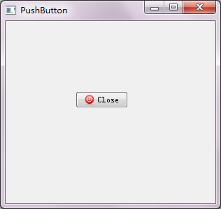
控制元件說明:
| 控制元件型別 | 控制元件名稱 | 文字 | 圖示 |
|---|---|---|---|
| QPushButton | closeButton | Close | close.png |
示例說明:
名稱為“Close”的 Buttton,點選該Button之後關閉該視窗。或者通過快捷鍵“Ctrl+C”的快捷方式亦可關閉該視窗。
程式碼分析:
其他程式碼部分可以參考上一篇《Pyqt5系列(二 )-第一個PyQt程式》中的說明。
L21~22:
self.closeButton.setText("Close")          #text
self.closeButton.setIcon(QIcon("close.png")) #icon
setText()方法,設定button的文字
setIcon()方法,設定button的圖示
關於button 文字和圖示的顯示,也可以通過QPushButton的建構函式,在建立物件例項的時候通過引數直接設定。
| QPushButton(str, QWidget parent=None)
| QPushButton(QIcon, str, QWidget parent=None)
L23:
self.closeButton.setShortcut('Ctrl+D') #shortcut key給closeButton設定快捷鍵方式,即通過Ctrl+D實現與點選closeButton一樣的功能。
L24:
self.closeButton.clicked.connect(self.close)closeButton點選事件處理的邏輯:在點選closeButton之後呼叫QWidget的close()方法。通過connect()方法將點選事件和處理邏輯關聯起來 。
L25:
self.closeButton.setToolTip("Close the widget")setToolTip()設定提示資訊,當滑鼠移動到button上時顯示”Close the widget”提示資訊。
QToolButton:
class QToolButton(QAbstractButton)
 |  QToolButton(QWidget parent=None)
同理QToolButton繼承自QAbstractButton。QToolButton就是工具操作相關的按鈕,通常和QToolBar搭配使用。QToolButton通常不顯示文字,而顯示圖示QIcon。一般QToolButton會在QToolBar::addAction時建立,或者已經存在的action新增到QToolBar時建立。
通過一個示例對QToolButton來進行說明:
#-*- coding:utf-8 -*-
'''
ToolButton
'''
__author__ = 'Tony Zhu'

from PyQt5.QtWidgets import QApplication, QWidget, QToolButton, QMainWindow
from PyQt5.QtGui import QIcon
from PyQt5.QtCore import Qt
import sys

class ToolButton(QMainWindow):
    def __init__(self):
        super(ToolButton,self).__init__()
        self.initUI()
    def initUI(self):
        self.setWindowTitle("ToolButton")
        self.setGeometry(400,400,300,260)

        self.toolbar = self.addToolBar("toolBar")
        self.statusBar()

        self._detailsbutton = QToolButton()
        self._detailsbutton.setCheckable(True)
        self._detailsbutton.setChecked(False)
        self._detailsbutton.setArrowType(Qt.RightArrow)
        self._detailsbutton.setAutoRaise(True)
        #self._detailsbutton.setIcon(QIcon("test.jpg"))
        self._detailsbutton.setToolButtonStyle(Qt.ToolButtonIconOnly)
        self._detailsbutton.clicked.connect(self.showDetail)
        self.toolbar.addWidget(self._detailsbutton)

    def showDetail(self):
        if self._detailsbutton.isChecked():
            self.statusBar().showMessage("Show Detail....")
        else:
            self.statusBar().showMessage("Close Detail....")

if __name__ == '__main__':
    app = QApplication(sys.argv)
    ex = ToolButton()
    ex.show()
    sys.exit(app.exec_())
執行之後的效果:
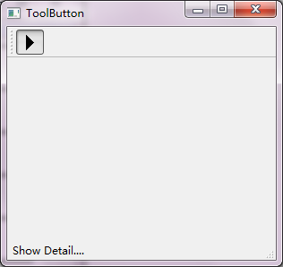
控制元件說明:
| 控制元件型別 | 控制元件名稱 | 文字 | 圖示 |
|---|---|---|---|
| QToolButton | _detailsbutton | 右箭頭圖示 |
示例說明:
圖示為“右箭頭圖示”的 Buttton,此按鈕有開關之分。當Button開啟之後在訊息欄顯示“Show Detail….”,反之顯示“Close Detail”。
程式碼分析:
其他程式碼部分可以參考上一篇《Pyqt5系列(二 )-第一個PyQt程式》中的說明。
L24~25:
self._detailsbutton.setCheckable(True) self._detailsbutton.setChecked(False)setCheckable()方法,“True”設定該button為可選屬性,及存在“開”和“關”兩種狀態。
setChecked()方法,設定button的狀態為為選中的狀態。
L26:
self._detailsbutton.setArrowType(Qt.RightArrow)setArrowType()方法,設定button上顯示的箭頭型別
arrowType,箭頭屬性,按鈕是否顯示一個arrow代替正常的icon
Qt.NoArrow 0
Qt.UpArrow 1
Qt.DownArrow 2
Qt.LeftArrow 3
Qt.RightArrow 4
L29:
self._detailsbutton.setToolButtonStyle(Qt.ToolButtonIconOnly)setToolButtonStyle(),設定button文字和圖示顯示的樣式。程式中的引數為只顯示icon不顯示文字(Qt.ToolButtonIconOnly)
引數型別如下:
Qt.ToolButtonIconOnly 0 Only display the icon.
Qt.ToolButtonTextOnly 1 Only display the text.
Qt.ToolButtonTextBesideIcon 2 The text appears beside the icon.
Qt.ToolButtonTextUnderIcon 3 The text appears under the icon.
Qt.ToolButtonFollowStyle 4
如果在實際的使用過程中,需要同時顯示自定義的icon和文字的時候,可以按照如下引數設定:
self._detailsbutton.setIcon(QIcon("test.jpg"))
self._detailsbutton.setToolButtonStyle(Qt.ToolButtonTextBesideIcon)
對於QPushButton和QToolButton,如上的例子中只是涉及到部分常用的方法,所以對於詳細的說明可以通過如下兩個途徑: