視覺化庫-Matplotlib-盒圖(第四天)
阿新 • • 發佈:2019-01-08
盒圖由五個數值點組成,最小觀測值,下四分位數,中位數,上四分位數,最大觀測值
IQR = Q3 - Q1 Q3表示上四分位數, Q1表示下四分位數,IQR表示盒圖的長度
最小觀測值 min =Q1 - 1.5*IQR
最大觀測值 max=Q3 + 1.5*IQR , 大於最大值或者小於最小值就是離群點
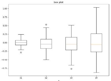
1. 畫出一個盒圖 plt.boxplot(tang_array, notch=False, sym='o', vert=True) # tang_array表示輸入的列表, notch表示盒圖的樣子,sym表示偏離值的表示方法, vert表示豎著,還是橫著
import matplotlib.pyplot as plt import numpy as np # 構造正態分佈的列表陣列 tang_array = [np.random.normal(0, std, 100) for std in [0.1, 0.2, 0.3, 0.4]] fig = plt.figure(figsize=(8, 6)) plt.boxplot(tang_array, notch=False, sym='o', vert=True) plt.xticks([x+1 for x in range(len(tang_array))], ['x1', 'x2', 'x3', 'x4']) plt.title('box plot') plt.xlabel('x') plt.show()
2 設定盒圖的線條顏色
import matplotlib.pyplot as plt import numpy as np # 構造正態分佈的列表陣列 tang_array = [np.random.normal(0, std, 100) for std in [0.1, 0.2, 0.3, 0.4]] fig = plt.figure(figsize=(8, 6)) bplt = plt.boxplot(tang_array, notch=False, sym='o', vert=True) for compnent in bplt.keys(): for line in bplt[compnent]: line.set_color('red') plt.xticks([x+1 for x in range(len(tang_array))], ['x1', 'x2', 'x3', 'x4']) plt.title('box plot') plt.xlabel('x') plt.show()

3.對盒圖進行填充操作 設定pacth_artist=True 對盒圖面進行填充bplt['boxes'].set_facecolor('r')
tang_array = [np.random.uniform(0, std, 100) for std in [0.1, 0.2, 0.3, 0.4]]
bar_labels = ['x1', 'x2', 'x3', 'x4']

fig = plt.figure()
plt.xticks([x+1 for x in range(len(tang_array))], bar_labels)
bplt = plt.boxplot(tang_array, notch=False, sym='o', vert=True, patch_artist=True)

colors = ['pink', 'lightblue', 'lightgreen']
for pacthes, color in zip(bplt['boxes'], colors):
    pacthes.set_facecolor(color)

plt.show()

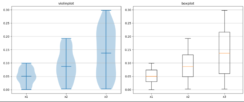
4. 設定小提琴圖
fig, axes = plt.subplots(nrows=1, ncols=2, figsize=(12, 5))
tang_data = [np.random.normal(0, std, 100) for std in range(1, 4)]
axes[0].violinplot(tang_data, showmeans=False, showmedians=True)
axes[0].set_title('violin plot')

axes[1].boxplot(tang_data)
axes[1].set_title('box plot')


for ax in axes:
    # 對y軸加上網格
    ax.yaxis.grid(True)
    ax.set_xticks([y+1 for y in range(len(tang_data))])
# 對每個圖加上xticks操作
plt.setp(axes, xticks=[y+1 for y in range(len(tang_data))], xticklabels=['x1', 'x2', 'x3'])
plt.show()