
設定input 的 checkbox樣式
阿新 • • 發佈:2019-01-09
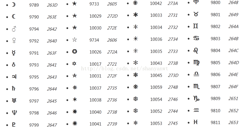
幾千個icon支援
<!DOCTYPE html>
<html><head>
<meta charset="UTF-8">
<title>自定義選擇按鈕</title>
<style type="text/css">
label em{
background-color: white;
border-radius: 5px;
border:1px solid #d3d3d3;
width:20px;
height:20px;
display: inline-block;
text-align: center;
vertical-align: middle;
line-height: 20px;
}
label input[type="checkbox"]:checked +em{
background-color:#2d8cf0;
}
label input[type="checkbox"]:checked +em:after{
content:"\2714";
/*content ICON 樣式 http://www.w3cplus.com/solution/css3content/images/html.png*/
color: #FFFFFF;
}
</style>
</head>
<body>
<body>
<label>
<input style="display: none;" type="checkbox" />
<em></em>
選擇
</label>
<p>
<a href="http://www.w3cplus.com/solution/css3content/images/html.png">
content小的icon地址》》</a>
</p>
</body>
</body>
</html>