Bootstrap中表格問題詳解
阿新 • • 發佈:2019-01-13
Bootstrap表格
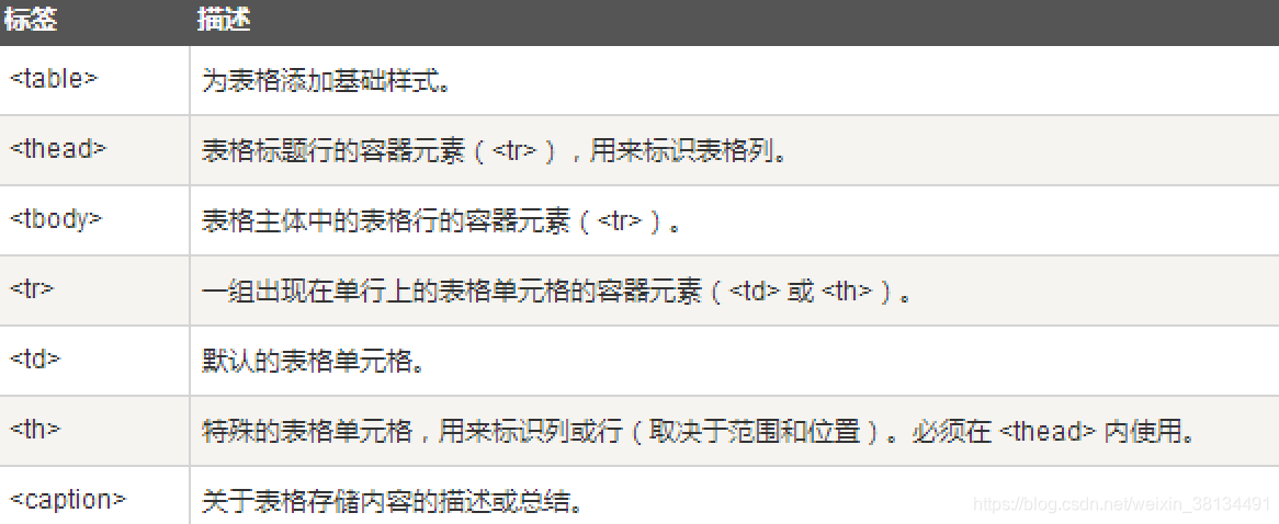
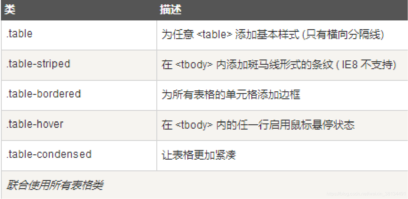
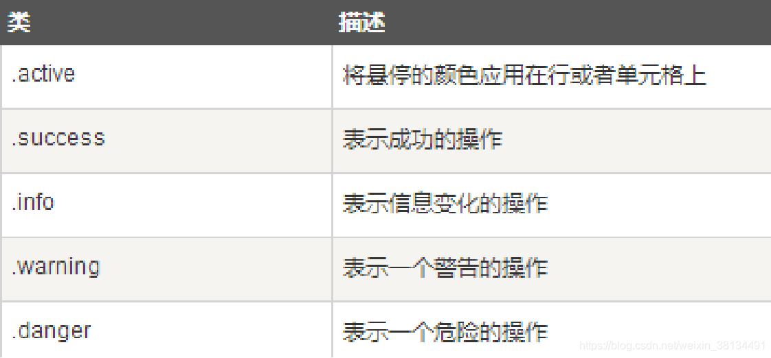
表格類
<tr>, <th> 和 <td> 類
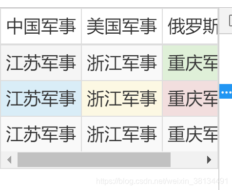
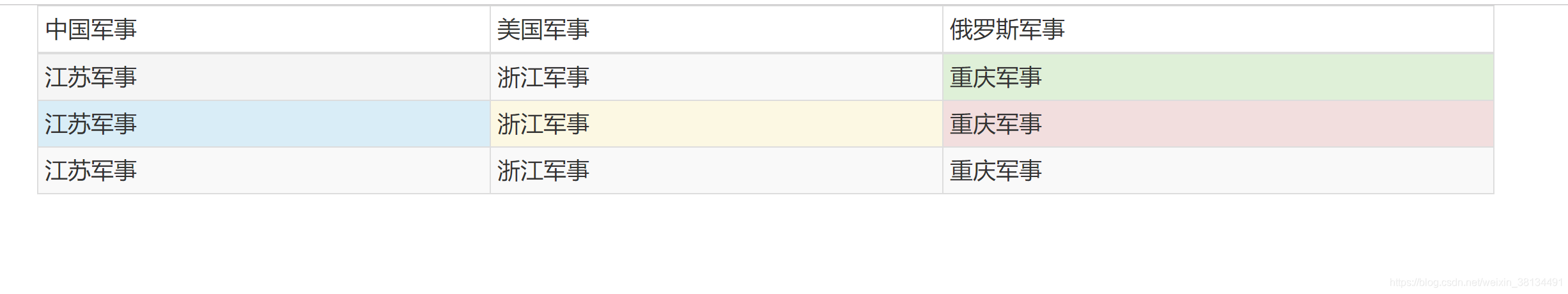
<!DOCTYPE html>
<html>
	<head>
		<meta charset="utf-8">
		<title></title>
		<link href="Bootstrap/css/bootstrap.css" rel="stylesheet" />

		<style type="text/css">
			table{
				width:100%;
				font-size: 18px;
				line-height: 45px;
			}

            td{
                mid-width:500px;  //最小寬度為500
              }

		</style>
	</head>
	<body>
		<div class="container">
		<table class="table table-striped table-bordered table-hover table-condensed">
			<thead>
				<tr>
					<td>中國軍事</td>
					<td>美國軍事</td>
					<td>俄羅斯軍事</td>
				</tr>
			</thead>
			<tbody>
				<tr>
					<td class="active">江蘇軍事</td>
					<td>浙江軍事</td>
					<td class="success">重慶軍事</td>
				</tr>

				<tr>
					<td class="info">江蘇軍事</td>
					<td class="warning">浙江軍事</td>
					<td class="danger">重慶軍事</td>
				</tr>

				<tr>
					<td>江蘇軍事</td>
					<td>浙江軍事</td>
					<td>重慶軍事</td>
				</tr>
			</tbody>
		</table>
		</div>


		<script src="Bootstrap/js/bootstrap.js"></script>
		<script src="bootstrap/js/jquery-1.11.3.min.js"></script>
	</body>
</html>
效果如下:
把table表格包在含table-responsive class的div內,可以讓表格水平滾動以適應小型裝置